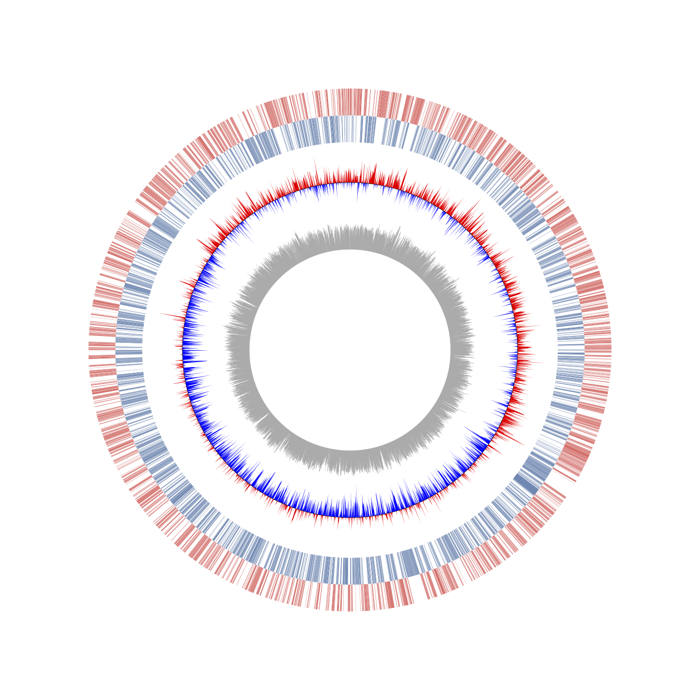
Circos is one of the most popular software for visualizing genomic similarities and features. However, its execution process is complicated. Additionally, Circos is written in Perl, which limits its integration with other software for biological analysis. On the other hand, various software packages have been developed for biological data analysis using Python. Therefore, by combining these packages, researchers can complete most of the required analysis. Nevertheless, Python lacks a library for drawing Circos plots (even though Circos software has been published for more than a decade). Here, we provide a python matplotlib based circular genome visualization package '"pyCircos," which can represent genomic features from a GenBank format file input. Therefore pyCircos does not require preparing a complicated config file. The genomic similarities among multiple-locus or genomes also can be visualized with a simple python script.
- python 3.6.2 later
- matplotlib 3.0.0 later
- Biopython
-
Download the github packages using the following single command.
git clone https://github.com/ponnhide/pyCircos -
Install the necessary Python packages using the following commands.
pip install matplotlib
pip install biopython
Go to the sample/tutorial/ directory and execute the following code
python how_to_use.py
If the script can work correctly, you can find the "test.pdf" as output in the directory.
Example 0
(sample/tutorial/how_to_use.py)
import sys
import numpy as np
sys.path.append("../../")
from pycircos import *

if __name__ == "__main__":
    gcircle = Gcircle()
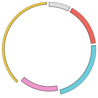
    gcircle.add_locus("1", 1000, bottom=900, height=100) #name, length, bottom (0<=bottom<=1000), height (0<=bottom<=1000)
    gcircle.add_locus("2", 2000, bottom=900, height=100, facecolor="#ED665D")
    gcircle.add_locus("3", 3000, bottom=900, height=100, facecolor="#6DCCDA")
    gcircle.add_locus("4", 2000, bottom=800, height=100, facecolor="#ED97CA")
    gcircle.add_locus("5", 5000, bottom=950, height=50, facecolor="#EDC948")
    gcircle.set_locus() #Creat figure object

    data = np.random.rand(100)
    gcircle.scatter_plot("1", data, bottom=900, height=-100)

    data = np.random.rand(100)
    gcircle.line_plot("2", data, bottom=600, height=100)

    data = np.random.rand(100)
    gcircle.line_plot("2", data, bottom=600, height=100)

    data = np.random.rand(50)
    gcircle.heatmap("3", data, bottom=600, height=100)

    data = np.random.rand(50)
    gcircle.bar_plot("4", data, bottom=600, height=-200)

    data = np.random.rand(50)
    gcircle.bar_plot("4", data, bottom=600, height=200)

    gcircle.chord_plot(["4", 1000, 1100], ["1", 200, 400], bottom=400)
    gcircle.chord_plot(["5", 1000, 1100, 950], ["3", 1000, 2000, 600], color="#FF0000")
    gcircle.chord_plot(["5", 4000, 4500, 950], ["2", 500, 1000, 400], color="#F2BE2B")

    gcircle.save()
Example 1
Visualization of CDS, GC-skew and GC-amount from Genbank (sample/prokayote1/prokaryote_1.ipynb)

Example 2
Visualization of homology links in the genome (sample/prokayote2/prokaryote_2.ipynb)

