Flutter video editor
A video editor that allows to edit (trim, crop, rotate and scale) and choose a cover with a very flexible UI design.
Contains advanced functions to control the video output according to the capped variables and predict output video size before processing of video.
The changes are then exported with ffmpeg.
📖 Installation
Following steps will help you add this library as a dependency in your flutter project.
- In the
pubspec.yamlfile in the root of your project
dependencies:
video_editor: ^1.4.4- Run the following command to install the package:
$ flutter packages get- Import the package in your project file:
import 'package:video_editor/video_editor.dart';Since v1.3.0, video_editor uses ffmpeg_kit_flutter main release which supports the latest features. (More info on flutter FFmepeg kit)
Those Android API level and iOS deployment target are required to uses this package. If you're planing to target older devices, check about the LTS release.
| Android API Level |
iOS Minimum Deployment Target |
|---|---|
| 24 | 12.1 |
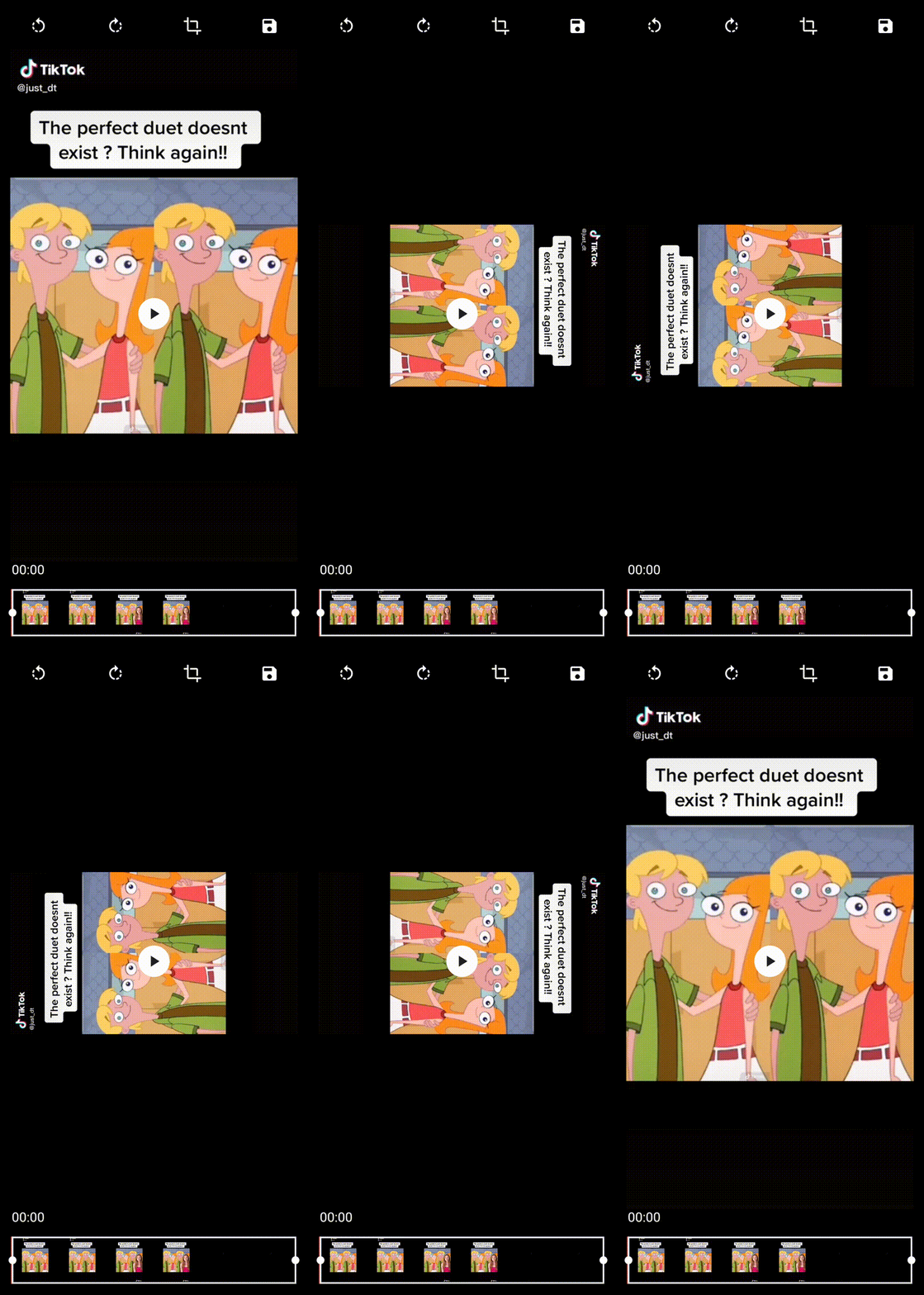
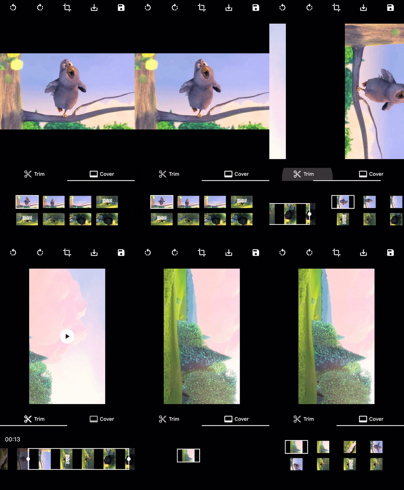
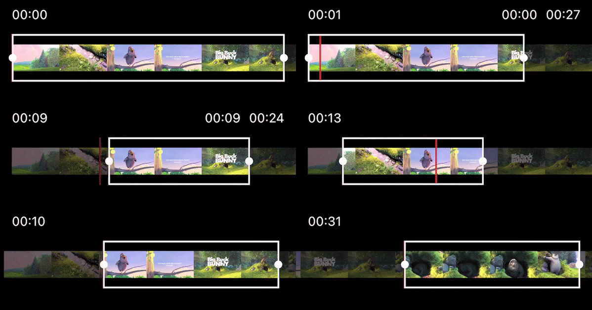
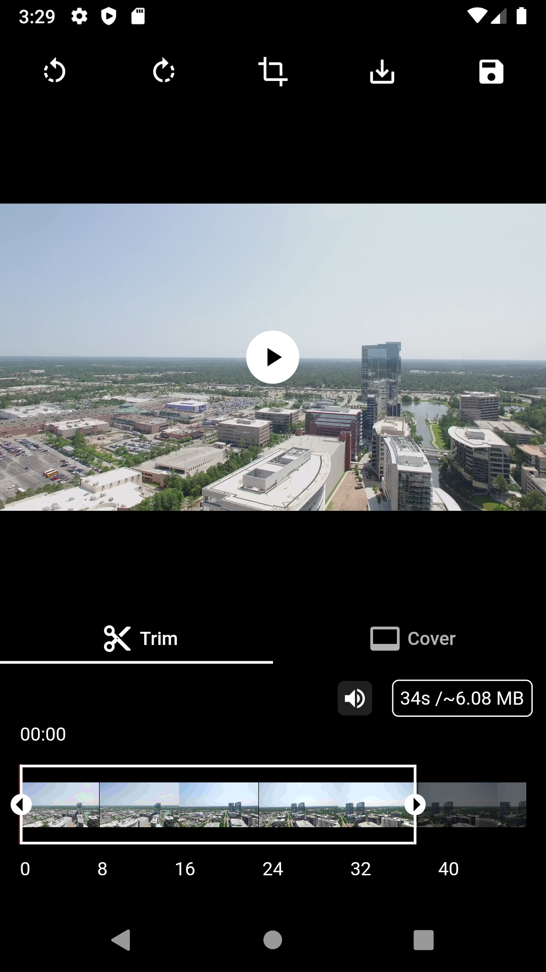
📸 Screenshots
(The UI Design is fully customizable on the example)
| Crop Video | Rotate Video | Video cover (selection, viewer) |
|---|---|---|
 |
 |
 |
| Trim video | Trimmer customization | Automatic size prediction |
|---|---|---|
 |
 |
👀 Usage
VideoEditorController
| Function | Description |
|---|---|
| initialize() | Init the controller parameters, the video, the trim and the cover |
| rotate90Degrees(RotateDirection) | Rotate the video by 90 degrees in the direction provided |
| preferredCropAspectRatio | Update the aspect ratio of the crop area |
| updateCrop | Update the controller crop min and max values |
| getMetaData(onCompleted) | Return the metadata of the video file in onCompleted function |
| exportVideo(onCompleted) | Return the generated video with the controller parameters in onCompleted function callback |
| extractCover(onCompleted) | Return the selected cover with the controller parameters in onCompleted function callback |
| exportVideoWithFuture | Return the generated video with the controller parameters as a Future |
| extractCoverWithFuture | Return the selected cover with the controller parameters as a result of Future |
Widgets
Click to expand widgets documentation
Crop
1. CropGridViewer
This widget is used to enable the crop actions on top of the video, or only to preview the cropped result.
| Param | Description |
|---|---|
| required VideoEditorController controller | The controller param is mandatory so every change in the controller settings will propagate in the crop view |
| bool showGrid = true | The showGrid param specifies whether the crop action can be triggered and if the crop grid is shown, set this param to false to display the preview of the cropped video |
| double horizontalMargin = 0.0 | The horizontalMargin param need to be specify when there is a margin outside the crop view, so in case of a change the new layout can be computed properly (i.e after a rotation) |
Trimmer
1. TrimSlider
Display the trimmer containing video thumbnails with rotation and crop parameters.
| Param | Description |
|---|---|
| required VideoEditorController controller | The controller param is mandatory so every change in the controller settings will propagate in the trim slider view |
| double height = 0.0 | The height param specifies the height of the generated thumbnails |
| double quality = 10 | The quality param specifies the quality of the generated thumbnails, from 0 to 100 (more info) |
| double horizontalMargin = 0.0 | The horizontalMargin param specifies the horizontal space to set around the slider. It is important when the trim can be dragged (controller.maxDuration < controller.videoDuration) |
| Widget? child | The child param can be specify to display a widget below this one (e.g: TrimTimeline) |
2. TrimTimeline
Display the video timeline.
| Param | Description |
|---|---|
| required VideoEditorController controller | The controller param is mandatory so depending on the controller.maxDuration, the generated timeline will be different |
| double secondGap = 5 | The secondGap param specifies time gap in second between every points of the timeline |
| EdgeInsets margin = EdgeInsets.zero | The margin param specifies the space surrounding the timeline |
Cover
1. CoverSelection
Display a couple of generated covers with rotation and crop parameters to updated the selected cover.
| Param | Description |
|---|---|
| required VideoEditorController controller | The controller param is mandatory so every change in the controller settings will propagate in the cover selection view |
| double height = 0.0 | The height param specifies the height of the generated thumbnails |
| double quality = 10 | The quality param specifies the quality of the generated thumbnails, from 0 to 100 (more info) |
| double horizontalMargin = 0.0 | The horizontalMargin param need to be specify when there is a margin outside the crop view, so in case of a change the new layout can be computed properly. |
| int quantity = 5 | The quantity param specifies the quantity of thumbnails to generate |
2. CoverViewer
Display the selected cover with rotation and crop parameters.
| Param | Description |
|---|---|
| required VideoEditorController controller | The controller param is mandatory so every change in the controller settings will propagate the crop parameters in the cover view |
| String noCoverText = 'No selection' | The noCoverText param specifies the text to display when selectedCover is null |
Style
Click to expand style documentation
1. CropStyle
You can create your own CropStyle class to customize the CropGridViewer appareance.
| Param | Description |
|---|---|
| Color croppingBackground = Colors.black.withOpacity(0.48) | The croppingBackground param specifies the color of the paint area outside the crop area when copping |
| Color background = Colors.black | The background param specifies the color of the paint area outside the crop area when not copping |
| double gridLineWidth = 1 | The gridLineWidth param specifies the width of the crop lines |
| Color gridLineColor = Colors.white | The gridLineColor param specifies the color of the crop lines |
| int gridSize = 3 | The gridSize param specifies the quantity of columns and rows in the crop view |
| Color boundariesColor = Colors.white | The boundariesColor param specifies the color of the crop area's corner |
| double boundariesLength = 20 | The boundariesLength param specifies the length of the crop area's corner |
| double boundariesWidth = 5 | The boundariesWidth param specifies the width of the crop area's corner |
2. TrimStyle
You can create your own TrimStyle class to customize the TrimSlider appareance.
| Param | Description |
|---|---|
| Color background = Colors.black.withOpacity(0.6) | The background param specifies the color of the paint area outside the trimmed area |
| Color positionLineColor = Colors.red | The positionLineColor param specifies the color of the line showing the video position |
| double positionLineWidth = 2 | The positionLineWidth param specifies the width of the line showing the video position |
| Color lineColor = Colors.white | The lineColor param specifies the color of the borders around the trimmed area |
| double lineWidth = 2 | The lineWidth param specifies the width of the borders around the trimmed area |
| Color iconColor = Colors.black | The iconColor param specifies the color of the icons on the trimmed area's edges |
| double circleSize = 8 | The circleSize param specifies the size of the circle behind the icons on the trimmed area's edges |
| double iconSize = 25 | The iconSize param specifies the size of the icon on the trimmed area's edges |
| IconData? leftIcon = Icons.arrow_left | The leftIcon param specifies the icon to show on the left edge of the trimmed area |
| IconData? rightIcon = Icons.arrow_right | The rightIcon param specifies the icon to show on the right edge of the trimmed area |
3. CoverStyle
You can create your own CoverStyle class to customize the CoverSelection appareance.
| Param | Description |
|---|---|
| Color selectedBorderColor = Colors.white | The selectedBorderColor param specifies the color of the border around the selected cover thumbnail |
| double selectedBorderWidth = 2 | The selectedBorderWidth param specifies the width of the border around the selected cover thumbnail |
| Widget? selectedIndicator | The selectedIndicator param specifies the Widget to show on top of the selected cover |
| AlignmentGeometry selectedIndicatorAlign = Alignment.bottomRight | The selectedIndicatorAlign param specifies where selectedIndicator should be shown in the Stack |
FAQ
1. How to use FFmpeg LTS release
Since v1.3.0, video_editor uses ffmpeg_kit_flutter main release which supports the latest features. If you want to support a wider range of devices you should use the LTS release. more info
To do this, add this to your pubspec.yaml:
dependency_overrides:
  ffmpeg_kit_flutter_min_gpl: ^4.5.1-LTS
✨ Main contributors
Le Goff Maël |

