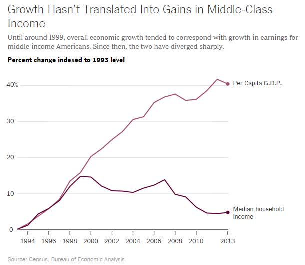
Neil Irwin, in an article in the New York Times, published this chart
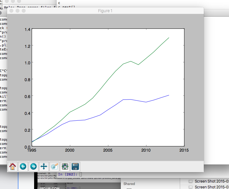
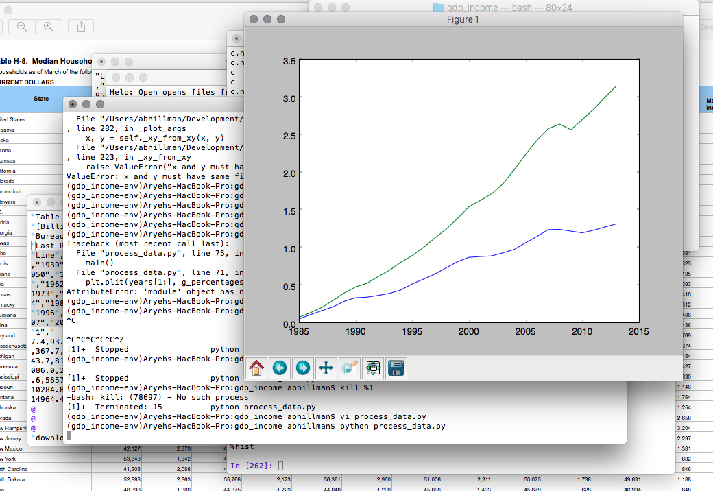
For fun, I decided to see if I could recreate the chart, especially going back a little further than 1995. Data were relatively easy to come by and their sources are mentioned in sources.txt
Indexed against 1995, here is the chart I came up with:
Indxed against 1984:
If you would like to plot the chart yourself, make sure you are running Python 2.7.x and that you have the dependencies listed in requirements.txt installed (for example, in a virtual environment). Then, simply run
python process_data.py


