We all have many politicians, they talk about very different topics in very different ways. Is there an easy way to compare how much they deal with a topic respect another one? Is there an easy way to understand which politician is addressing with a topic we care about?
The problem I want to solve through designing this interactive visualization is to effectively show how much the politician deals with specific topic, such as Europe, Health, LGBT rights, Environment etc.
In this visualization I stopped at “how much” the politicians deal with specific topic, because it is very difficult to visualize “how” (positive, negative, neutral) they are talking about them. Of course, there are tool of sentimental analysis that could solve also this problem, but they are not 100% accurate and there are too much for the purpose of this project.
Also computing “how much” a politician talk about a subject has some limit, all of these are due to natural language that they are using. My aim is to use very simple natural language processing tool and some information retrieval technique in order to reach the goal of the visualization. So, there should be some errors, let me make an extreme example, if the politician says: “Neapolitan Pizza is the best of all Europe!” of course it is not talking about the European Parliament or how to reform the EU, but anyway this ambiguous speech are very rare (in Italy not so much), and the overall quality of the visualization is very high, in fact in the section Tweet visualization I talk about another part of the visualization and so how the user can check and evaluate the quality of the visualization, through the visualization itself.
My solution, is an interactive visualization that you can find at this link:
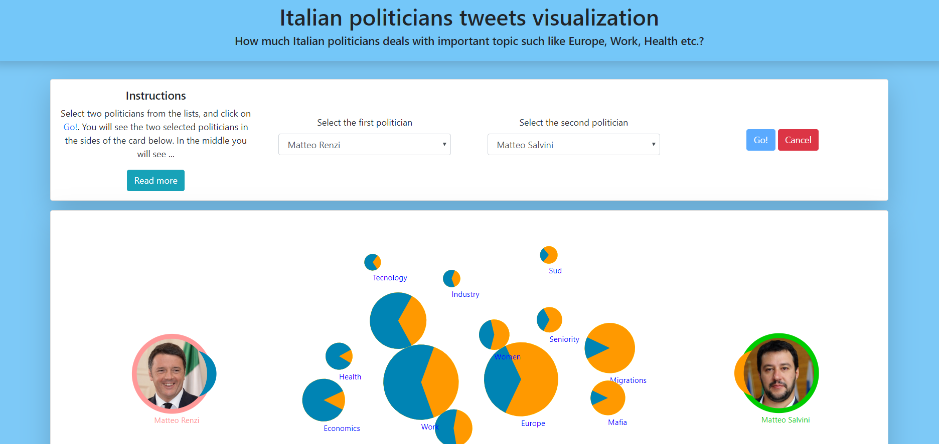
It has two parts, the first one is an interactive force graph. The second one is a set of embedded tweets and Twitter timelines. In the following figure you can see a preview of the first part.
It is webpage fully developed by me.
In order to reach the goal of the visualization I chose as dataset the tweets of various Italian Politicians. To interact with Twitter I used its developer API [1]. So I wrote some script to download as much tweets as I could, more precisely I wrote a python script that through the endpoint GET statuses/user_timeline [2] downloaded and saved on the local machine all the most recent tweet of some selected politicians. This script is called 1_Retrieve.py.
Then I wrote a script for parsing and format all this data in order to clean the tweet from emoji, links, stop words etc, and organize them in a json file. More specifically I used the library [12] to understand which words are useful for my aim. The json file is a map built using ids of the tweets as keys and parsed and cleaned text of the tweets as values. I chose this way of organizing after several iteration, for example in the beginning I didn’t need the tweet id, but then, for reason explained in the section Tweet visualization they had become indispensable. The script for extracting and parsing is called [2_ExtractAndParse2.py] (2_ExtractAndParse2.py).
The next step is to compute, for each politician and for each topic, the relationship between how much a topic is addressed and the all Twitter corpus of the politician. This is done in a very simple and effective way, let me make an example: if some tweet of the politician “A” contains the words: “pil” (that is the Italian equivalent of GDP Gross domestic product) or “spread” or “debit,” a temporary value “tmp” increases by one for the politician “A”. After scanning of the tweets, the ratio of the topic Economics for the politician “A” will be “tmp” / number all the words he used. I arrange the data in a json file in which for each topic a have the its ratio respect all politicians. This file is used by the webpage in order to plot the force graph. The set of words associated to each topic is in this json file **topics.json. The script for this computation is called 3_Statistics2.py.
I took inspiration from this visualization [3]. I want the user to select two politician, maybe very different ones for example to understand how much far-right politicians and far-left ones differ, or maybe very similar one to understand how much politicians from the same party are similar. The components of the first part of the visualization are: two photos of the selected politicians with their names in the sides and many topics in between. The user can interact with the visualization moving its component, finding out that they try to return in the original position. They move in a very realistic (physically speaking) way, so the user can really enjoy playing with them. Every topic is a pie-chart, the bigger it is the more the politicians address the corresponding topic, the nearer to a politician the more he addresses it. The pie-charts are drawn using the proportions with which the selected politicians address the related topic. The pie-charts are not simple ones, but they rotate in order to face the right side. I will talk about this in the section 3.1.
I used the version 5 of the library D3 [4] in order to create a force layout. This library has some strengths but a lot of weaknesses that I had to face. In the end, I am glad I managed all the problems and the visualization looks like exactly as I wanted.
For the UI of the website (and so for the appearance of the select boxes, button, cards, shadow etc.) I use Bootstrap version 4 [[5]. For the pie-chart and the photo of the politicians I use simple svg [10]. I get the photo from internet and I add an outline of the main colour the party in which the politician is. The colours of the pie-chart are fixed: blue and orange. The simple reason why I do that instead of using main colour of the party also for the pie-charts is because if I want to compare to politician from the same party, I could recognize the difference in the pie-charts. The first politician (the one in the left) has the colour blue, the second politician (the one on the right) has the colour orange. To make it clear there a small section of circle of the right colour near the right politician. I think this solution is elegant and fancy. The pie-chart are also rotated in order to make the right part face the right politician. To do that a used my basic knowledge of geometry and the transformation “rotate” of svg [11].
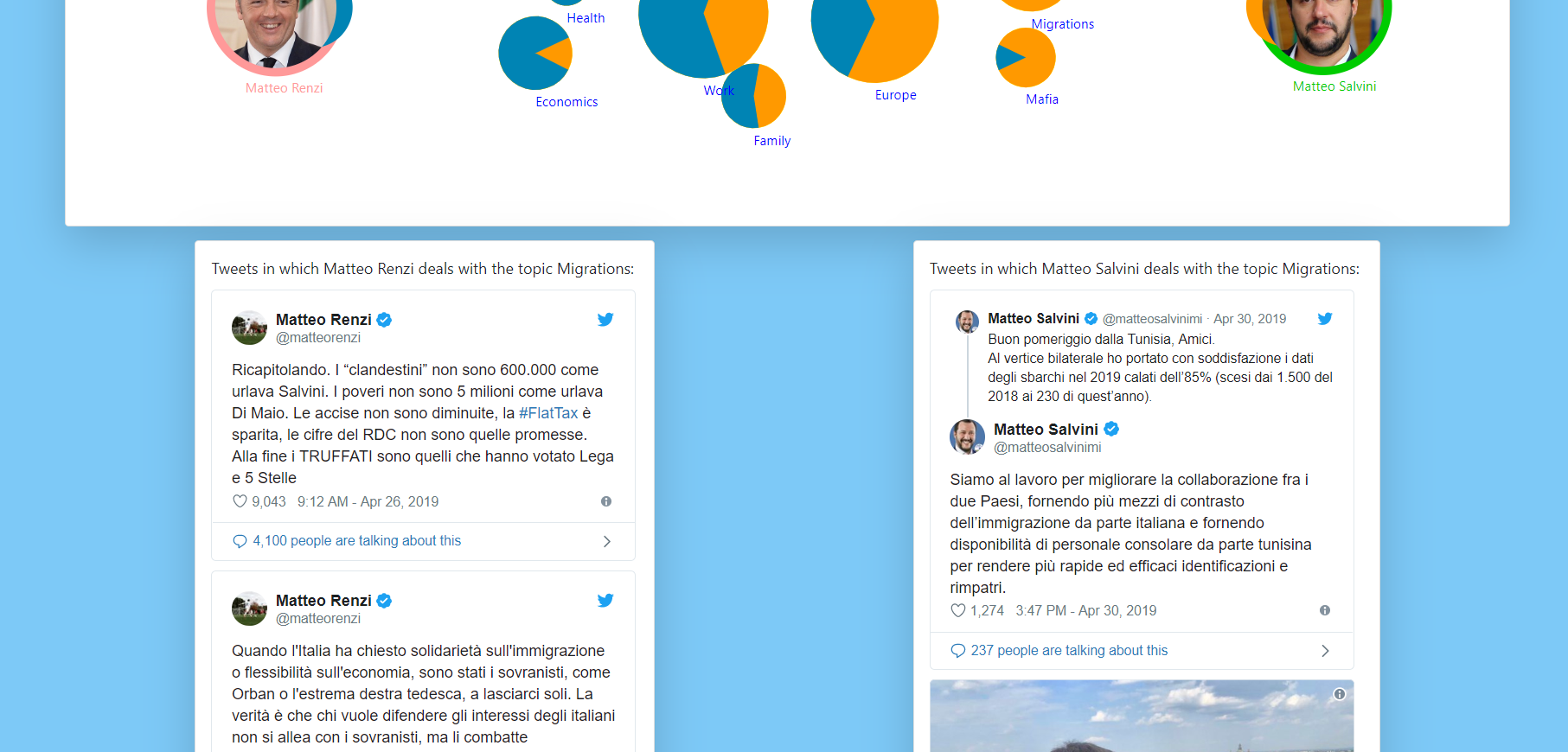
There is a second part of the visualization that can be show if the user just clicks (and so not drag and drop) on a politician or on a topic. In the first case there will be shown the timeline of politician. In the second case there will be shown the tweets of both politicians that address the topic. For embedding these components in the website I use these Twitter tools [6]. When I decided to add this part the project organization changed a lot, for example before the scripts were just computing the presence of the various words. In the new version they have to link the presence of the words to some real tweet id and also save them. I think this second part is very important for the visualization because first of all the user can see also “how” the two politicians are addressing the topics and also can judge the quality of the visualization, that, after many tests made by me, seems to be very high. In the following figure you can see a preview of the second part of the visualization.
-
https://developer.twitter.com/en/docs/tweets/timelines/api-reference/get-statuses-user_timeline.html
-
https://github.com/aboffa/Italian-politicians-tweets-visualization
-
https://chrome.google.com/webstore/detail/moesif-orign-cors-changer/digfbfaphojjndkpccljibejjbppifbc
-
https://developer.mozilla.org/en-US/docs/Web/SVG/Attribute/transform
-
https://www.ims.uni-stuttgart.de/forschung/ressourcen/werkzeuge/treetagger.en.html

