This is a repo for analysing data from the Acaia Lunar scales.
The data has the following fields;
id, name, createdAt, temperature, grind, tasty, note,
total time, average flowrate, total weight, brew data.
There is some notable information missing, such as the dose, origin, or the bean name.
If you are consistent you can add information using the name field e.g. type, roastery, origin
| name |
|---|
| Espresso, Full Circle, Brazil |
| Espresso, Full Circle, Brazil |
| Espresso, Full Circle, Brazil |
| Espresso, Full Circle, Brazil |
| Espresso, Full Circle, Brazil |
library(dplyr)
library(tidyr)
extra_data1 <-
  raw_data %>%
  # Separate out name
separate(name, sep = ", ", into = c("type", "roastery", "origin"))| type | roastery | origin |
|---|---|---|
| Espresso | Full Circle | Brazil |
| Espresso | Full Circle | Brazil |
| Espresso | Full Circle | Brazil |
| Espresso | Full Circle | Brazil |
| Espresso | Full Circle | Brazil |
The JSON string can be included in the note field.
Firstly, to make it easier the app settings should be changed so that the notes from the last brew are automatically populated for the next brew.
Settings > Remember Notes
Secondly, add a JSON string in the notes section
e.g. [{”batch_name”:”Sao Joao”, ”roast_date”:”2020-08-18”,
”variety”:”bourbon”, ”roast”:”medium”, ”dose”:18.2}]
There is no limit to the extra fields added here, and you do not need to be consistent in the fields added. If a field appears in certain brews it will be NA for all others.
library(dplyr)
library(tidyr)

extra_data2 <-
  extra_data1 %>%
  bind_cols(
    lapply(raw_data[["note"]], function(x) jsonlite::fromJSON(gsub("”|“", '"', x))) %>%
bind_rows())| batch_name | variety | roast_date | roast | dose | other | decaf |
|---|---|---|---|---|---|---|
| Reunidas De Cachoeira | catuai | 2020-11-03 | medium | 18 | no tamp | NA |
| Reunidas De Cachoeira | catuai | 2020-11-03 | medium | 18 | no tamp | NA |
| Reunidas De Cachoeira | catuai | 2020-11-03 | medium | 18 | NA | NA |
| Reunidas De Cachoeira | catuai | 2020-11-03 | medium | 18 | NA | NA |
| Reunidas De Cachoeira | catuai | 2020-11-03 | medium | 18 | NA | NA |
The data now has the following fields;
id, type, roastery, origin, createdAt, temperature, grind,
tasty, note, total time, average flowrate, total weight, brew
data, batch_name, variety, roast_date, roast, dose,
other, decaf.
library(lubridate)
tidy_data <-
  extra_data2 %>%
  # tidy decaf column (add FALSE where NA)
  mutate(decaf = case_when(is.na(decaf) ~ F, T ~ T)) %>%
  # tidy columns + calc age and ratio
  mutate(createdAt = as_date(createdAt),
         roast_date = as_date(roast_date),
         age = createdAt - roast_date, ratio = `total weight`/dose) %>%
  # rename columns
  rename(total_time = `total time`, total_weight = `total weight`,
         mean_flow = `average flowrate`, brew_data = `brew data`)
flow_data <-
tidy_data$brew_data %>%
# Split the data into a vector for each brew
strsplit(split = ";") %>%
# Add names to each vector
lapply(function(x){names(x) = paste0("t_", 1:length(x)); return(x)}) %>%
# Combine all time series
bind_rows() %>%
# Add original data cols
bind_cols(tidy_data) %>%
# reshape data to have weight and time in a single column
pivot_longer(cols = starts_with("t_"),
names_to = "time", values_to = "weight") %>%
# parse time and calc times
mutate(time = as.numeric(gsub("t_", "", time)) * 0.2,
weight = as.numeric(weight),
weight_diff = weight - lag(weight),
flow = weight_diff / 0.2)
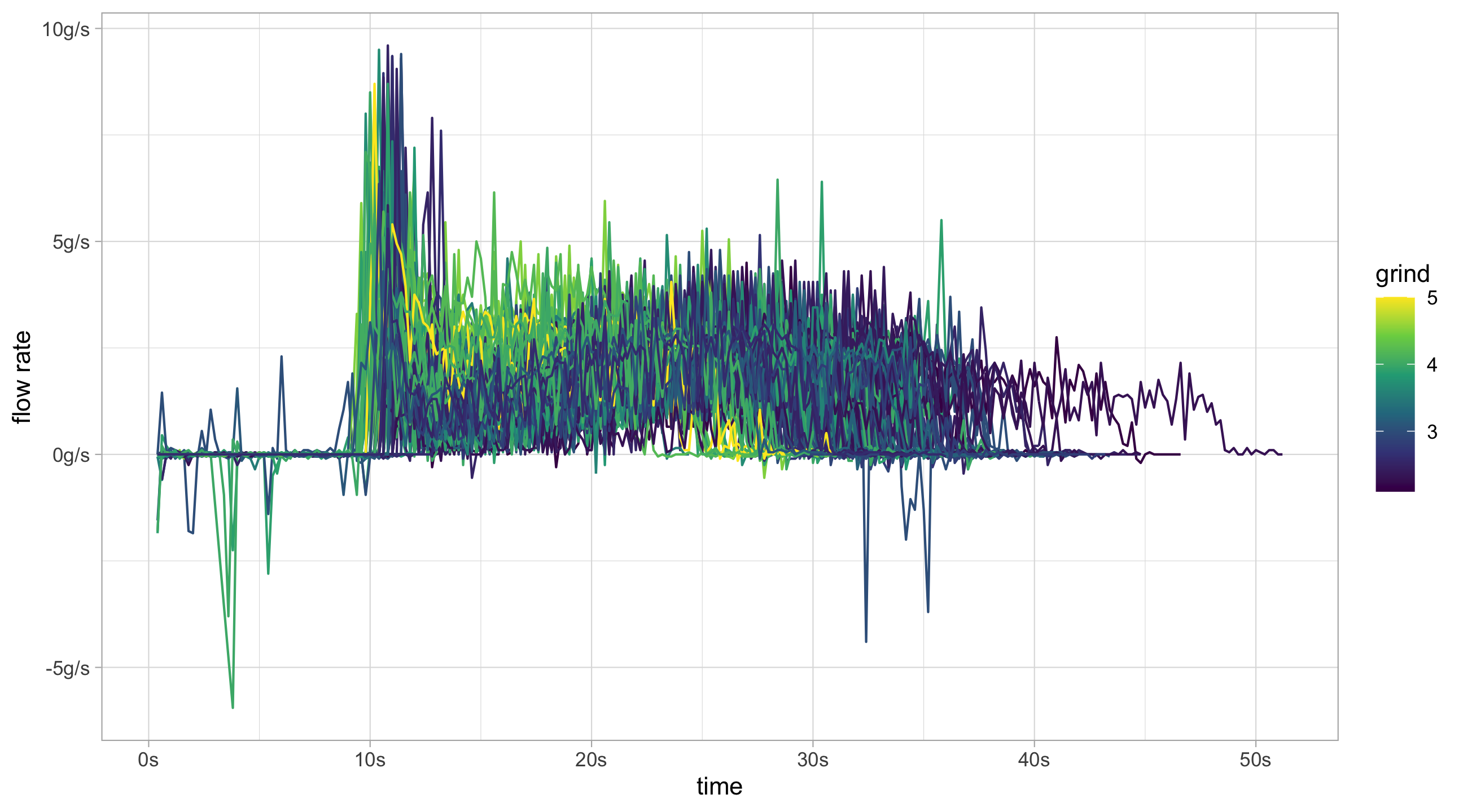
# Now it's ready to plotlibrary(ggplot2)
flow_data %>%
# Remove decaf and large spikes in flow rate
filter(!decaf, flow < 10, flow > -10) %>%
ggplot(aes(x = time, y = flow, group = id, colour = grind)) +
geom_line() +
scale_color_continuous(type = "viridis") +
scale_x_continuous(labels = function(x)paste0(x,"s")) +
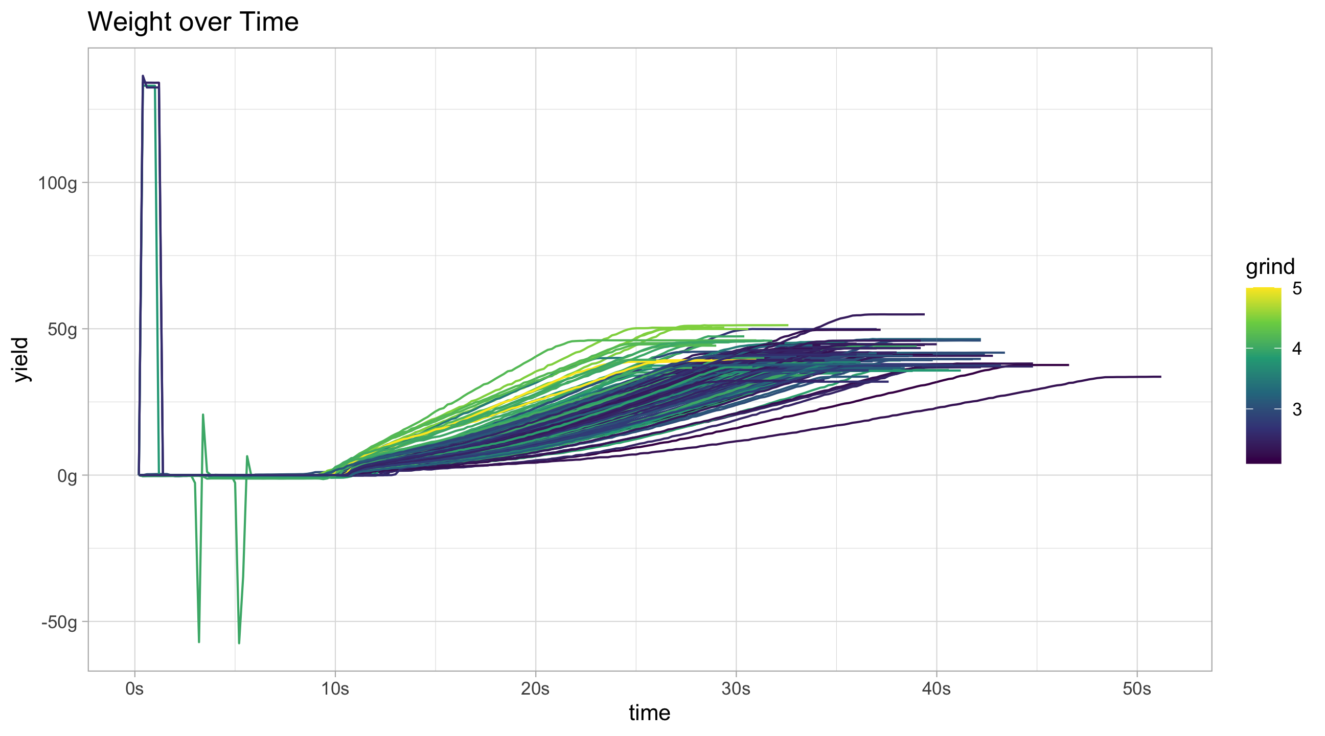
scale_y_continuous("flow rate", labels = function(x)paste0(x, "g/s"))flow_data %>%
filter(!decaf) %>%
ggplot(aes(x = time, y = weight, group = id, colour = grind)) +
geom_line() +
scale_color_continuous(type = "viridis") +
scale_x_continuous(labels = function(x)paste0(x,"s")) +
scale_y_continuous("yield", labels = function(x)paste0(x, "g")) +
ggtitle("Weight over Time")Ideally large spikes at the very beginning should be removed, as should the very end of the time series when the line is flat. Removing the flat piece at the end of the curve would give a better ending time for the shot.
my_brew_data_time <-
  function(x,
           split = ";",
           pad_length = NULL,
           beginning_time = 8,
           beginning_tol = 0.5,
           stall_tol = 0.05,
           change_lag = 2){

    split_data <- as.numeric(unlist(strsplit(x, split =  split)))

    # Want to remove any spikes at the beginning of the pour
    beginning_vals <- 1:round(beginning_time/0.2)
    beginning_outliers <- which(abs(split_data[beginning_vals]) >= beginning_tol)
    if (length(beginning_outliers) > 0)
      split_data[beginning_vals][beginning_outliers] <- 0


    lag_n <- diff(split_data, lag = change_lag)
    first_flow <- min(which(lag_n > beginning_tol))

    lag_n_backwards <- diff(rev(split_data), lag = change_lag)
    last_flow <- min(which(lag_n_backwards < -stall_tol))
    last_flow <- length(split_data) - last_flow

    if (last_flow > first_flow) {
      split_data[last_flow:length(split_data)] <- NA
    }else{
      last_flow <- length(split_data)
    }

    if (!is.null(pad_length))
      split_data <- c(split_data, rep(NA, pad_length - length(split_data)))

    split_data <- c(split_data, first_flow, last_flow)

    names(split_data) <- c(paste("t",1:(length(split_data) - 2), sep = "_"),
                           "estimated_first_flow", "estimated_last_flow")
    return(split_data)
  }


my_brew_data_series <- function(.data, col_name, ...){
  col_name <- as_label(enquo(col_name))
  .data %>%
    bind_cols(
      lapply(.data[[col_name]], my_brew_data_time, ...) %>%
        bind_rows()
    ) %>%
    select(-col_name)
}
We can now use the my_brew_data_series to process the flow data. On
top of that the flow rate can be smoothed by calculating a rolling
average.
flow_data_adv <-
  tidy_data  %>%
  my_brew_data_series(brew_data,
                      stall_tol = 0.1,
                      change_lag = 2) %>%
  # reshape data to have weight and time in a single column
  pivot_longer(cols = starts_with("t_"),
               names_to = "time", values_to = "weight") %>%
  # parse time and calc times
  mutate(time = as.numeric(gsub("t_", "", time)) * 0.2,
         weight = as.numeric(weight),
         flow = (weight - lag(weight)) / 0.2,
         # Can calculate the beginning and end by multiplying by time frequency
         estimated_begin = estimated_first_flow * 0.2,
         estimated_end = estimated_last_flow * 0.2) %>%
  # Group by ID and calculate moving average
  group_by(id) %>%
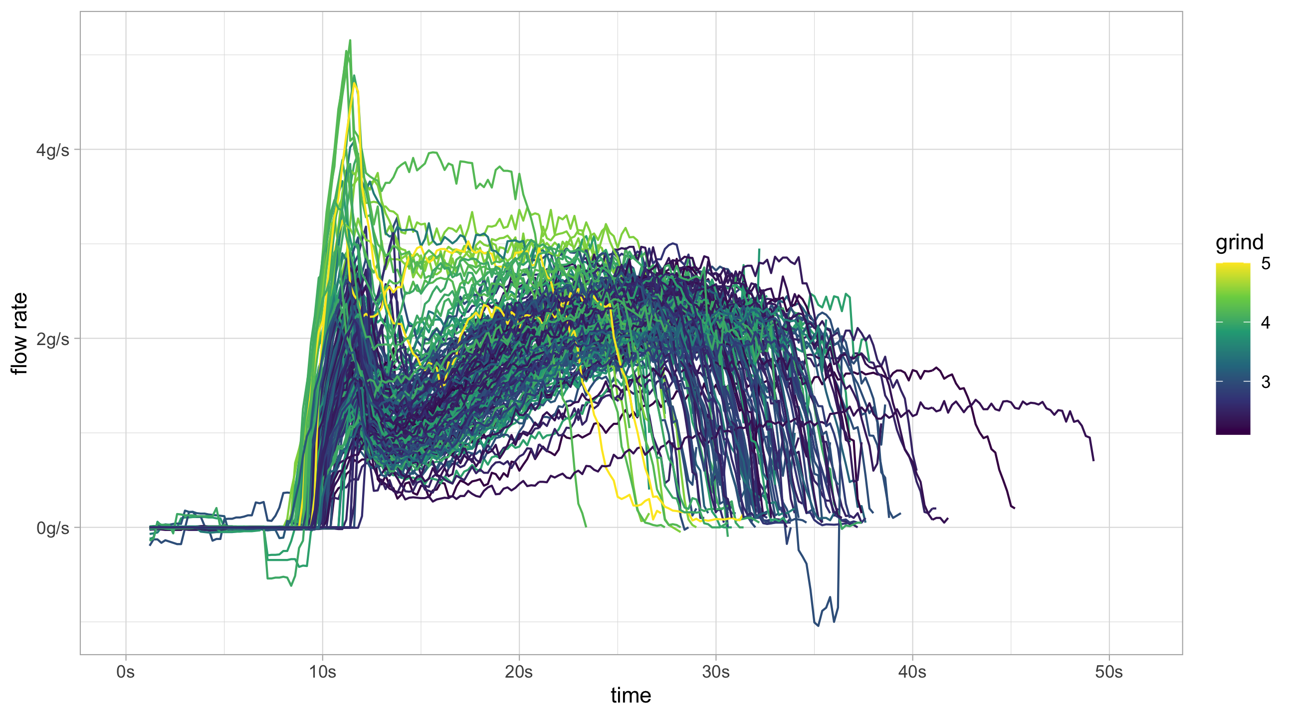
mutate(smooth_flow = zoo::rollapply(flow, 11, mean, fill = NA, na.rm = TRUE)) The smoothed flow rates give a much clearer graph compared to before.
flow_data_adv %>%
  filter(!decaf) %>%
  ggplot(aes(x = time, y = smooth_flow, group = id, colour = grind)) +
  geom_line() +
  scale_color_continuous(type = "viridis") +
  scale_x_continuous(labels = function(x)paste0(x,"s")) +
  scale_y_continuous("flow rate", labels = function(x)paste0(x, "g/s"))
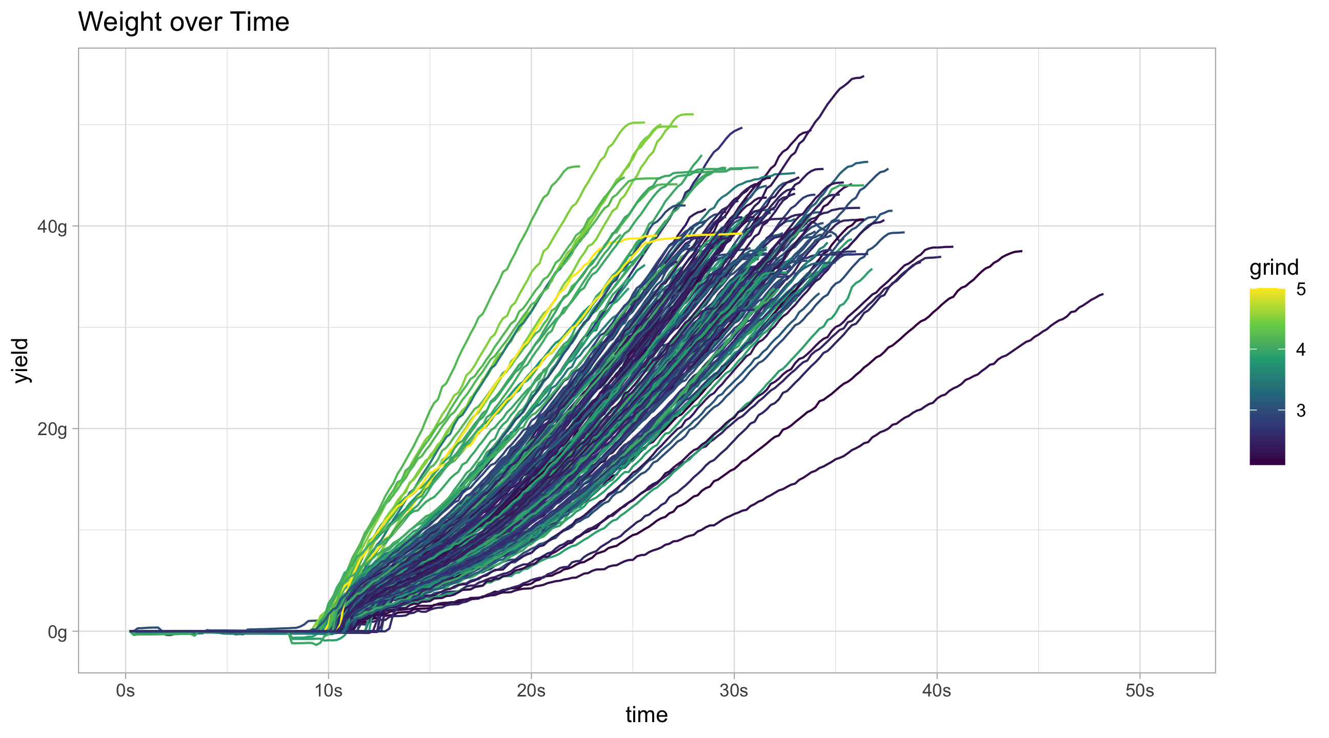
flow_data_adv %>%
filter(!decaf) %>%
ggplot(aes(x = time, y = weight, group = id, colour = grind)) +
geom_line() +
scale_color_continuous(type = "viridis") +
scale_x_continuous(labels = function(x)paste0(x,"s")) +
scale_y_continuous("yield", labels = function(x)paste0(x, "g")) +
ggtitle("Weight over Time")


