#Atomic
Collection of atom plugins I use for dev
##Install
apm install activate-power-mode advanced-open-file atom-material-ui autocomplete-modules autocomplete-paths color-picker editor-stats esformatter file-icons fold-functions gitignore-snippets highlight-selected imdone-atom language-gitignore language-javascript-jsx linter linter-eslint linter-flow mac-fix-path merge-conflicts minimap minimap-autohide minimap-bookmarks minimap-find-and-replace minimap-git-diff minimap-hide minimap-highlight-selected minimap-linter minimap-pigments minimap-selection npm-install pane-layout-plus pigments react-snippets regex-railroad-diagram regex-tester sort-lines terminal-plus tomorrow-night-eighties-syntax
##Plugin List
- activate-power-mode
- advanced-open-file
- atom-material-ui
- autocomplete-modules
- autocomplete-paths
- color-picker
- editor-stats
- esformatter
- file-icons
- fold-functions
- gitignore-snippets
- highlight-selected
- imdone-atom
- language-gitignore
- language-javascript-jsx
- linter
- linter-eslint
- linter-flow
- mac-fix-path
- merge-conflicts
- minimap
- minimap-autohide
- minimap-bookmarks
- minimap-find-and-replace
- minimap-git-diff
- minimap-hide
- minimap-highlight-selected
- minimap-linter
- minimap-pigments
- minimap-selection
- npm-install
- pane-layout-plus
- pigments
- react-snippets
- regex-railroad-diagram
- regex-tester
- sort-lines
- terminal-plus
- tomorrow-night-eighties-syntax
Activate POWER MODE to write your code in style.
activate-power-mode atom package
A package for Atom to replicate the effects from codeinthedark/editor. Available through the Atom package installer (https://atom.io/packages/activate-power-mode).
Activate with Ctrl-Alt-O or through the command panel with Activate Power Mode: Toggle. Use the command again to deactivate.

For a list of power mode packages to other editors, check out codeinthedark/awesome-power-mode. ##advanced-open-file
Open and create files and directories easily. Type in a path (with autocomplete) and view directory contents.
Advanced Open File

Advanced Open File is a package for helping Atom users to open files and folders easily. It can also create new files and folders if they don't exist.
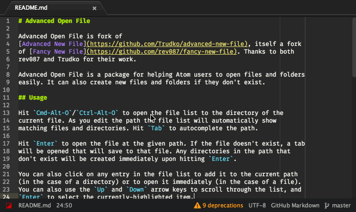
Advanced Open File is fork of Advanced New File, itself a fork of Fancy New File. Thanks to both rev087 and Trudko for their work.
Usage
Hit Cmd-Alt-O/Ctrl-Alt-O to open the file list to the directory of the
current file. As you edit the path the file list will automatically show
matching files and directories. Hit Tab to autocomplete the path.
Relative paths are considered relative to the current project's first root folder.
Hit Enter to open the file at the given path. If the file doesn't exist, a tab
will be opened that will save to that file. Any directories in the path that
don't exist will be created immediately upon hitting Enter.
You can also click on any entry in the file list to add it to the current path
(in the case of a directory) or to open it immediately (in the case of a file).
You can also use the Up and Down arrow keys to scroll through the list, and
Enter to select the currently-highlighted item.
If a directory has a plus symbol on the right side of its entry, clicking the
symbol will add it as a project directory. You can also add a highlighted
directory as a project directory using Shift-Cmd-O/Ctrl-Alt-O.
Cmd-Z/Ctrl-Z will undo changes made to the current path, such as
autocompletion or directory shortcuts.
Keybindings
Available commands for binding:
advanced-open-file:toggle- Toggles the Advanced Open File dialog.
core:confirm- If a path has been selected with the cursor, open it. If no path is selected, open the current path in the input.
advanced-open-file:confirm-selected-or-first-
Similar to
core:confirm. If nothing is selected, select the first item in the list. core:cancel- Close the Advanced Open File dialog.
application:add-project-folder- If a folder path has been selected with the cursor, add it as a project directory.
advanced-open-file:autocomplete- Attempts to autocomplete the current input.
advanced-open-file:undo- Undo changes to the current path.
advanced-open-file:move-cursor-up- Move the cursor/highlight for the currently selected file up.
advanced-open-file:move-cursor-down- Move the cursor/highlight for the currently selected file down.
advanced-open-file:delete-path-component-
A more powerful version of
alt-backspacethat erases the a directory component in the miniEditor including the slash ('/').
The following extra keybindings are included by default:
| Action | Extra Keys |
|---|---|
advanced-open-file:move-cursor-up |
Ctrl-p, Ctrl-i |
advanced-open-file:move-cursor-down |
Ctrl-n, Ctrl-k |
advanced-open-file:delete-path-component |
Ctrl-l |
You can of course remap the keys however you wish. For example, add the
following to your keymap to map Ctrl-x Ctrl-f to toggle the dialog and
Ctrl-j to move the cursor down:
'atom-workspace':
  'ctrl-x ctrl-f': 'advanced-open-file:toggle'

'.advanced-open-file atom-text-editor':
  'ctrl-j': 'advanced-open-file:move-cursor-down'
Settings
- Create directories
- Normally, when you attempt to open a path pointing to a directory that doesn't exist, an error beep sounds and nothing happens. When this setting is enabled, opening a non-existent directory will create it and show a notification confirming the creation.
- Create files instantly
- If checked, files are created immediately instead of on save if they don't exist.
- Default input value
- Determines what the default value in the path input is when the dialog is opened. Possible choices are nothing, the current project's root directory, or the directory of the currently-active file.
- Shortcuts for fast directory switching
-
When enabled, allows for quick directory switching when appending certain strings to a path that ends in a slash:
-
Adding an extra slash (e.g.
/) will switch to the filesystem root. -
Adding a tilde and a slash (e.g.
~/) will switch to the current user's home directory. -
Adding a colon and a slash (e.g.
:/) will switch to the current project's root directory.
-
Adding an extra slash (e.g.
Event Service
Other packages can subscribe to events to get notified when certain actions
happen in advanced-open-file. To do so, you'll need to consume the
advanced-open-file-events service:
package.json
"consumedServices": {
  "advanced-open-file-events": {
    "versions": {
      "0.1.0": "consumeEventService"
    }
  }
}
Main Module
{Disposable} = require 'atom'


module.exports =
  consumeEventService: (service) ->
    openDisposable = service.onDidOpenPath (path) ->
      console.log "Open: ###{path}"

    createDisposable = service.onDidCreatePath (path) ->
      console.log "Create: ###{path}"

    return new Disposable ->
      openDisposable.dispose()
      createDisposable.dispose()
onDidOpenPath
Triggered when a file is opened via advanced-open-file.
service.onDidOpenPath (path) ->
  console.log "Open: ###{path}"
onDidCreatePath
Triggered when a file is created via advanced-open-file. Note that this is only triggered when the "Create files instantly" preference is enabled. It does not trigger when the preference is disabled and a new file is opened and then subsequently saved.
service.onDidCreatePath (path) ->
  console.log "Create: ###{path}"
Contributing
First, if you're interested in contributing, thank you! It's awesome that you want to help!
The easiest way to contribute is to file an issue with the bug you've found or the new feature you want added. If you're interested in implementing the fix for your request yourself, or fixing an issue submitted by someone else, read on.
Developer Setup
Setting up a development install is easy with apm:
$ apm develop advanced-open-file /path/to/checkoutThe command above will use Git to clone Advanced Open File to the
/path/to/checkout directory, download the dependencies, and create a symlink
in your .atom profile for the package.
Now, if you launch Atom with the -d flag, Atom will load the development
checkout of Advanced Open File (instead of the released version, if you have it
installed). Any changes you make to the code will be reflected if you use the
Window: Reload command in the Command Palette to reload the editor.
That should be all you need to get started. Create a branch, write your changes, and submit the branch as a pull request, and you should hear back shortly!
License
Licensed under the MIT License. See LICENSE for details.
##atom-material-ui
A dark UI theme for Atom that follows Google's Material Design Guidelines

A dynamic UI theme for Atom that (kinda) follows Google's Material Design Guidelines. Best with Atom Material Syntax. (Mostly) works with other dark syntax themes as it uses syntax colors for the UI. Light themes work too, but might not look as nice.
Inspired by Mattia Astorino's SublimeText theme.
Installation
Fire up a console and type:
$ apm install atom-material-ui atom-material-syntax atom-material-syntax-light
Or, inside Atom's settings select Install and then search for this package.
Configuration
Atom Material UI supports different accent colors. To change it, go to Settings > Themes and click the cog icon next to the theme selector.

You'll find the color dropdown there.
Screenshot
Here's the obligatory screenshot. The toolbar on the left side is a package named Tool-bar-main.

Animated tabs! (these animations can be disabled from the theme's settings)

Light syntax theme variant

Extra

You can download the redesigned icon from dropbox. It's a ZIP file containing multiple resolution PNGs, ICNS and ICO formats. Windows ICO converted by Akshit Tripathi. ##autocomplete-modules
Autocomplete for require/import statements
Atom autocomplete for modules.


Autocomplete for require/import statements.

License

Adds path autocompletion to autocomplete+
autocomplete+ paths suggestions 


Adds path autocompletion to autocomplete+

Installation
You can install autocomplete-paths using the Preferences pane.
Please make sure you have autocomplete-plus installed as well ##color-picker
Right click or press CMD-SHIFT-C/CTRL-ALT-C to open it.
A Color Picker for Atom
Right click and select Color Picker, or hit CMD-SHIFT-C/CTRL-ALT-C to open it. Currently reads HEX, HEXa, RGB, RGBa, HSL, HSLa, HSV, HSVa, VEC3 and VEC4 colors – and is able to convert between the formats.
It also inspects Sass and LESS color variables. Just open the Color Picker with the cursor at a variable and it'll look up the definition for you. From there, you can click the definition and go directly to where it's defined.
Preview

Settings
Open Atom Settings, go to Packages in the left hand sidebar, and press Settings on color-picker to open the list of settings available for the Color Picker.
- Abbreviate Color Values: If possible, abbreviate color values, like for example “0.3” to “.3”, “###ffffff” to “###fff” and “rgb(0, 0, 0)” to “rgb(0,0,0)”.
- Automatically Replace Color: Replace selected color automatically on change. Works well with as-you-type CSS reloaders.
- Preferred Color Format: On open, the Color Picker will show a color in this format.
- Serve a random color on open: If the Color Picker doesn't get an input color, it serves a completely random color.
- Trigger key: Decide what trigger key should open the Color Picker.
CMD-SHIFT-{TRIGGER_KEY}andCTRL-ALT-{TRIGGER_KEY}. Requires a restart. - Uppercase Color Values: If sensible, uppercase the color value. For example, “###aaa” becomes “###AAA”.
To do
- Selectable list of the current project color variables ##editor-stats
Display a graph of keyboard and mouse usage for the last 6 hours.
Editor Stats package 

View a graph of your mouse and keyboard activity for the last 6 hours.
The blue bar indicates the time of greatest activity.
You can toggle it using the Editor Stats: Toggle command from the command palette.

Beautify JavaScript
esformatter
Beautify JavaScript using esformatter

Issues with the output should be reported on the esformatter issue tracker.
Install
$ apm install esformatter
Or, Settings → Install → Search for esformatter
Usage
Open the Command Palette and type esformatter.
Can also be run on just a selection. For example the code in a <script> tag.
There's a Format On Save option in the settings.
Config
Some plugins are bundled. PR welcome for more.
Just add the ones you want to your config file:
{
	"plugins": [
		"esformatter-braces"
	]
}
License
MIT © Sindre Sorhus ##file-icons
Assign file extension icons and colours for improved visual grepping
If you've just updated and your icons are all messed up, please restart Atom before filing an issue.
Some of the underlying icon fonts have updated and rearranged their icons, a restart will fix this.
Installing
On the command line:
apm install file-icons
On Atom:
Go to Preferences > Install, search for file-icons and install it.
file-icons
Adds file specific icons to atom for improved visual grepping. Works with Tree View and Fuzzy Finder and Tabs.
A number of icons and colours are provided by default for a range of common file types. If you have file that you would like custom icons for you can easily add this yourself.
File Icons are now specified via css(less) only.
No Colours
Disable colours in the settings.
Unity Theme
By default the Unity theme hides icons, you can force to show the icons in the settings
Customisation
The following css can be added to your user stylesheet to customise files with the .rb file extension.
@import "packages/file-icons/styles/colors"; // to use the colours
@import "packages/file-icons/styles/icons";  // to use the defined icons
@import "packages/file-icons/styles/items";
@{pane-tab-selector}, .icon-file-text {
&[data-name$=".rb"] { .medium-red; } // Colours icon and filename
&[data-name$=".rb"]:before { .ruby-icon; .medium-red; } // Colours icon only
}Folders
@import "packages/file-icons/styles/items";
@{pane-tab-selector}, .icon-file-directory {
  &[data-name=".git"]:before { .git-icon; }
}
Icons
Icons are located at ./stylesheets/icons.less. You can create a custom CSS class and express its code through content: "\fxxx";. Octicons is the default icon's class.
.ruby-icon { content: "\f047"; }Fonts
Some custom fonts are already provided
- FontAwesome(
.fa) - FontMfizz(
.mf) - Icomoon(
.iconmoon) - Devicons(
.devicons)
.coffee-icon { .fa; content: "\f0f4"; }Colours
Colours are from the Base16 colour palette. CSS classes used to apply color follow its primary 8 (eight) colours and 3 (three) variants:
- Red, Green, Yellow, Blue, Maroon, Purple, Orange, Cyan.
- Light, Medium, Dark.
Medium is colour provided by Base16. Light is medium lightened 15%. Dark is medium darkened 15%. In order to "construct" a CSS class color, you provide its variant followed by a dash (-).
.light-red;
.medium-blue;
.dark-maroon;
Acknowledgments
Wouldn't have even tried to make this if it weren't for sommerper/filetype-color Also thanks to all the contributors. ##fold-functions
Toggle folding on all functions
Fold Functions
Folds functions within your code. Currently comes with a toggle, fold, and unfold option that will look for functions marked with 'meta.function'. Handy because it won't fold things like comments associated with functions.

Note: this currently folds only those functions it finds at a single indentation (e.g. it will fold the top level functions)
Heavily inspired/influnced by Fold Comments.
Autofolding
You can turn on the auto-folding feature with the following in your configuration file:
"fold-functions":
    autofold: true
    shortfileCutoff: 42
    autofoldGrammars: []
    autofoldIgnoreGrammars: ['SQL', 'CSV', 'JSON', 'CSON', 'Plain Text']
By default, this is setup to ignore files that are under 42 lines. This can be configured by changing the shortfileCutoff option to a larger or smaller number. If you wish to fold all files, even short ones, you can change this option to 0.
Additionally, two new autofolding options have been added in 0.4.2:
autofoldGrammarsallows you to specify grammar names for grammars you want to autofold. An empty list (which is the default), means everything is fair game to fold. That is except...autofoldIgnoreGrammarsallows you to specify grammar names for grammars you do not want to autofold. This fires afterautofoldGrammarsand does have a default value (see above). ##gitignore-snippets
Quickly create .gitignore files with templates from GitHub.
Gitignore Snippets
Quickly create .gitignore files with templates from GitHub.

Usage
Prefix a template name (lowercase) with "gig-" and press tab.
gig-[template-name]
Examples
Node
gig-node
Rails
gig-rails
Table of all available snippets
You can find all available templates on https://github.com/github/gitignore.
| Snippet | Template |
|---|---|
| gig-actionscript | Actionscript |
| gig-ada | Ada |
| gig-agda | Agda |
| gig-android | Android |
| gig-appceleratortitanium | AppceleratorTitanium |
| gig-archives | Archives |
| gig-archlinuxpackages | ArchLinuxPackages |
| gig-autotools | Autotools |
| gig-bancha | Bancha |
| gig-bricxcc | BricxCC |
| gig-c | C |
| gig-c++ | C++ |
| gig-cakephp | CakePHP |
| gig-cfwheels | CFWheels |
| gig-chefcookbook | ChefCookbook |
| gig-clojure | Clojure |
| gig-cloud9 | Cloud9 |
| gig-cmake | CMake |
| gig-codeigniter | CodeIgniter |
| gig-commonlisp | CommonLisp |
| gig-composer | Composer |
| gig-concrete5 | Concrete5 |
| gig-coq | Coq |
| gig-cvs | CVS |
| gig-dart | Dart |
| gig-darteditor | DartEditor |
| gig-delphi | Delphi |
| gig-dm | DM |
| gig-dreamweaver | Dreamweaver |
| gig-drupal | Drupal |
| gig-eagle | Eagle |
| gig-eclipse | Eclipse |
| gig-eiffelstudio | EiffelStudio |
| gig-elisp | Elisp |
| gig-emacs | Emacs |
| gig-ensime | Ensime |
| gig-episerver | EPiServer |
| gig-erlang | Erlang |
| gig-espresso | Espresso |
| gig-expressionengine | ExpressionEngine |
| gig-fancy | Fancy |
| gig-finale | Finale |
| gig-flexbuilder | FlexBuilder |
| gig-forcedotcom | ForceDotCom |
| gig-fuelphp | FuelPHP |
| gig-gcov | gcov |
| gig-go | Go |
| gig-gradle | Gradle |
| gig-grails | Grails |
| gig-gwt | GWT |
| gig-haskell | Haskell |
| gig-idris | Idris |
| gig-java | Java |
| gig-jboss | Jboss |
| gig-jekyll | Jekyll |
| gig-jetbrains | JetBrains |
| gig-joomla | Joomla |
| gig-jython | Jython |
| gig-kate | Kate |
| gig-kdevelop4 | KDevelop4 |
| gig-kohana | Kohana |
| gig-lazarus | Lazarus |
| gig-leiningen | Leiningen |
| gig-lemonstand | LemonStand |
| gig-lilypond | Lilypond |
| gig-linux | Linux |
| gig-lithium | Lithium |
| gig-magento | Magento |
| gig-matlab | Matlab |
| gig-maven | Maven |
| gig-mercurial | Mercurial |
| gig-meteor | Meteor |
| gig-modelsim | ModelSim |
| gig-monodevelop | MonoDevelop |
| gig-nanoc | nanoc |
| gig-netbeans | NetBeans |
| gig-node | Node |
| gig-notepadpp | NotepadPP |
| gig-objective-c | Objective-C |
| gig-ocaml | OCaml |
| gig-opa | Opa |
| gig-opencart | OpenCart |
| gig-oracleforms | OracleForms |
| gig-osx | OSX |
| gig-packer | Packer |
| gig-perl | Perl |
| gig-phalcon | Phalcon |
| gig-playframework | PlayFramework |
| gig-plone | Plone |
| gig-prestashop | Prestashop |
| gig-processing | Processing |
| gig-python | Python |
| gig-qooxdoo | Qooxdoo |
| gig-qt | Qt |
| gig-quartus2 | Quartus2 |
| gig-r | R |
| gig-rails | Rails |
| gig-redcar | Redcar |
| gig-rhodesrhomobile | RhodesRhomobile |
| gig-ros | ROS |
| gig-ruby | Ruby |
| gig-sass | Sass |
| gig-sbt | SBT |
| gig-scala | Scala |
| gig-scons | SCons |
| gig-scrivener | Scrivener |
| gig-sdcc | Sdcc |
| gig-seamgen | SeamGen |
| gig-sketchup | SketchUp |
| gig-slickedit | SlickEdit |
| gig-stella | stella |
| gig-sublimetext | SublimeText |
| gig-sugarcrm | SugarCRM |
| gig-svn | SVN |
| gig-symfony | Symfony |
| gig-symfony2 | Symfony2 |
| gig-symphonycms | SymphonyCMS |
| gig-tags | Tags |
| gig-target3001 | Target3001 |
| gig-tasm | Tasm |
| gig-tex | TeX |
| gig-textmate | TextMate |
| gig-textpattern | Textpattern |
| gig-turbogears2 | TurboGears2 |
| gig-typo3 | Typo3 |
| gig-umbraco | Umbraco |
| gig-unity | Unity |
| gig-vagrant | Vagrant |
| gig-vim | vim |
| gig-virtualenv | VirtualEnv |
| gig-visualstudio | VisualStudio |
| gig-vvvv | VVVV |
| gig-waf | Waf |
| gig-webmethods | webMethods |
| gig-windows | Windows |
| gig-wordpress | WordPress |
| gig-xcode | Xcode |
| gig-xilinxise | XilinxISE |
| gig-yeoman | Yeoman |
| gig-yii | Yii |
| gig-zendframework | ZendFramework |
| ##highlight-selected |
Highlights the current word selected when double clicking
Highlight Selected

Double click on a word to highlight it throughout the open file.
This is something hacky I've put together as I missed the functionality that Sublime gave.
Some code and has been taken from Atom's find and replace package
Please log any issues and pull requests are more than welcome!

Change the following CSS in your StyleSheet to change the colours to suit your theme. Either set the light theme check box in settings to be able to toggle between styles or just overwrite the default box/background.
atom-text-editor, atom-text-editor::shadow {
  // Box
  .highlights .highlight-selected .region {
    border-color: ###ddd;
  }
  // Background
  .highlights .highlight-selected.background .region {
    background-color: rgba(155, 149, 0, 0.6);
  }
  // Light theme box (set in settings)
  .highlights .highlight-selected.light-theme .region {
    border-color: rgba(255, 128, 64, 0.4);
  }
  // Light theme background (set in settings)
  .highlights .highlight-selected.light-theme.background .region {
    background-color: rgba(255, 128, 64, 0.2);
  }
}
Issues and Todo
- Should we highlight symbols?
- Merge this feature in the find-and-replace package ##imdone-atom
A hackable task-board for TODOs, FIXMEs, HACKs, etc in your code.
// A HACK:4 ble task-board in your code.
You live in the code, your tasks should too!


Developers are creative people and the text editor is their canvas. For decades they've used TODO style code comments to track issues that almost never end up in issue tracking software. imdone is a plugin for your favorite text editor that turns code comments into trackable issues. It collects all TODO style comments in your project and organizes them in a drag and drop task-board that integrates with any web based issue tracking system.
imdone works best with todo.txt and markdown syntax. See the syntax guide at imdone-core for details.
Whats new!
- ⚡ Open all files for filtered tasks!
- Open task links in intellij family of products with imdone-atom and imdone intellij plugin!
- How To Write Plugins for imdone-atom
- Link your TODO comments to github issues. Try the imdone-atom-github plugin!
Install
$ apm install imdone-atom
or open Atom and go to Preferences > Install and search for imdone-atom
Ignoring files
-
Configuration setting
You can ignore files with the "Exclude Vcs Ignored Paths" setting -
.imdoneignore
Glob patterns in.imdoneignorewill be matched against files and directories. For example, if your project is in/home/jesse/projects/imdone-atomand your.imdoneignorelooks like this, then all files and folders in/home/jesse/projects/imdone-atom/libwill be ignored.
lib
- .imdone/config.json
imdone will also ignore files and folders that match a regex in the.imdone/config.json,excludearray. The array is seeded with some common excludes on first run.
IMPORTANT: If your project is large (###files > 1000) consider adding an .imdoneignore file.
How To Link Code And Github Issues
Using todo.txt metadata in your tasks and a minor change to .imdone/config.json, you can link to external resources like github issues and profiles.
- Add a
metaattribute to.imdone/config.json
"meta": {
  "issue": {
    "urlTemplate": "https://github.com/imdone/imdone-core/issues/%s",
    "titleTemplate": "github issue ###%s"
  }
}- Use
issue:[gh issue id]as metadata in your tasks.
// &###35;BACKLOG:0 issue:27 Export TODOs
- Your issue is linked to the comment!

Look at imdone/imdone-core###metadata for more info. ##language-gitignore
Syntax highlighting for .gitignore files in Atom
Syntax Highlighting for .gitignore Files in Atom
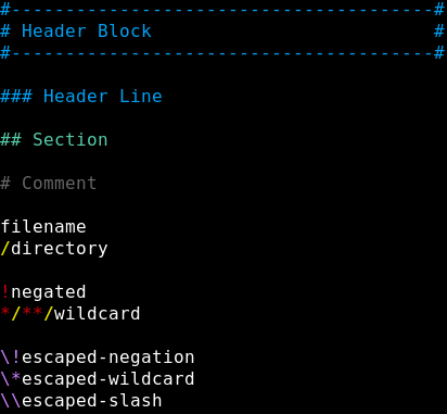
Adds syntax highlighting to .gitignore files in Atom.
For full list of supported formats for "Header Blocks", see the header block samples page.
(Theme used in screenshot: "Oscuro Syntax"...which I have not yet finished but will soon) ##language-javascript-jsx
JavaScript, ES6, ES7, React JSX, Flow, etc… by SubtleGradient of Facebook
JavaScript, ES6, ES7, React JSX, Flow, etc…
by SubtleGradient of Facebook
##linter
A Base Linter with Cow Powers
Linter


Linter is a base linter provider for the Hackable Atom Editor.
It provides a top-level API to its consumer that allows them to visualize errors and other kind-of messages, easily.

How to / Installation
Install package through Atom or use CLI:
$ apm install linter
Available linters
API Documentation
Performance Tuning
Is linter working slow for you? Try changing the interval of inline bubble or disabling it completely and/or try disabling Line tab.
Contribute
Stick to imposed codestyle:
$ npm i -g coffeelint eslint$ npm run lint##linter-eslint
Lint JavaScript on the fly, using ESLint
linter-eslint


This linter plugin for Linter provides an interface to eslint. It will be used with files that have the "JavaScript" syntax.
Installation
apm install linter-eslintlinter-eslint will look for a version of eslint local to your project and
use it if it's available. If none is found it will fall back to the version it
ships with.
Lets say you depend on a specific version of eslint, maybe it has unreleased
features, maybe it's just newer than what linter-eslint ships with. If
your-project/node_modules/eslint exists linter-eslint will be used.
This package requires an eslint of at least v1.0.0.
Note that if you do not have the linter package installed it will be installed
for you. If you are using an alternative linter-* consumer feel free to disable
the linter package.
Use with plugins
You have two options:
-
Install locally to your project
eslintand the plugin$ npm i --save-dev eslint [eslint-plugins]
-
Install globaly
eslintand plugins$ npm i -g eslint [eslint-plugins]- Activate
Use Global Eslintpackage option - (Optional) Set
Global Node Pathwith$ npm config get prefix
Contributing
If you would like to contribute enhancements or fixes, please do the following:
- Fork the plugin repository
- Hack on a separate topic branch created from the latest
master - Commit and push the topic branch
- Make a pull request
- Welcome to the club!
Please note that modifications should follow these coding guidelines:
- Indent is 2 spaces
- Code should pass the
eslintlinter with the provided.eslintrc - Vertical whitespace helps readability, don’t be afraid to use it
Thank you for helping out! ##linter-flow
Lint JavaScript on the fly, using Flow
linter-flow
Lightweight alternative to Facebook's Flow plugin for facebook/flow.

Installation
- Install flow
flow initapm install linter-flow
Settings
You can configure linter-flow by editing ~/.atom/config.cson (choose Open Your Config in Atom menu) or in Preferences:
'linter-flow':
  'executablePath': 'flow'
'enableAll': falseexecutablePath: Absolute path to the Flow executable on your system.enableAll: Typecheck all files, not just file containing@flow.
Why not X?
linter-flow is made to be a lightweight package that does one thing well.
- A similarly named package: linter-flow-plus is now a mirror. The development happens for both packages in parallel.
- IDE-flow works relatively well, but it doesn't lint on-the-fly and doesn't integrate with the linter package.
- Nuclide has too many problems for now to be reliable. It also involves installing a large number of other packages.
Please Note: IDE-flow and Nuclide provide other features such as autocomplete, type definitions on hover etc. Please continue to use those services for those features. (possibly in addition to linter-flow)
Limitations
This linter currently does not support Hack. Though the linter just uses the flow-cli and hack support should be trivial to add, I'm not a Hack/PHP developer and I can't test that it actually works. I would welcome if someone was to add support for Hack to this package and test it.
Contributing
If you would like to contribute enhancements or fixes, please do the following:
- Fork the plugin repository
- Hack on a separate topic branch created from the latest
master - Commit and push the topic branch
- Make a pull request
- Welcome to the club!
Please note that modifications should follow these coding guidelines:
- Indent is 2 spaces with
.editorconfig - Code should pass
eslintlinter with the provided.eslintrc - Vertical whitespace helps readability, don’t be afraid to use it
Thank you for helping out! ##mac-fix-path
fix $PATH variable when running Atom from launcher
mac-fix-path package
A short description of your package.

Resolve git conflicts within Atom
Merge Conflicts

Resolve your git merge conflicts in Atom!

This package detects the conflict markers left by git merge and overlays a set of controls for resolving each and navigating among them. Additionally, it displays your progress through a merge.
Features
- Conflict resolution controls are provided for each detected conflict.
- Choose your version, their version, combinations thereof, or arbitrary changes edited in place as a resolution.
- Navigate to the next and previous conflicts in each file.
- Track your progress through a merge with per-file progress bars and a file list.
- Save and stage your resolved version of each file as it's completed.
Using
When git merge tells you that it couldn't resolve all of your conflicts automatically:
$ git merge branch
Auto-merging two
CONFLICT (content): Merge conflict in two
Auto-merging one
CONFLICT (content): Merge conflict in one
Automatic merge failed; fix conflicts and then commit the result.
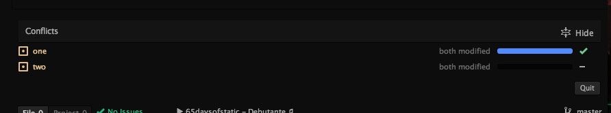
Open Atom on your project and run the command Merge Conflicts: Detect (default hotkey: alt-m d). You'll see a panel at the bottom of the window describing your progress through the merge:
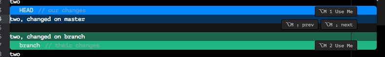
Click each filename to visit it and step through the identified conflicts. For each conflict area, click "Use me" on either side of the change to accept that side as-is:
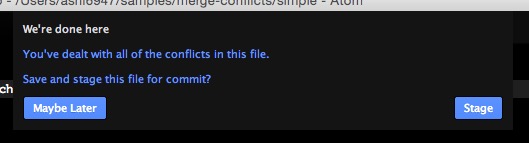
Use the right-click menu to choose more advanced resolutions, like "ours then theirs", or edit any chunk by hand then click "use me" to accept your manual modifications. Once you've addressed all of the conflicts within a file, you'll be prompted to save and stage the changes you've made:
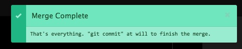
Finally, when all of the conflicts throughout the project have been dealt with, a message will appear to prompt you how to commit the resolution and continue on your way. 🎉
Events
The merge-conflicts plugin emits a number of events that other packages can subscribe to, if they wish. If you want your plugin to consume one, use code like the following:
{CompositeDisposable} = require 'atom'

pkg = atom.packages.getActivePackage('merge-conflicts')?.mainModule
subs = new CompositeDisposable

subs.add pkg.onDidResolveConflict (event) ->

### ...

subs.dispose()onDidResolveConflict: broadcast whenever a conflict is resolved.event.file: the absolute path of the file in which the conflict was found;event.total: the total number of conflicts in that file;event.resolved: the number of conflicts that are resolved, including this one.onDidStageFile: broadcast whenever a file has been completed and staged for commit.event.file: the absolute path of the file that was staged.onDidQuitConflictResolution: broadcast when you stop merging conflicts by clicking the quit button.onDidCompleteConflictResolution: broadcast when all conflicts in all files have successfully been resolved.
Contributions
Pull requests are welcome, big and small! Check out the contributing guide for details. ##minimap
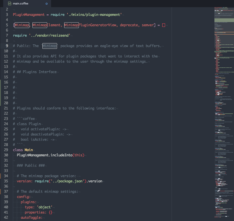
A preview of the full source code.


Minimap package
A preview of the full source code.
 In the screenshot above the minimap-git-diff and minimap-highlight-selected plugins are activated.
Installation
apm install minimap
Features
- Service-based Plugin API: Use the plugin generation command and start developing your plugin right away.
- Decoration API: Use the same API to manage
TextEditorandMinimapdecorations. - Canvas-based Rendering: Simple, fast and flexible.
- Stand-alone Mode: Wants to display a preview of a text editor in your UIs, use a stand-alone version of the Minimap.
Available Plugins
Below is the list of available plugins so far:
| Package | Description |
|---|---|
| Auto-Hide | Hides the Minimap while editing. |
| Bookmarks | Displays Atom bookmarks. |
| Code Glance | Shows the code that's under the mouse cursor when hovering the Minimap. |
| Cursor Line | Highlights the line with cursor. |
| Find And Replace | Displays the search matches. |
| Git Diff | Displays the file diff. |
| Google-Repo-Diff-Minimap | A Minimap binding for the google-repo-diff package and google-repo package. |
| GPool-Diff-Minimap | A minimap binding for the gpool-diff package. |
| Hide on inactive panes | Hide the Minimap when pane isn't focus. |
| Highlight Selected | A Minimap binding for the highlight-selected package. |
| Linter | Displays linter markers. |
| Pigments | Displays the Pigments colors. |
| Selection | Display the buffer's selections. |
| Split-Diff | A Minimap binding for the split-diff package. |
Settings
Auto Toggle
If checked the Minimap is toggled on at startup. (default=true)
Device Pixel Ratio Rounding
If checked the devicePixelRatio will be rounded using Math.floor. (default=true)
Display Code Highlights
If checked the code will be highlighted using the grammar tokens. (default=true)
true |
false |
|---|---|
 |
 |
Display Minimap On Left
If checked the Minimap appears on the left side of editors, otherwise it appears on the right side. (default=false)
true |
false |
|---|---|
 |
 |
Char Height
The height of a character in the Minimap in pixels. (default=2)
1px |
2px |
4px |
|---|---|---|
 |
 |
 |
Char Width
The width of a character in the Minimap in pixels. (default=1)
1px |
2px |
|---|---|
 |
 |
Interline
The space between lines in the Minimap in pixels. (default=1)
1px |
2px |
|---|---|
 |
 |
Text Opacity
The opacity used to render the line text in the Minimap. (default=0.6)
0.6 |
1 |
|---|---|
 |
 |
Display Plugins Controls
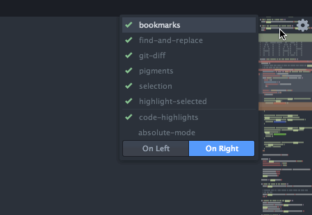
If checked, the Minimap plugins can be activated/deactivated from the Minimap settings view and a quick settings dropdown will be available on the top right corner of the Minimap. (default=true)
You need to restart Atom for this setting to be effective.

Minimap Scroll Indicator
Toggles the display of a side line showing which part of the buffer is currently displayed by the Minimap. The side line appear only if the Minimap height is bigger than the editor view height. (default=true)

Plugins *
When plugins are installed, a setting is created for each to enable/disable them directly from the Minimap settings view.
Scroll Animation
Enable animations when scrolling the editor by clicking on the Minimap. (default=false)
Scroll Animation Duration
Duration of the scroll animation when clicking on the Minimap. (default=300)
Use Hardware Acceleration
If checked the Minimap scroll is done using a translate3d transform, otherwise the translate transform is used. (default=true)
Absolute Mode
When enabled the Minimap uses an absolute positioning, letting the editor's content flow below the Minimap. (default=true)
Note that this setting will do nothing if Display Minimap On Left is also enabled.
false |
true |
|---|---|
 |
 |
Key Bindings
The Minimap package doesn't provide any default keybindings. But you can define your own as demonstrated below:
'atom-workspace':
  'cmd-m': 'minimap:toggle'
  'ctrl-alt-cmd-j': 'minimap:generate-javascript-plugin'
  'ctrl-alt-cmd-b': 'minimap:generate-babel-plugin'
  'ctrl-alt-cmd-c': 'minimap:generate-coffee-plugin'
Tweaking The Minimap
Hiding scrollbars
If you want to hide the default editor scrollbar, edit your style.less (Open Your Stylesheet) and use the following snippet:
atom-text-editor .vertical-scrollbar,
atom-text-editor::shadow .vertical-scrollbar {
  opacity: 0;
  width: 0;
}
Changing the Minimap's background
atom-text-editor atom-text-editor-minimap,
atom-text-editor::shadow atom-text-editor-minimap {
  background: green;
}
Changing the color of the Minimap's visible-area
atom-text-editor atom-text-editor-minimap::shadow .minimap-visible-area,
atom-text-editor::shadow atom-text-editor-minimap::shadow .minimap-visible-area {
  background-color: green;
  opacity: .5;
}
Changing the color of the Minimap's scroll-indicator
atom-text-editor atom-text-editor-minimap::shadow .minimap-scroll-indicator,
atom-text-editor::shadow atom-text-editor-minimap::shadow .minimap-scroll-indicator {
  background-color: green;
}
Disabling mouse interactions when in absolute mode
If you want to prevent to catch the mouse pointer when the absoluteMode setting is enabled you can use the following snippet to do so:
atom-text-editor atom-text-editor-minimap,
atom-text-editor::shadow atom-text-editor-minimap {
  pointer-events: none;
}

atom-text-editor atom-text-editor-minimap::shadow .minimap-visible-area,
atom-text-editor::shadow atom-text-editor-minimap::shadow .minimap-visible-area {
  pointer-events: auto;
}
The visible area will still allow interaction but the Minimap track won't.
ASCII Art Comments
One neat trick is to use ASCII art to create huge comments visible in the minimap. This is really efficient when navigating huge files.
To generate these comments you can use on these useful Atom packages:
Developers Documentation
You can find below the developers documentation on how to create Minimap's plugins and how to use decorations and stand-alone Minimaps.
For a more detailled documentation of the API make sure to check the Minimap API Documentation.
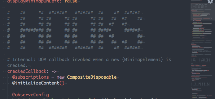
Plugins
The Minimap comes with a plugin system used to extend the features displayed in it. Minimap plugins, once activated, are known and can be managed through the Minimap settings.
Plugin Generation Command
Use the Generate Javascript Plugin, Generate Coffee Plugin or Generate Babel Plugin commands, available in the command palette, to generate a new Minimap plugin package.
Minimap: Generate Javascript Plugin: Will generate a vanilla JavaScript package.Minimap: Generate Coffee Plugin: Will generate a CoffeeScript package.Minimap: Generate Babel Plugin: Will generate a ES6 package that uses babel-js.
Plugins Controls
When the displayPluginsControls setting is toggled on, plugins activation can be managed directly from the Minimap package settings or by using the quick settings dropdown available on the Mimimap itself:
Stand-alone Mode
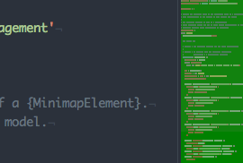
Starting with version 4.13, the Minimap can operate in a stand-alone mode. Basically, it means that a Minimap can be appended to the DOM outside of a TextEditor and without being affected by it.
The example below demonstrates how to retrieve and display a stand-alone Minimap:
atom.packages.serviceHub.consume('minimap', '1.0.0', (api) => {
  editor = atom.workspace.getActiveTextEditor()
  minimap = api.standAloneMinimapForEditor(editor)

  minimapElement = atom.views.getView(minimap)
  minimapElement.attach(document.body)
  minimapElement.style.cssText = `
    width: 300px;
    height: 300px;
    position: fixed;
    top: 0;
    right: 100px;
    z-index: 10;
  `
})
In a nutshell, here's the main changes to expect when using a stand-alone Minimap:
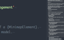
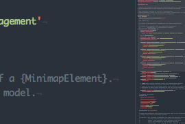
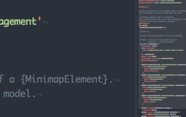
- In stand-alone mode, it's the
MinimapElementthat is responsible to sets the size of the underlyingMinimapmodel, so you can give it any size and the Minimap will just adapt to it. - Scrolling in the target
TextEditorwon't change the Minimap display. - The mouse controls in the Minimap are removed.
- The visible area and the quick settings button are removed.
- Stand-alone Minimaps aren't dispatched in the
observeMinimapscallback, so they won't be targeted by plugins and won't receive the decorations that plugins normally creates on Minimaps.
For the moment, stand-alone Minimaps still need a target TextEditor but I hope to make it work with just a path at some point.
Minimap Decorations
The Minimap package mimic the decoration API available on editors so that you can easily add your own decorations on the Minimap.
While the interface is the same, some details such as the available decorations types change relatively to the editor's decorations API.
Scope And Styling
The most important change is that decorations on the Minimap doesn't use a class, but rather a scope
minimapView.decorateMarker(marker, {type: 'line', scope: '.scope .to .the.marker.style'})It's still possible to pass a class parameter to the decoration:
minimapView.decorateMarker(marker, {type: 'line', class: 'the marker style'})In that case, when rendering the decoration a scope will be build that will look like .minimap .editor .the.marker.style.
The reason of using a scope rather than a class is that while editor's decorations are part of the DOM and benefit of the styles cascading, Minimap's decorations, rendered in a canvas, do not. In order to work around that, decoration's styles are defined using a scope property containing the selector allowing to retrieve the decoration style.
This allow the Minimap decorations to still be styled using css. For instance, the scope used by the minimap-selection package is:
.minimap .editor .selection .region {
  /* ... */
}
Note that the scope is prefixed with .minimap so that you can override the selection style in the Minimap without impacting the editor's one.
Also note that only the background property will be retrieved to style a decoration.
A last option is to pass a css color directly in a color option, such as:
minimapView.decorateMarker(marker, {type: 'line', color: '###ff0000'})In that case neither the scope nor the class will be used.
Decorations Types
Another non-trivial change is the list of available decoration's type. At the time, the available types on the Minimap are:
line: Same as the editor one, it colors the line background with a color extracted from the decoration scope.highlight-under: Correspond to an editorhighlightdecoration that is rendered before rendering the line content.highlight-over,highlight: Correspond to an editorhighlightdecoration that is rendered after having rendered the line content.highlight-outline: Correspond to an editorhighlightdecoration that is rendered only as an outline in the Minimap.
License
Automatically hide the minimap when you aren't using it.
minimap-autohide package
Hide your minimap until you need it.
This package automatically hides the minimap until you need it.
When editing normally, you have the entire window for your editor. As soon as you begin to scroll, the minimap appears and you can interact with it normally.
Written by @JayKuri - If you like it, say Hi!
By default the minimap will be hidden when not scrolling, and will slide out from the right when scrolling. You can, however, tweak the appearance. When you are scrolling, the minimap will have a class 'scrolling' added to it. You can therefore override the default by adding an entry to your personal styles.less file.
For example, this style entry restores the original look of the minimap, but causes the minimap to instantly disappear when not scrolling... for a more 'snap-in' effect.
atom-text-editor::shadow {
  atom-text-editor-minimap.scrolling {
    left: 0px;
    display: block;
  }
  atom-text-editor-minimap {
    background: rgba(0,0,0,0.2);
    position: relative;
    display: none;
    left: 0px;
    opacity: 1;
  }
}
Likewise, if you don't like the semi-transparent background, you can override it in your theme:
atom-text-editor-minimap {
  // give us a nice dark-blue background
  background: ###000040;
}
Known issues: Does not interact well with 'minimap-on-left' setting. You may, however, be able to set a style in your own styles.less that would allow it to work. ##minimap-bookmarks
Displays Atom bookmarks in the minimap
minimap-bookmarks package 

Displays Atom bookmarks in the minimap.
Minimap bindings for the find and replace package
minimap-find-and-replace package
Displays the search matches in the minimap.
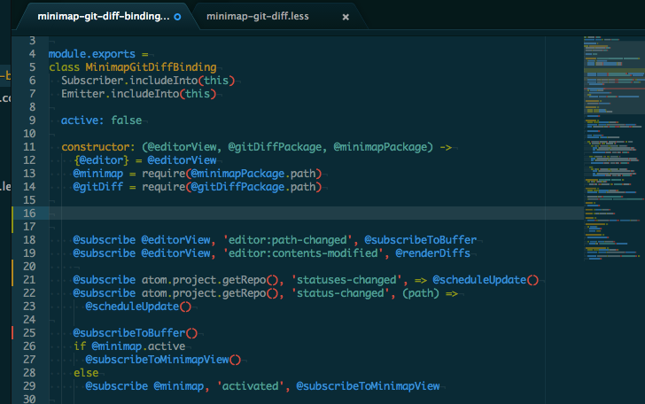
You will need the Minimap package installed to use this package. ##minimap-git-diff
A minimap binding for the git diff package
minimap-git-diff package
A minimap binding for the Atom git-diff package.
You will need the Minimap package installed to use this package. ##minimap-hide
Hide the minimap when pane isn't focus
minimap-hide package
####Hide the minimap when pane isn't focus
Installation
apm install minimap-hide

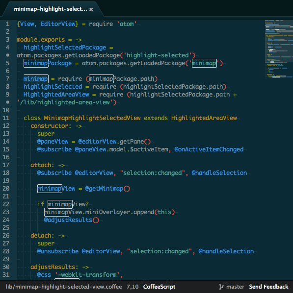
A minimap binding for the highlight-selected package
minimap-highlight-selected package
A minimap binding for the highlight-selected package.
Customization
If you want to change the color of the minimap highlights use the following CSS rules in your user stylesheet:
/* The rule for normal highlights */
.minimap .highlight-selected {
  background: blue;
}

/* The rule for selected highlights */
.minimap .highlight-selected.selected {
  background: red;
}Minimap bindings for atom-linter
minimap-linter package
Atom package to display linter markers on minimap.
An Atom plugin to display pigments colors in the Minimap.
minimap-pigments package 

An Atom plugin to display pigments colors in the Minimap.
Display the buffer's selections on the minimap
minimap-selection package 

Display the buffer's selections on the minimap
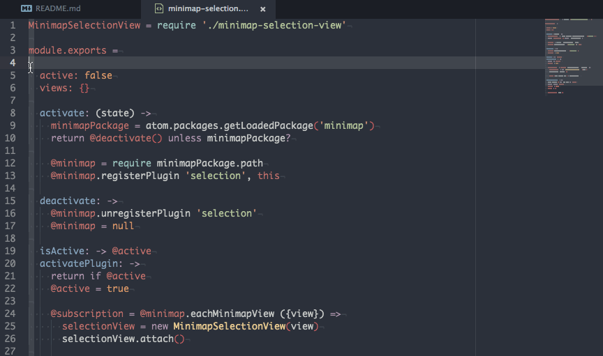
Settings
Highlight Cursors Lines
When enabled, lines that holds a cursors will be highlighted in the minimap.
Customization
The selection color can be customized using the following CSS rule in your user stylesheet:
.minimap-selection .region {
  background: green;
}
When the Highlight Cursors Lines setting is enabled the line's highlight color can be customized using the following CSS rule in your user stylesheet:
.minimap-selection .cursor-line {
  background: blue;
}Automatically install and save any missing npm modules being used in the current file
npm-install 

Atom plugin to automatically install and save any selected
npm packages not already included in the closest package.json file.

Usage
- Select the
requireorimportstatements of the packages you want to install. - Open the Command Palette, and type
npm installto bring up the available commands. - Your packages will be installed. Enjoy!
Configuration Options
Accessible from Settings > Packages > npm-install:
- Install Cache: force your installations to always or never use the local cache.
- Custom npm PATH lookup: useful if you keep your npm in an unconventional location. Point this to the directory of your npm executable should you have any issues.
Changelog
3.0.0
- Packages must now be selected to be installed. This gives you control over which packages are being installed instead of trying to work that out for you, making it simpler to support scoped packages ✨.
- The installation pane is now attached to the right instead of the bottom of the screen.
- ES6 support! No more parsing errors, also
importstatements can be installed like you would requires too. - CoffeeScript is no longer supported. If you'd like that back, I'd recommend sticking with the previous version or submitting a pull request to atom-selected-requires.
2.0.0
As of version 2.0.0 keybindings are not included by default. If you miss
these shortcuts, simply add the following to your keymap file:
'.workspace':
  'ctrl-alt-i': 'npm-install:save'
  'ctrl-alt-d': 'npm-install:save-dev'
License
MIT. See LICENSE.md for details. ##pane-layout-plus
Can has switch the layout of your panes.
Atom.io – Pane Layout Package
Focus and control the layout of your atom editor.
Features
| Command | Mac | PC and Linux |
|---|---|---|
| Set the column layout | Cmd + Alt + [1-5] | Alt + Shift + [1-5] |
| Jump to column | Ctrl + [1-4] | Same |
Demo
Nitty Gritty
- When a layout is chosen that increases the pane count, any additional panes will be left empty.
- When a layout is chosen that decreases the pane count, any left over panes will be collapsed into the last available pane.
- When a layout is chosen and a custom layout is already in place, any left over panes will be collapsed into the last available pane.
- When a layout is changed that causes panes to collapse, stay focused on the active file – iff the file is in the file system. ##pigments
A package to display colors in project and files.

A package to display colors in project and files:

Pigments will scan source files in your project directories looking for colors and will build a palette with all of them. Then for each opened file, it will use the palette to evaluate the value of a given color. The legible source paths can be defined through various settings either at the global or per project level. By default colors in every file will be highlighted, to limit the display of colors to the desired filetype only please see the Defining Where Pigments Applies below.
Pigments supports out of the box most of the color transformations functions and expressions of the three biggest CSS pre-processors out there, namely LESS, Sass and Stylus. However, it doesn't mean pigments is able to parse and understand all of these languages constructs. For the moment, Pigments' aim is to support the widest range of usage, even if it implies reducing its ability to parse certain complex constructs. You can refer to the parser specs for an exhaustive list of the supported expressions.
Install
Using apm:
apm install pigments
Or search for pigments in Atom settings view.
Defining Where Pigments Applies
By default, Pigments will highlight every color in every file, but you can limit that using the two settings Supported Filetypes and Ignored Scopes.
The first setting allow you to specify the list of extensions where pigments will apply. For instance, by using the values css, less, colors will be visible only in CSS and Less files.
The second setting takes an array of regular expression strings used to exclude colors in specific scopes (like comments or strings). You can find the scope that applies at the cursor position with the Editor: Log Cursor Scope command (cmd-alt-p or ctrl-alt-shift-p).

Defaults File
Pigments is able to follow variables uses up to a certain point, if a color refers to several variables whose values can't be evaluated (because they use unsupported language-specific features) the color will be flagged as invalid and not displayed. This can be problematic when it happens on the core components of a complex palette.
To solve that issue, you can define a defaults file named .pigments at the root of a project directory and you can put in it all the variables declarations to use if a value from the sources files can't be evaluated.
This can also be used when your project core palette is dynamically defined so that pigments can evaluate properly the rest of the project colors.
Commands
Note: Pigments doesn't define any keybindings for the provided commands, instead it'll let you define your own keybindings.
Pigments: Show Palette
You can display the project's palette through the Pigments: Show Palette command from the command palette:

The project palette is made of all the colors that are affected to a variable, which means it won't display hardcoded colors affected to a CSS property. If you want to find every color used in a project, including the hardcoded colors in CSS files, use the Pigments: Find Colors instead.
Patterns for Less, Sass, Scss and Stylus variables are currently supported, which includes:
my-var = ###123456 // stylus$my-var: ###123456 // sass
$my-var: ###123456; // scss@my-var: ###123456; /* less */As with every command, this command can be triggered using the keyboard by defining a keybinding like this:
'atom-workspace':
  'alt-shift-p': 'pigments:show-palette'
Pigments: Find Colors
You can search for all colors in your project using the Pigments: Find Colors command from the command palette:

The results will include colors declared in variables, places where the color variables are used as well as hardcoded color values in every file that matches one of the patterns defined in both pigments.sourceNames and pigments.extendedSearchNames settings.
By default this includes:
**/*.css
**/*.less
**/*.scss
**/*.sass
**/*.styl
**/*.stylus
This command can be triggered using the keyboard by defining a keybinding like this:
'atom-workspace':
  'alt-shift-f': 'pigments:find-colors'
Pigments: Convert To Hexadecimal/Pigments: Convert to RGB(A)
It evaluates and replace a color by either its hexadecimal notation or rgb/rgba notation. Accessible from the command palette or by right clicking on a color.

These commands can be triggered using the keyboard by defining a keybinding like this:
'atom-workspace':
  'alt-shift-h': 'pigments:convert-to-hex'
  'alt-shift-g': 'pigments:convert-to-rgb'
  'alt-shift-j': 'pigments:convert-to-rgba'
When triggered from the command palette or from the keyboard, the conversion will operate on every cursor positioned on color markers.
Pigments: Project Settings
Each Pigments project has its own set of settings that can extend or replace the global configuration. These settings are available through the pigments:project-settings command:

The Source Names, Ignored Names, Ignored Scopes and Extended Search Names fields all match a global configuration. When defined the project will use both the global config and the one of the current project, except when the Ignore Global checkbox is checked.
The Include Atom Themes Stylesheets setting is specific to the project and can't be defined globally. When enabled, it'll add all the public themes variables in the current project palette:

Note that it won't add all the variables defined in the less files of the syntax and ui themes, only the ones that must be present as defined in the themes documentation.
This feature is still quite experimental at this stage.
Pigments: Reload
This command will force a reload of all variables in the project, this can be useful when the serialized state of the plugin contains invalid data and you want to get rid of them without having to touch to the content of the .atom/storage directory.
This command can be triggered using the keyboard by defining a keybinding like this:
'atom-workspace':
  'alt-shift-r': 'pigments:reload'
Settings
Source Names
An array of glob patterns of the files to use as source for the project's variables and colors.
- Key:
pigments.sourceNames - Default:
['**/*.styl', '**/*.stylus', '**/*.less', '**/*.sass', '**/*.scss']
Ignored Names
An array of glob patterns of the files to ignore as source files for the project's variables and colors.
- Key:
pigments.ignoredNames - Default:
['node_modules/*']
Extended Search Names
An array of glob patterns of files to include in the Pigments: Find Colors scanning process.
- Key:
pigments.extendedSearchNames - Default:
['**/*.css']
Supported Filetypes
An array of file extensions where colors will be highlighted. If the wildcard * is present in this array then colors in every file will be highlighted.
- Key:
pigments.supportedFiletypes - Default:
['*']
Ignored Scopes
An array of regular expressions strings to match scopes to ignore when rendering colors in a text editor.
For instance, if you want to ignore colors in comments and strings in your source files, use the following value:
\.comment, \.string
As you can notice, the . character in scopes are escaped. This is due to the fact that this setting uses javascript RegExp to test the token's scope and the . is used to match against any character.
For instance, to ignores colors in html attributes you can use the following expression:
\.text\.html(.*)\.string
Note the (.*) in the middle of the expression. It'll ensure that we're searching for the .string scope in the .text.html grammar even if there's other scope between them by catching any character between the two classnames.
To find which scope is applied at a given position in a buffer you can use the editor:log-cursor-scope command. From that you'll be able to determine what expression to use to match the scope.
- Key:
pigments.ignoredScopes - Default:
[]
Autocomplete Scopes
The autocomplete provider will only complete color names in editors whose scope is present in this list.
- Key:
pigments.autocompleteScopes - Default:
['.source.css', '.source.css.less', '.source.sass', '.source.css.scss', '.source.stylus']
Extend Autocomplete To Variables
When enabled, the autocomplete provider will also provides completion for non-color variables.
- Key:
pigments.extendAutocompleteToVariables - Default:
false
Traverse Into Symlink Directories
Whether to traverse symlinked directories to find source files or not.
- Key:
pigments.traverseIntoSymlinkDirectories - Default:
false
Ignore VCS Ignored Paths
When this setting is enabled, every file that are ignored by the VCS will also be ignored in Pigments. That means they'll be excluded when searching for colors and when building the project palette.
- Key:
pigments.ignoreVcsIgnoredPaths - Default:
true
Marker Type
Defines the render mode of color markers. The possible values are:
| background | outline | underline |
|---|---|---|

|

|

|
| dot | square-dot | gutter |

|

|

|
- Key:
pigments.markerType - Default:
'background'
Sort Palette Colors
The type of sorting applied to the colors in the palette view. It can be changed directly from the palette view.
- Key:
pigments.sortPaletteColors - Default:
'none'
Group Palette Colors
Defines how the colors are grouped together in the palette view. It can be changed directly from the palette view.
- Key:
pigments.groupPaletteColors - Default:
'none'
Merge Duplicates
Defines whether to merge colors duplicates together as a single result in the palette view. It can be changed directly from the palette view.
- Key:
pigments.mergeDuplicates - Default:
false
Delay Before Scan
Pigments rescans the text buffer once you stopped editing it, however as the process can be sometime expensive, it'll apply an extra delay after the dispatch of the did-stop-changing event before starting the scanning process. This setting define the number of milliseconds to wait after the did-stop-changing event before starting to scan the buffer again. If your start typing in the buffer again in this interval, the rescan process will be aborted.
- Key:
pigments.delayBeforeScan - Default:
500(ms) ##react-snippets
Atom Snippets for React, React Router and Flux
Atom React.js Snippets 

An Atom snippet library for React, React Router and Flux. This library uses ES6 syntax, if you would prefer ES5 or Coffeescript snippets please use the Atom React Package.
Install
Go to Packages > Settings View > Open once in settings go to the Install tab and search for react-snippets
Development
$ cd ~/.atom/packages
$ git clone https://github.com/webbushka/atom-react-snippets.git
$ cd atom-react-snippets
$ apm install
$ apm link
Features
- React Snippets
- React Router Snippets - Needs update from v0.13 to v1.0
- Flux Snippets
Contributing
- Fork it!
- Create your feature branch:
git checkout -b my-new-feature - Commit your changes:
git commit -m 'Add some feature' - Push to the branch:
git push origin my-new-feature - Submit a pull request
Change Log
License
MIT License © Zeno Rocha
Credit
The React.js snippets were originally created by orktes in Atom React in ES5 syntax. ##regex-railroad-diagram
Display railroad diagram of regex under cursor.
regex-railroad-diagram package
A regular expression railroad diagram view for regular expression under cursor. This is still in development and for me it is a test of graphics capabilities of Atom.
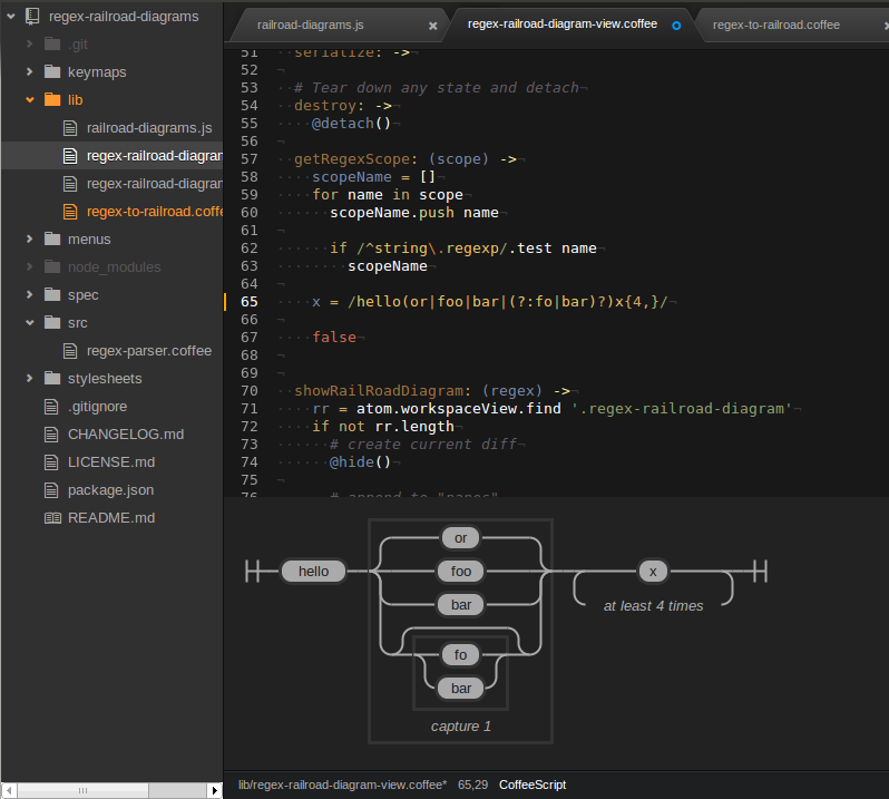
It also shows you a parsing error message, if your regex is not syntactically correct.
For now it only supports most common regex features, but there are more to come.
Test Javascript regular expressions
regex-tester


Test Javascript regular expressions

Run regex-tester:toggle to open the panel
##sort-lines
Sorts your lines. Never gets tired.
Sort Lines Package 

Sorts your lines in Atom, never gets tired.

A terminal package for Atom, complete with themes and more.
Author's Note
- Please make sure you are on the latest version of Atom before reporting bugs!
- This package requires that you have the dependencies for node-gyp.
See node-gyp install instructions. - You must use a monospaced font in order for the spacing to be right.
- Having issues on Windows 10? Try this.
Terminal-Plus
Terminal-Plus is a terminal package for Atom, complete with themes and more.

Nucleus Dark UI with Atom Material Syntax and our Homebrew theme.
Usage
Terminal-Plus stays in the bottom of your editor while you work.
Status Bar

You can keep track of terminal instances via the status bar. Each terminal has a status icon (  ) in the status bar. The (
  ) button creates a new terminal, while the (
  ) button closes all terminals.
Click on a status icon to toggle that terminal. Right click the status icon for a list of available commands. From the right-click menu you can color code the status icon as well as hide or close the terminal instance.
Terminal
You can open the last active terminal with the terminal-plus:toggle command (Default:ctrl-`). If no terminal instances are available, then a new one will be created. The same toggle command is used to hide the currently active terminal.
From there you can begin typing into the terminal. By default the terminal will change directory into the project folder if possible. The default working directory can be changed in the settings to the home directory or to the active file directory.
Features
Full Terminal
Every terminal is loaded with your system’s default initialization files. This ensures that you have access to the same commands and aliases as you would in your standard terminal.
Themes
The terminal is preloaded with several themes that you can choose from. Not satisfied?
Use the following template in your stylesheet:
.terminal-plus .xterm {
  background-color: ;
  color: ;

  ::selection {
    background-color: ;
  }

  .terminal-cursor {
    background-color: ;
  }
}
Process Titles
By hovering over the terminal status icon, you can see which command process is currently running in the terminal.

Terminal Naming
Need a faster way to figure out which terminal is which? Name your status icons!
Available via the status icon context menu.
Color Coding
Color code your status icons!
The colors are customizable in the settings, however the color names remain the same in the context menu.
Sorting
Organize your open terminal instances by dragging and dropping them.

Resizable
You can resize the view vertically, or just maximize it with the maximize button.
Working Directory
You can set the default working directory for new terminals. By default this will be the project folder.
File Dropping
Dropping a file on the terminal will insert the file path into the input. This works with external files, tabs from the Atom tab-view, and entries from the Atom tree-view.
Insert Selected Text
Insert and run selected text from your text editor by running the terminal-plus:insert-selected-text command (ctrl-enter).

If you have text selected, it will insert your selected text into the active terminal and run it.
If you don't have text selected it, will run the text on the line where your cursor is then proceed to the next line.
Quick Command Insert
Quickly insert a command to your active terminal by executing the terminal-plus:insert-text command.

A dialog will pop up asking for the input to insert. If you have the Run Inserted Text option enabled in the settings (default is false), Terminal-Plus will automatically run the command for you.
Support for Special Keys
Support for IME, dead keys and other key combinations via the Insert Text dialog box. Just click the keyboard button in the top left of the terminal or set up a keymap to the terminal-plus:insert-text command.

Note: Make sure you have the Run Inserted Command toggle off otherwise it will run your inserted text.
Map Terminal To
Map your terminals to each file or folder you are working on for automatic terminal switching.
File

Folder

Toggling the Auto Open a New Terminal (For Terminal Mapping) option will have the mapping create a new terminal automatically for files and folders that don't have a terminal. The toggle is located right under the Map Terminals To option.

Install
Ready to install?
You can install via apm: apm install terminal-plus
Or navigate to the install tab in Atom’s settings view, and search for terminal-plus.
Commands
| Command | Action | Default Keybind |
|---|---|---|
| terminal-plus:new | Create a new terminal instance. | ctrl-shift-tor cmd-shift-t |
| terminal-plus:toggle | Toggle the last active terminal instance. Note: This will create a new terminal if it needs to. |
ctrl-`(Control + Backtick) |
| terminal-plus:prev | Switch to the terminal left of the last active terminal. | ctrl-shift-jor cmd-shift-j |
| terminal-plus:next | Switch to the terminal right of the last active terminal. | ctrl-shift-kor cmd-shift-k |
| terminal-plus:insert-selected-text | Run the selected text as a command in the active terminal. | ctrl-enter |
| terminal-plus:insert-text | Bring up an input box for using IME and special keys. | –––––––––––– |
| terminal-plus:close | Close the active terminal. | ctrl-shift-xor cmd-shift-x |
| terminal-plus:close-all | Close all terminals. | –––––––––––– |
| terminal-plus:rename | Rename the active terminal. | –––––––––––– |
To-Do List
- Possibly merge dependencies into Terminal-Plus?
- Add support for dead keys and IME input
- Add support for terminal tabs
- Add support for automatic directory switching
- Fix Atom requesting a rebuild after every update
- Update winpty in pty.js dependency
- Add support for custom ANSI colors in terminal
- Fix
ctrl+cfor bash prompts on OS X and Linux - Add support for status icon names ##tomorrow-night-eighties-syntax
Tomorrow Night Eighties syntax theme for Atom.
Tomorrow Night Eighties Atom Syntax Theme
Atom syntax theme using the ever popular Tomorrow Night Eighties colors:
