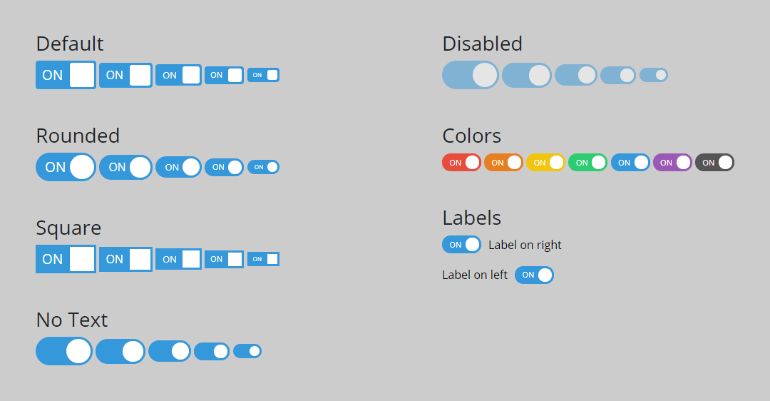
A pure CSS toggle switch for form input checkboxes
<link rel="stylesheet" href="toggle-switchy.css">
<label for="ID_HERE" class="toggle-switchy">
	<input checked type="checkbox" id="ID_HERE">
	<span class="toggle">
		<span class="switch"></span>
	</span>
</label>
| Option | Data Attribute |
|---|---|
| Rounded | data-style="rounded" |
| Square | data-style="square" |
| No Text | data-text="false" |
| Disabled | add the disabled attribute to the input tag |
| Checked | add the checked attribute to the input tag |
| Sizes | data-size="xl"data-size="lg"medium (default) data-size="sm"data-size="xs" |
| Colors | data-color="red"data-color="orange"data-color="yellow"data-color="green"data-color="blue"data-color="purple"data-color="gray" |
| Labels | data-label="left"label on right (default) |
- CSS only - no JavaScript!
- No dependencies
- Fully reponsive
- Fully customizable
- Fully self contained
- 7 color schemes
- Labels on the left and the right
- Keyboard Accessible - accessibility (a11y)
- Focus Styles - accessibility (a11y)
- Supports all modern browsers
- Search engine friendly
- Screen reader friendly
- Doesn't dump a bunch of global styles that'll screw with your other CSS
- Add in error checking to make sure the input element is a checkbox -
input[type='checkbox'] - Better a11y (accessibility) support
- Add
tabindex="0"to the demo for keyboard accessibility instructions
- IE10 and below doesn't support the smooth slide


