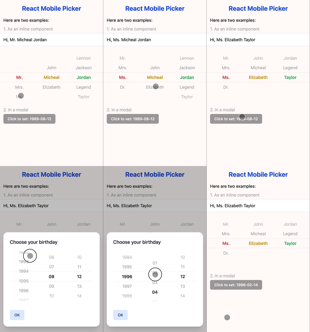
React Mobile Picker is a super simple component like iOS picker for React. It's almost unstyled, so you can easily customize it as you like.
Scan this Qr in you mobile.
Or visit (in mobile or mobile simulator): https://react-mobile-picker.vercel.app
npm install react-mobile-pickeror
yarn add react-mobile-pickerBy design, React Mobile Picker is a controlled component, which means the selected items of the rendered element will always reflect the value prop. Every time you want to change the selected items, just modify the value prop.
import { useState } from 'react'
import Picker from 'react-mobile-picker'

const selections = {
  title: ['Mr.', 'Mrs.', 'Ms.', 'Dr.'],
  firstName: ['John', 'Micheal', 'Elizabeth'],
  lastName: ['Lennon', 'Jackson', 'Jordan', 'Legend', 'Taylor']
}

function MyPicker() {
  const [pickerValue, setPickerValue] = useState({
    title: 'Mr.',
    firstName: 'Micheal',
    lastName: 'Jordan'
  })

  return (
    <Picker value={pickerValue} onChange={setPickerValue}>
      {Object.keys(selections).map(name => (
        <Picker.Column key={name} name={name}>
          {selections[name].map(option => (
            <Picker.Item key={option} value={option}>
              {option}
            </Picker.Item>
          ))}
        </Picker.Column>
      ))}
    </Picker>
  )
}Each Picker.Item component exposes a selected state that can be used to customize the appearance of the item. This is called the render props technique.
import { useState } from 'react'
import Picker from 'react-mobile-picker'

function MyPicker() {
  const [pickerValue, setPickerValue] = useState({
    name1: 'item1',
    /* ... */
  })

  return (
    <Picker value={pickerValue} onChange={setPickerValue}>
      <Picker.Column name="name1">
        <Picker.Item value="item1">
          {({ selected }) => (
            /* Use the `selected` state to conditionally style the selected item */
            <div style={{ color: selected ? 'red' : 'black' }}>
              Item 1
            </div>
          )}
        </Picker.Item>
        {/* ... */}
      </Picker.Column>
      {/* ... */}
    </Picker>
  )
}React Mobile Picker is designed to be used on mobile devices, but it can also support wheel scrolling on desktop browsers. To enable this feature, you can set the wheelMode prop to either 'natural' or 'normal'.
import { useState } from 'react'
import Picker from 'react-mobile-picker'

function MyPicker() {
  const [pickerValue, setPickerValue] = useState({
    name1: 'item1',
    /* ... */
  })

  return (
    <Picker value={pickerValue} onChange={setPickerValue} wheelMode="natural">
      {/* ... */}
    </Picker>
  )
}the main Picker container component.
| Prop | Default | Description |
|---|---|---|
| value | N/A | { [name: string]: string }Selected value pairs |
| onChange | N/A | (value: T, key: string) => voidCallback function when the selected value changes |
| height | 216 | numberHeight of the picker in px |
| itemHeight | 36 | numberHeight of each item (that is each option) in px |
| wheelMode | 'off' |
'off' | 'natural' | 'normal'Enable wheel scrolling on desktop browsers |
The wrapper component for each column.
| Prop | Default | Description |
|---|---|---|
| name | N/A | stringThe name should be one of the keys of the value in Picker component |
The wrapper component for each selectable option.
| Prop | Default | Description |
|---|---|---|
| value | N/A | stringThe value of the current option |
| Render Prop | Description |
|---|---|
| selected | booleanWhether or not the current option is selected |
You can check out the examples folder for more code samples. Or run this project locally:
git clone this repo
cd react-mobile-picker
pnpm i
pnpm run dev
point your browser to http://localhost:5173Adcent Lei (@adcentlei)
MIT.


