A SwiftUI library to present a Pill Picker view
-
Highly customizable: PillPickerView offers a wide range of customization options to tailor the appearance of the pills to your needs. You can customize the font, border color, animation, width, height, corner radius, and color scheme of the pills.
-
Easy integration: PillPickerView seamlessly integrates with SwiftUI, making it simple to add the pill picker to your SwiftUI-based app.
-
Select multiple pills: You can select multiple pills simultaneously, and the library provides smooth transitions when adding or removing pills from the selection.
-
Simple API: PillPickerView follows a straightforward API design, making it easy to use. It automatically adjusts the layout of pills to fit within the available space horizontally.
-
Compatibility: Supports iOS 14+, macOS 11+
-
Lightweight and dependency-free: The library has a lightweight structure and does not have any external dependencies, minimizing its impact on your app's size and performance.
Demo: https://github.com/adisve/PillPickerView/assets/96535657/4f052e75-36f1-4f59-9664-0a187b07de28
Requires iOS 14+. PillPickerView can be installed through the Swift Package Manager (recommended) or Cocoapods.
|
Swift Package Manager
Add the Package URL: |
Cocoapods
Add this to your Podfile: |
|
|
Creating a PillPickerView
To create a pill picker, you need to follow these steps:
-
Define a struct or enum that conforms to the Pill protocol. This protocol requires implementing the title property, which represents the title of each pill, as well as requiring the object to be Equatable and Hashable.
-
In your SwiftUI view, create a @State or @Binding variable to hold the selected pills. For example:
@State private var selectedPills: [YourPillType] = []Instantiate a PillPickerView by providing the necessary parameters, such as the list of items and the selected pills binding:
PillPickerView(
    items: yourItemList,
    selectedPills: $selectedPills,
    maxSelectablePill : 5 // Optional Property
)
Here's an example usage of PillPickerView in a SwiftUI view:
import PillPickerView

struct ContentView: View {
    @State private var selectedPills: [YourPillType] = []

    var body: some View {
        VStack {
            // Your other content here

            PillPickerView(
                items: yourItemList,
                selectedPills: $selectedPills,
                maxSelectablePill : 5
            )

            // Your other content here
        }
    }
}
In the example above, replace YourPillType with your custom pill type and yourItemList with an array of items conforming to the Pill protocol. The maxSelectablePills property is optional. If it is not set, all pills in the array can be selected. If it is set, only the specified number of pills can be selected, and the rest will be disabled.
PillPickerView offers a range of customization options to tailor the appearance of the pills to your app's design. You can customize the font, colors, animation, size, and other visual aspects of the pills by using the available modifier functions.
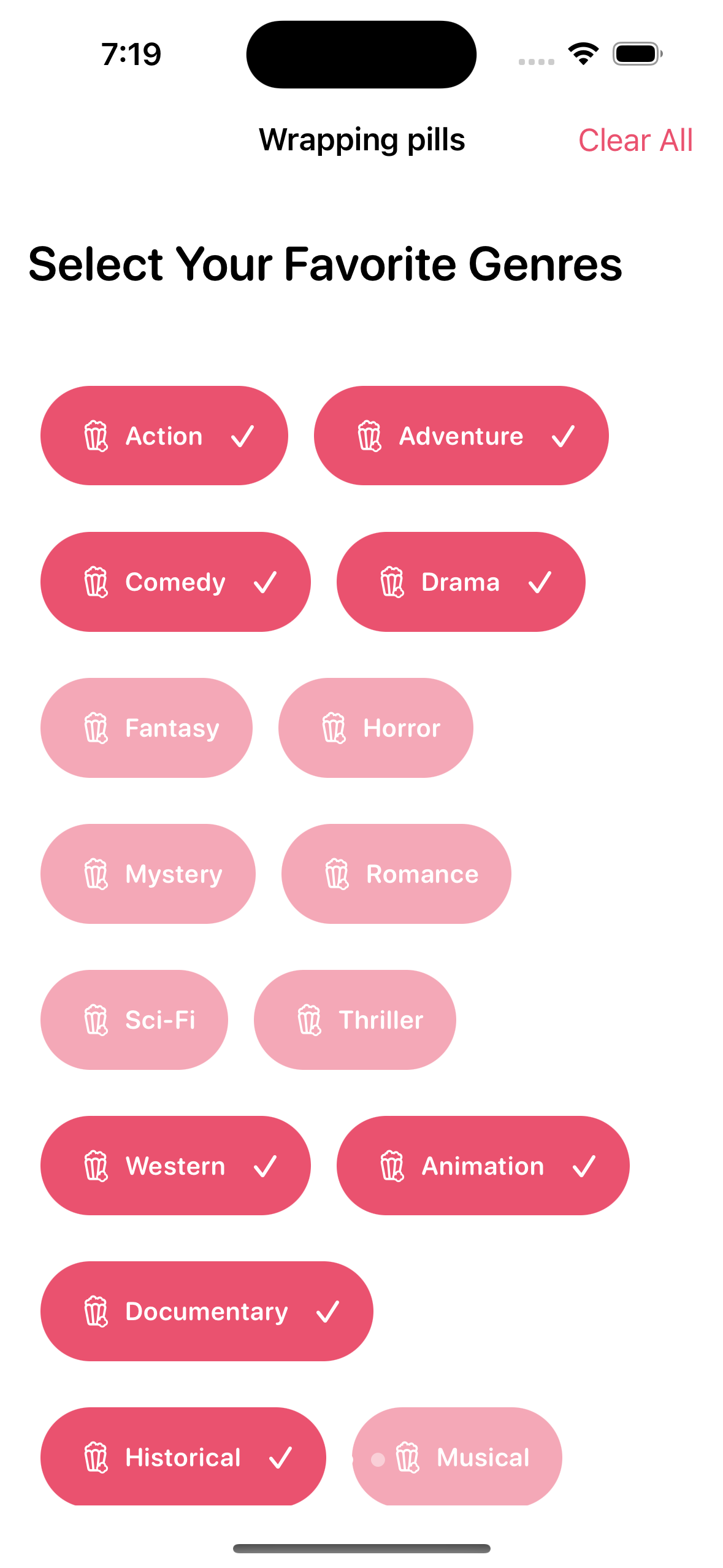
The PillPickerView includes a wrapping mechanism that automatically adjusts the layout of pills to fit within the available space. If the pills exceed the horizontal width of the container, the view wraps the excess pills to a new line. This makes it easy to present a large number of pills without worrying about truncation.
You can customize the appearance of the pills by chaining the available modifier functions on the PillPickerView. For example:
PillPickerView(
    items: yourItemList,
    selectedPills: $selectedPills,
    maxSelectablePill : 5
)
.pillFont(.system(size: 16, weight: .semibold))
.pillSelectedForegroundColor(.white)
.pillSelectedBackgroundColor(.blue)
.pillDisabledBackgroundColor(.gray.opacity(0.2))
.pillDisabledForegroundColor(.gray.opacity(0.5))
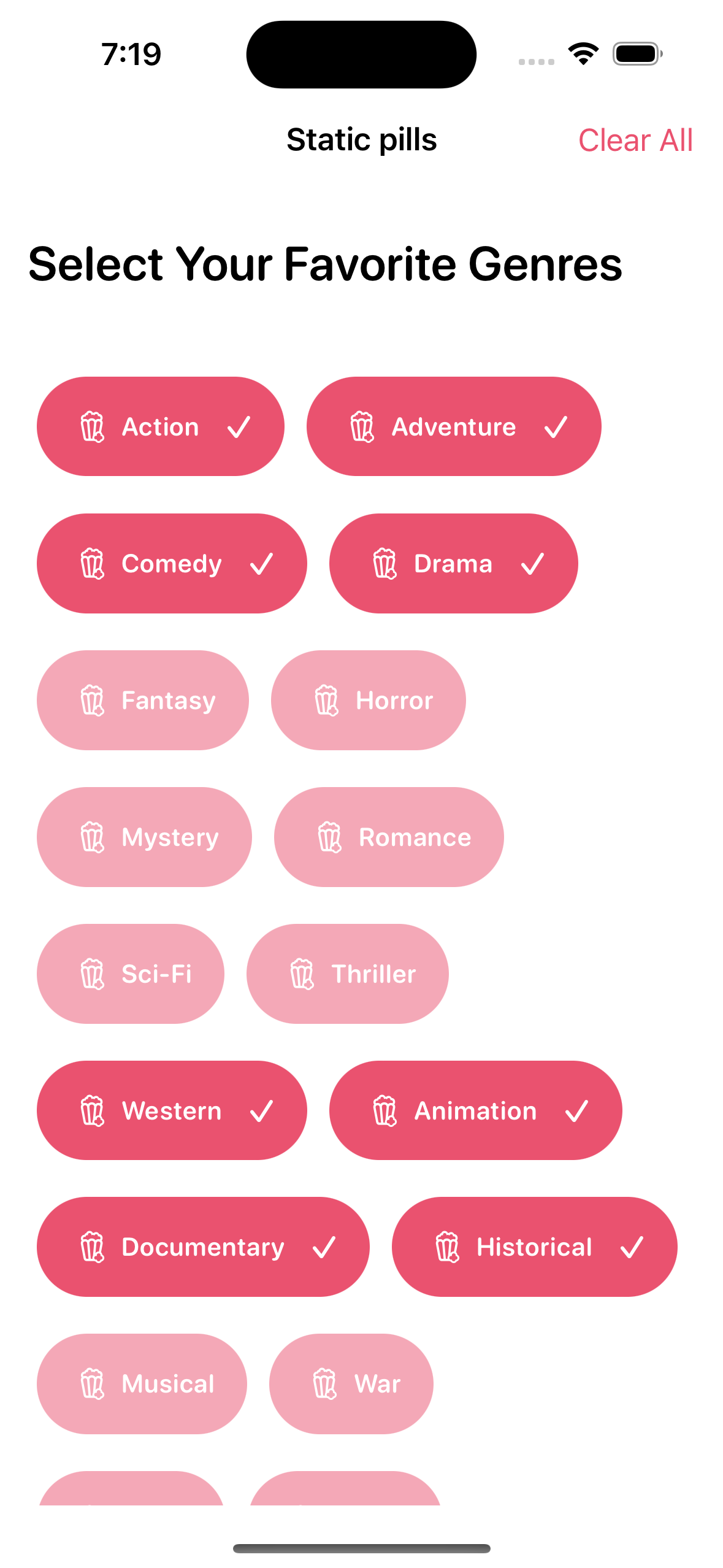
To switch between the underlying stack style for the content. Choosing .noWrap will invariably cause any text inside the pills to be truncated depending on length, as it will automatically be fitted inside the view and not wrap to a new line. Choosing .wrap will let the pills be dynamically placed an move in the PillPickerView.
.pillStackStyle(.noWrap) // Prevents pills from wrapping to a new line and being dynamic
.pillStackStyle(.wrap) // Default value. Allows pills to move in container
To modify the vertical or horizontal spacing in the PillPickerView
.pillViewVerticalSpacing(10)
.pillViewHorizontalSpacing(5)
To change the font of the pills
.pillFont(.caption)You can of course chain things together to get a good layout based on your circumstances and requirements.
.pillFont(.title3)
.pillViewHorizontalSpacing(30)
To change the icon used by each pill when it is 'selected'. I advise you to choose something that indicates that the pill will no longer be selected if this icon is pressed, as this is the intended behavior.
.pillSelectedIcon(Image(systemName: "xmark"))To change the background color of a not selected and selected pill, respectively
.pillNormalBackgroundColor(.green)
.pillSelectedBackgroundColor(.blue)
To change the foreground color of a not selected and selected pill, respectively
.pillNormalForegroundColor(.orange)
.pillSelectedForegroundColor(.white)
The height and width of the pills can also be set, but width will be treated as the minimum width of the pills
.pillMinWidth(20)
.pillHeight(10)
This adds trailing and leading icons to the view, but only displays the trailing icons when the element has been selected.
.pillLeadingIcon(Image(systemName: "popcorn"))
.pillTrailingIcon(Image(systemName: "checkmark"))
.pillTrailingOnlySelected(true) /// Only when item is selected
Corner radius and border color can also be changed easily
.pillBorderColor(.green)
.pillCornerRadius(40)
You can also change the animation used when a pill is pressed or wrapped to a newline
.pillAnimation(.easeInOut)Padding can also be applied
.pillPadding(10)If maxSelectablePill is set you can adjust the disabled state colors
.pillDisabledBackgroundColor(.gray.opacity(0.2))
.pillDisabledForegroundColor(.gray.opacity(0.5)) Created by A. Veletanlic (github.com/adisve) on 5/20/23.
Copyright © 2023 A. Veletanlic. All rights reserved.
MIT License
Copyright (c) 2023 A. Veletanlic
Permission is hereby granted, free of charge, to any person obtaining a copy
of this software and associated documentation files (the "Software"), to deal
in the Software without restriction, including without limitation the rights
to use, copy, modify, merge, publish, distribute, sublicense, and/or sell
copies of the Software, and to permit persons to whom the Software is
furnished to do so, subject to the following conditions:
The above copyright notice and this permission notice shall be included in all
copies or substantial portions of the Software.
THE SOFTWARE IS PROVIDED "AS IS", WITHOUT WARRANTY OF ANY KIND, EXPRESS OR
IMPLIED, INCLUDING BUT NOT LIMITED TO THE WARRANTIES OF MERCHANTABILITY,
FITNESS FOR A PARTICULAR PURPOSE AND NONINFRINGEMENT. IN NO EVENT SHALL THE
AUTHORS OR COPYRIGHT HOLDERS BE LIABLE FOR ANY CLAIM, DAMAGES OR OTHER
LIABILITY, WHETHER IN AN ACTION OF CONTRACT, TORT OR OTHERWISE, ARISING FROM,
OUT OF OR IN CONNECTION WITH THE SOFTWARE OR THE USE OR OTHER DEALINGS IN THE
SOFTWARE.


