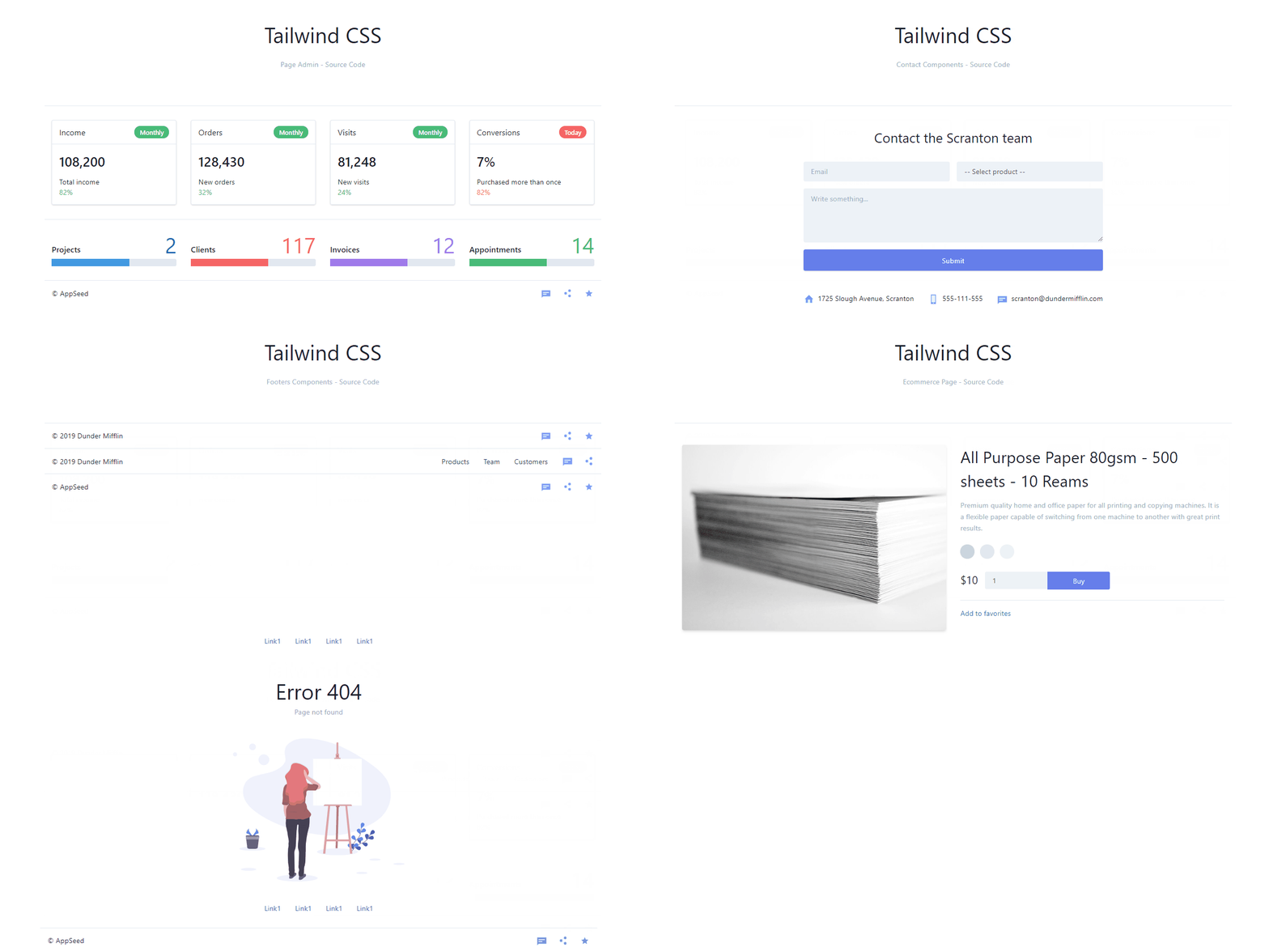
Open-Source project. The initial components generated by Tailwind.Build.
Project's source files are placed in ./src/ directory
-
./src/assets - default static files (eg. image placeholders). You should replace them with your own files.
-
./src/scss/ - Sass sources used to build Bulma theme. Variables used in Theme Customizer are located in custom-variables.scss file.
-
./src/*.pug - All your pages (templates) are stored in separated .pug files.
# Install dependencies
$ yarn

# Run dev server with live preview (Browsersync)
$ yarn start

# Or make production build
yarn build
Need More? Check out this curated list with Open-Source Tailwind Themes
Soft UI Dashboard Tailwind is built with over 70 frontend individual elements, like buttons, inputs, navbars, navtabs, cards or alerts, giving you the freedom of choosing and combining.
- 👉 Soft UI Dashboard Tailwind -
product page - 👉 Soft UI Dashboard Tailwind -
LIVE demo
Build your website faster with an Innovative Admin Template based on TailwindCSS, Flowbite, and HTML. Soft UI Flowbite features a huge number of components built to fit together and look amazing.
- 👉 Soft UI Flowbite -
product page - 👉 Soft UI Flowbite -
LIVE demo
This Free Dashboard is coming with prebuilt design blocks, so the development process is seamless, switching from our pages to the real website is very easy to be done.
Argon is a completly new product built on our newest re-built from scratch framework structure that is meant to make our products more intuitive, more adaptive and, needless to say, so much easier to customize. Let Argon amaze you with its cool features and build tools and get your project to a whole new level.
- 👉 Argon Dashboard Tailwind -
product page - 👉 Argon Dashboard Tailwind -
LIVE demo
Argon is a completly new product built on our newest re-built from scratch framework structure that is meant to make our products more intuitive, more adaptive and, needless to say, so much easier to customize. Let Argon amaze you with its cool features and build tools and get your project to a whole new level.
- 👉 Notus Svelte -
product page - 👉 Notus Svelte -
LIVE demo
Material Tailwind Kit React features over 120 individual components, giving you the freedom of choosing and combining. This means that there are thousands of possible combinations. All components can also take variations in color, which you can easily modify using react.js props.
- 👉 Material Tailwind Kit React -
product page - 👉 Material Tailwind Kit React -
LIVE demo
Tailwind CSS Components - Provided by AppSeed Web App Generator.


