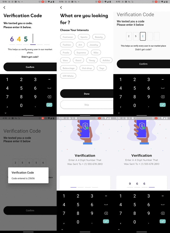
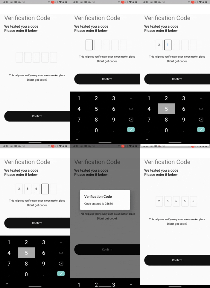
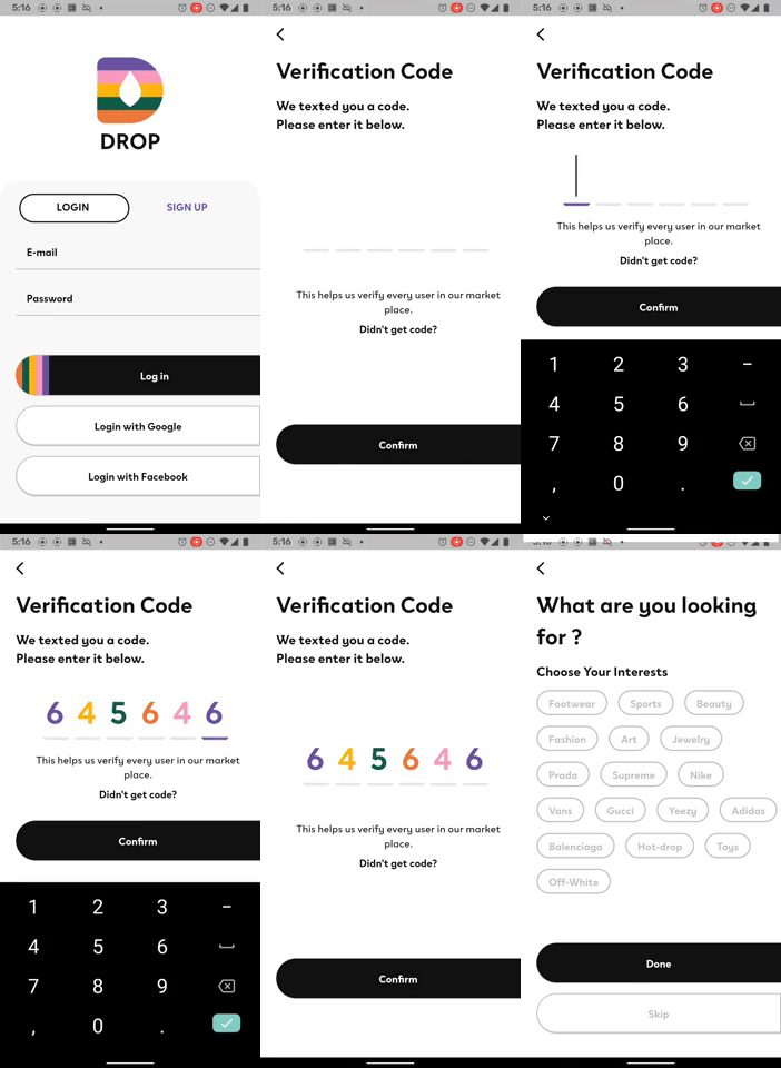
The flutter_otp_text_field package for flutter is a TextField widget that allows you to display different style pin. It supports all the platforms flutter supports.
- allows you to customize the shape of textField in any way you want
- built-in 2 commonly used pin styles of shape
- obscure support
- input decoration support
- support all the textField properties support
- Flutter web support
Install the latest version from pub.
Add this to your package's pubspec.yaml file:
dependencies:
  flutter_otp_text_field: ^1.1.0+2
You can install packages from the command line: with Flutter:
$ flutter packages get
Alternatively, your editor might support flutter packages get. Check the docs for your editor to learn more.
Now in your Dart code, you can use:
import 'package:flutter_otp_text_field/flutter_otp_text_field.dart';
if you want an otp_text_field with same style or with field shaped as a box
    OtpTextField(
        numberOfFields: 5,
        borderColor: Color(0xFF512DA8),
        //set to true to show as box or false to show as dash
        showFieldAsBox: true,
        //runs when a code is typed in
        onCodeChanged: (String code) {
            //handle validation or checks here
        },
        //runs when every textfield is filled
        onSubmit: (String verificationCode){
            showDialog(
                context: context,
                builder: (context){
                return AlertDialog(
                    title: Text("Verification Code"),
                    content: Text('Code entered is $verificationCode'),
                );
                }
            );
        }, // end onSubmit
    ),
if you want an otp_text_field with different styles for each field
    // if you want an otp_text_field with different
    // styles for each field

    Color accentPurpleColor = Color(0xFF6A53A1);
    Color primaryColor = Color(0xFF121212);
    Color accentPinkColor = Color(0xFFF99BBD);
    Color accentDarkGreenColor = Color(0xFF115C49);
    Color accentYellowColor = Color(0xFFFFB612);
    Color accentOrangeColor = Color(0xFFEA7A3B);

    otpTextStyles = [
        createStyle(accentPurpleColor),
        createStyle(accentYellowColor),
        createStyle(accentDarkGreenColor),
        createStyle(accentOrangeColor),
        createStyle(accentPinkColor),
        createStyle(accentPurpleColor),
    ];

    TextStyle? createStyle(Color color) {
        ThemeData theme = Theme.of(context);
        return theme.textTheme.headline3?.copyWith(color: color);
    }

    OtpTextField(
            numberOfFields: 6,
            borderColor: accentPurpleColor,
            focusedBorderColor: accentPurpleColor,
            styles: otpTextStyles,
            showFieldAsBox: false,
            borderWidth: 4.0,
            //runs when a code is typed in
            onCodeChanged: (String code) {
                //handle validation or checks here if necessary
            },
            //runs when every textfield is filled
            onSubmit: (String verificationCode) {

            },
    ),
Customizable Properties for OtpTextField
| Attribute Name | Example Value | Description |
|---|---|---|
| numberOfFields | 4 | The default is 4 |
| fieldWidth | 40 | allows to change the width of the textField |
| showFieldAsBox | true | changes the default decoration of the textFields to a box with borderRadius of 4.0 |
| hasCustomInputDecoration | true | set this to true if you want to pass your own decoration |
| decoration | InputDecoration | set hasCustomInputDecoration to true and pass your own input decoration the way you see fit |
| filled | false | set to true if you want to pass a fillColor |
| fillColor | Color(0xFFFFFFFF) | pass fillColor and set filled to true |
| enabledBorderColor | Color(0xFF4F44FF) | Pass Color value to show when textfield is enabled |
| focusedBorderColor | Color(0xFF4F44FF) | Pass Color value to show when textfield is in focus |
| borderColor | Color(0xFFE7E7E7) | Pass Color value to set border color |
| disabledBorderColor | Color(0xFFE7E7E7) | Pass Color value to show when textfield is disabled |
| styles | List | Pass a list of textStyles to customize the styles of each field. TextStyle in each index matches each field. Note that length of the styles array should be equal to the numberOfFields |
| borderRadius | BorderRadius.all(Radius.circular(4.0)) | pass BorderRadius to customise textField when showFieldAsBox is set to true |
| margin | EdgeInsets.only(right: 8.0) | customize the margin between each textField |
| textStyle | TextStyle(fontSize: 20, color: Colors.green); | Add custom textStyle |
| borderWidth | 2.0 | Default value is 2.0, allows you to customize the width of the border |
| cursorColor | Colors.blue | Change color of textFields cursor. Defaults to [ThemeData.cursorColor] or [CupertinoTheme.primaryColor] depending on [ThemeData.platform]. |
| mainAxisAlignment | MainAxisAlignment.center | Defaults to MainAxisAlignment.center |
| crossAxisAlignment | CrossAxisAlignment.center | Defaults to CrossAxisAlignment.center |
| onSubmit | (String pin){} | The callback will execute when user is done inputting the verification code. |
| keyboardType | TextInputType.number | Just like TextField's keyboardType, the default is TextInputType.number |
| clearText | Bool | When set to true, it clears all the text in the fields |
| autoFocus | false | Same as TextField's autoFocus, the default is false |
| enabled | true | Same as TextField's enabled, the default is true |
| obscureText | false | Defaults to false |
| onCodeChanged | (String code){} | Executes every time a value is entered into the textField. Same as TextField's onChanged |
| handleControllers | (List controllers){} | exposes the list of textEditingControllers to control the textFields. This can be set to a local variable for manipulation |


