Epoxy is a suite of declarative UI APIs for building UIKit applications in Swift. Epoxy is inspired and influenced by the wonderful Epoxy framework on Android, as well as other declarative UI frameworks in Swift such as SwiftUI.
Epoxy was developed at Airbnb and powers thousands of screens in apps that are shipped to millions of users. It has been developed and refined for years by dozens of contributors.
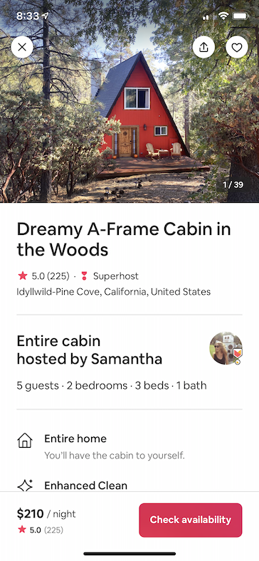
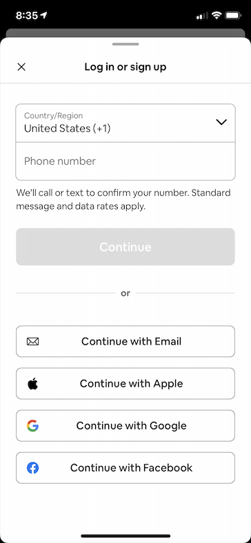
Below are a few sample screens from the Airbnb app that we've built using Epoxy. Our usages of Epoxy span from our simplest forms and static screens to our most advanced and dynamic features.
| Home Details | Home Photos | Messaging | Registration |
|---|---|---|---|
 |
 |
 |
 |
Epoxy can be installed using CocoaPods or Swift Package Manager.
To get started with Epoxy using Cocoapods add the following to your Podfile and then follow the integration instructions.
pod 'Epoxy'Epoxy is separated into podspecs for each module so you only have to include what you need.
To install Epoxy using Swift Package Manager you can follow the tutorial published by Apple using the URL for the Epoxy repo with the current version:
- In Xcode, select “File” → “Swift Packages” → “Add Package Dependency”
- Enter https://github.com/airbnb/epoxy-ios.git
Epoxy is separated library products for each module so you only have to include what you need.
Epoxy has a modular architecture so you only have to include what you need for your use case:
| Module | Description |
|---|---|
Epoxy |
Includes all of the below modules in a single import statement |
EpoxyCollectionView |
Declarative API for driving the content of a UICollectionView |
EpoxyNavigationController |
Declarative API for driving the navigation stack of a UINavigationController |
EpoxyPresentations |
Declarative API for driving the modal presentations of a UIViewController |
EpoxyBars |
Declarative API for adding fixed top/bottom bar stacks to a UIViewController |
EpoxyLayoutGroups |
Declarative API for building composable layouts in UIKit with a syntax similar to SwiftUI's stack APIs |
EpoxyCore |
Foundational APIs that are used to build all Epoxy declarative UI APIs |
For full documentation and step-by-step tutorials please check the wiki. For type-level documentation, see the Epoxy DocC documentation hosted on the Swift Package Index.
There's also a full sample app with a lot of examples that you can either run via the EpoxyExample scheme in Epoxy.xcworkspace or browse its source.
If you still have questions, feel free to create a new issue.
EpoxyCollectionView provides a declarative API for driving the content of a UICollectionView. CollectionViewController is a subclassable UIViewController that lets you easily spin up a UICollectionView-backed view controller with a declarative API.
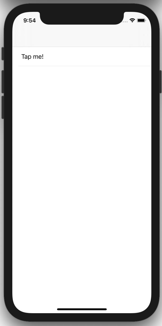
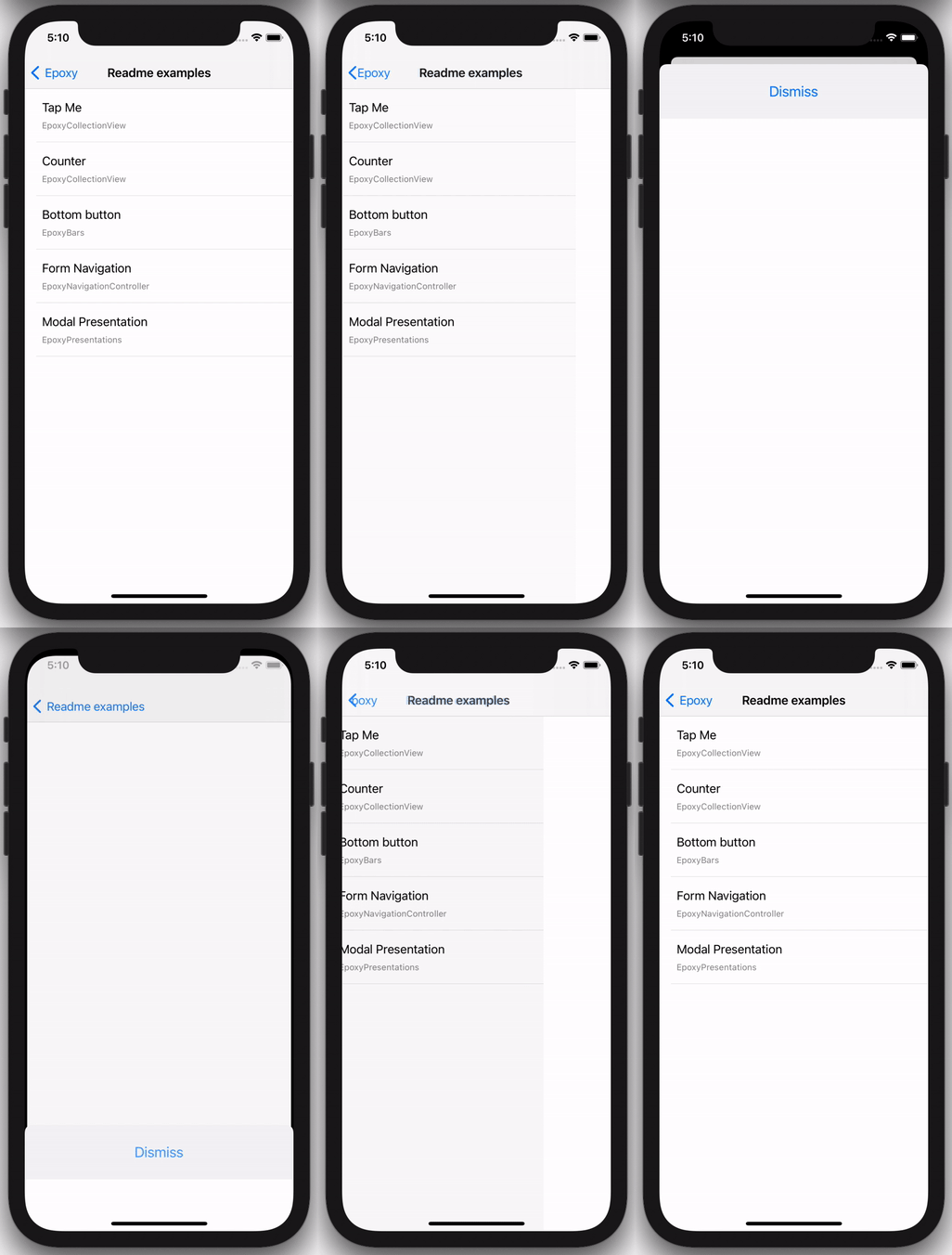
The following code samples will render a single cell in a UICollectionView with a TextRow component rendered in that cell. TextRow is a simple UIView containing two labels that conforms to the EpoxyableView protocol.
You can either instantiate a CollectionViewController instance directly with sections, e.g. this view controller with a selectable row:
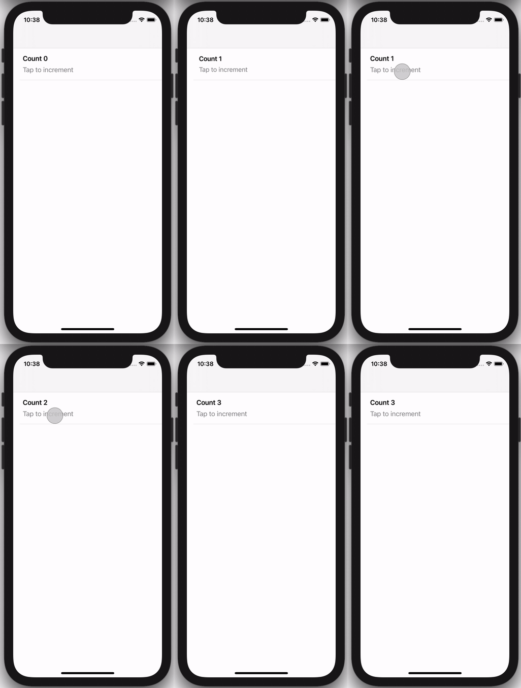
Or you can subclass CollectionViewController for more advanced scenarios, e.g. this view controller that keeps track of a running count:
You can learn more about EpoxyCollectionView in its wiki entry, or by browsing the code documentation.
EpoxyBars provides a declarative API for rendering fixed top, fixed bottom, or input accessory bar stacks in a UIViewController.
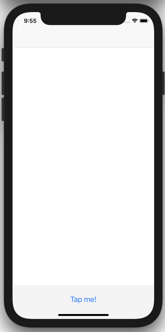
The following code example will render a ButtonRow component fixed to the bottom of the UIViewController's view. ButtonRow is a simple UIView component that contains a single UIButton constrained to the margins of the superview that conforms to the EpoxyableView protocol:
You can learn more about EpoxyBars in its wiki entry, or by browsing the code documentation.
EpoxyNavigationController provides a declarative API for driving the navigation stack of a UINavigationController.
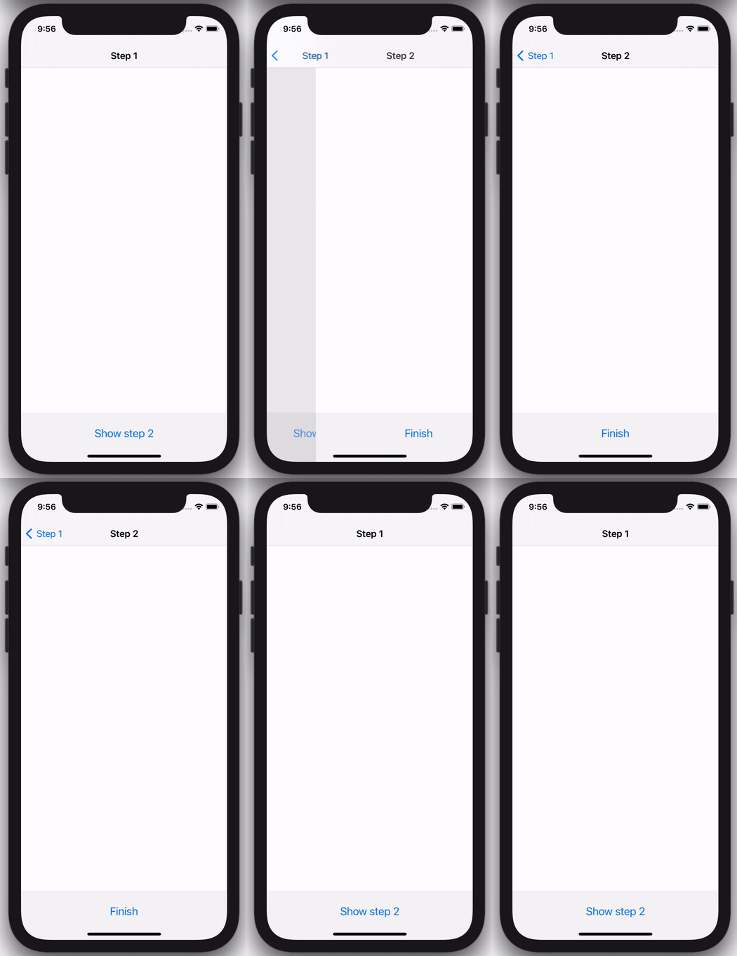
The following code example shows how you can use this to easily drive a feature that has a flow of multiple view controllers:
You can learn more about EpoxyNavigationController in its wiki entry, or by browsing the code documentation.
EpoxyPresentations provides a declarative API for driving the modal presentation of a UIViewController.
The following code example shows how you can use this to easily drive a feature that shows a modal when it first appears:
You can learn more about EpoxyPresentations in its wiki entry, or by browsing the code documentation.
LayoutGroups are UIKit Auto Layout containers inspired by SwiftUI's HStack and VStack that allow you to easily compose UIKit elements into horizontal and vertical groups.
VGroup allows you to group components together vertically to create stacked components like this:
As you can see, this is incredibly similar to the other APIs used in Epoxy. One important thing to note is that install(in: view) call at the bottom. Both HGroup and VGroup are written using UILayoutGuide which prevents having large nested view hierarchies. To account for this, we’ve added this install method to prevent the user from having to add subviews and the layout guide manually.
Using HGroup is almost exactly the same as VGroup but the components are now horizontally laid out instead of vertically:
Groups support nesting too, so you can easily create complex layouts with multiple groups:
You can learn more about EpoxyLayoutGroups in its wiki entry, or by browsing the code documentation.
- Why would I use Epoxy and UIKit instead of SwiftUI?
- How does Epoxy for iOS differ from Epoxy for Android?
Pull requests are welcome! We'd love help improving this library. Feel free to browse through open issues to look for things that need work. If you have a feature request or bug, please open a new issue so we can track it. Contributors are expected to follow the Code of Conduct.
Epoxy is released under the Apache License 2.0. See LICENSE for details.
Logo design by Alana Hanada and Jonard La Rosa


