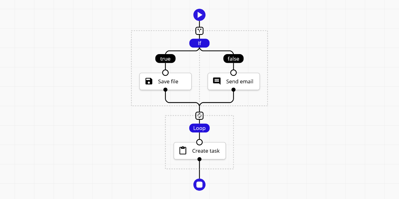
Sequential workflow designer with 0 external dependencies for web applications. It's written in pure TypeScript and uses SVG for rendering. This designer is not associated with any workflow engine. It's full generic. You may create any kind application by this, from graphical programming languages to workflow builders.
Features:
- 0 external dependencies,
- fully generic and configurable,
- use light/dark themes or customize easily,
- compatible with modern browsers and mobile devices,
- the definition is stored as JSON,
- supports Angular, React and Svelte.
📝 Check the documentation for more details.
🤩 Don't miss the pro version.
- ⏩ Live Testing
- ❎ Fullscreen
- 🌅 Image Filter
- 🔴 Particles
- ⛅ Light Dark
- 🤖 Code Generator
- 🌻 Rendering Test
- 🚄 Stress Test
- 🚪 Editing Restrictions
- 📜 Scrollable Page
- 🌵 Multi-Conditional Switch
- 🌀 Auto-Select
- Angular Demo
- React Demo
- Svelte Demo
Pro:
- 🤩 Pro Components
- 🍬 Custom Theme Flat
- 🌹 Custom Step Types
- 👈 Goto
- 📁 Folders
- ⭕ Wheel Mode
- 💠 Grid
- 🐭 Minimal Root Component
- 🦁 External UI Components
- 👋 Custom Dragged Component
- 🔰 Badges
- 🎩 Custom Viewport
- 🛎 Clickable Placeholder
- ⛽ Sequential Workflow Editor - Powerful step editor builder. Don't write step editors manually, build them.
- 🚚 Sequential Workflow Machine - Workflow engine for browser and NodeJS apps, powered by the xstate library.
To use the designer you should add JS/TS files and CSS files to your project.
Install this package by NPM command:
npm i sequential-workflow-designer
To import the package:
import { Designer } from 'sequential-workflow-designer';If you use css-loader or similar, you can add CSS files to your bundle:
import 'sequential-workflow-designer/css/designer.css';
import 'sequential-workflow-designer/css/designer-light.css';
import 'sequential-workflow-designer/css/designer-dark.css';
To create the designer write the below code:
// ...
Designer.create(placeholder, definition, configuration);Add the below code to your head section in HTML document.
<head>
...
<link href="https://cdn.jsdelivr.net/npm/sequential-workflow-designer@0.18.0/css/designer.css" rel="stylesheet">
<link href="https://cdn.jsdelivr.net/npm/sequential-workflow-designer@0.18.0/css/designer-light.css" rel="stylesheet">
<link href="https://cdn.jsdelivr.net/npm/sequential-workflow-designer@0.18.0/css/designer-dark.css" rel="stylesheet">
<script src="https://cdn.jsdelivr.net/npm/sequential-workflow-designer@0.18.0/dist/index.umd.js"></script>
Call the designer by:
sequentialWorkflowDesigner.Designer.create(placeholder, definition, configuration);Check examples directory.
import { Designer } from 'sequential-workflow-designer';

const placeholder = document.getElementById('placeholder');

const definition = {
  properties: {
    'myProperty': 'my-value',
    // root properties...
  },
  sequence: [
    // steps...
  ]
};

const configuration = {
  theme: 'light', // optional, default: 'light'
  isReadonly: false, // optional, default: false
  undoStackSize: 10, // optional, default: 0 - disabled, 1+ - enabled

  steps: {
    // all properties in this section are optional

    iconUrlProvider: (componentType, type) => {
      return `icon-${componentType}-${type}.svg`;
    },

    isDraggable: (step, parentSequence) => {
      return step.name !== 'y';
    },
    isDeletable: (step, parentSequence) => {
      return step.properties['isDeletable'];
    },
    isDuplicable: (step, parentSequence) => {
        return true;
    },
    canInsertStep: (step, targetSequence, targetIndex) => {
      return targetSequence.length < 5;
    },
    canMoveStep: (sourceSequence, step, targetSequence, targetIndex) => {
      return !step.properties['isLocked'];
    },
    canDeleteStep: (step, parentSequence) => {
      return step.name !== 'x';
    }
  },

  validator: {
    // all validators are optional

    step: (step, parentSequence, definition) => {
      return /^[a-z]+$/.test(step.name);
    },
    root: (definition) => {
      return definition.properties['memory'] > 256;
    }
  },

  toolbox: {
    isCollapsed: false,
    groups: [
      {
        name: 'Files',
        steps: [
          // steps for the toolbox's group
        ]
      },
      {
        name: 'Notification',
        steps: [
          // steps for the toolbox's group
        ]
      }
    ]
  },

  editors: {
    isCollapsed: false,
    rootEditorProvider: (definition, rootContext, isReadonly) => {
      const editor = document.createElement('div');
      // ...
      return editor;
    },
    stepEditorProvider: (step, stepContext, definition, isReadonly) => {
      const editor = document.createElement('div');
      // ...
      return editor;
    }
  },

  controlBar: true,
  contextMenu: true,
};

const designer = Designer.create(placeholder, definition, configuration);
designer.onDefinitionChanged.subscribe((newDefinition) => {
  // ...
});
You can hide default UI components by setting the corresponding configuration property to false.
const configuration = {
  toolbox: false,
  editors: false,
  controlBar: false,
  contextMenu: false,
  // ...
}This project is released under the MIT license.


