This tutorial uses QGIS 3 to teach the basics of desktop GIS for the Social Sciences, with an emphasis on acquiring census data, mapping census tracts, and generating a map.
You should download and install QGIS version 3.14 or higher to your computer.
The datasets for the workshop are available in this data folder.
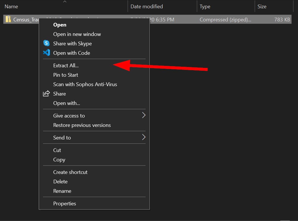
Download all the files and extract them.
This beginner-level workshop will focus upon the fundamental concepts and skills needed to use Geographic Information Systems (GIS) software for the exploration and analysis of U.S. Census datasets with spatial attributes using the QGIS platform.
No prior experience QGIS or other GIS software is required.
By the end of this workshop, you will be able to:
-
Define basic GIS geospatial concepts and terminology.
-
Know the about different type of data sets
-
Understand where to find Census data on the web
-
Know how to add data to a QGIS project
-
Find the attributes of your data in QGIS
-
Perform basic selections and queries in QGIS
-
Stylize a map using different data types in QGIS
-
Export a map in QGIS
What is GIS? Depending on who you ask, GIS has two meanings:
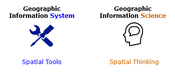
Geographic Information System typically refers to applications and software that is used to create spatial data and to investigate spatial relationships between that data.
Geographic Information Science is the framework we use to ask questions about the spatial relationship between data.
For example, predicting the effects of climate change (rising sea-levels) on low laying areas (elevation) would be an application of Geographic Information Science, while the software to do the predictions would be an example of a Geographic Information System.
In short:
There are two key distinction between data types, spatial or non-spatial data.
Spatial data is data that already contains geographic information.
Common file types are the following:
-
Shapefiles: .zip (these are made up of 5 files, and the .shp is commonly used to identify them)
-
KML files: .kml, .kmz
-
GeoJSON files: .geojson
-
JPG files: .jpg*
Non-spatial data is data that has no geographic information.
Common non-spatial data are the following:
-
Excel Spreadsheets: .xlsx, .xls
-
Comma/Table Separated Value files: .csv, .tsv
-
JSON files: .json
-
dBase database file: .dbf
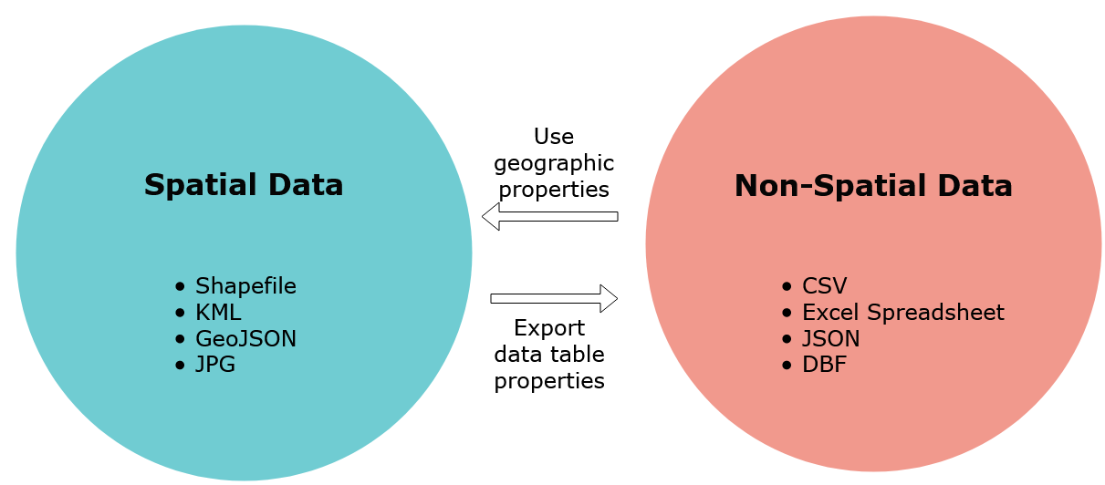
When non-spatial data has geographic attributes, like zipcodes, addresses, city names, or even latitude/longitude coordinates it can be turned into spatial data. The distinction is that non-spatial data will only show up as tables in GIS applications.
On the other hand, spatial data that has data attributes can be turned into a non-spatial data type by saving/exporting its data as tables. The following graphic summarizes this relationship:
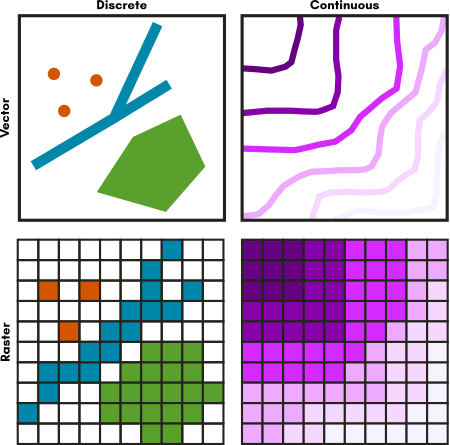
There are several data spatial data models that you may encounter as you work with geo data. Geodata formats are commonly divided into two types, vector data or a raster data. In GIS, discrete data means that the data has a fixed location. Continuous data in GIS does not have well defined or no boundary at all, the most common example is elevation. The graphic below shows how vector data and raster data formats can represent continuous or discrete data:
Spatial Data Types (Source: Michele Tobias, UC Davis)
The graphic also illustrates how certain vector data is often better suited for discrete data, while raster data is often better used for continuous data. Let's go into a little more detail about each!
Vector data represents discrete objects in the real world with points, lines, and polygons in the dataset.
If you were to draw a map to your house for a friend, you would typically use vector data - roads would be lines, a shopping center included as an important landmark might be a rectangle of sorts, and your house might be a point (perhaps represented by a star or a house icon).
Raster data represents continuous fields or discrete objects on a grid, storing measurements or category names in each cell of the grid.
Digital photos are raster data you are already familiar with. If you zoom in far enough on a digital photo, you'll see that photo is made up of pixels, which appear as colored squares. Pixels are cells in a regular grid and each contains the digital code that corresponds to the color that should be displayed there.
You may be surprised to see jpgs listed as a data type that you may have thought to be non-spatial, but satellite imagery is commonly stored in photo formats.
Now that we have a good understanding of geospatial data, we can explore the GIS connection to the social sciences.
Geography is divided into physical geography (natural systems) and human geography (human-made systems). The social sciences sit within human-made systems and the data here is often captured in specific units. Such as number of people living in a specific city or the language spoken in a country. Thusly, most of the data we will encounter will be discrete.
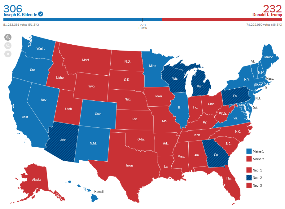
Another common example is the following election result map which shows the number of people from each state that voted for either Biden or Trump in the 2020 general election.
Source: New York Times, 2020
The states themselves are the boundaries, even though the data is collected at smaller levels.
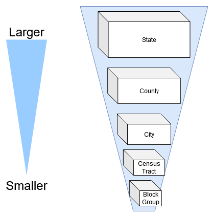
How is that possible? The answer is geographical hierarchy.
Move over Aristotle: The sum is the whole of its parts!
The first law of Geography (and perhaps only) is "everything is related to everything else, but nearer things are more related than distant things." When thinking about human data, there are many different units, countries, states, cities, and even households. Whenever this data is being summarized to larger geographies, as long as the smaller boundaries do not overlap then you can do so. However, this does not mean it is always safe to do so, why?
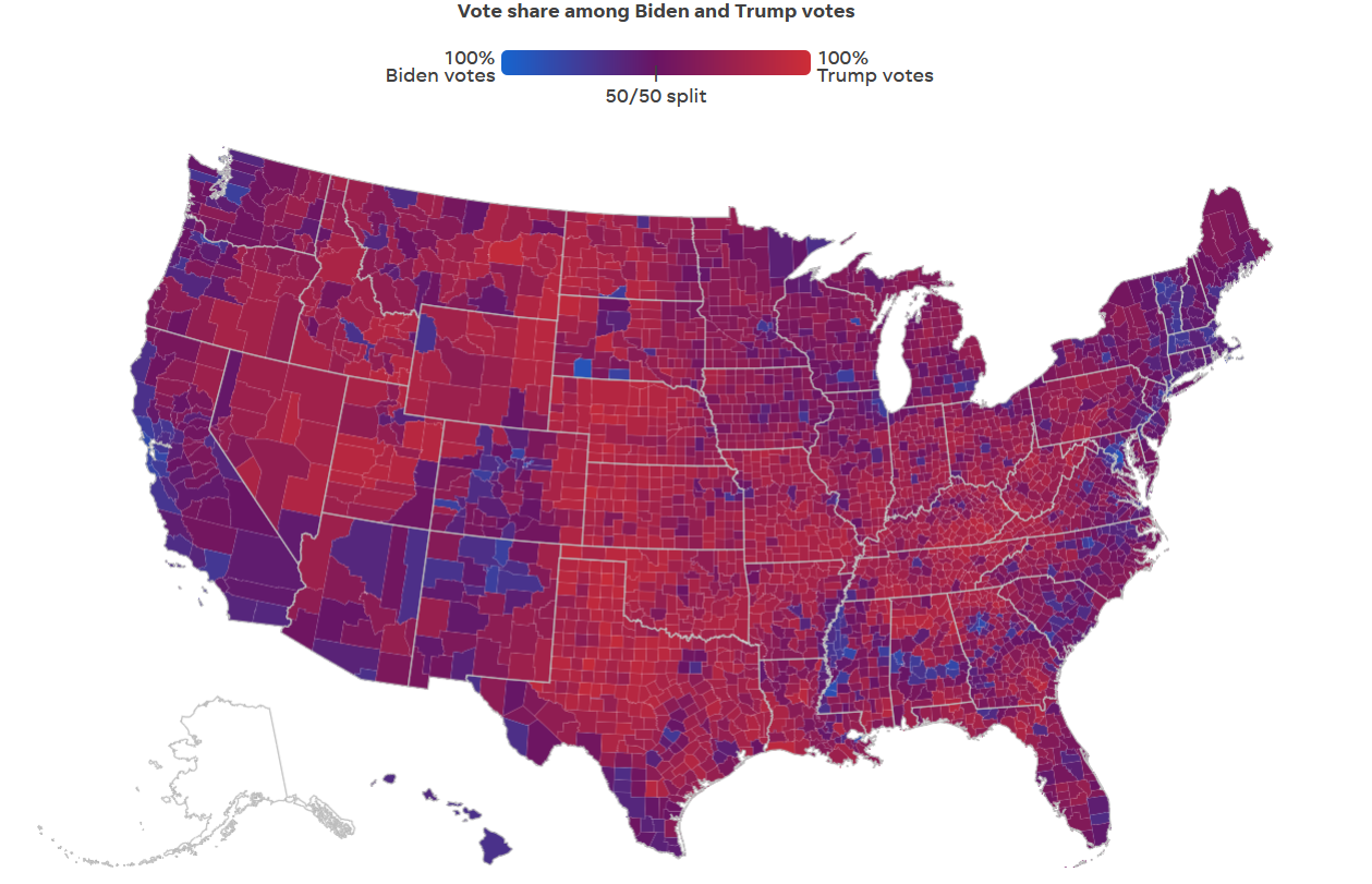
Keeping the first law of geography in mind, when you summarize smaller data to larger geographies (i.e. going from cities to a state), the nearer things become less related because they are summarized to a larger geographic relation. Let's return to the election map above, but break it down into counties to see how the summing of the data changed spatial relationships.
Source: USA Today, 2020
How does this map compare to the previous map?
For one thing, you can see that a state like Nevada is not completely blue and has quite a bit of Republican voters. When a whole state is considered “democrat” or blue, such types of simplifications can only occur when data from the counties is summarized upwards to the state level.
Below is an example of how the United States Census Bureau’s uses hierarchal geography:
The Federal Information Processing Standards (FIPS) codes represents this in numerical format:
[STATE] + [COUNTY] + [CENSUS TRACT] + [CENSUS BLOCK GROUP]
For example:
06 + 037 + 2653 + 01 or 06037265301, which is UCLA's census tract.
When data is organized in this way it can readily summarized, since the smaller units make up the larger units. For example, demographic information that is collected at the smaller Census Tract level can be easily aggregated to answer questions at the city or state level. Questions such as "how many Asians are there in California?" are readily answerable. But the voting data that was collected at the voting precinct level, the summarization could occur at the state level because all the units fell within a particular state and it did not overlap. If you were to combine the voting data with a bigger geography that causes boundaries to overlap, then data will be double counted and will cause problems (and headaches!)
What other ways could voter data be summarized to?
Voting data can also be summarized at the county level, since counties do not overlap and these are still bigger than the precincts. When trying to aggregate data to the census tracts a major problem occurs, some precincts will overlap with many different census tracts! A special type of analysis, called a "weighted-merge" will need to be done in order to distribute the votes across census tracts accurately.
Now that we have a better understanding of geospatial datasets, how it relates to the social sciences, and some of the problems associated with them, we can finally start to utilize spatial data.
In this workshop, we will be answering the following question:
Research Question: Which areas in Los Angeles have more than 25% of their population living in poverty?
We will be using the following data:
-
Los Angeles 2010 Census Tracts
-
County Boundaries
We are using the Census Tracts because those are how demographic data is collected in the United States.
Data for mapping in the social sciences will commonly be found as standalone tables or vector data, and the best way to find these data is from authoritative sources, like the government, news organizations, and research groups.
One good resource is https://censusreporter.org
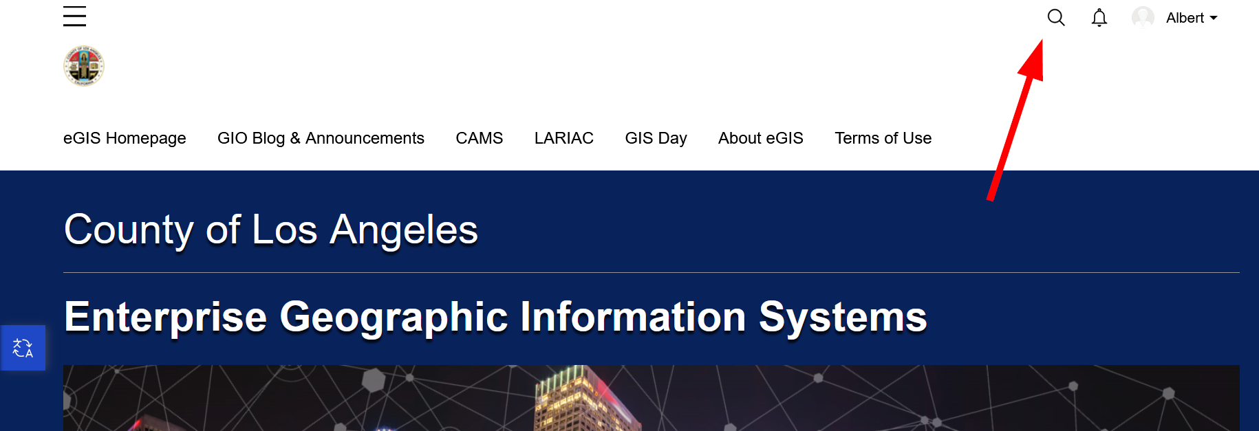
Geodata portals are other places where spatial data sets can be found. The Los Angeles County operates a geodata portal that uses the ESRI Geohub tool, and we will navigate to it below:
https://egis-lacounty.hub.arcgis.com/
-
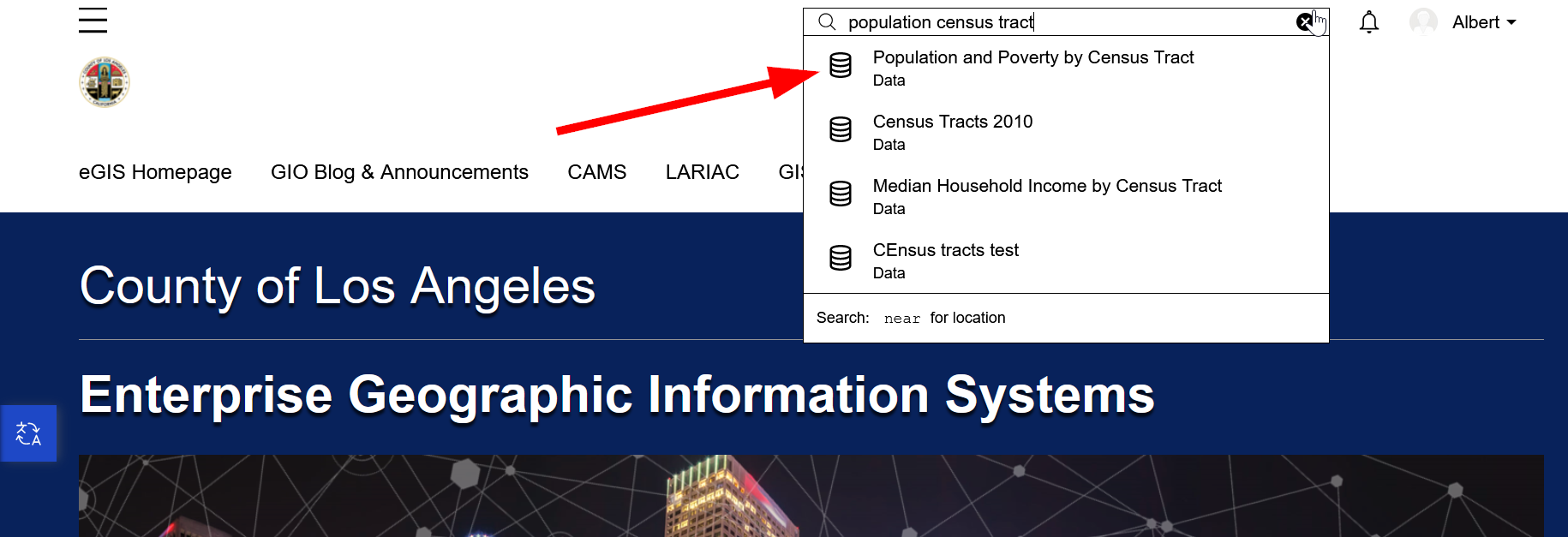
Click the search box and type in "Population Census Tract"
-
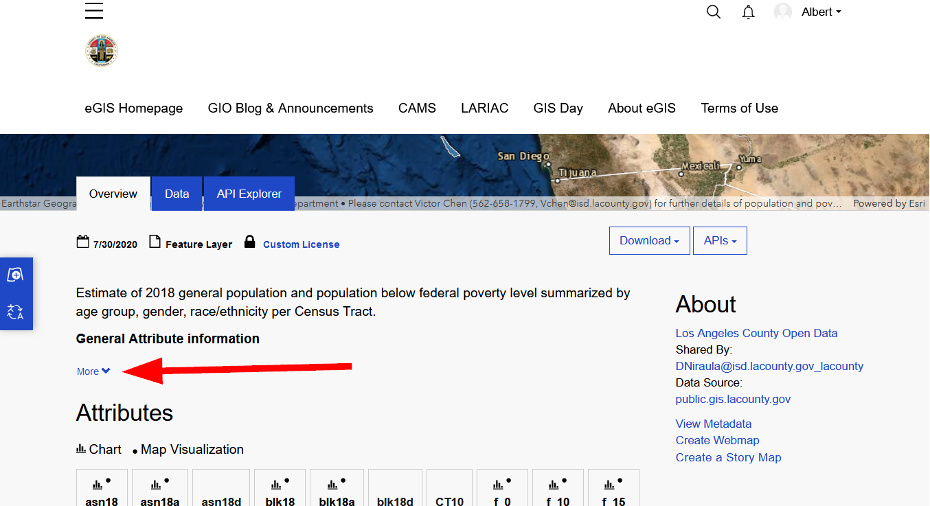
Click on "Population and Poverty by Census Tract"
-
Before downloading anything, we should check the see if this data is worth it, so click on "More" under "General Attribute Information"
-
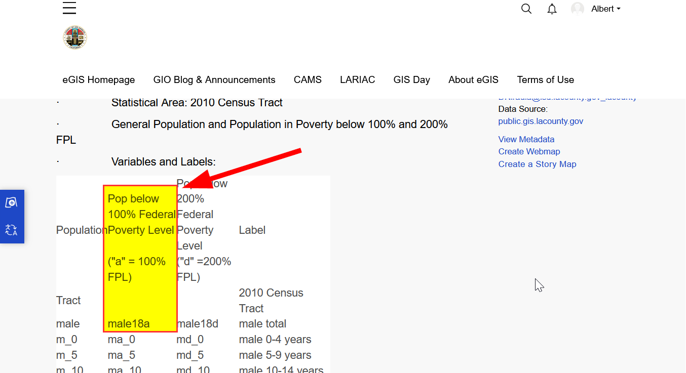
Scroll down to see the table that says, "population below federal poverty level"
-
Perfect, the data we need is in here:
-
male18a is the total male population 100% below the Federal Poverty Level
-
female18a is the total female population100% below the Federal Poverty Level.
-
-
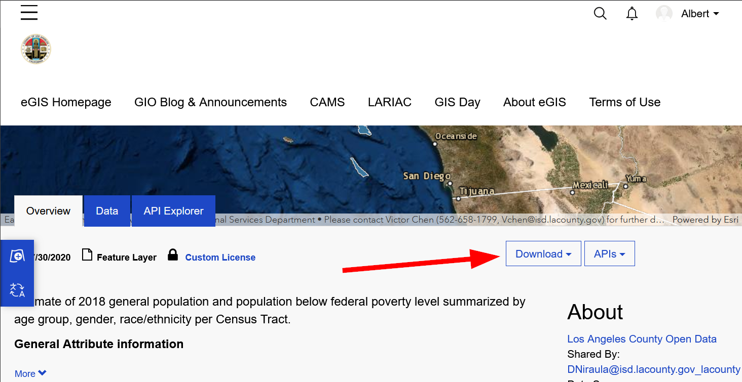
Scroll down the page and find and click "Download"
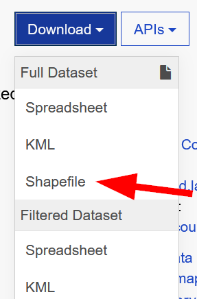
Pop-quiz! Which file types are spatial and which are not?
-
Download the shapefile:
-
Extract the zip file.
-
You should now have a new folder containing the following files:
Exercise #1
Find and download the County Boundary Layer.
Hint: Search "Boundary"
If you get stuck, feel free to download all of required data from this Box Folder Online.
-
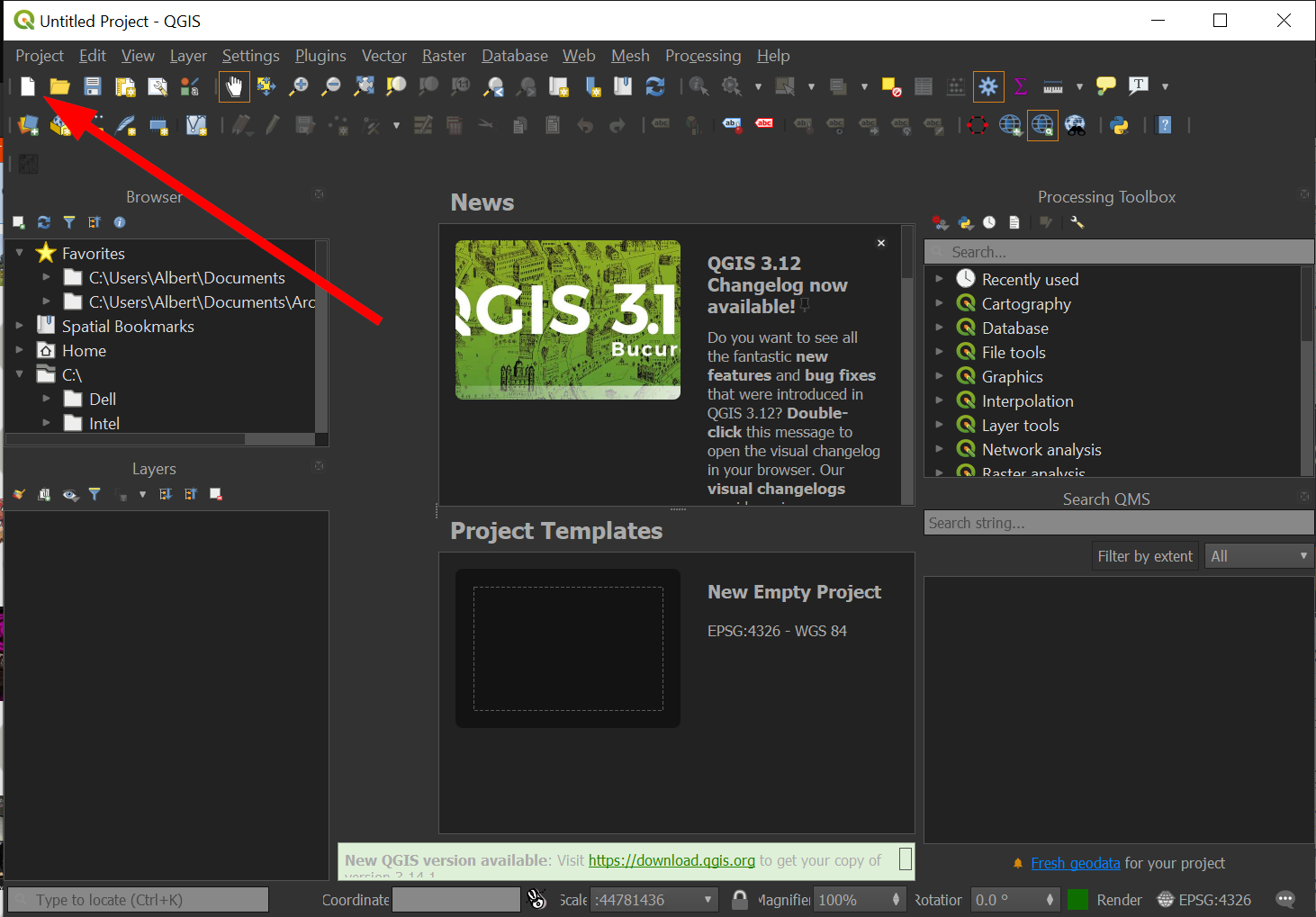
Start QGIS in the way you typically open any program on your particular computer's operating system.
-
Click on the "New file" on the top right corner to start a new project.
-
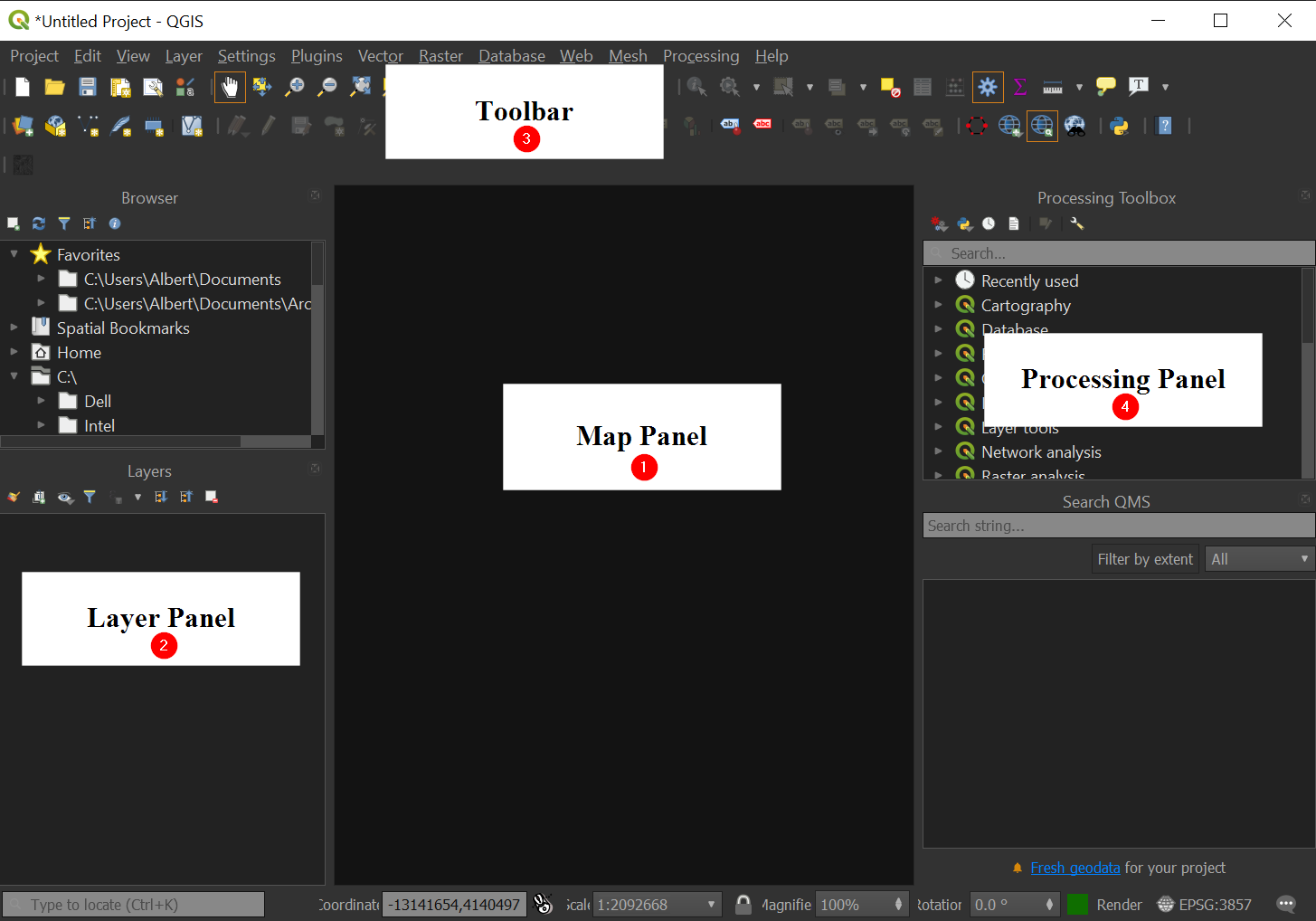
Let's get acquainted with the default layout of QGIS:
-
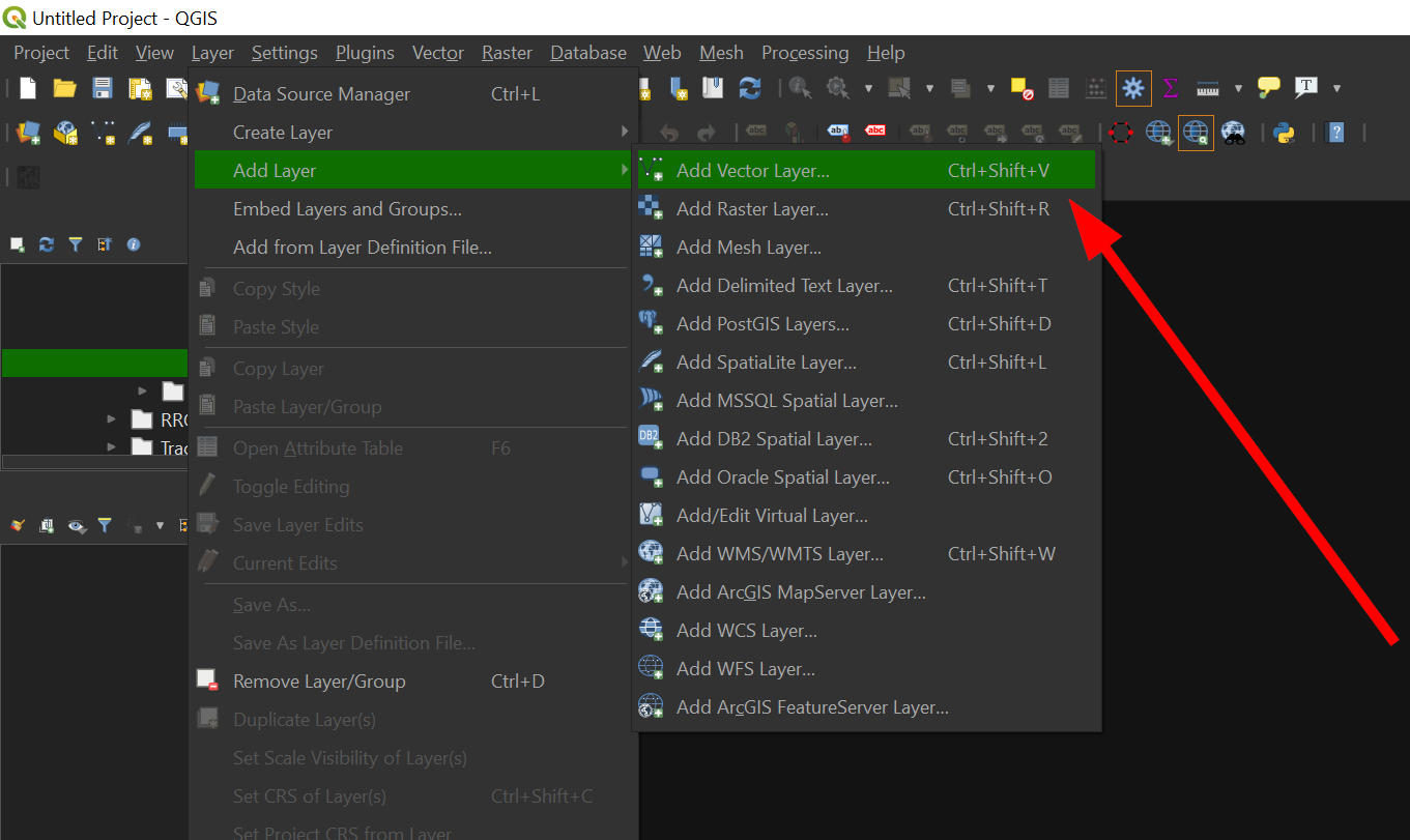
Add the downloaded data set by going to the Toolbar and then "Layer" >> "Add Vector Data":
-
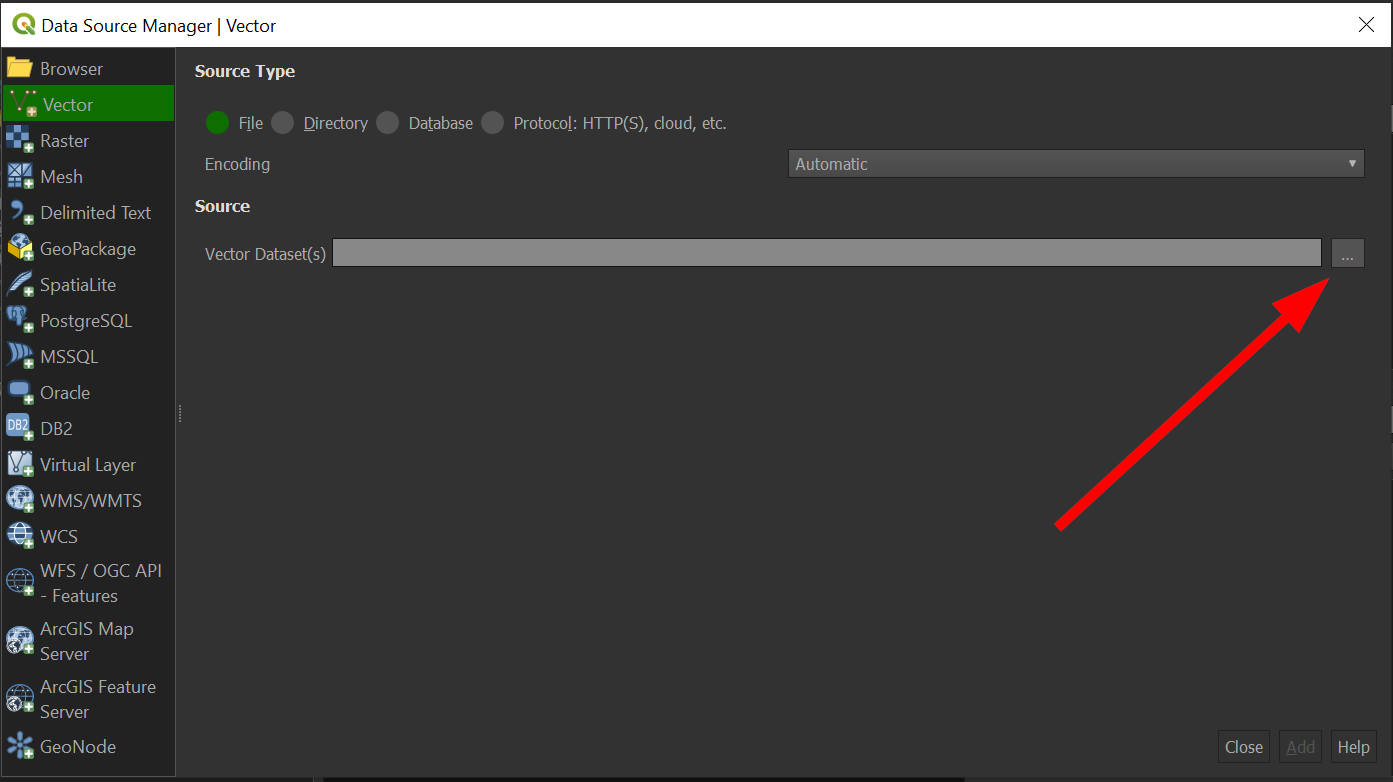
Click on the "..." to browse for the shapefile that we downloaded:
-
Locate the file and click "Open".
-
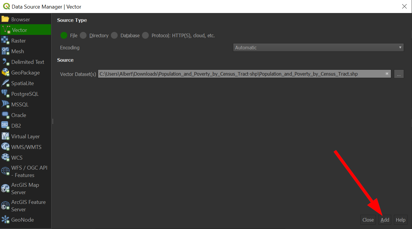
Click "Add"
-
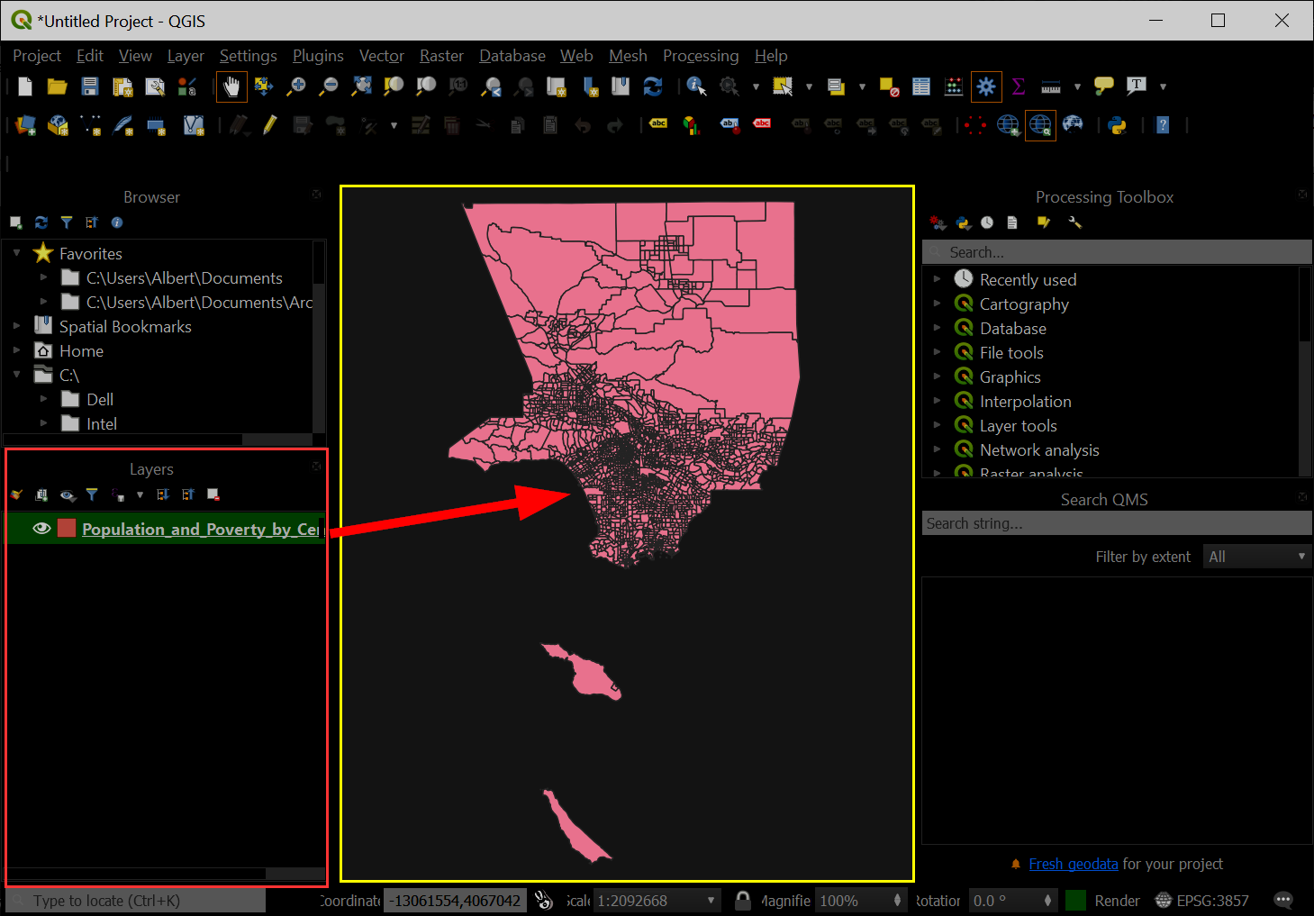
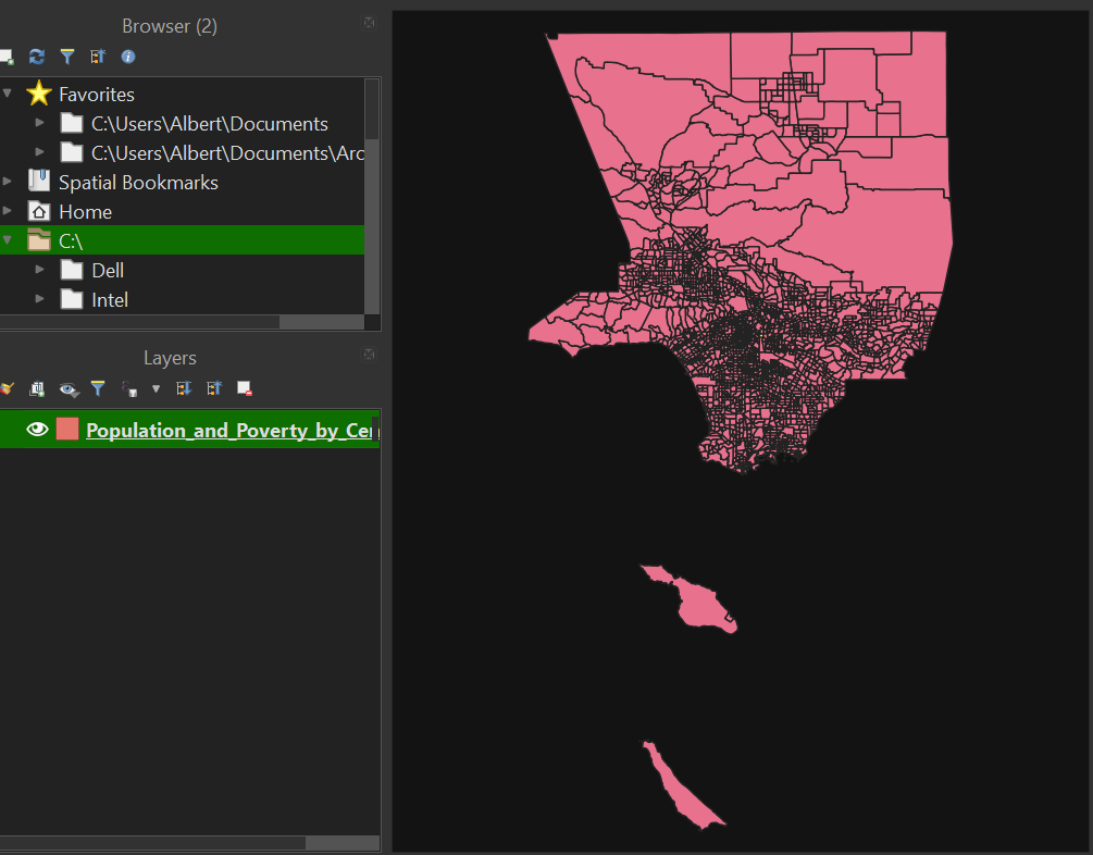
Notice that the dataset was added to the Layer Panel and then Map Panel at the same time:
The value of GIS data is that it has various information connected to it. We can examine and interrogate this data by opening the layer's "Attribute Table."
-
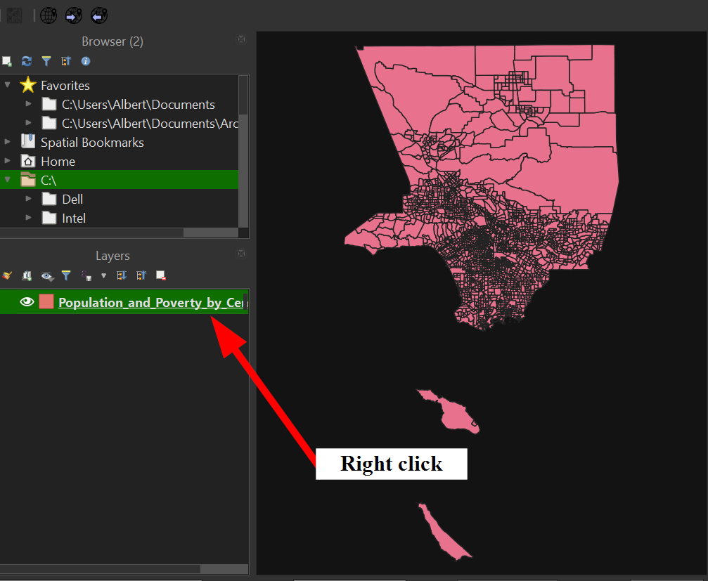
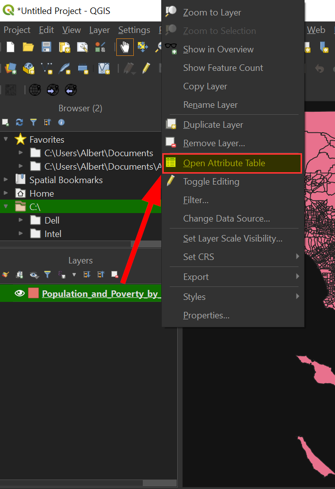
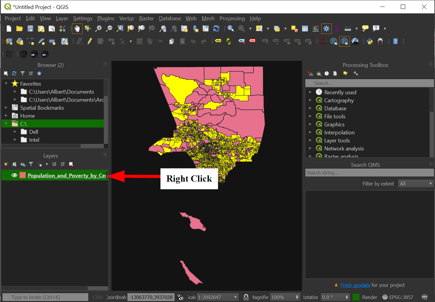
Let's check what data we have by right clicking on the layer:
-
Go to "Open Attribute Table" to open the data:
-
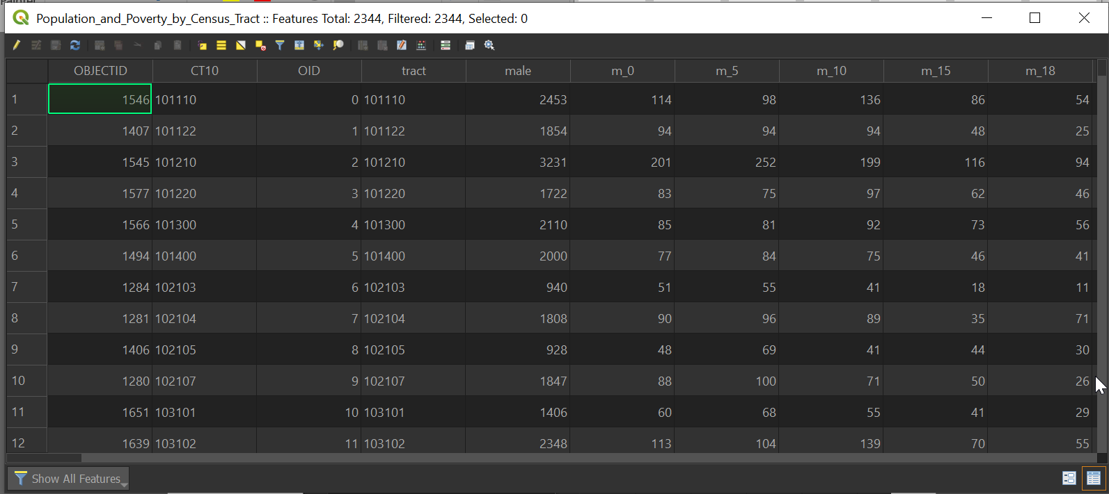
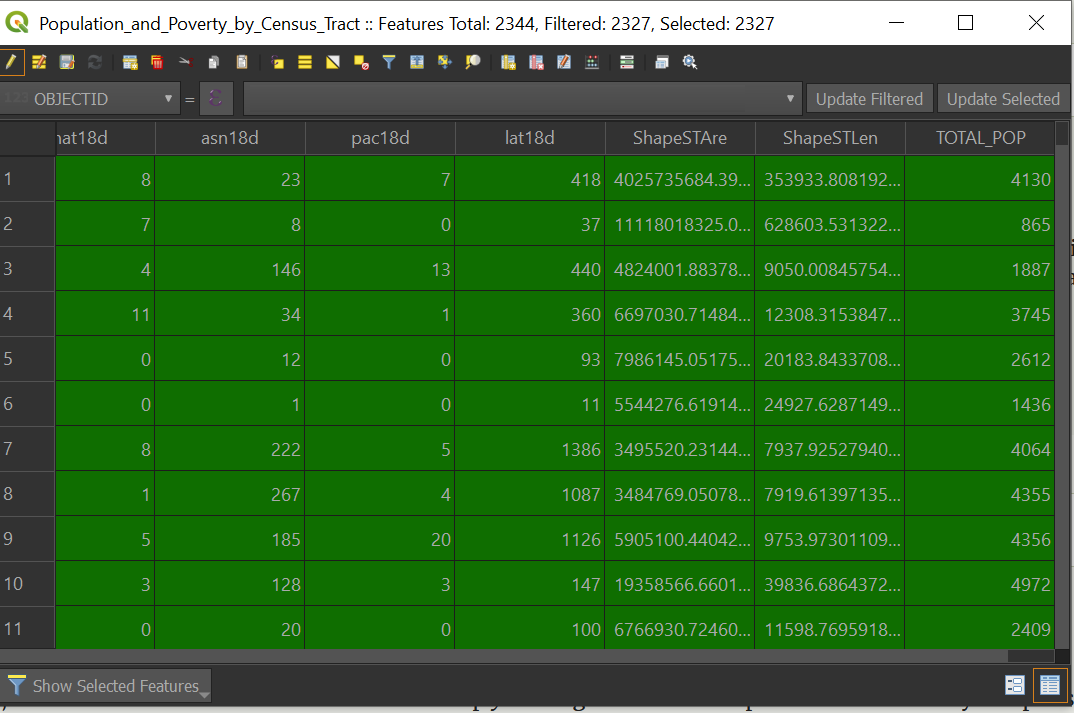
A window should open up with the data in columns and rows:
-
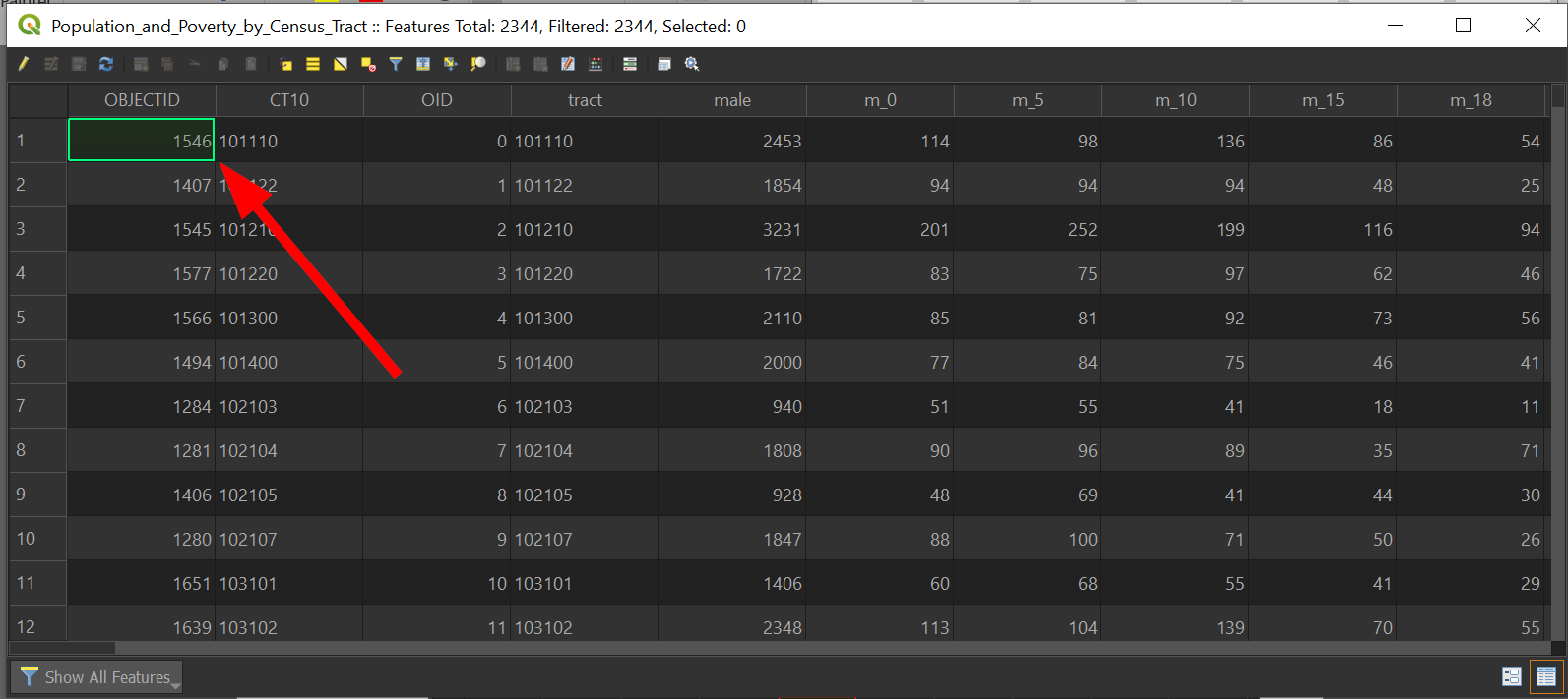
The "green" box is the location of our cursor in the data and is useful to find where we are in our data set:
Let's answer the following.
Spatial Question #1:
What are the Top 10 Census Tracts with males in Los Angeles County?
-
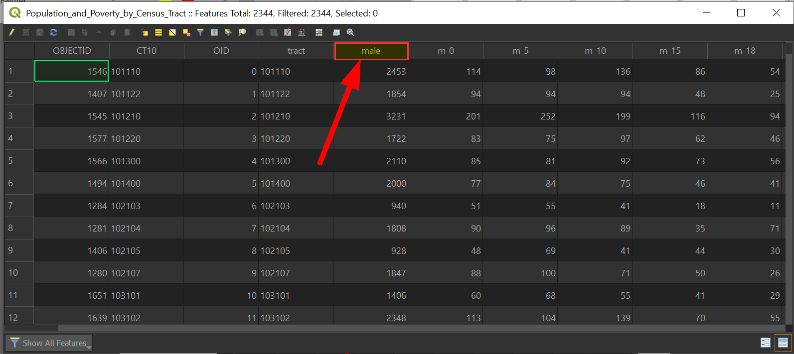
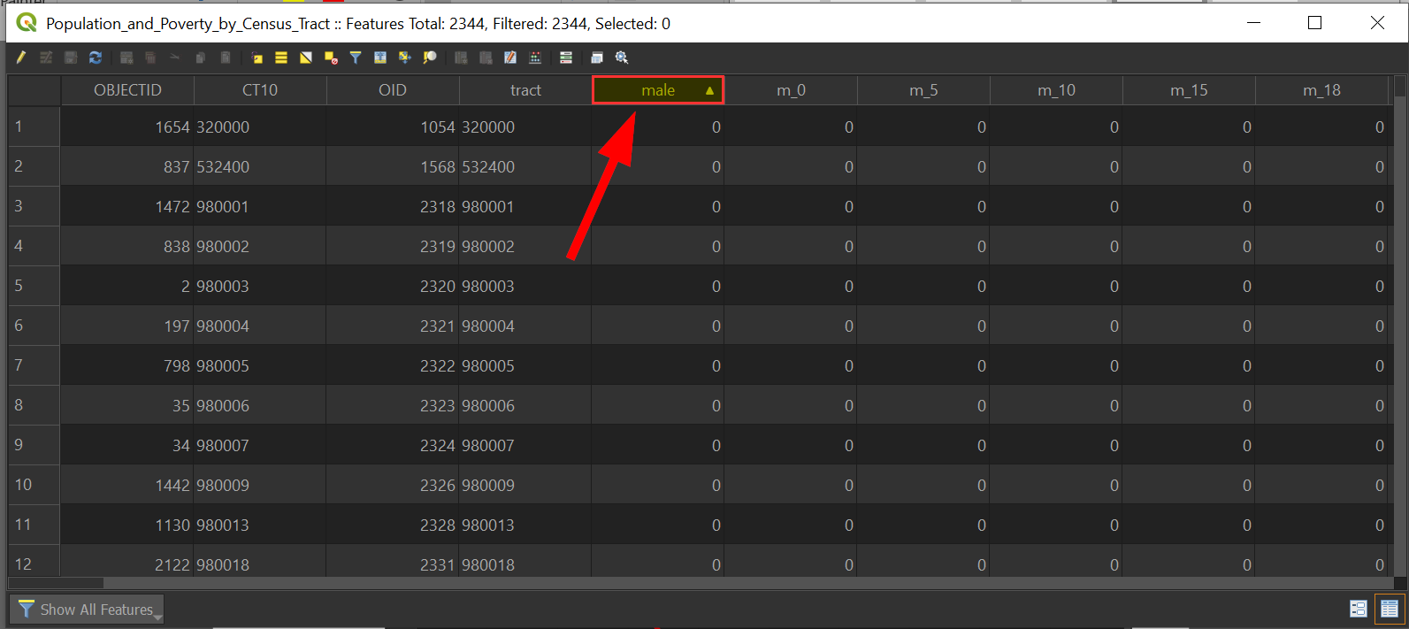
We can quickly sort the rows by the column by clicking on them, so for our query, we will click on "male":
Notice how an arrow appears and the data begins at 0 now.
-
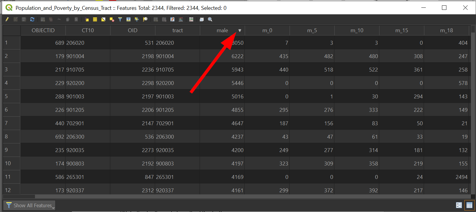
Click "male" once again to sort by descending:
-
Your data table should look like the following with the arrow facing downwards:
-
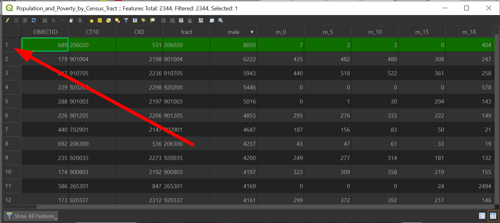
Click on the "1" to highlight that feature:
-
Check the map to see what happened:
Census tracts are small, so they are pretty hard to see, especially with these outlines! Don't worry though, we'll get to making the map prettier later. For now, let's return to answering our spatial query!
-
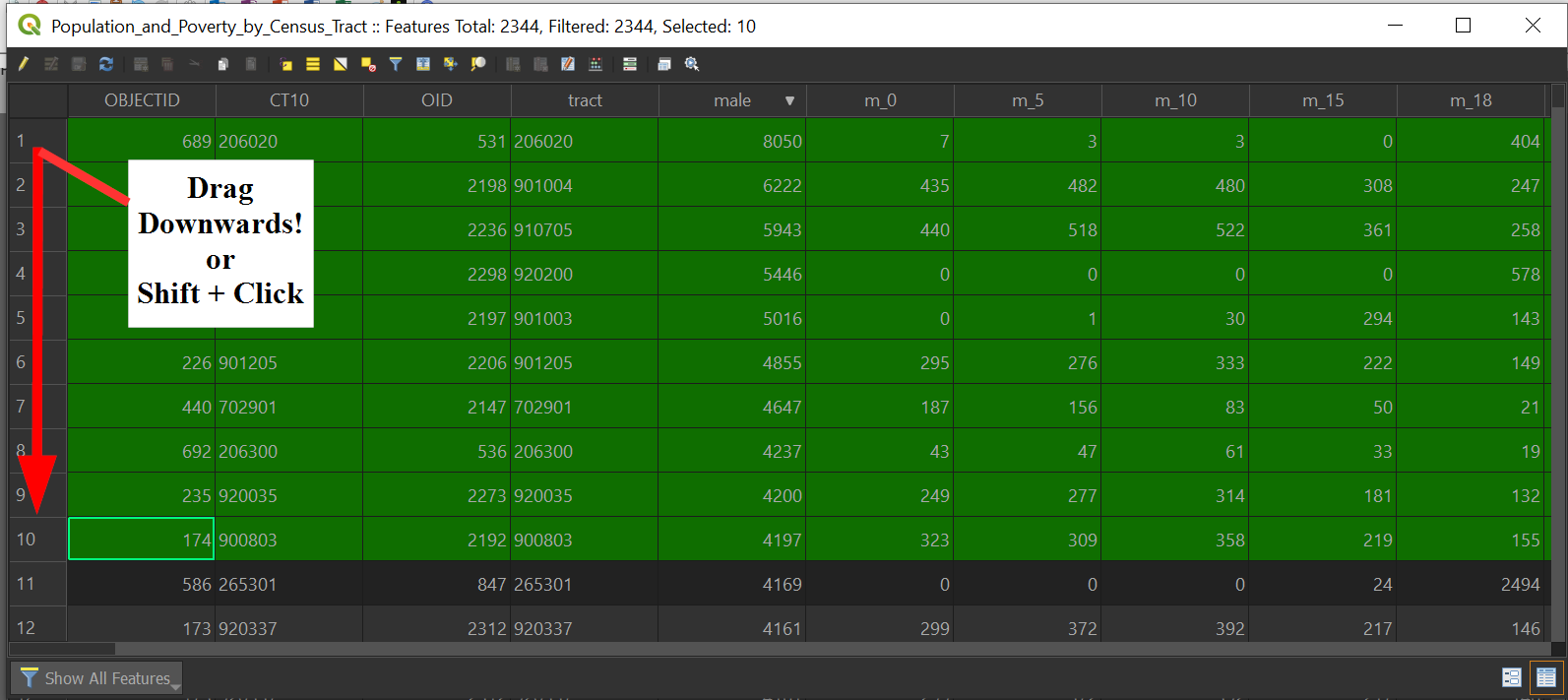
Let's go back to our table and from the "1" on the left, that down to "10", this effectively answers our question:
-
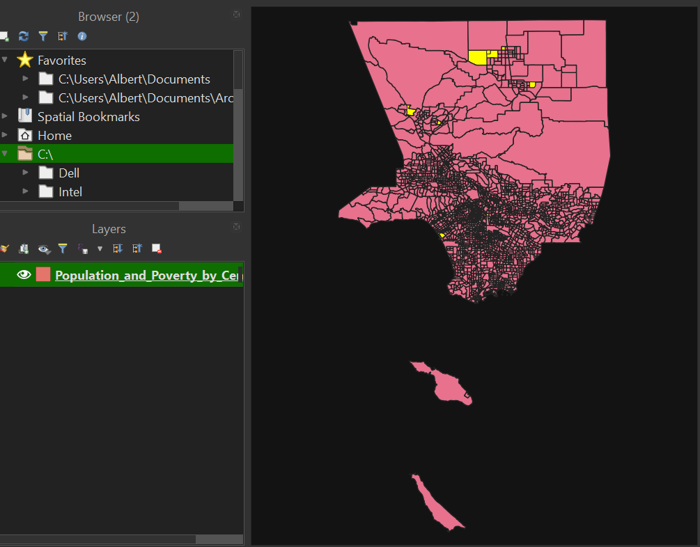
Check the map to see what happened:
-
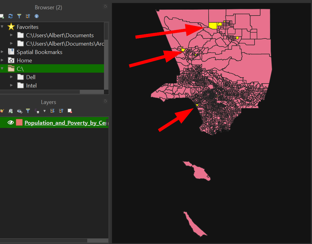
Notice that the selection of the data has also appeared on the map as yellow highlights:
-
While this method of filtering is quick, it does have drawbacks because requires scrolling through the data set.
-
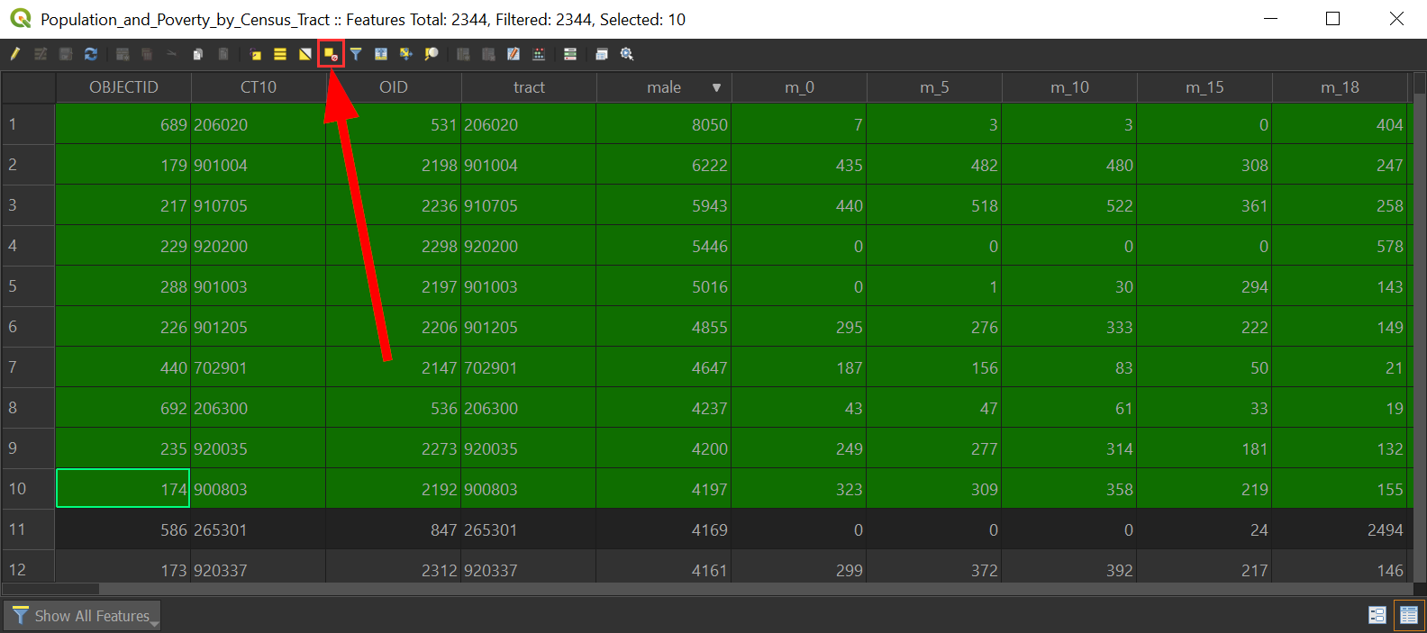
Clear our current selection by clicking on the "Clear Selection" button:
Returning to our research question, "which census tracts have more than 25% of the population living in poverty," the fields that we need for our analysis do not exist, so we have to create them!
Since, our data set only has male and female population, we can add those up to create the total population. The same applies for the population in poverty, too. In order to generate these fields, we will need to create those fields using the "Field Calculator". To create the "total population" field we need to add the male and female fields, to create the "total population under the 100% Federal Poverty Line" field we will need to add male18a and female18a.
-
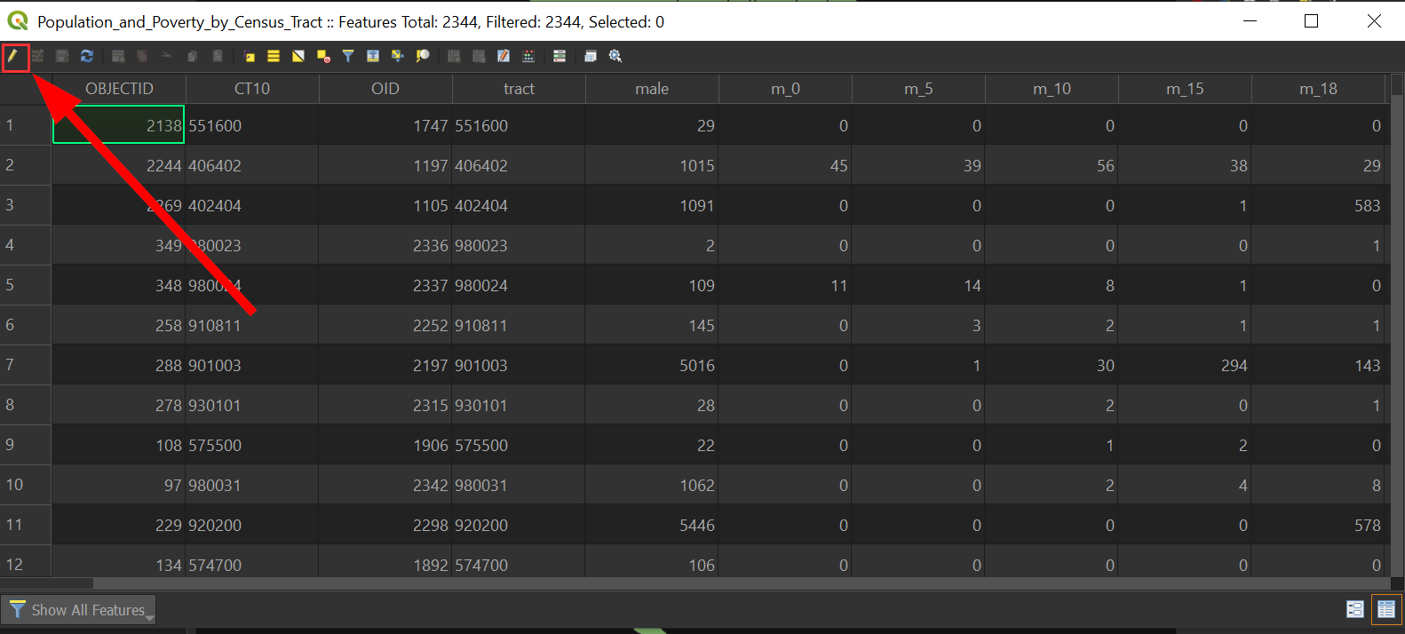
Since we are going to be editing our data, we need to toggle editing mode by clicking on the pencil icon:
-
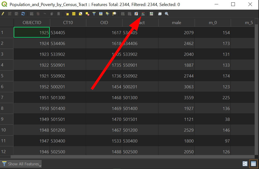
Click on "Field Calculator"
-
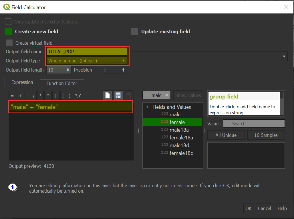
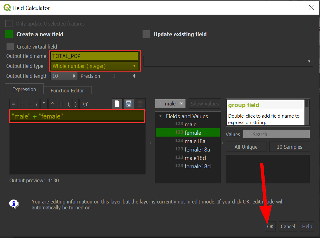
Create a new field with the following:
-
Output field name: TOTAL_POP
-
Output field type: "Whole number (integer)"
-
Expression: "male" + "female"
-
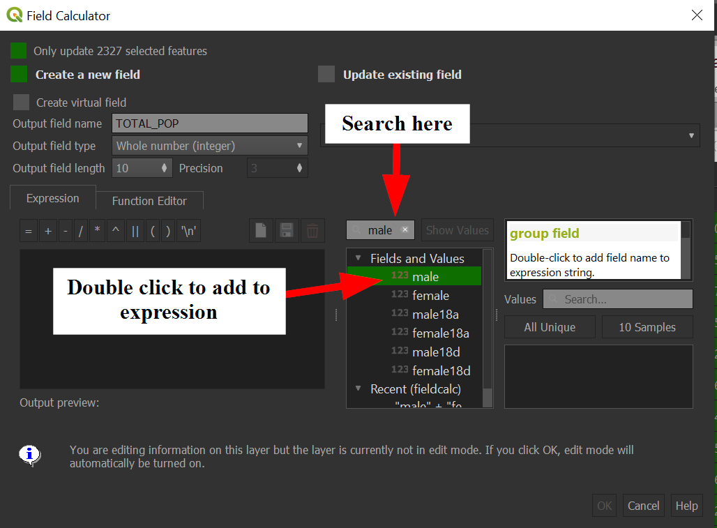
To avoid misspelling, you can type "male" in the search on the right and it will filter the fields for you, this will allow you to double click on the field to add into the expression:
-
When your fields look like the following, click on "OK" to create the field:
-
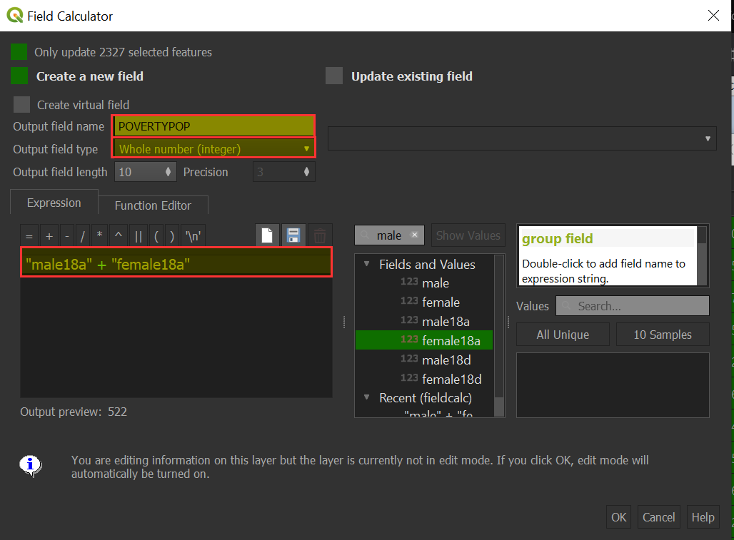
Let's add the next field called POVERTY_POP, which will be the combination of male18a and female18a:
-
Output field name: POVERTYPOP
-
Output field type: "Whole number (integer)
-
Expression: "male18a" + "female18a"
-
Recall that male18a and female18a are stated from the Los Angeles Geohub as " Population 100% Federal Poverty Level"
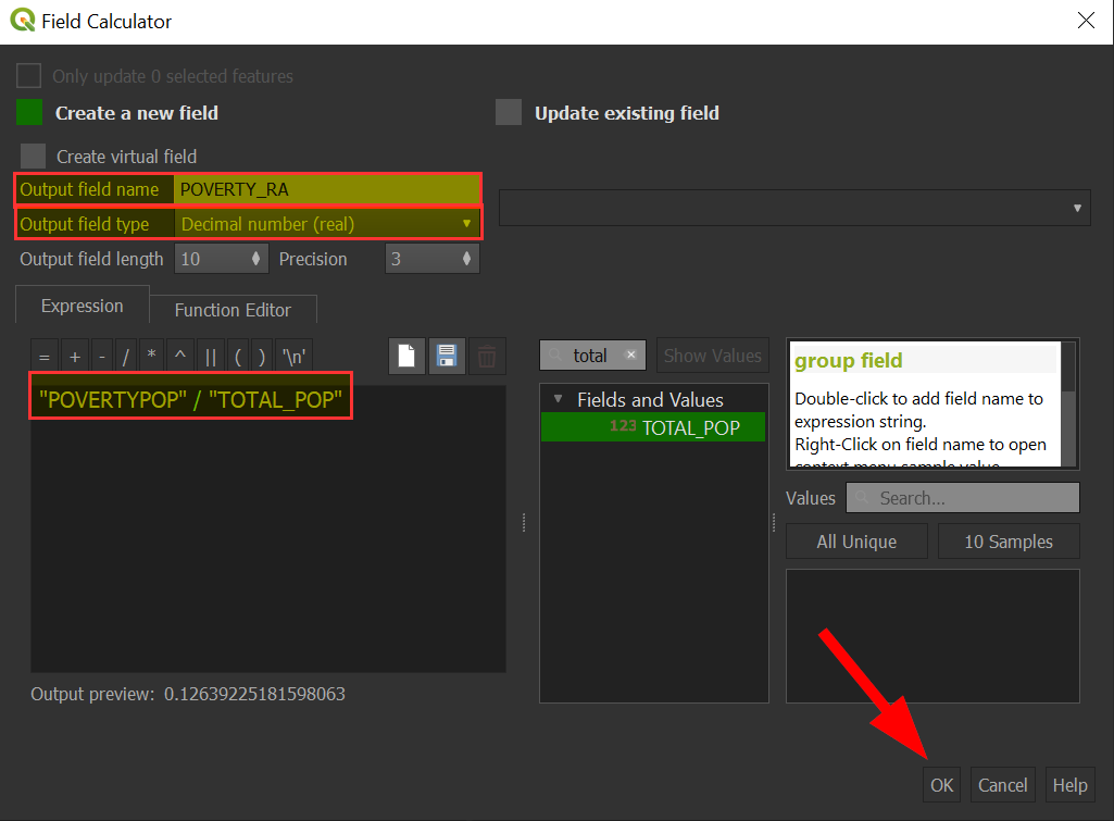
The last field we will calculate is the proportion of the population that is under poverty line which is the number of people in poverty (POVERTYPOP) divided by the total population (TOTAL_POP). The field will be called, POVERTY_RA, for poverty ratio.
-
The "Field Calculation" should look like the following:
-
Output field name: POVERTY_RA
-
Output field type: "Decimal number (real)"
-
Expression: "POVERTYPOP" / "TOTAL_POP"
-
-
Now that we have our fields ready, let's filter out Census Tracts with no population.
-
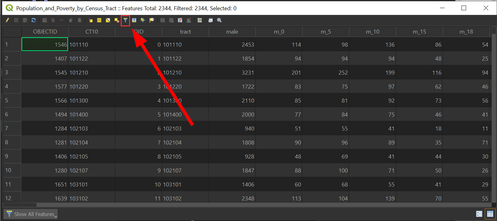
Rather than do a quick sort, locate the toolbar, and click on the filter button:
-
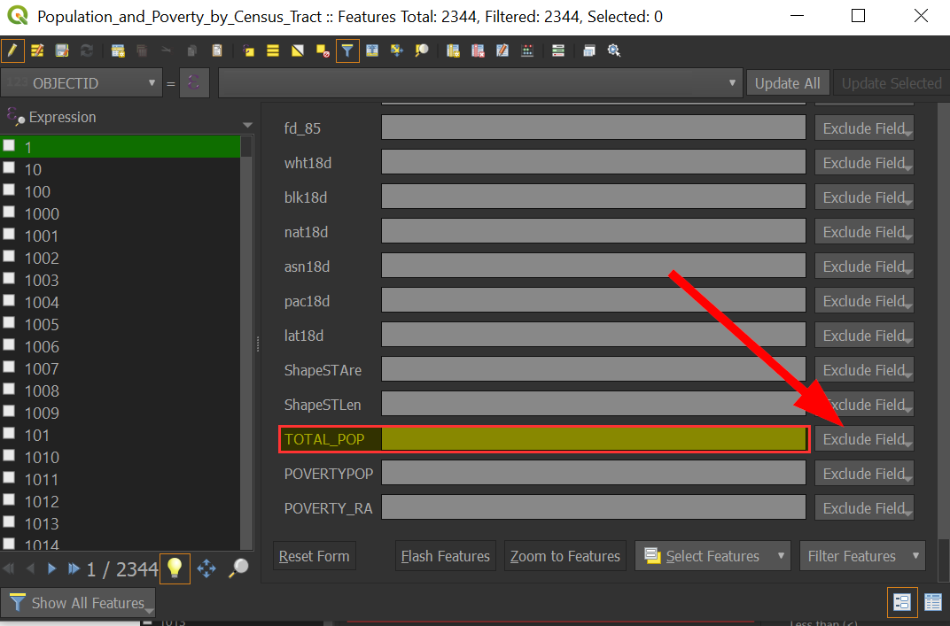
Scroll down to the total population field we calculated, "TOTAL_POP"
-
Click on "Exclude Field" next to "TOTAL_POP":
-
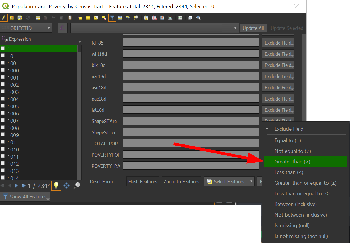
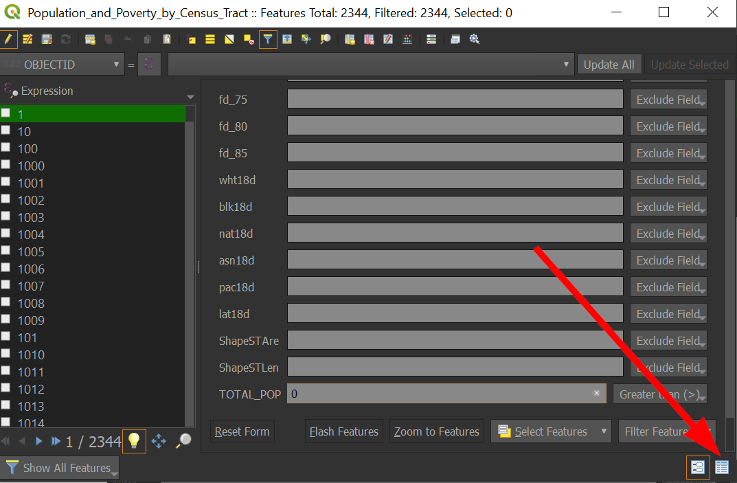
Change it to "Greater than":
-
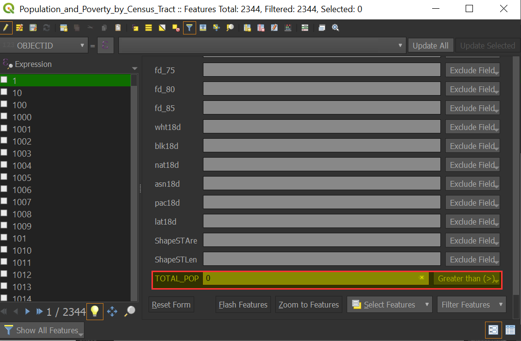
Next to "TOTAL_POP", enter "0":
-
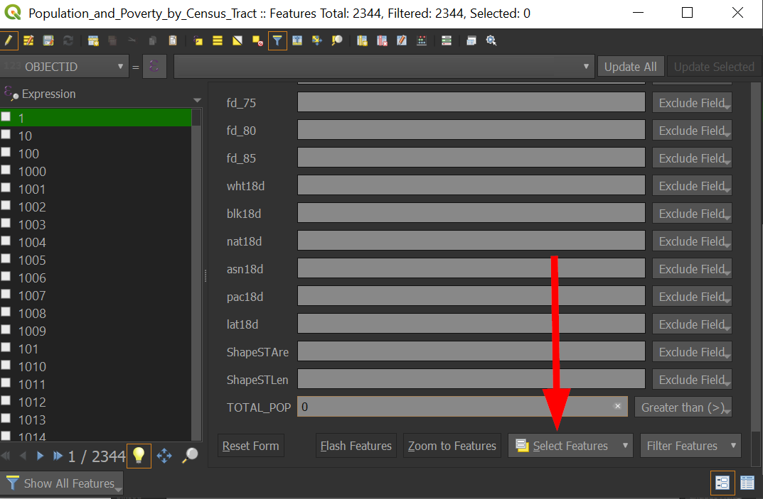
Scroll to the bottom of the window and choose "Select Features"
-
Select the table icon to return to the table view:
-
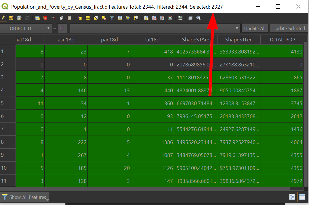
Notice that the "Selected" on the top has changed to reflect the number of records selected:
-
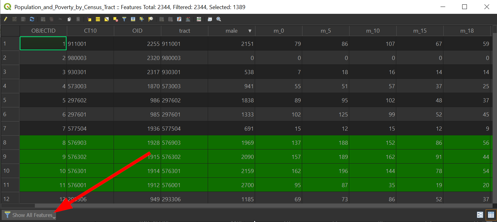
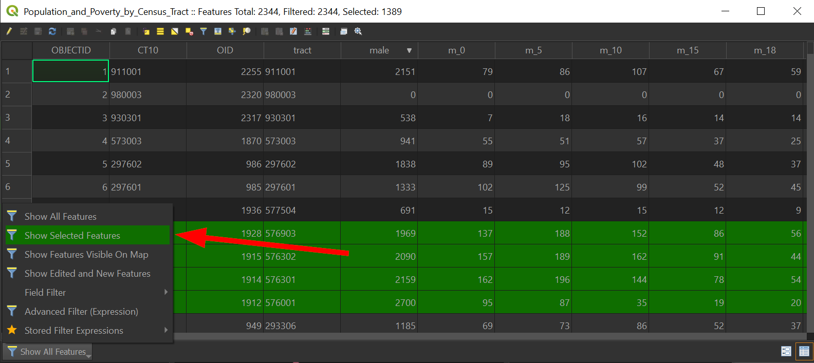
You can view only selected records by clicking on the lower right and going to "Selected Records".
We can save the records we selected! In doing so, we can save it as a shapefile (a spatial data type) or as a CSV file (a non-spatial dataset) that we can use in other software.
-
With the records still selected, right click on the "Population_and_Poverty_by_Census_Tract" layer:
-
Click on "Save Selected Data Set as..."
-
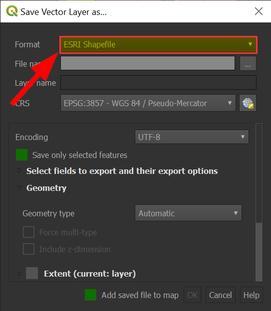
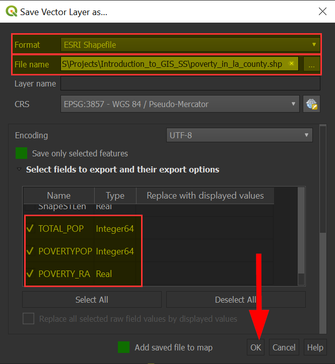
Choose the "ESRI Shapefile" format:
-
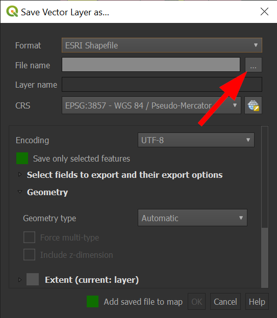
For File name, be sure to click on the "..." and save your file in an accessible location.
-
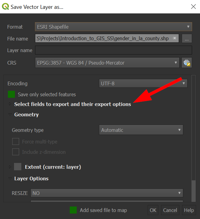
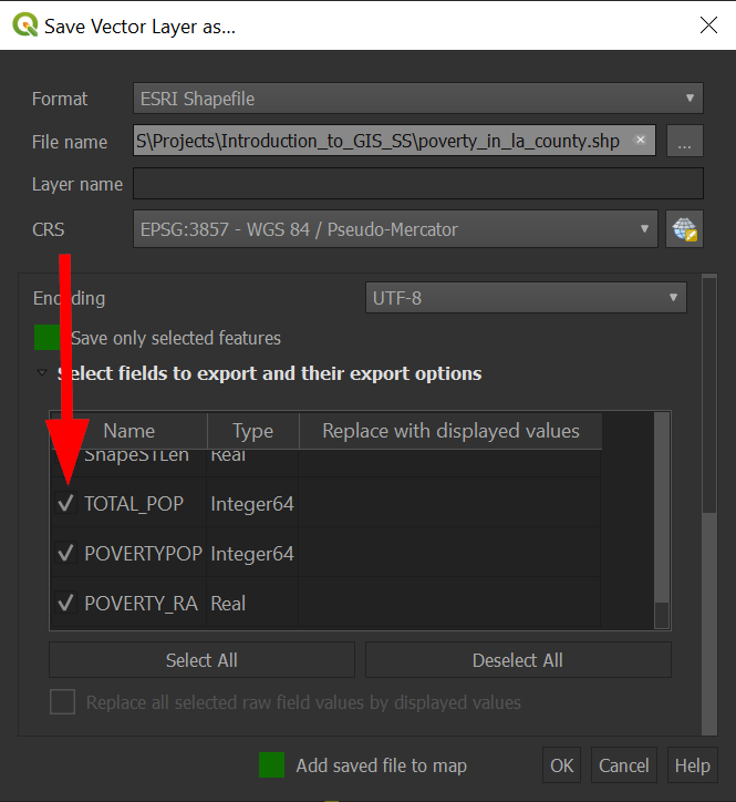
Click on "Select fields to export and their export options"
-
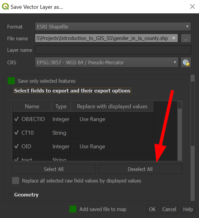
Click on "Deselect all" so no columns are selected:
-
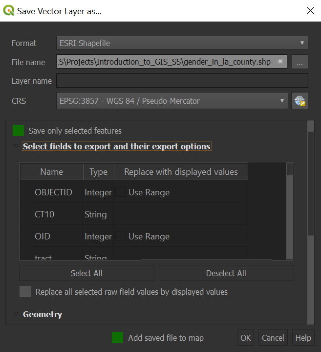
All the checkmarks to the left should disappear:
-
Now click the small box to the right of the fields to "check" them for exporting.
-
When complete, click on "OK" to save the file:
Non-GIS programs will have a hard time working with shapefiles, and the most basic data file is a text file, so we should also know how to save files as a CSV!
-
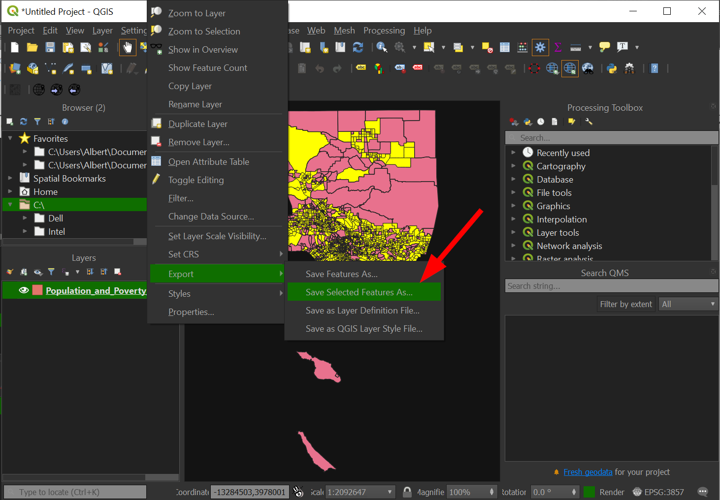
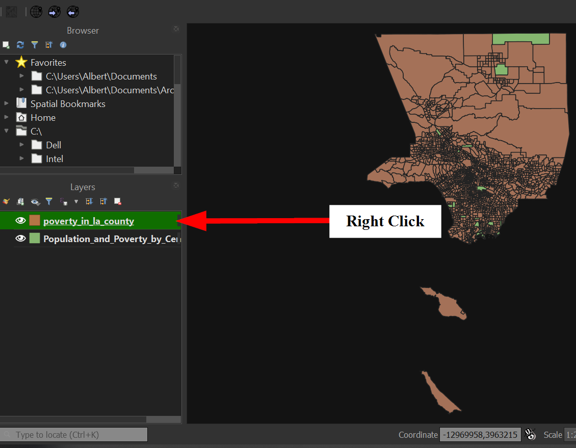
Right click on the new layer we created, "poverty_in_la_county".
-
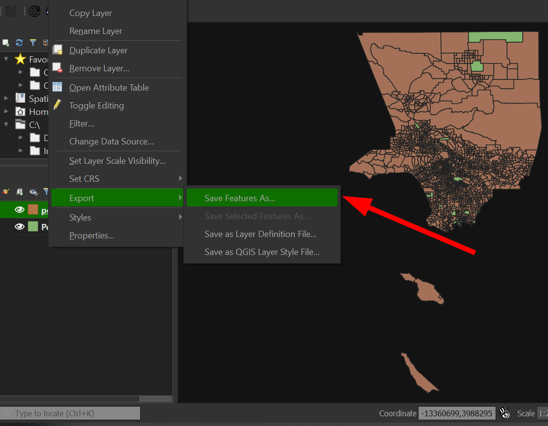
Go to "Export" >> "Save Features As.."
-
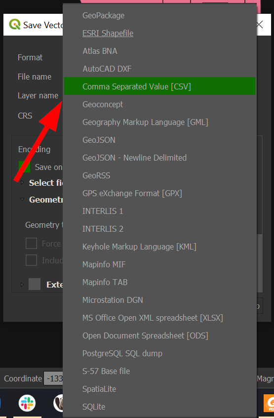
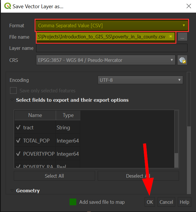
For Format, choose "Comma Separated Value [CSV]":
-
Save the file in an accessible location and click "OK":
-
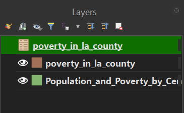
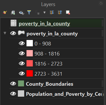
Your "Layers" panel should look like the following:
-
Great! Now we know how to save a spatial and non-spatial file type!
-
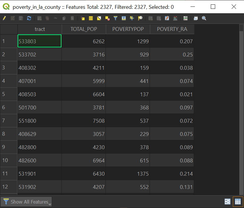
We can open the attribute for both files in our data layers, and doing so for the "poverty _in_la_county" gives the following window:
Now that we can export our layers and trim out extra fields, this makes working with large and complicated data sets a little more manageable when we are deciding to style our map! Imagine having to constantly scroll through a list of 20 fields each time you want to change how your map looks!
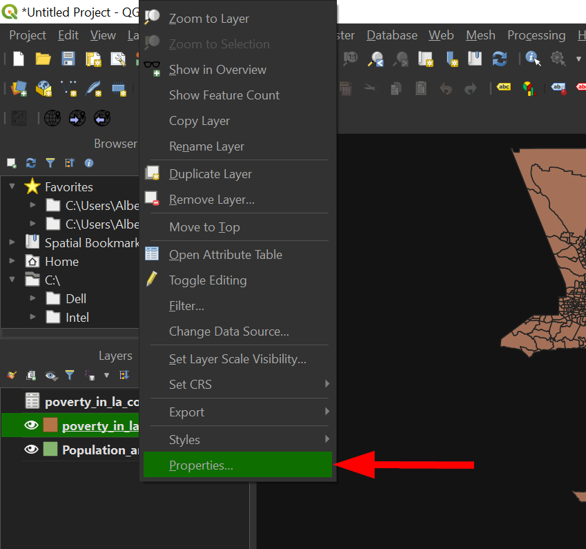
-
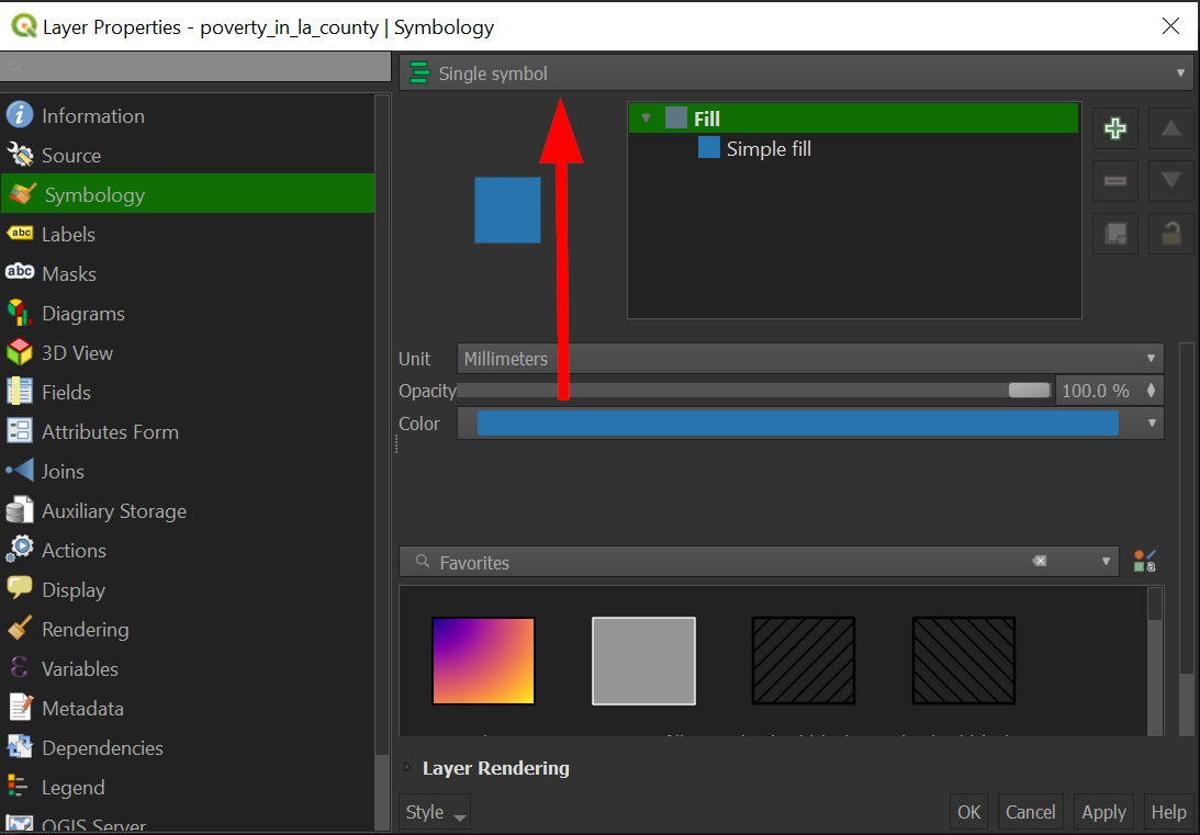
Right click on "poverty_in_los_angeles_county", and go to "Properties":
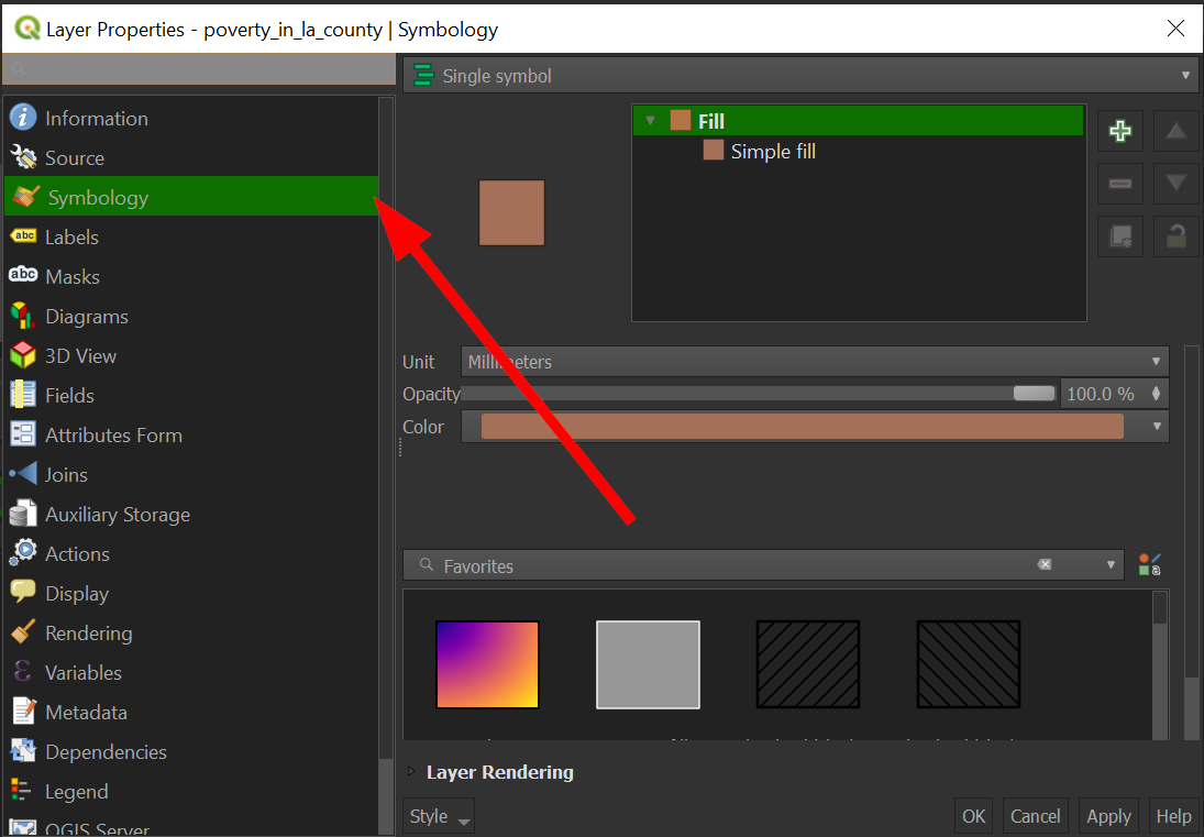
-
On the navigation panel in the properties window, click on "Symbology"
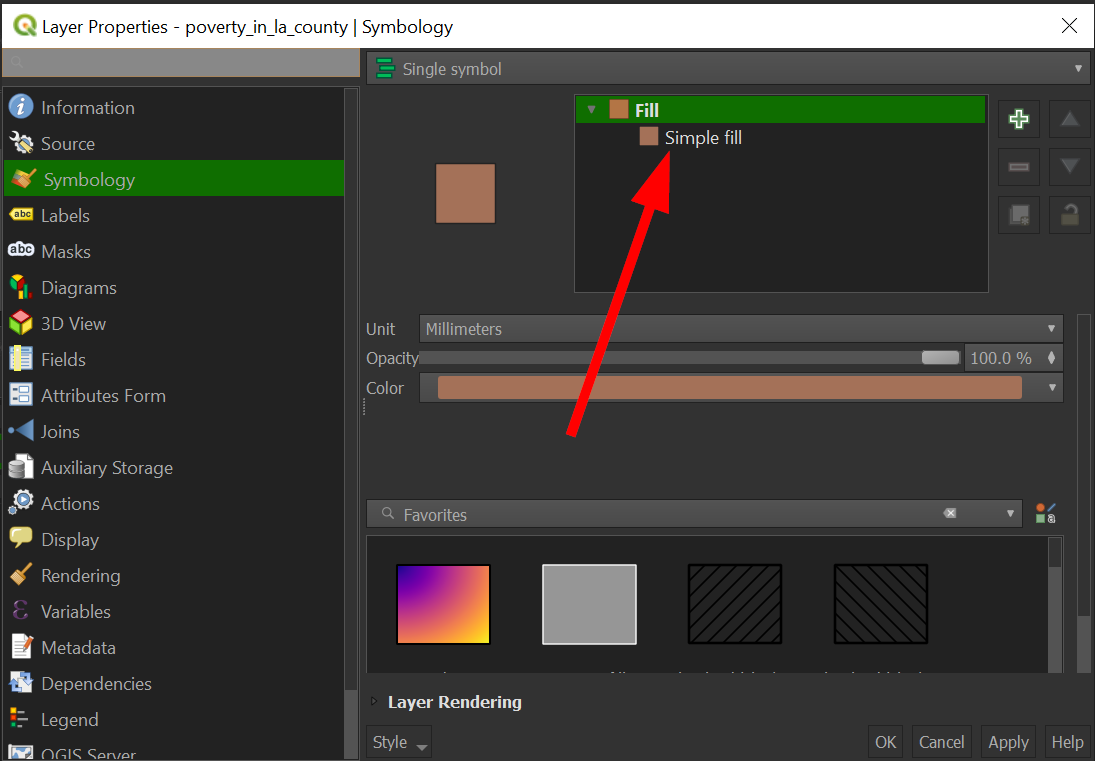
-
Click on the "Simple Fill" to open more options:
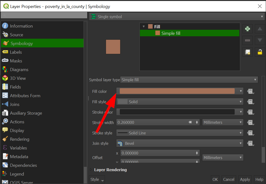
-
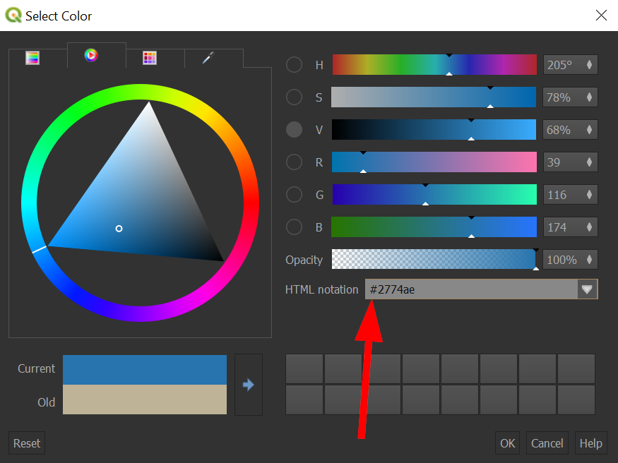
Click on "Fill Color" to open a color picker:
-
Under "HTML notation" put the following "#2774AE":
-
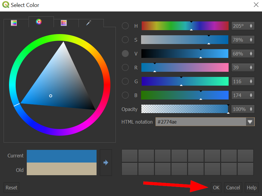
Click "Ok"
-
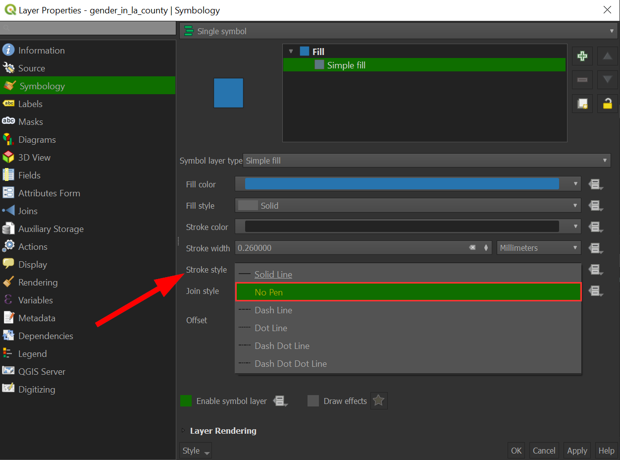
Outlines are not very helpful when we are zoomed out and have many small features, so we will remove them, by clicking "Stroke Style" and then choosing "No Pen":
-
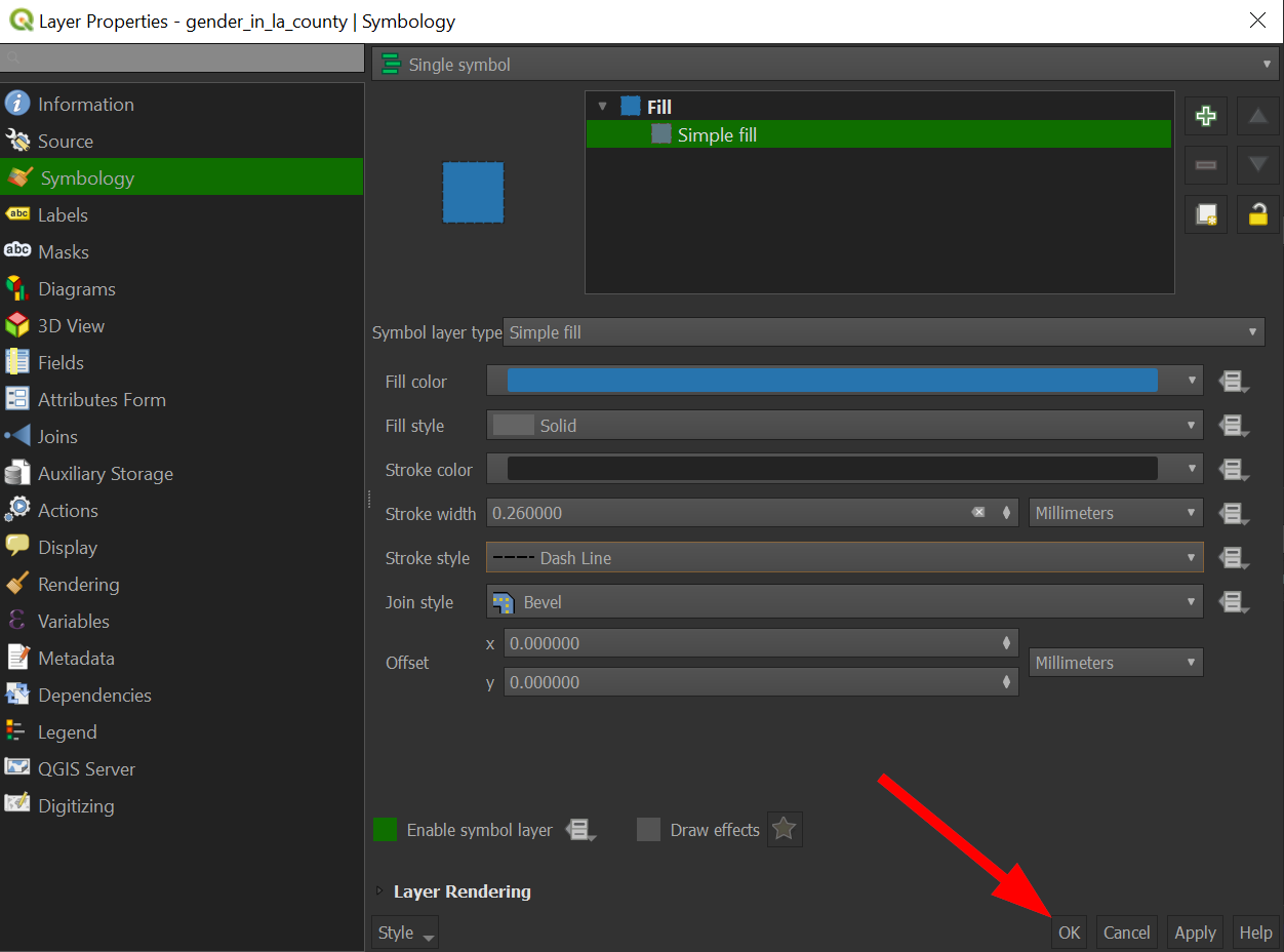
Click "OK" to apply the changes to the map:
-
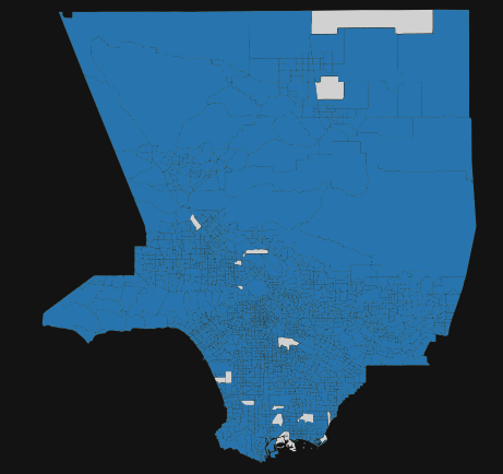
The map should like something like this:
Exercise #2
Let's apply what we learned and change the symbology of the bottom layer.
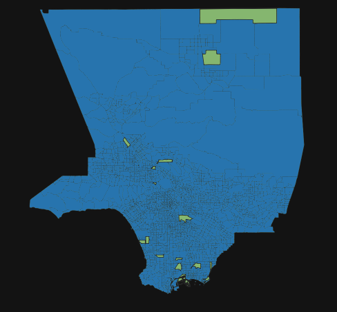
If your map looks the like following, great! I opted to show places with no people as "white".
You successfully were able to apply what we just learned! Our map shows us places where there are people living in Los Angeles County, but we can do more and show what the distribution looks like by applying a colored scale on our maps (also known as a choropleth).
Choropleth maps vs. Categorical maps
A choropleth map uses a colored ramp to style to map, typically having different shades of one color and only works for data that is numerical. A categorical map uses categorical data, often stored as text fields, to style a map. A categorical map has vastly different colors for values, and not shades of one color. This is because categorical data, like name, language spoken, religion, etc. does not have a numerical association. For example, if someone were to ask you, "what is the average, median, and mode of city name" and map it, you would most likely be confused. You could try to convert the categorical data and get a count of "city names", but to actually treat city name as a number, is not possible. Similarly, GIS software does not even allow you to select Text (string) fields when using the graduated symbolization option.
We will start our choropleth exercise by mapping the distribution of poverty in Los Angeles County in census tracts.
-
Go back to the "Symbology" setting, by going to "Properties" >> "Symbology"
-
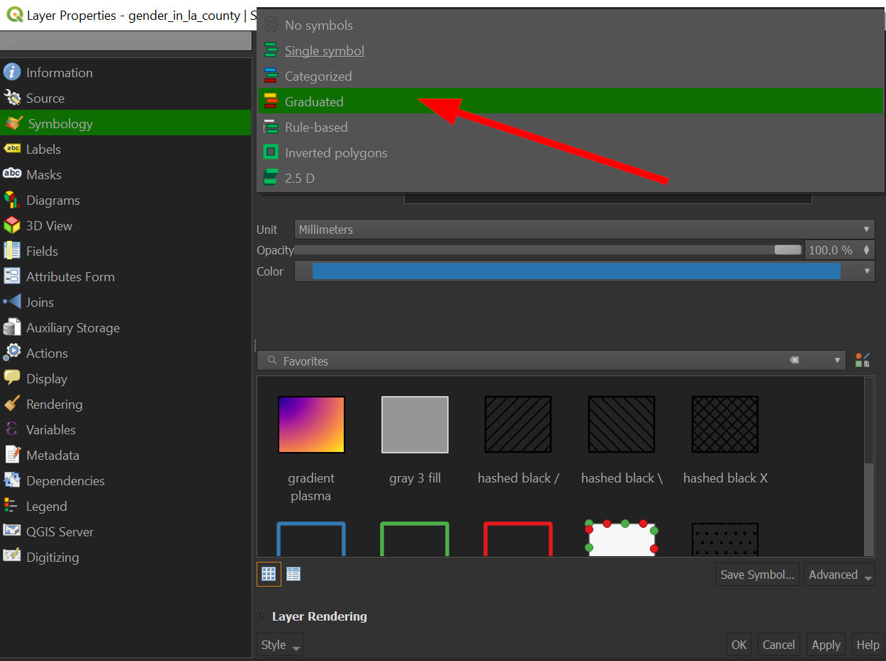
Click the dropdown where it says, "Single Symbol" and choose "Graduated":
-
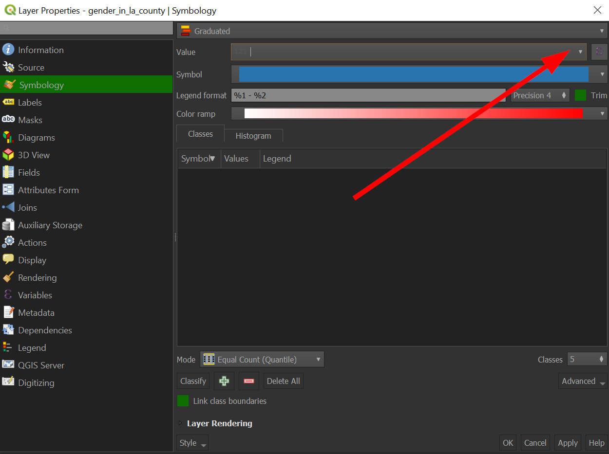
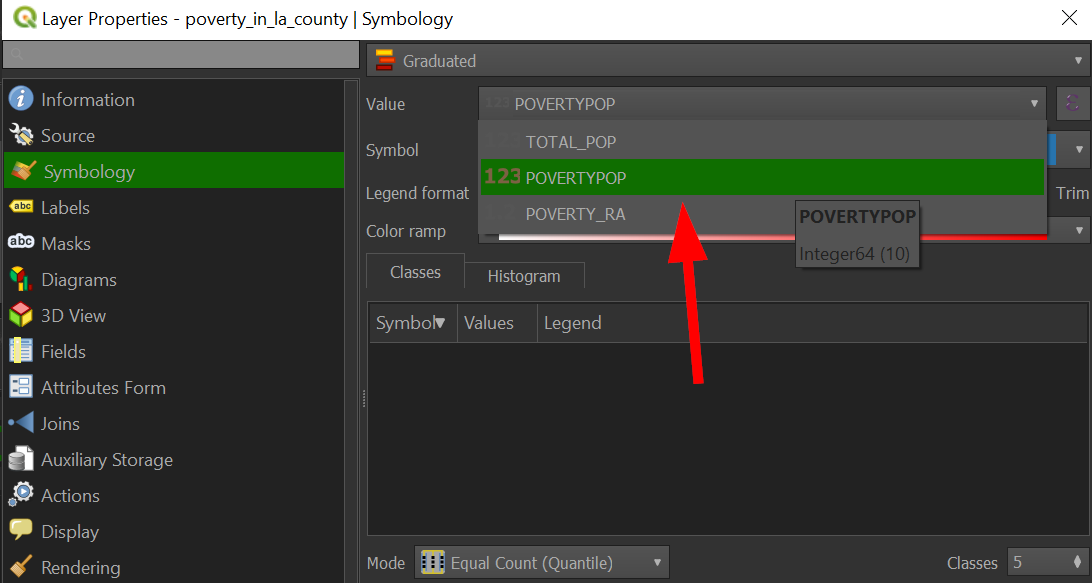
Under "Value", click the dropdown arrow and choose "POVERTYPOP":
-
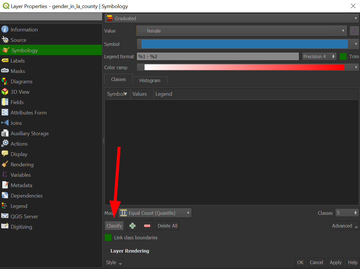
Nothing has changed yet, so click on "Classify":
-
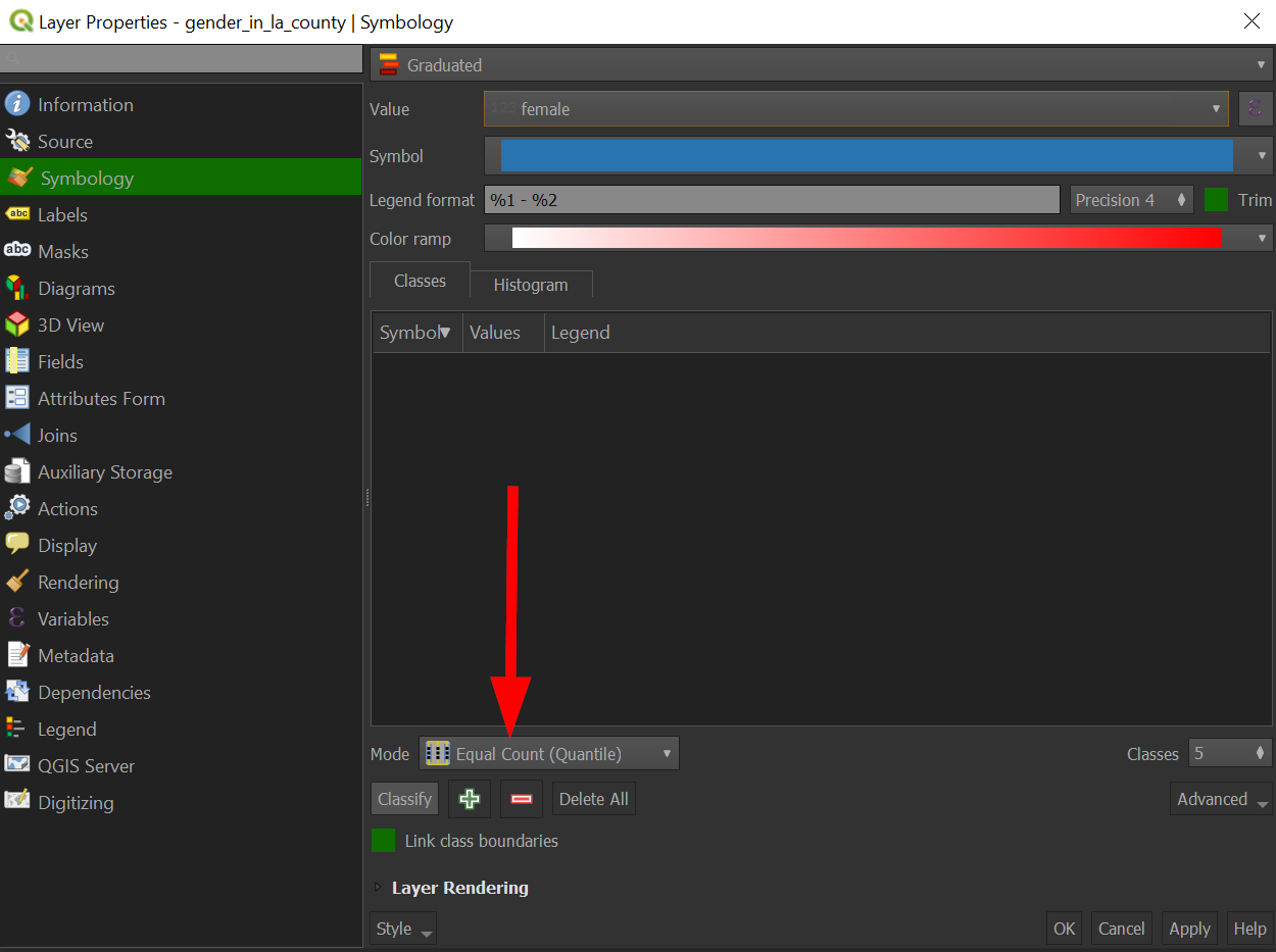
By clicking classify, we classified the numerical data based on the statistical mode shown here:
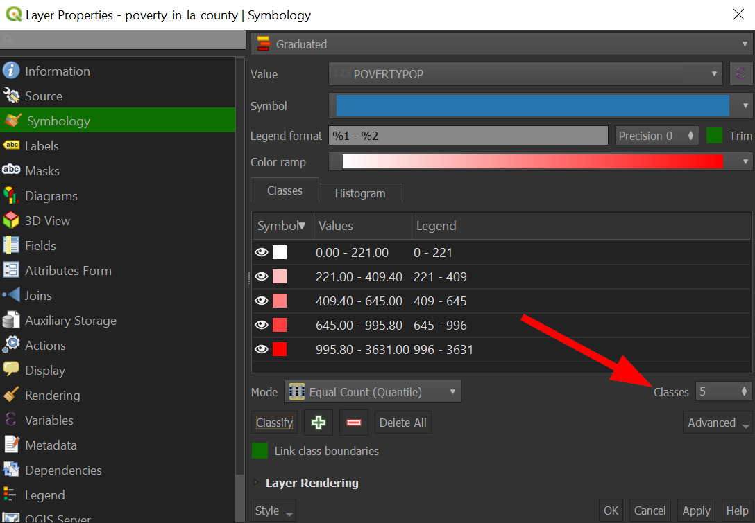
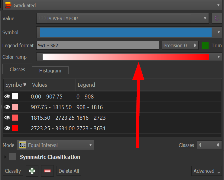
You can click on histogram to get a better sense of how the data looks in order to choose a more appropriate classification mode, but for now let's draw our attention to the number of classes, which is 5. With a graduate color scheme, each class gets its own color and so, it is not usually a good idea to go higher than 5.
-
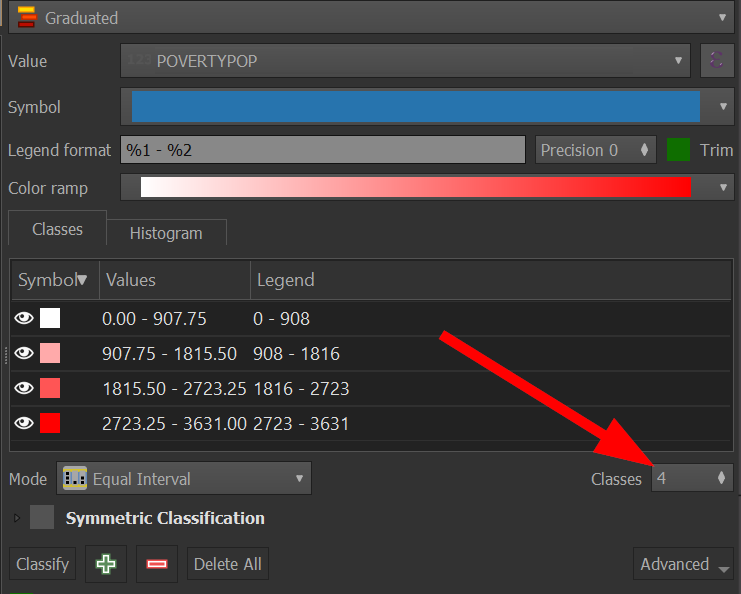
Go to "Classes" near the right side:
-
My preference is to stick with 4, which draws more attention darker and lighter areas better.
-
Side note: you can change the color ramp, by clicking on it:
-
When editing the color ramp, you can choose the two colors that make up the ramp, and here is some basic advice in doing so:
-
Stick with one primary color if you are showing data that doesn't have negative values, like poverty.
-
Choose two different primary colors if what you are showing does have negative values, like population growth.
-
The more classes you choose, the harder it will be to distinguish them from each other.
-
Pay attention to color blindness! A good website to help with choose a color-blind friendly color scheme is: https://gka.github.io/palettes/
-
-
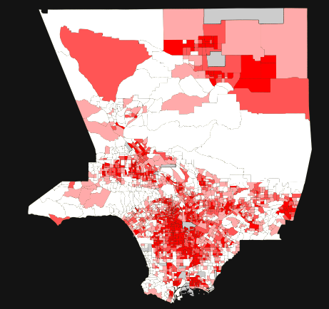
Click "OK" and our map should look like the following:
-
What happened? Our map now has more details about where poverty is concentrated in Los Angeles County.
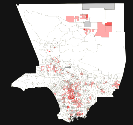
To get a sense as to how drastic the statistical methods affect the map, let's change the data to "equal interval" and see what happens:
Exercise #3
Use the "equal Interval" classification method to map the data
The resulting map should look like the following:
Now we will turn our attention to the County_Boundaries-shp zip we downloaded earlier!
-
Outside of QGIS, unzip the "County_Boundaries-shp" file
-
Return to QGIS, and add the "County_Boundaries.shp" as a vector layer to our project.
-
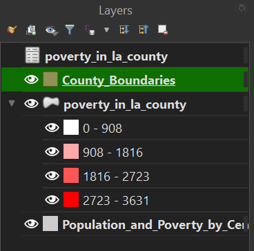
Your layers should look like the following:
-
Drag "County_Boundaries" below the "poverty layer" so that the larger counties do not cover all of our data.
-
Right click on the "County_Boundaries" layer to go to "Properties"
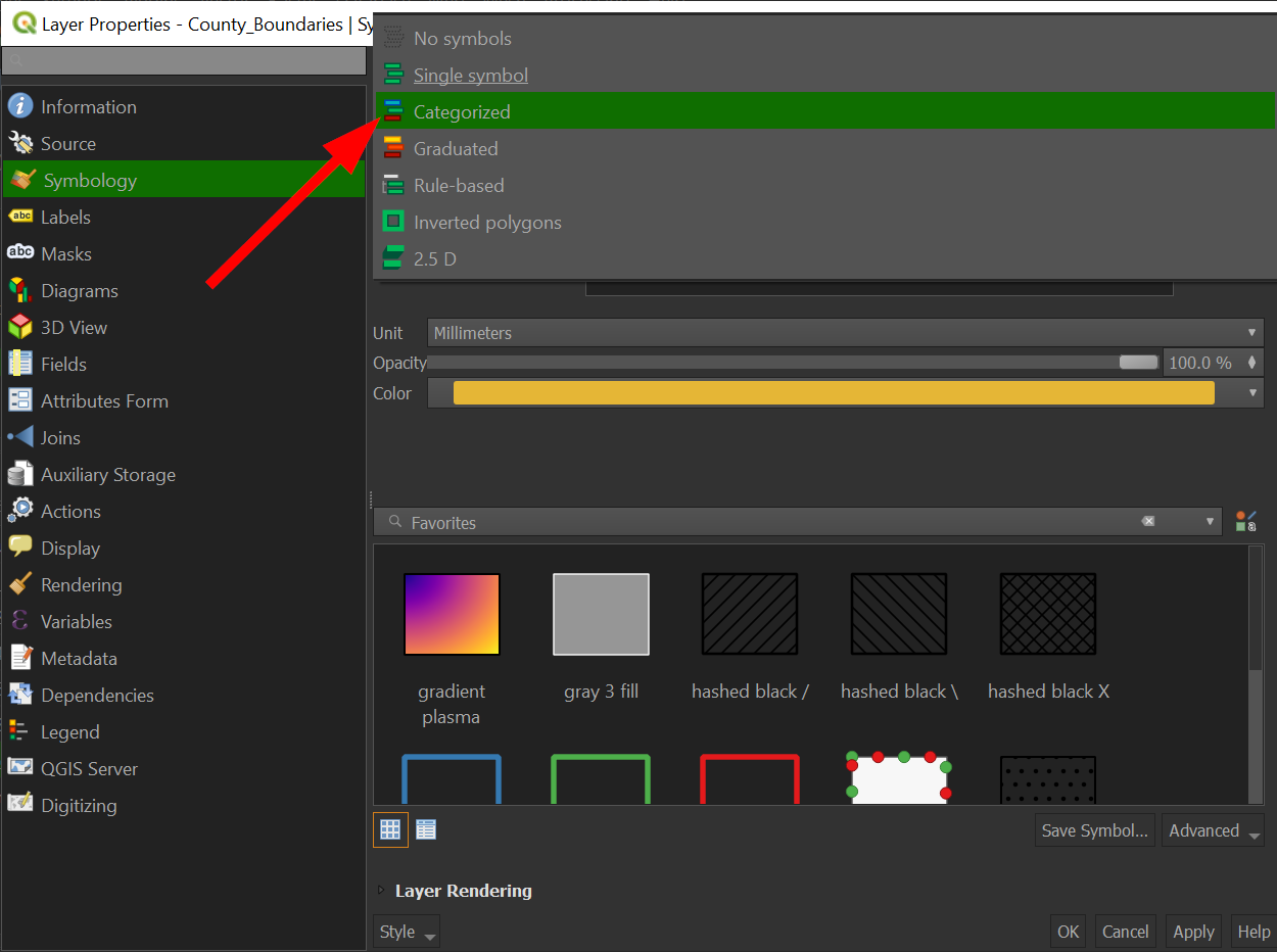
-
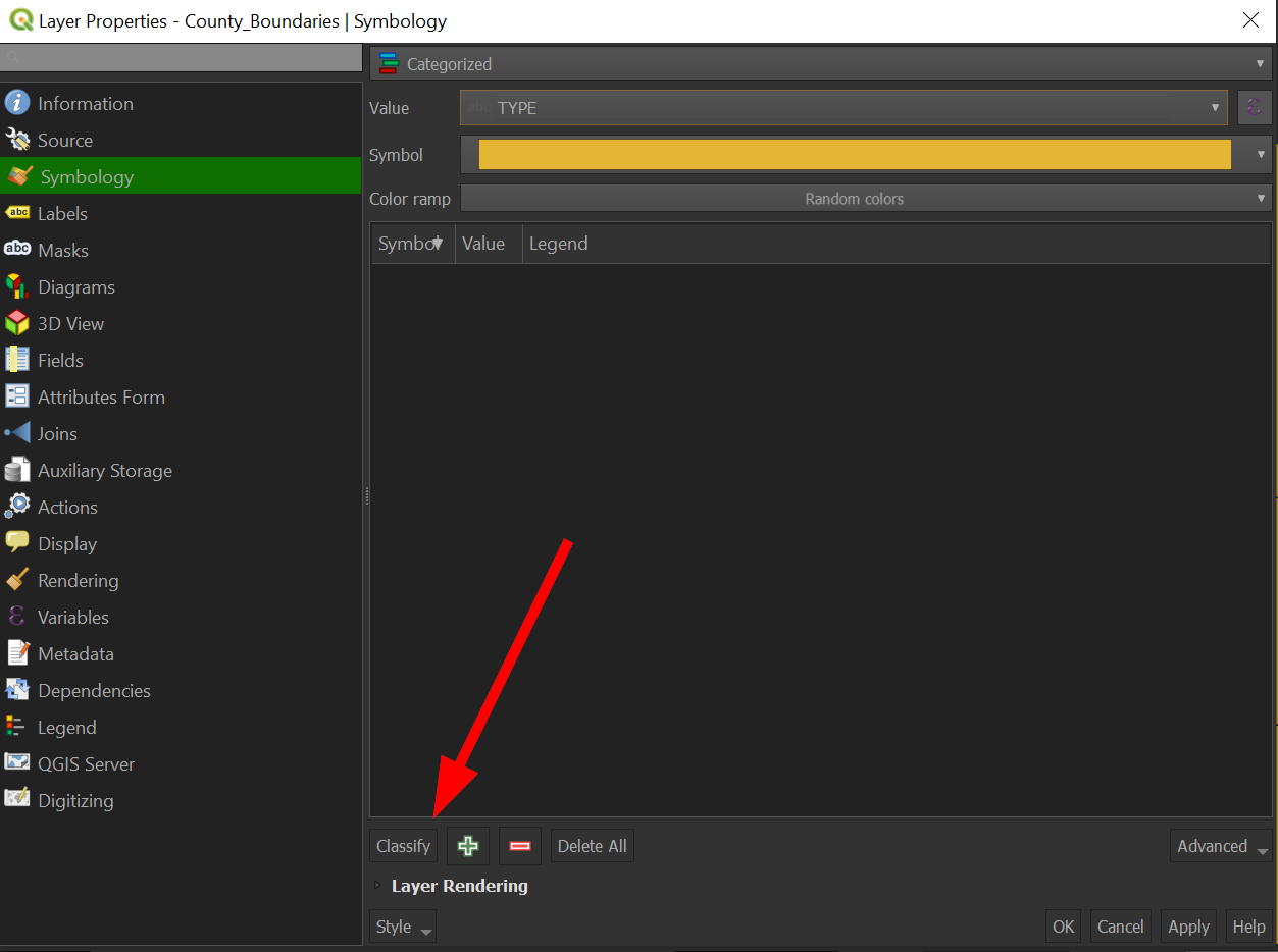
Click on "Symbolize" and this time, switch from "Simple Fill" to "Categorized"
-
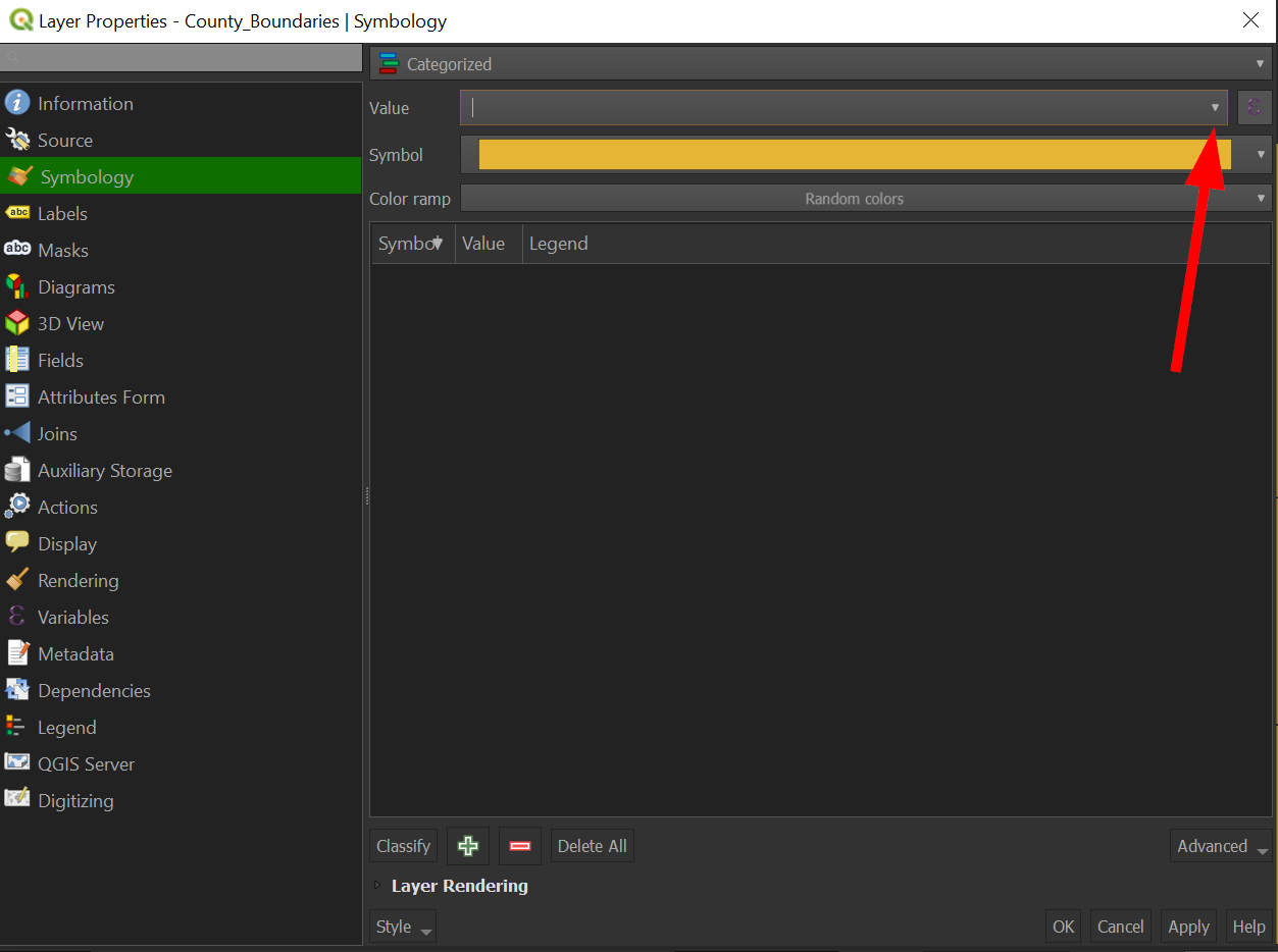
Click "Value":
-
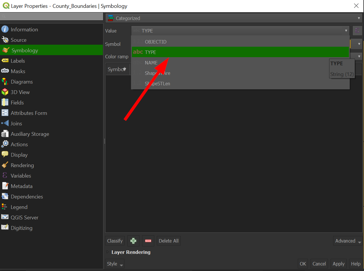
Choose the field "Type":
-
Click "Classify"
-
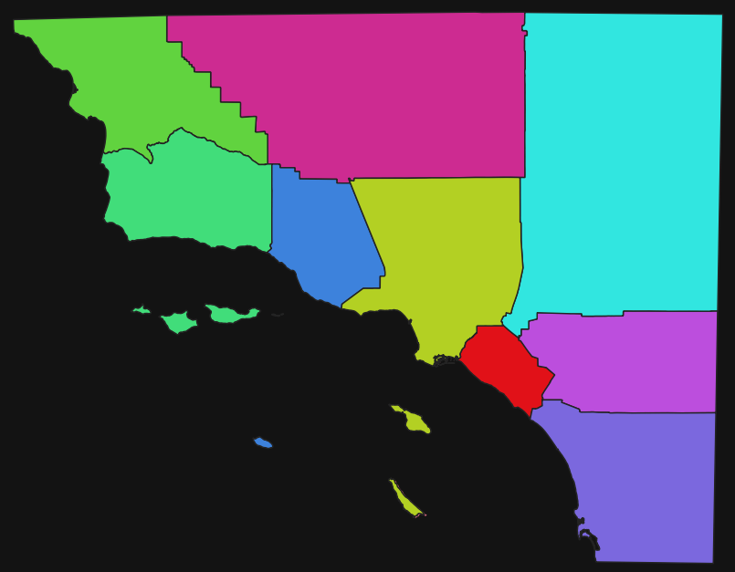
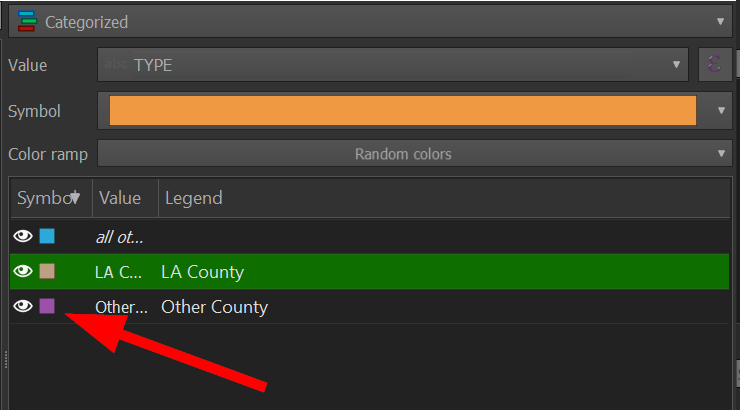
Notice how the colors are randomized:
-
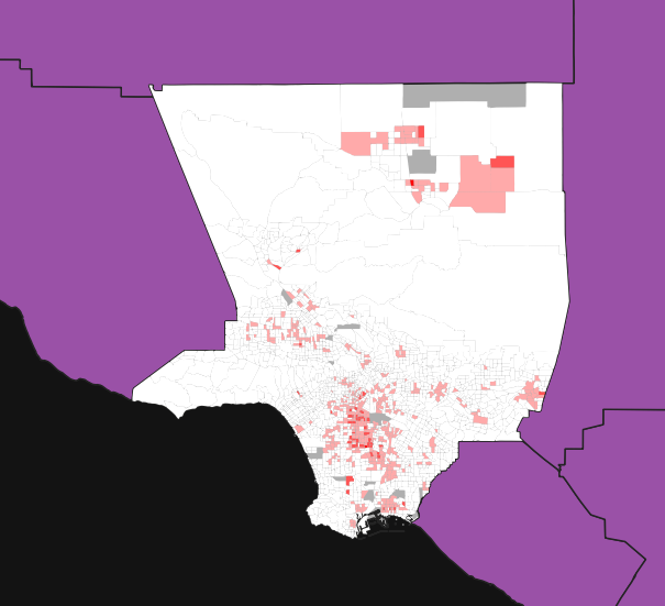
Click "OK" to apply the changes to the map and it should look like the following:
-
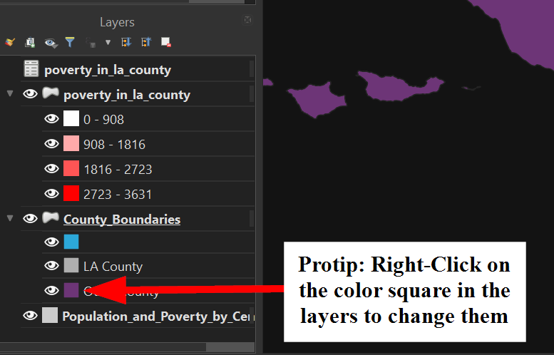
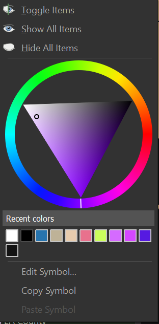
The purple is a bit jarring, let's quickly change the color by right clicking on it in the layers panel:
-
The color wheel should show up:
-
Congratulations! You've successfully completed a categorical map!
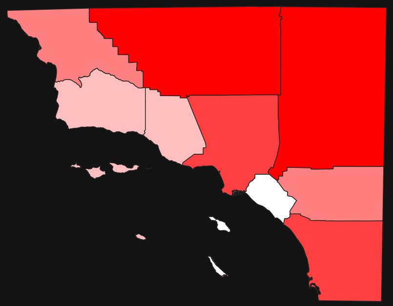
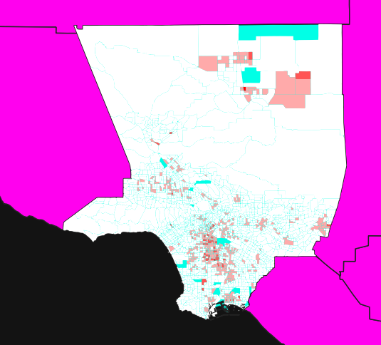
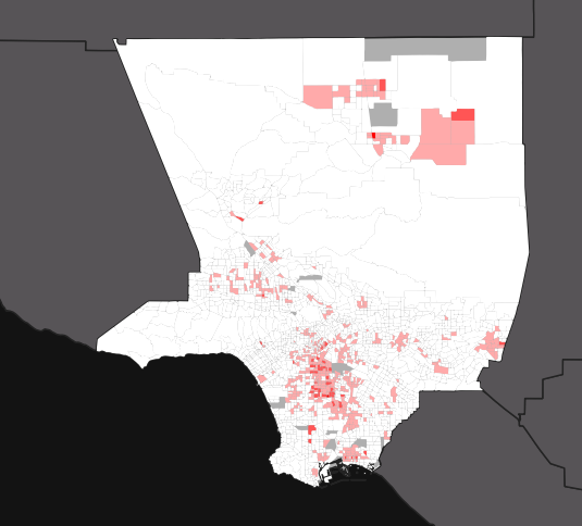
Feel free to change the color for the "Other County" as well. When choosing colors, it is important to bear in mind that a map with no visual hierarchy will be hard to understand. Visual hierarchy is the concept that important things are easier to see than less important things. Take for example these two versions of the map we just made:
One example of poor visual hierarchy is when the background map has more vibrance than the main focus of the map, such as the one on the left side.
Final Exercise!!
The time has come to put our skills to the test and answer our initial research question. Return to the "poverty_in_los_angeles_county" layer and use the "POVERTY_RA" field to see the ratio of poverty to people in Los Angeles.
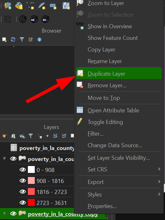
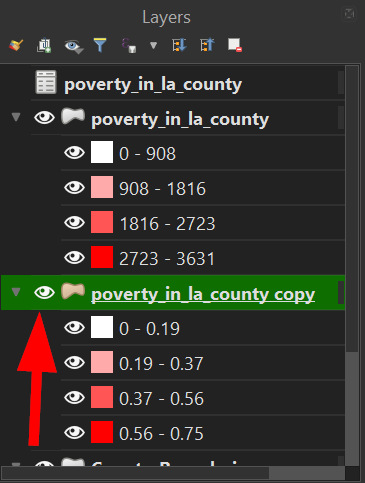
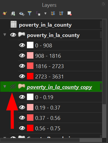
If you like the map you currently have, you can duplicate the layer and hide it while you work on another one, by right clicking on the layer and choosing duplicate.
The copied layer will automatically be hidden, so click the "eye" icon to unhide it, the same functionality of hiding and unhiding works on all map layers.
-
Filter "POVERTY_RA" to be "Greater than or equal to" .25
-
Export those selected values
-
Symbolize the values using graduated color scheme and the "POVERTY_RA" field.
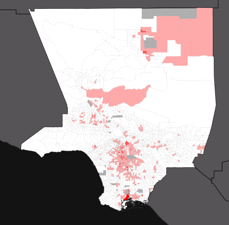
If the field has been successfully changed, then we should be able to see which areas in Los Angeles County have more than 25% of people living under the Federal Poverty Line:
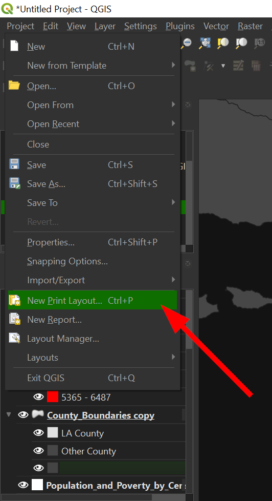
Now that you have a map you are proud of, the time has come to open up the "Print Layout" which is the QGIS way of styling the map with text, legends, and other cartographic goodness.
-
Go to the "Toolbar" >> "Project" >> "New Print Layout"
-
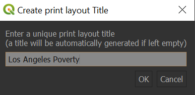
Give a name for your layout in the new window, "Los Angeles Poverty"
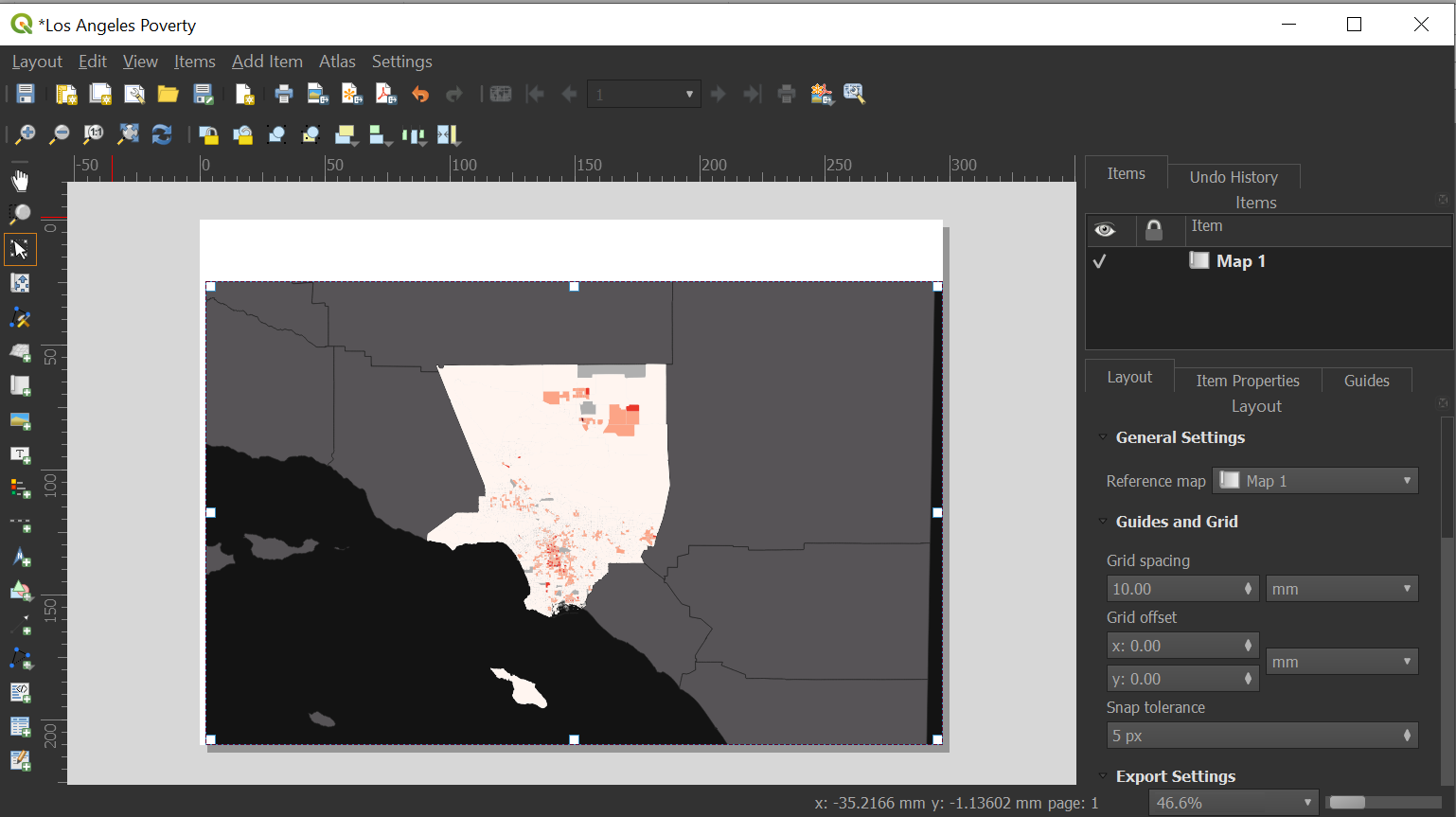
-
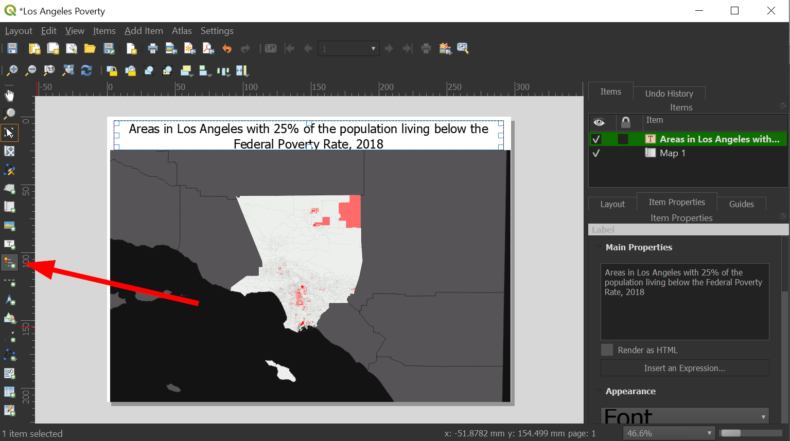
Another window will appear, and since we are mainly authoring a map, let's add that first by clicking the "Add Map" button on the right side:
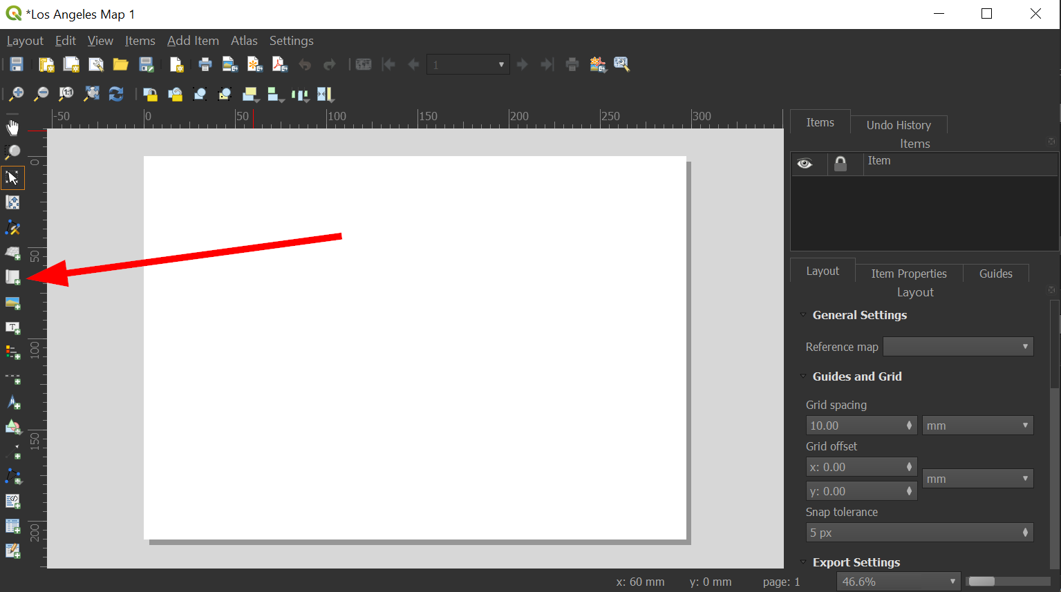
-
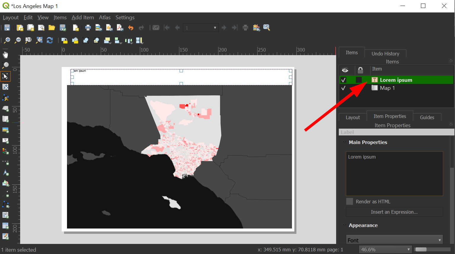
Click the "Text" button to add some text that will serve as our title:
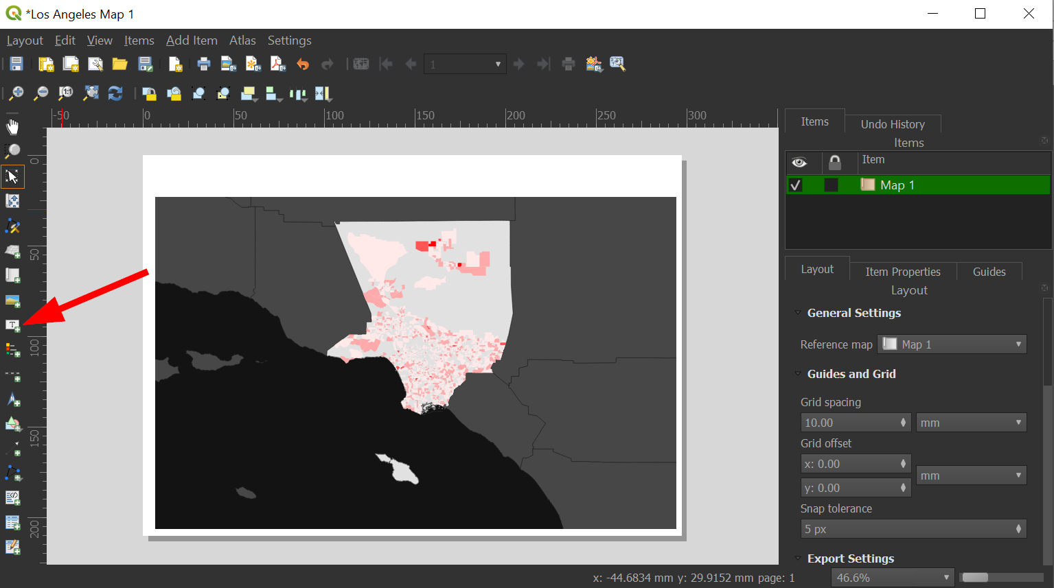
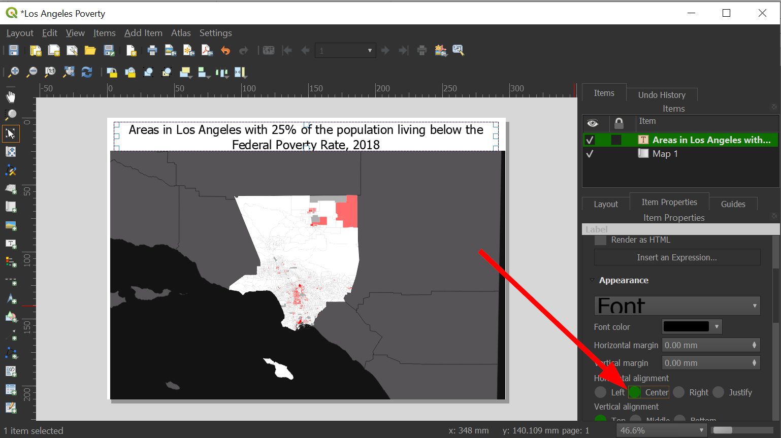
Our title will be, "Areas in Los Angeles with 25% of the population living below the Federal Poverty Rate, 2018"
-
Under "Appearance" scroll or click the arrow to change the font size:
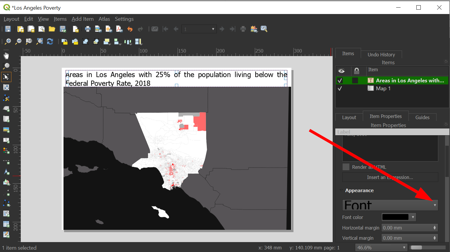
-
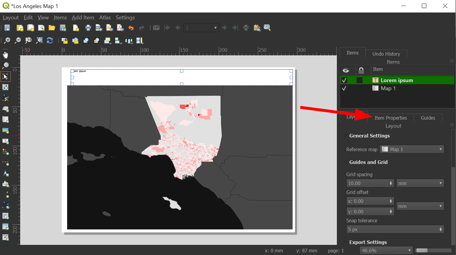
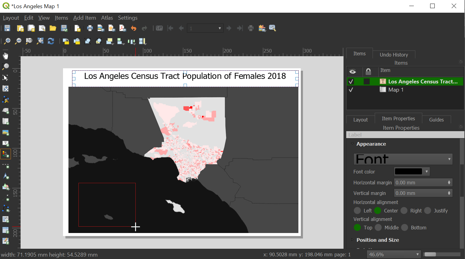
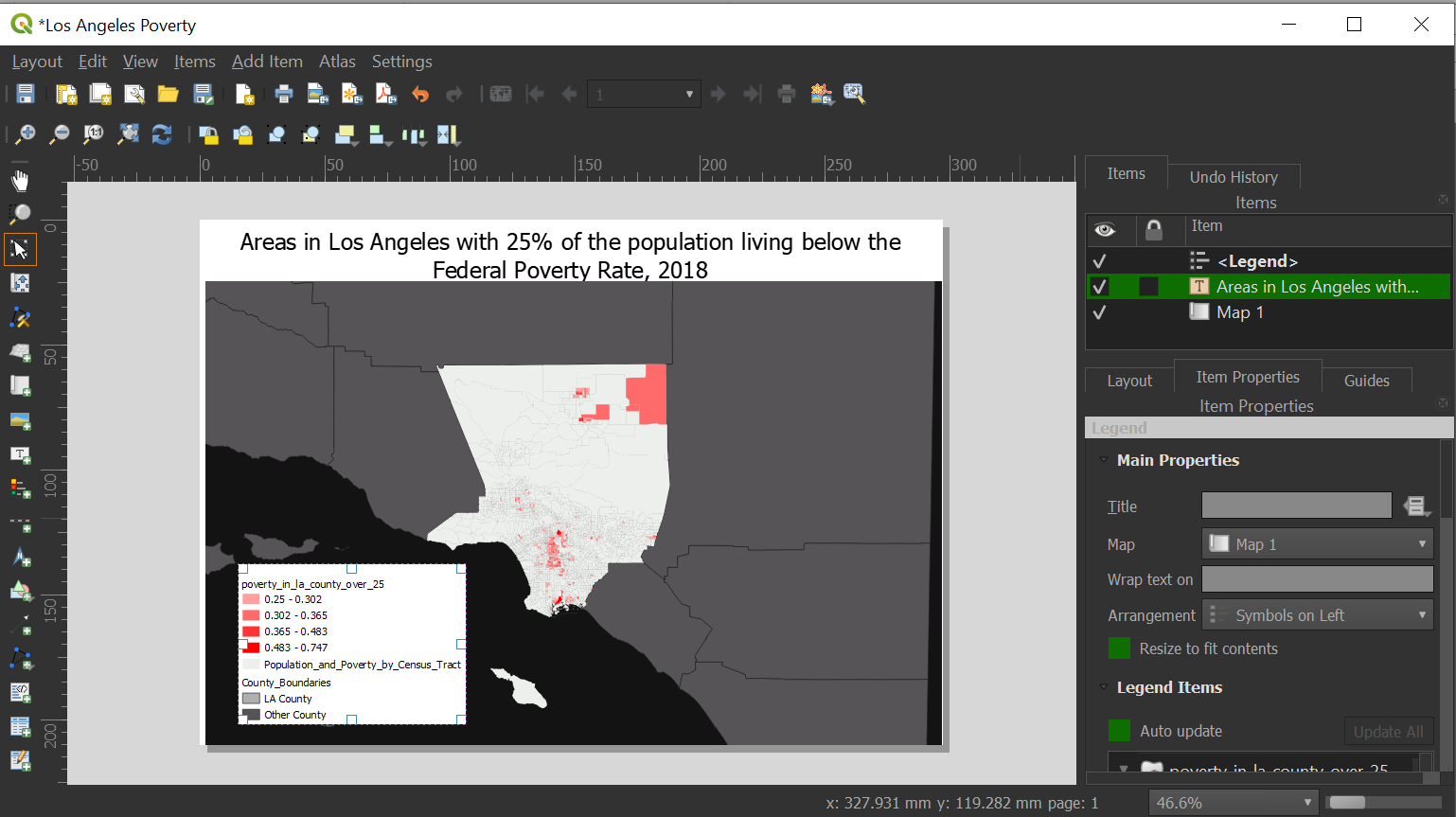
You can fine tune the legend by clicking on the "Item" and then going to "Item Properties"
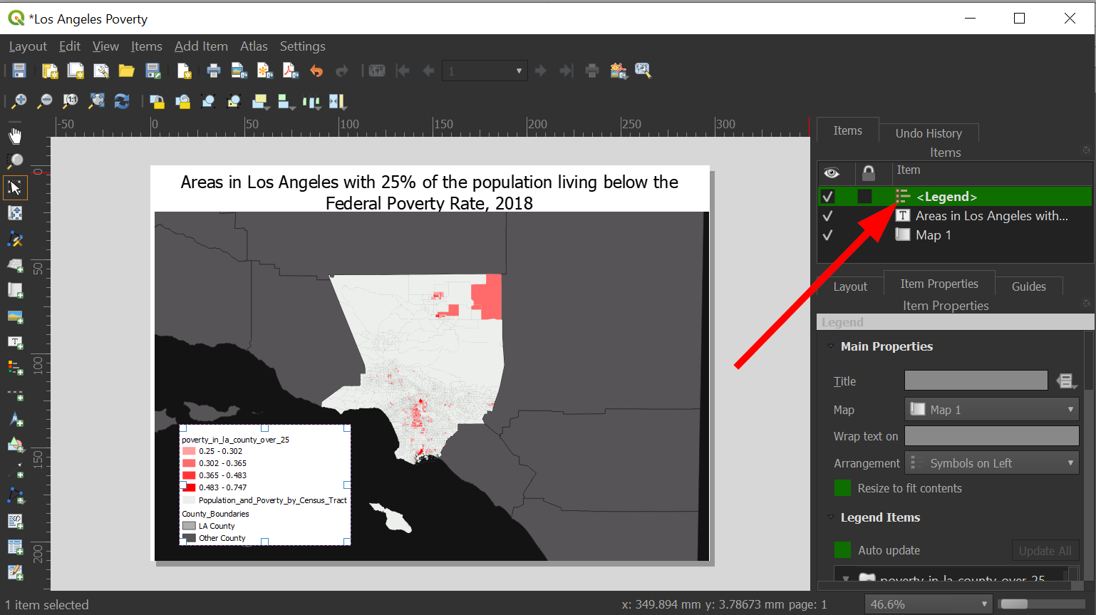
-
Scroll down to the box and uncheck "Auto update" to get more control:
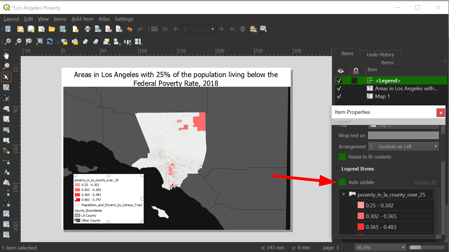
-
Click on the layer name "poverty_in_la_county_over_25" and rename it to: "Census Tracts with more than 25% of living in poverty"
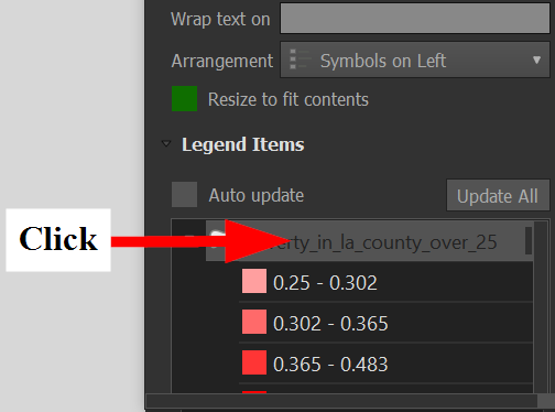
-
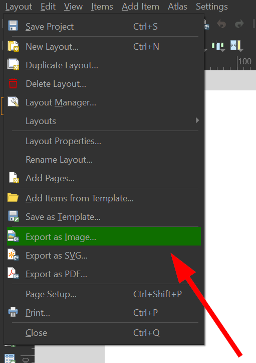
With the legend complete, you are ready to export the map!
-
Choose a location for your map and click save.
-
Close the layout editor and save your QGIS project by going to "Project" >> "Save As.."
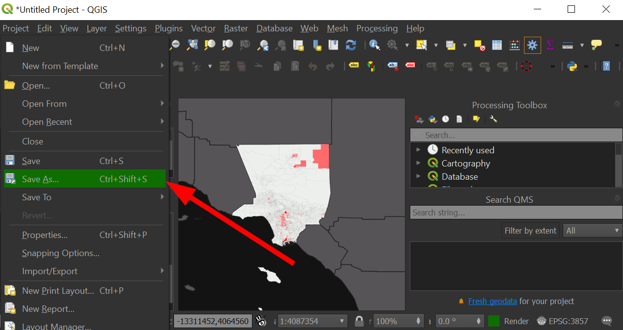
-
Congratulations! You have completed your first mapping project in QGIS!
