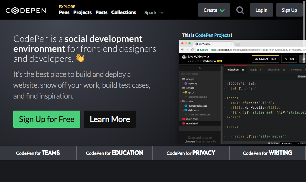
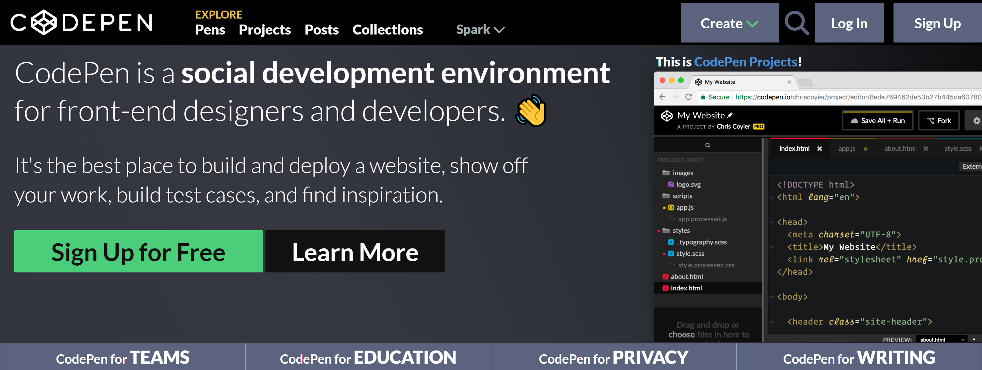
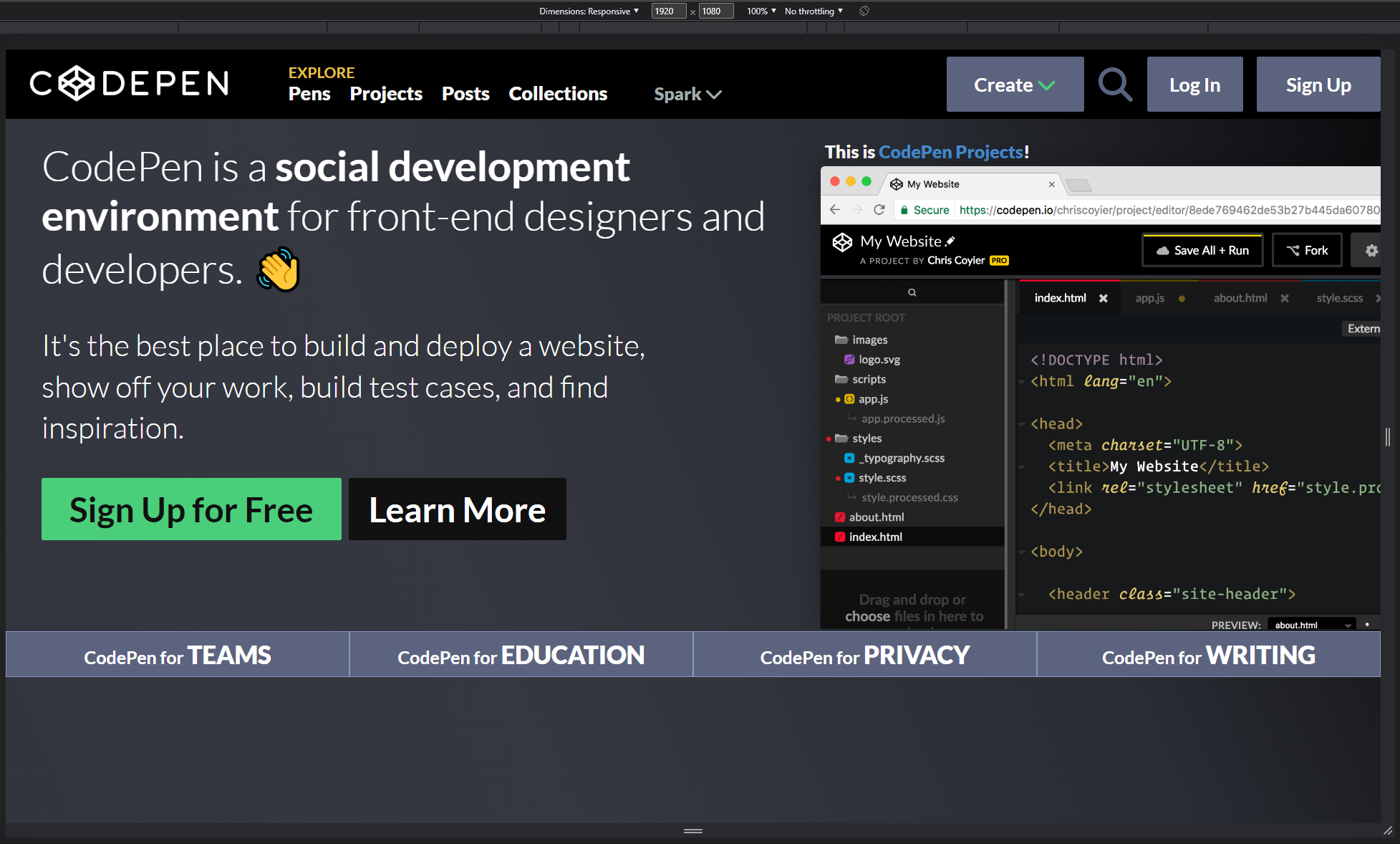
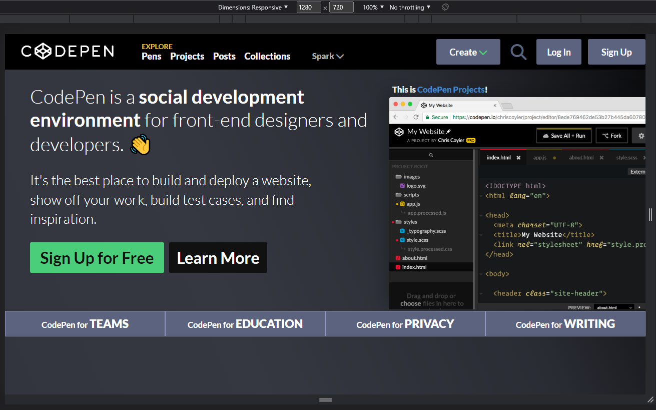
Replicate the CodePen.io homepage (just the landing page section) using as a reference the provided template photo.
- Navbar that includes: "Pens, Projects, Posts, Collections, and Spark with a down chevron (does not need to actually dropdown).
- Images - use available tools to recreate colors, etc.
- Simply replicate the landing page (Don't worry about replicating any functionality features such as drop-down, scrolling, etc)
- Add basic animations (hover, button click, etc)
- Add responsive design (Medium, Wide and Ultrawide screens)
- Add mobile design (Small screens)
The project uses a single .html file (index.html). The HTML structure of the head is:
- CSS Stylesheets references: there are 7 Stylesheets
Button.css: contains all the styles of the basic button (most of these are override with the specific characteristics of the button).helpers.css: contains styles related to helpers (i.e. an extra separation between elements).background.css: contains the background image styles and positioning.common.css: contains common styles of all the web pages (i.e. fonts and generic elements styles).navbar.css: contains navbar styles and elements positioning.content.css: contains styles and elements positioning of the main content of the web (headers, paragraphs, images, etc).footer.css: contains styles and element positioning of the footer.
- Fonts references: the main font of the project is
Lato. - Awesome font references: basic icons.
The HTML structure of the body is:
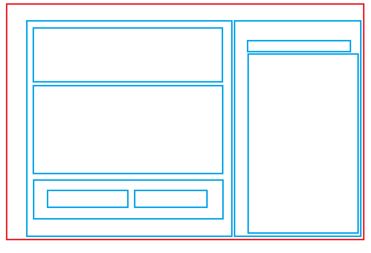
- Main div (
bg-content-section): this part of the web is the background image, all the other elements are posicioned over this image.- First section div (
navbar): contains all the elements of the navbar (the 5 anchors and the Create, Login and Sign Up buttons). - Second section div (
content-section-wrapper): contains the header, paragraphs, buttons and side image of the main content of the web. - Third section div (
footer-section-wrapper): contains the 4 columns of the footer with information about codePen main characteristics.
- First section div (
A combination of CSS basic translations and Flexbox is used to position the elements on the navigation bar.
Just Flexbox is used to position the elements on the navigation bar.
Just Flexbox is used to position the elements on the navigation bar.
The web is designed using relative units (vw, %, etc) and support a wide variety of monitors. For the mobile version, media-queries has been used.

