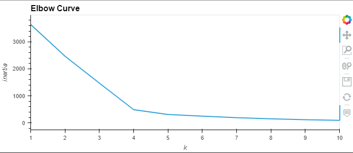
The first visualization that was made was through the use of and elbow curve to determine the cluster count:

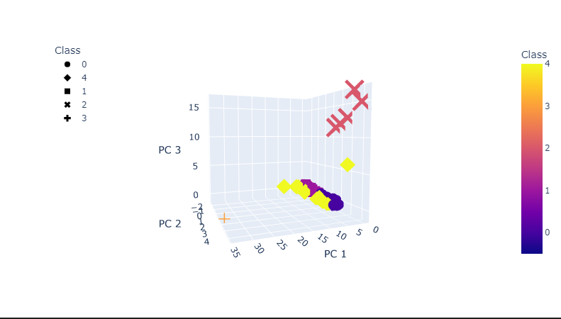
Data was combined and a 3D-scatter plot was made with the PCA data and the clusters:

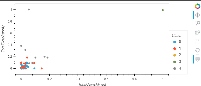
Finally, a hvplot.scatter plot was created using x=Total Coins Mined and y=Total Coin Supply:
