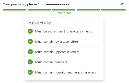
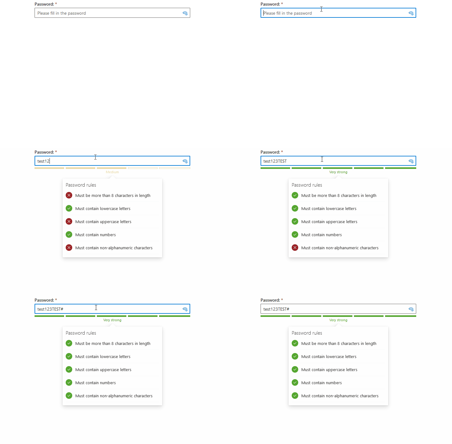
A ReactJS password box built using the FluentUI library. It features a basic structure, with some additional features:
- a strength indicator which can be set to one of the three avaialble different flavours;
- a password status callout bubble, which shows the strength rules the password must meet and which have been met thus far.
Additionally, it exposes some of the customization options which are available for the standard FluentUI TextInput field.
Here's a static screenshot of how it all looks like using the default styling:
And also an animated gif which shows how it all respons to user input:
- Installation
- Demo
- Basic Usage
- Styling
- Building
- Customization Options
- Computing password strength levels
- Events
- Changelog
- Donate
npm install --save lvd-fluentui-passwordbox
The demo directory contains a compiled and ready-to-run example. Just open up the index.html file.
import React from 'react';
import { PasswordBox,
	StrengthIndicatorStyles } from 'lvd-fluentui-passwordbox';

class SomePasswordPage extends React.Component {
	constructor(props) {
		super(props);

		this._handlePasswordChanged =
			this._handlePasswordChanged.bind(this);
	}

	_handlePasswordChanged(oldValue, newValue) {
		// For instance, compute strength level or password rules
		//	See below for a built-in API to do that (though it's not mandatory)
	}

	render() {
		const strengthLevel = /* fetch or compute strength level from somehwere */;
		const strengthLevelText = /* fetch or compute strength level text from somehwere */;
		const rules = /* fetch or compute password rules from somewhere */;

		return (
			<PasswordBox
				label="Your password, please"
				placeholder="Please fill in your new password"
				canReveal={true}
				required={true}
				underlined={true}
				emptyErrorMessage="The password is required, whether you like it or not!"
				passwordStrengthProps={{
					style: StrengthIndicatorStyles.intermittentBar,
					level: strengthLevel,
					text: strengthText
				}}
				passwordRulesProps={{
					rules: rules
				}}
				onPasswordChanged={this._handlePasswordChanged}
			/>
		);
	}
}
You can find a full working example here.
You can either directly include the dist/style.css into your html web page or use the @import directive inside your stylesheet if building using webpack:
@import '~lvd-fluentui-passwordbox/dist/style.css';Also see the component itself.
To build the demo application:
npm run build-app
To build the library:
npm run build-dist
To build both in one sitting:
npm run build
| What | Prop Name | Type | Notes |
|---|---|---|---|
| Label | label |
string |
Defaults to Password: |
| Placeholder | placeholder |
string |
Defaults to Please fill in the password |
| Descriptive text displayed below the field | description |
string |
Defaults to empty string. |
| Allow user to reveal password | canReveal |
boolean |
Defaults to true |
| Disable the field | disabled |
boolean |
Defaults to false |
| Display field in underlined style. | underlined |
boolean |
Defaults to false |
| Set field as required. | required |
boolean |
Defaults to false |
| Set field as readonly. | readOnly |
boolean |
Defaults to false |
| Message to display when field is required, but not filled in. | emptyErrorMessage |
string |
Defaults to You must fill in the password |
| Password strength indication. | passwordStrengthProps |
Password Strength Object |
Defaults to not display password strength indication. See below. |
| Password rules information. | passwordRulesProps |
Password Rules Information Object |
Defaults to not display any password rules information. See below. |
All the default values are defined here.
A plain javascript object with the following properties:
| Name | Type | Notes |
|---|---|---|
style |
StrengthIndicatorStyles |
Mandatory. See below info on the available values. |
level |
PasswordStrengthLevels |
Describes the currently assigned password strength level. Mandatory. See below info on the available values. |
percent |
number |
Optional. The percentage (values between 0 an 100) that describes the password strength. If not specified, defaults to the default percetnage assigned to the given password strength level. |
text |
string |
Optional. User-displayable text for the current password strength. If not specified, no text is displayed, with the exception of StrengthIndicatorStyles.textOnly, which displays the default text assigned to the given password strength level. |
The following strength levels are available, fixed and may not be changed:
| Name | Usage | Notes |
|---|---|---|
| Very Weak | PasswordStrengthLevels.veryWeak |
By default, up to 20% strength. |
| Weak | PasswordStrengthLevels.weak |
By default, from 21% up to 40% strength. |
| Medium | PasswordStrengthLevels.medium |
By default, from 41% up to 60% strength. |
| Strong | PasswordStrengthLevels.strong |
By default, from 61% up to 80% strength. |
| Very Strong | PasswordStrengthLevels.veryStrong |
By default, from 81% up to 100% strength. |
The following styles are available:
| Name | Usage | Notes |
|---|---|---|
| Bar | StrengthIndicatorStyles.bar |
Displays a contigous static bar filled in accordance with the determinted password strength percentage. Also displays an optional descriptive text, if given. Implemented here |
| Intermittent Bar | StrengthIndicatorStyles.intermittentBar |
Displays an intermittent static bar comprised of five segments, each segment corresponding to a strength level. The bar segments that are filled are determinted by the given password strength level. Also displays an optional descriptive text, if given. Implemented here |
| Text Only | StrengthIndicatorStyles.textOnly |
Just displays a descriptive text. Implemented here |
A plain javascript object with the following properties:
| Name | Type | Notes |
|---|---|---|
rules |
Rule Evaluation Result Object[] |
See below. |
container |
Password Information Callout Container Properties Object |
See below. |
title |
Password Information Callout Title Properties Object |
See below. |
icons |
Password Information Callout Icons Properties Object |
See below. |
A plain javascript object with the following properties:
| Name | Type | Notes |
|---|---|---|
ruleMet |
boolean |
Whether or not the rule is satisfied or not. |
text |
string |
The descriptive text, displayed for the object. |
These are the properties that are applied to the callout container itself. A plain javascript object with the following properties:
| Name | Type | Notes |
|---|---|---|
gapSpace |
number |
Defaults to 5. |
isBeakVisible |
boolean |
Defaults to true. |
beakWidth |
number |
Defaults to 15. |
directionalHint |
DirectionalHint |
Defaults to DirectionalHint.bottomCenter. |
style |
object |
Inline style applied. Defaults to { width: 300, padding: 10 }. |
calloutWidth |
number |
Defaults to 0. |
calloutMaxWidth |
number |
Defaults to 0. |
calloutMinWidth |
number |
Defaults to 0. |
These properties mirror their corresponding properties described for the FluentUI Callout component.
These are the properties that are applied to the callout title. A plain javascript object with the following properties:
| Name | Type | Notes |
|---|---|---|
visible |
boolean |
Whether o not to show the tile. Defaults to true. |
text |
string |
The title text. Defaults to Password rules. |
variant |
IFontStyles |
Defaults to mediumPlus. |
style |
object |
Inline style applied. Defaults to { marginBottom: 0, fontWeight: FontWeights.semilight }. |
These properties mirror their corresponding properties described for the FluentUI Text component.
These properties describe various icons used for rendering the password rules. A plain javascript object with the following properties:
| Name | Type | Notes |
|---|---|---|
metIcon |
Type | Icon name used when the rule is met. Defaults to CheckMark. |
notMetIcon |
Type | Icon name used when the rule is not met. Defaults to Cancel. |
Please see the supported FluentUI icons.
It is up to you how you compute the password strength level, just as long you provide one of the values described above.
However, for your convenience there's an API that you can use to do so:
- define your rules using by creating instances of:
- feed these rules to the built-in password evaluator.
Here's an example, similar to the one built-in the demo application:
import { PasswordEvaluator,
	PasswordCallbackRule,
	PasswordLengthRule }
from 'lvd-fluentui-passwordbox';

function _hasLowercaseLetters(password) {
	return !!password.match(/[a-z]+/);
}

function _hasUppercaseLetters(password) {
	return !!password.match(/[A-Z]+/);
}

function _hasNumbers(password) {
	return !!password.match(/[0-9]+/);
}

function _hasNonAlphaNumericCharacters(password) {
	return !!password.match(/[^a-zA-Z0-9]+/);
}

function _getRules() {
	return [
		new PasswordLengthRule(8),
		new PasswordCallbackRule(_hasLowercaseLetters,
			'Must contain lowercase letters'),
		new PasswordCallbackRule(_hasUppercaseLetters,
			'Must contain uppercase letters'),
		new PasswordCallbackRule(_hasNumbers,
			'Must contain numbers'),
		new PasswordCallbackRule(_hasNonAlphaNumericCharacters,
			'Must contain non-alphanumeric characters')
	];
}

export function evaluatePassword(password) {
	const evaluator = new PasswordEvaluator(_getRules());
	return evaluator.evaluatePassword(password);
}
You may also create your own password rules objects, just as long as they provide:
- an
evaluate(input)method, that returnstrueif the password satisfies the rule orfalseotherwise; - a
nameproperty, that describes the rule - will be displayed to the user.
| Event | Prop Name | Arguments | Notes |
|---|---|---|---|
| Value changed | onPasswordChanged |
(oldPassword:string, newPassword:string) |
Triggered whenever the value of the password field changes. |
| Component initialized | onPasswordBoxInitialized |
none |
Triggered when the component is mounted by React. |
| Component disposed | onPasswordBoxDisposed |
(currentPassword:string) |
Triggered when the component is un-mounted by React. |
| Focused | onFocus |
(event:React.FormEvent) |
Triggered when the underlying password text field gains focus. |
| Lost focus | onBlur |
(event:React.FormEvent) |
Triggered when the underlying password text field loses focus. |
- Updated type definitions.
- Added type definitions.
- A descriptive text can now be displayed below the text field input, using the
descriptionprop; - Can now listen for the text field input focus event using the
onFocusprop; - Can now listen for the text field input blur event using the
onBlurprop.
I put some of my free time into developing and maintaining this plugin. If helped you in your projects and you are happy with it, you can...


