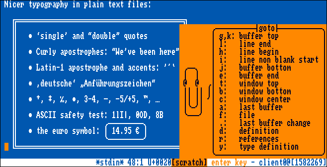
A screenshot of the Kakoune editor, using the Topaz Unicode font, and an Amiga Workbench inspired colour scheme. The editor is showing a portion of Markus Kuhn's UTF-8 demo, demonstrating some of the new characters added in this version, like box-drawing characters and fancy punctuation.
The Amiga 500 came out in 1987, and like the original Macintosh, it boasted a full GUI but only a single ~800KB floppy drive. Like the Mac, in order for the computer to still be able to do useful things while no disk was in the drive, a lot of the resources required for the GUI were stored in ROM. In particular, the default UI font was a monospaced, 8x8px font called Topaz (although the default video mode was 640x200 pixels, so drawing it at 8x16px on modern displays looks more authentic).
Topaz is therefore a highly nostalgic typeface for people of a certain age and geographical distribution, but it's also a genuinely good font. It's high contrast, it's consistently designed (within the limits of 8x8px), and it's quite compact.
As a monospaced font, it'd be great for use in modern terminals, except for a couple of problems:
- It's a single-size bitmap font, and most modern operating systems have dropped support for anything but TrueType and OpenType scalable fonts.
- The original font only supports the Latin-1 character set, so it doesn't support non-Latin writing systems, or even common terminal characters like box-drawing or blocks.
This project attempts to solve both these problems.
I started with the file amiga-ks13-topaz-08.yaff
from Rob Hagemans'
Hoard of Bitfonts.
I converted it to the Adobe Glyph Bitmap Distribution Format and doubled the height to 16 pixels using monobit bitmap font conversion software.
I loaded the BDF into Kreative Korp's Bits'N'Picas bitmap font editor, and started drawing new glyphs.
All the original Topaz glyphs are present and unmodified, except for character 0xDF "ß", which was designed to be ambiguous between U+00DF ß LATIN SMALL LETTER SHARP S and U+03B2 β GREEK SMALL LETTER BETA. Since Unicode gives each letter separate encodings, I pasted the glyph into both locations, and edited each one to more specifically depict the letter it was supposed to be.
I added a whole bunch of new glyphs, including:
- all the Windows Glyph List 4 characters, including Cyrillic, Greek, and the MS-DOS CP437 symbols
- everything in the Box Drawing Unicode block
- everything in the Block Elements Unicode block
- a lot of things in the Symbols for Legacy Computing Unicode block
- anything else that caught my eye or seemed useful
When drawing new glyphs,
I was very careful to constrain myself to the 8x8 pixel grid,
make vertical lines two pixels wide.
I also followed the model of the official Topaz glyphs:
for example, capital letters with a cedilla are raised up,
like the original Ç,
but small letters with a cedilla just have one pixel below them,
like the original ç.
Finally, I used Bits'N'Picas to convert the font from BDF format to TTF, which uses a special process that guarantees the resulting font will render crisply at the target size. I also generate a "Bold" version that uses the same pixel-repeating trick that the original Amiga GUI used, so that bold text will look crisp and authentic instead of being antialiased by a modern font engine.
You can download the latest versions of the TTF files.
