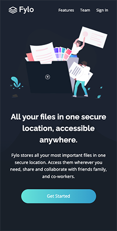
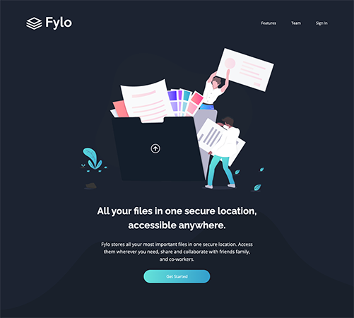
This is a solution to the Fylo dark theme landing page challenge on Frontend Mentor. Frontend Mentor challenges help you improve your coding skills by building realistic projects.
Users should be able to:
- View the optimal layout for the site depending on their device's screen size
- See hover states for all interactive elements on the page
- Solution URL: https://github.com/allyson-s-code/fylo-dark-theme-landing-page
- Live Site URL: https://allyson-s-code.github.io/fylo-dark-theme-landing-page/
- Semantic HTML5 markup
- CSS custom properties
- Flexbox
- Mobile-first workflow
- JavaScript
This project reinforced the concept of absolute positioning to get the divs to behave as they needed, especially the aside email sign up box. I also learned how to add a class to a section of a svg to be able to access the ``fill` attribute on hover.
Positioning the intro background image was tricky, especially the mobile view where the image stopped short of the bottom of the div. I made use of a gradient to make a seamless transition into the darker background color which needed to run through the rest of the div.
intro {
  background: url(../images/bg-curvy-mobile.svg), linear-gradient(180deg, hsl(
          217,
          28%,
          15%
        ) 55%, hsl(218, 28%, 13%) 65%);
  background-size: 110%;
  background-position: 65% 54%;
  background-repeat: no-repeat;
}I'll be continuing to learn more advanced CSS and JavaScript. I'm also always interested to learn HTML best practices for accessibilty and semantic HTML.
- Website - Allyson Smith
- Frontend Mentor - @allyson-s-code

