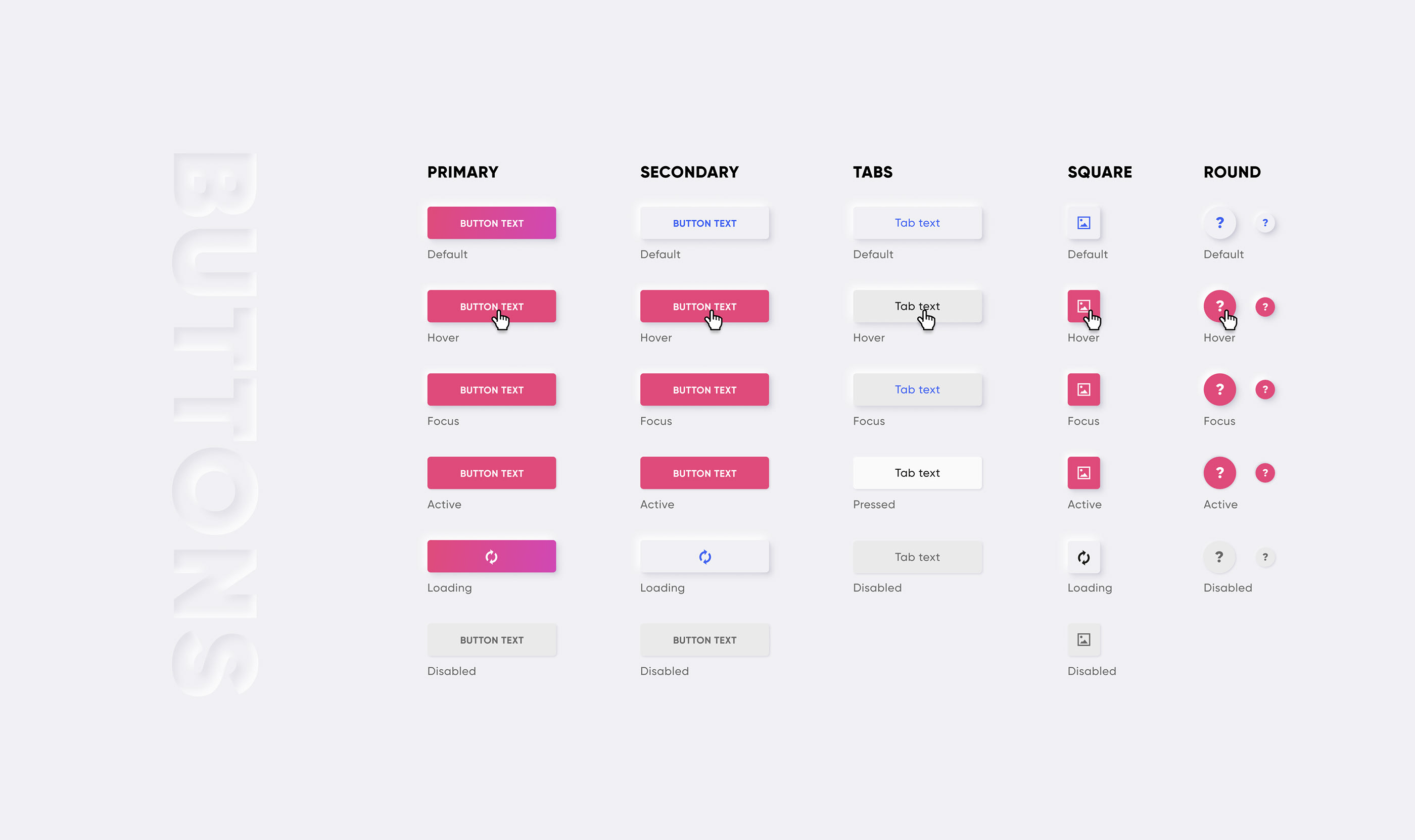
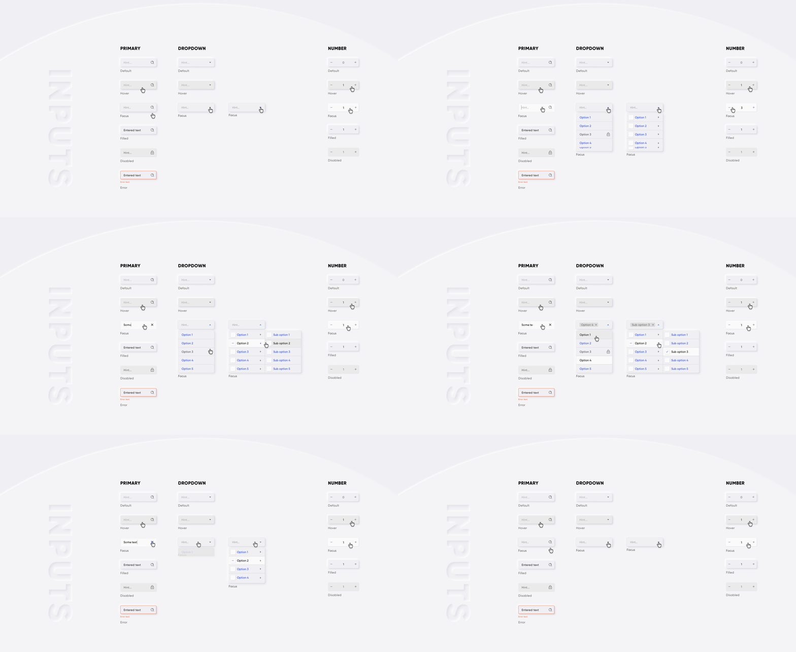
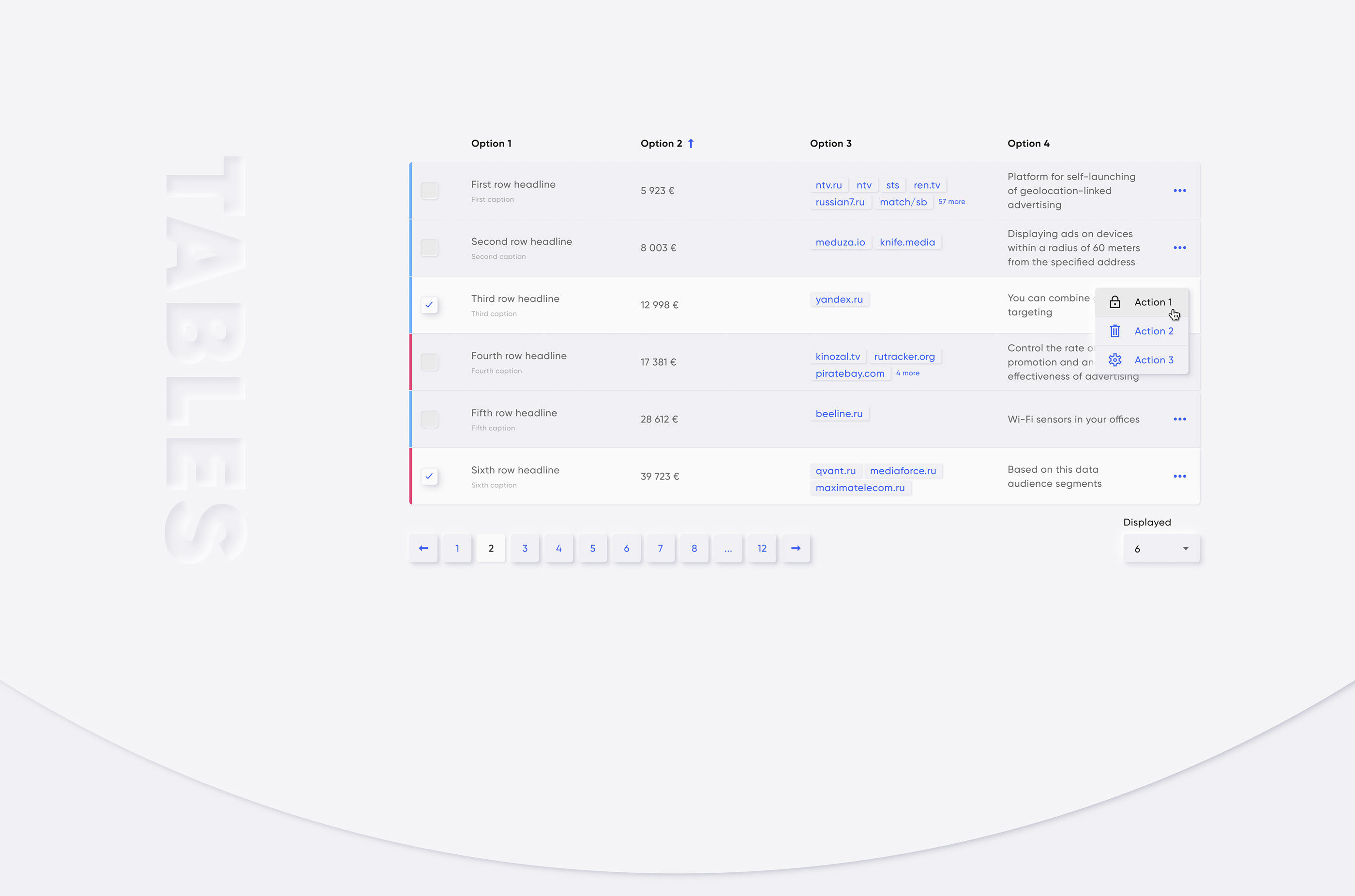
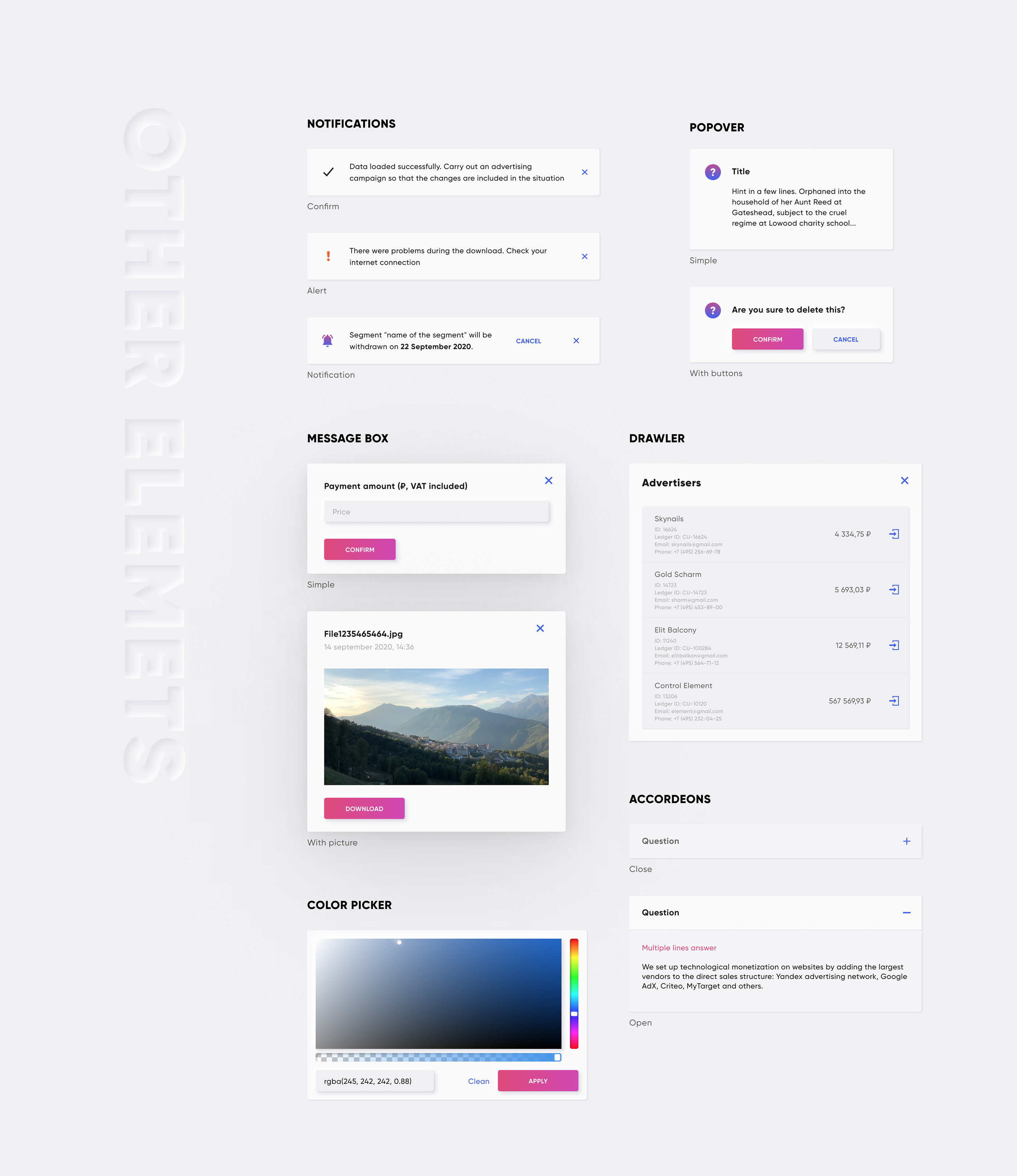
Written in TypeScript with Composition API 🔥
A component's library helping us build great products for our customers. This library for Vue 3.x
Qui for Vue 2.x is here!
What is it?
- 🔩 30+ Vue 3 components
- 🔥 Fully written with Composition API
- 🔑 Typescript
- 📦 icons pack
- 🏳️🌈 colors & grid
- 🥷 neumorphism styles
- 📚 storybook sandbox
Some examples below:
npm install @qvant/qui-max -S
yarn add @qvant/qui-max
You can import Qui entirely, or just import what you need. Let's start with fully import.
In main.js:
import { createApp } from 'vue';
import Qui from '@qvant/qui-max';
import '@qvant/qui-max/styles';

const app = createApp(App);
// Setup all components
app.use(Qui);
// that's it! All components will be imported with styles
in YourComponent.vue: (Example)
<template>
  <q-input v-model="value" />
</template>
<script>
import { ref } from 'vue';

export default {
  setup() {
    const value = ref('');
    return { value };
  }
};
</script>- import styles separately to avoid unused css
- set
localization.messagesto support any language for components - change zIndex of appeared components (e.g Dialogs, Notifications, Dropdowns etc.)
- control setup of components
In main.js:
import { createApp } from 'vue';
import {
  createQui,
  QButton,
  QProgressIndicatior,
  // import default messages for different locales
  localeRu
} from '@qvant/qui-max';

// import required styles
import '@qvant/qui-max/css/main';
import '@qvant/qui-max/fonts';
import '@qvant/qui-max/icons';

// import the only styles of component you gonna use
import '@qvant/qui-max/css/q-button';
import '@qvant/qui-max/css/q-progress-indicatior';

const Qui = createQui({
  localization: {
    // English language by default, but we have two more locales out-of-the-box: 'ru' | 'zh'
    // set 'ru' - for Russian, set 'zh' - for Chinese
    locale: 'ru',
    messages: {
      ru: {
        // import and merge default messages for different locale
        ...localeRu,
        // rewrite default texts, see the source: src/qComponents/constants/locales or set your custom messages
        QDatepicker: {
          placeholder: 'Выберите дату рождения'
        }
      }
    },
    // zIndexCounter is being used by some components (e.g QPopover, QSelect, QDialog ...etc)
    // 2000 by default
    zIndexCounter: 3000
  }
});

app.use(Qui);
app.use(QButton);
app.use(QProgressIndicatior, {
  trickle: true,
  trickleSpeed: 200,
  stackable: true
});
Now you have implemented Vue and Qui Max to your project, and it's time to write your code. Please refer to each component's Stories to learn how to use them.
- Russian ✅
- English ✅
- Also you can use any language by setting texts for components via
localization.messagesproperty in the Qui instance. See the example above.
Create a file in your plugins folder:
// plugins/qui.ts
import { defineNuxtPlugin } from '#imports';
import Qui from '@qvant/qui-max';

export default defineNuxtPlugin(nuxtApp => {
  nuxtApp.vueApp.use(Qui);
});
Add configuration to your nuxt.config.ts file:
import { defineNuxtConfig } from 'nuxt3';

export default defineNuxtConfig({
  css: ['@qvant/qui-max/styles'],
  build: {
    transpile: ['@qvant/qui-max']
  }
});Modern browsers are recomended:
- safari: >11
- chrome: >=61
- firefox: >=58
- opera: >=62
- edge: >=16
- yandex: >=18
Clone repository and run storybook
yarn storybook
npm run storybookMIT


