Flexbox is a CSS display property that aims to create a better way to layout and align items within a parent container. Flexbox is best suited to creating small components of a website.
Flexbox allows us to put elements inside of a container, and have that container decide how to shrink/expand/wrap those elements to fill the space available. It also allows us to specify how the items are arranged and ordered.
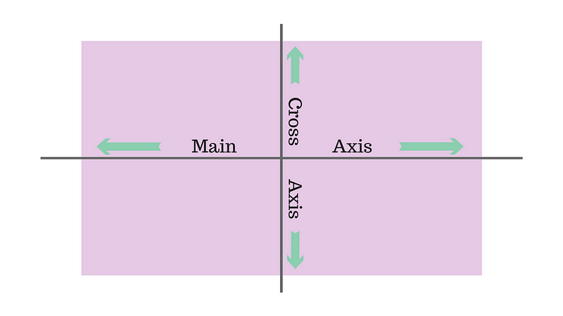
We will be walking through using the included HTML and CSS file. Flexbox has two axis that we can use to organize our elements, the main-axis and the cross-axis. By default the main-axis is horizontal and the cross-axis is vertical.
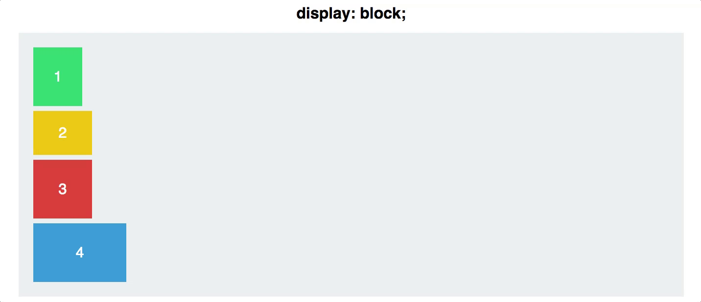
By default a flex container will put all elements on the main axis with no wrapping, even if it has to shrink the elements. Lets try it!
In the index.css file give the container class the display: flex; property. Reload the HTML page. What has happened? The block level elements have shifted to sit along the main-axis, and also moved to the start of the cross-axis!
The items inside of the container are now flex items and will adjust based on how the parent container tells them to. We can now start telling the container how to arrange its children.
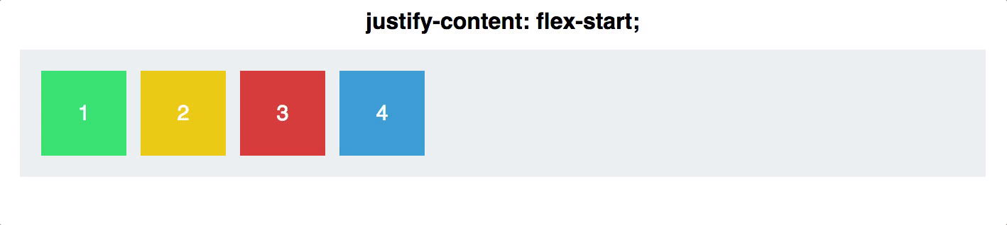
To change how the children sit along the main axis we use justify-content on the container. This rule has several values that do the following:
justify-content: flex-startis the default value and justify the content to the start of the main-axisjustify-content: flex-endwill do the opposite of flex-start and justify the content to the end of the main axis.justify-content: centerwill center the content along the main axisjustify-content: space-betweenwill equally space out the content along the main-axis with any space not taken by content being put between the elementsjustify-content: space-aroundwill do the same as above, but also put space on the outside of the elements.
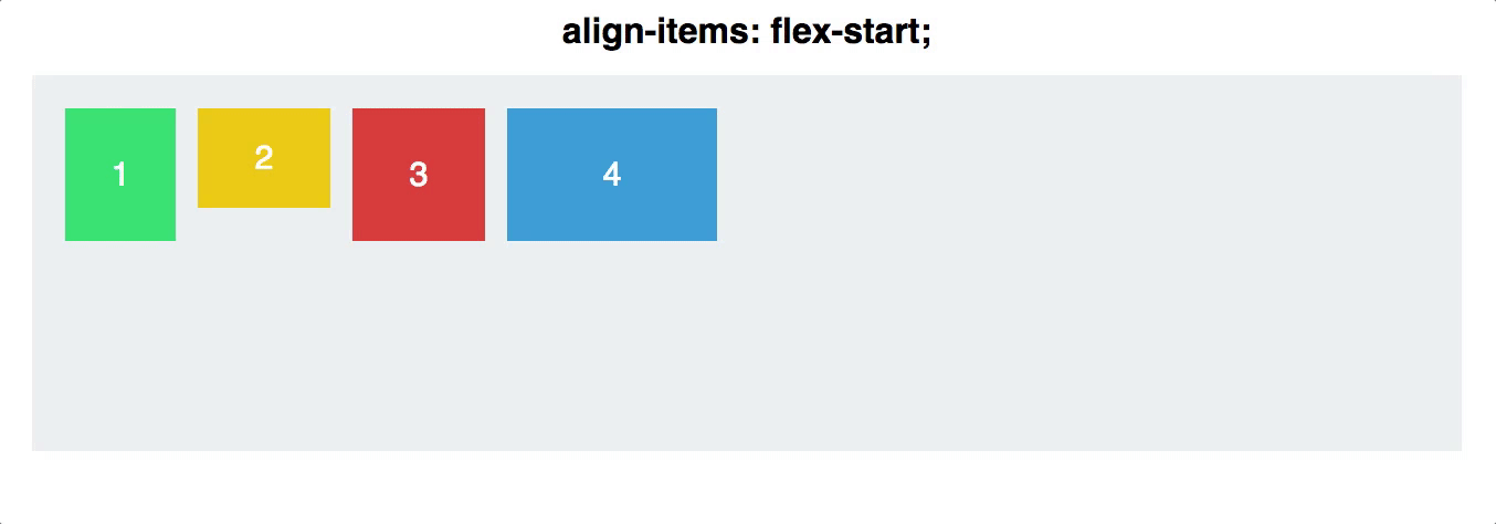
To change how children sit along the cross-axis we use align-items on the container.
align-items: flex-startis the default value and will align the elements to the start of the cross-axisalign-items: flex-endsame as above, but to the end of the cross-axisalign-items: centerwill center the content along the cross-axisalign-items: stretchwill have the item take up any remaining room in the container along the cross-axis, but only if the elements do not have a defined heightalign-items: baselinewill align the elements so that their content is aligned
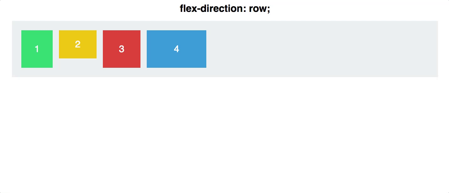
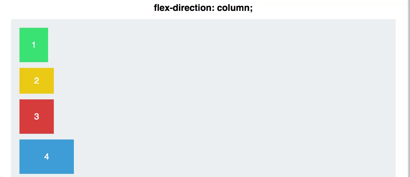
We can also tell flexbox where to put the main and cross axis using flex-direction on the container
flex-direction: rowthis is the default and will have the elements on the main axis in orderflex-direction: columnthis will switch the main and cross axisflex-direction: row-reversewill flip the direction of the main axisflex-direction: column-reversewill flip the direction of the main axis when it is vertical
By default flexbox will try to keep all flex items on a single line, shrinking them down to almost nothing if it has to. However if we want flex items to take up their full size and wrap to a next line we need the flex-wrap property. By default flex-wrap is set to nowrap. By simply setting flex-wrap: wrap on the flex container we tell it to let its flex items wrap to the next line if there is not enough room for them. This allows the items to maintain their original size for longer.
.container {
  display: flex;
  flex-wrap: wrap;
  justify-content: space-between;
  align-items: center;
}
We can also add flex properties to individual flex properties to reorder or manually align a single element.
We can use the order property to manually set the order of elements. By default all items are set to group 0. This means they will all be in order within their group. If we set a item to order: 1 then it will appear after the order 0 items. Likewise we can set a item to order: -1 to place it in front of the order 0 group. Lets test it out! 👍
We can also use align-self on a single flex item in order to give it a specific align property such as flex-end.
Media Queries allow us to set specific breakpoints in our css that can add or overwrite properties for a element, class, or id. They are used to make responsive displays that change as the screen size changes.
The main two ways to set breakpoints are with max-width: 420px and min-width: 800px. You can set the breakpoints to any pixel size but you should have at least three. One for mobile, tablet/small monitors, and one for large screens.
Example:
@media (min-width: 420) {
    div {
      background-color: yellow;
    }
 }

 @media (max-width: 419) {
   div {
     background-color: orange;
   }

   p {
     color: red;
   }
 }
We can even use media queries to specify which css file should be used.
<link rel="stylesheet" media="(min-width: 420px)" href="tablet.css" />
<link rel="stylesheet" media="(max-width: 419px)" href="mobile.css" />
Note: Always put your media queries in order from smallest to largest. Remember that if you have two of the same rule applying to the same element the lower one will overwrite the one above. In the case of media queries we want this to happen as we enlarge the screen and trigger different media queries.
We can also make sure that our page can render properly on different devices that, even though they have the same screen size, have different resolutions. We do this through the use of the meta tag in our html document. You can set up different viewports for almost any different device, allowing you to fine tune your site for particular devices. The standard was of doing a generic mobile viewport is this:
<meta name="viewport" content="width=device-width, initial-scale=1">
This is setting our viewport to use the width that is the same as the device that is displaying the content. The initial-scale value is the level of zoom we want the page to have on initial load.