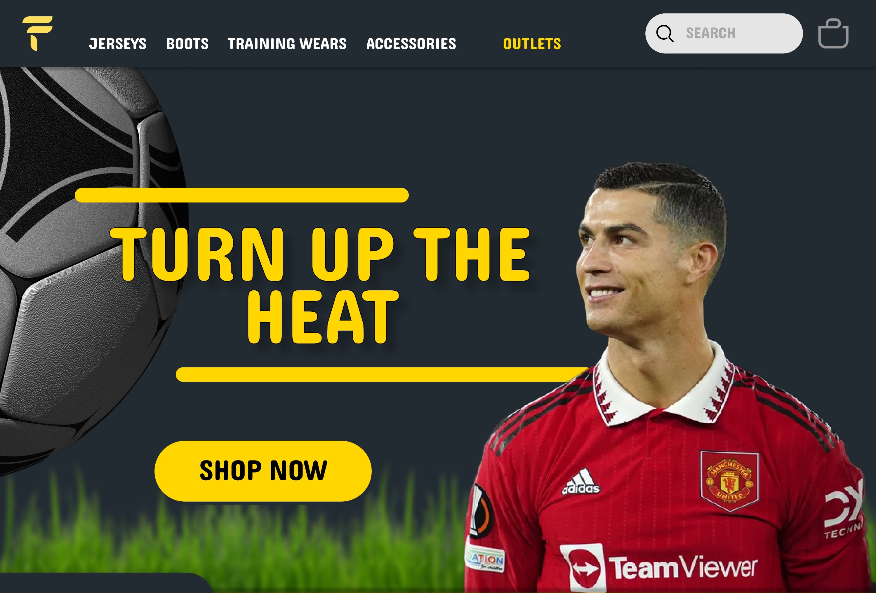
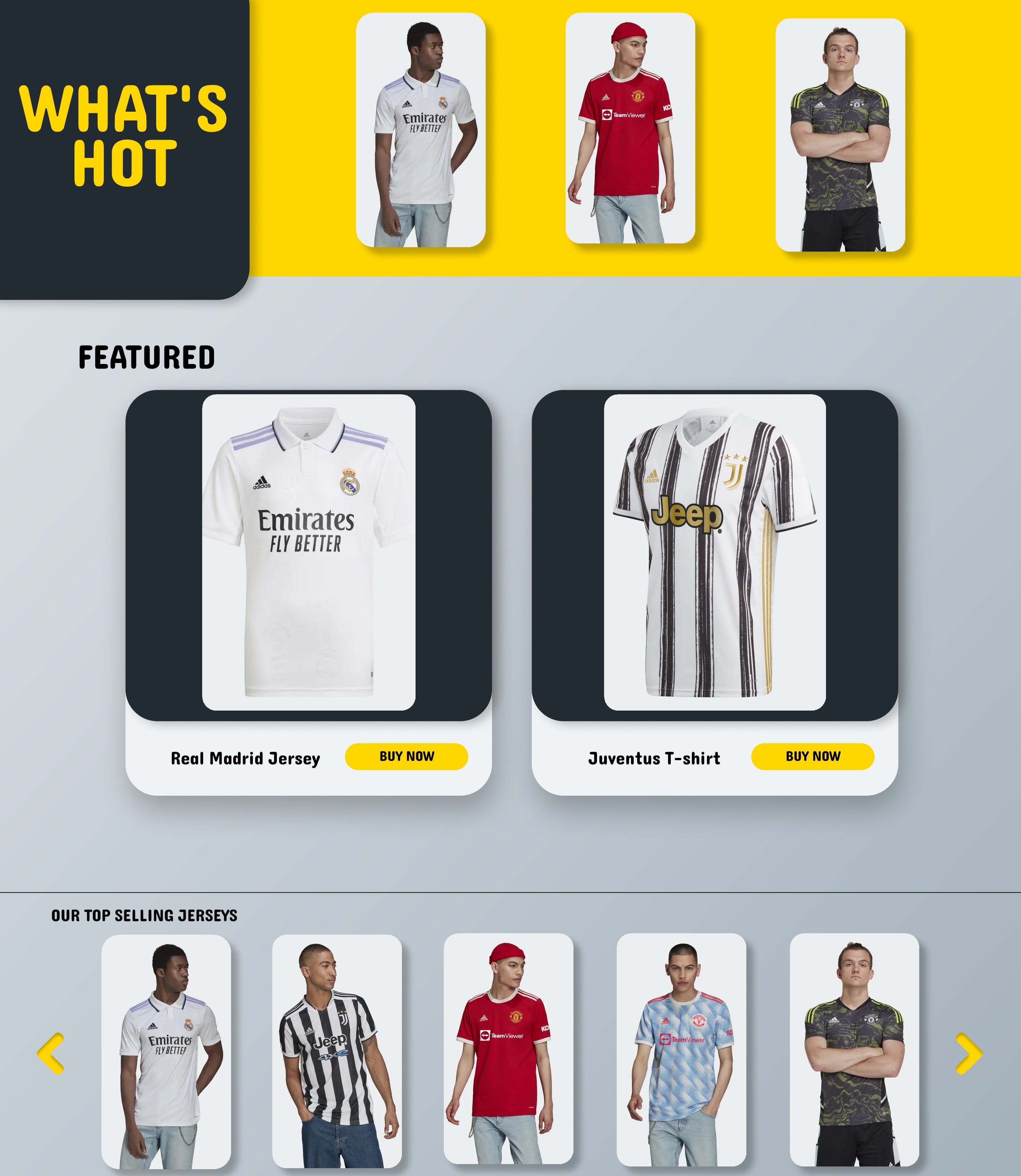
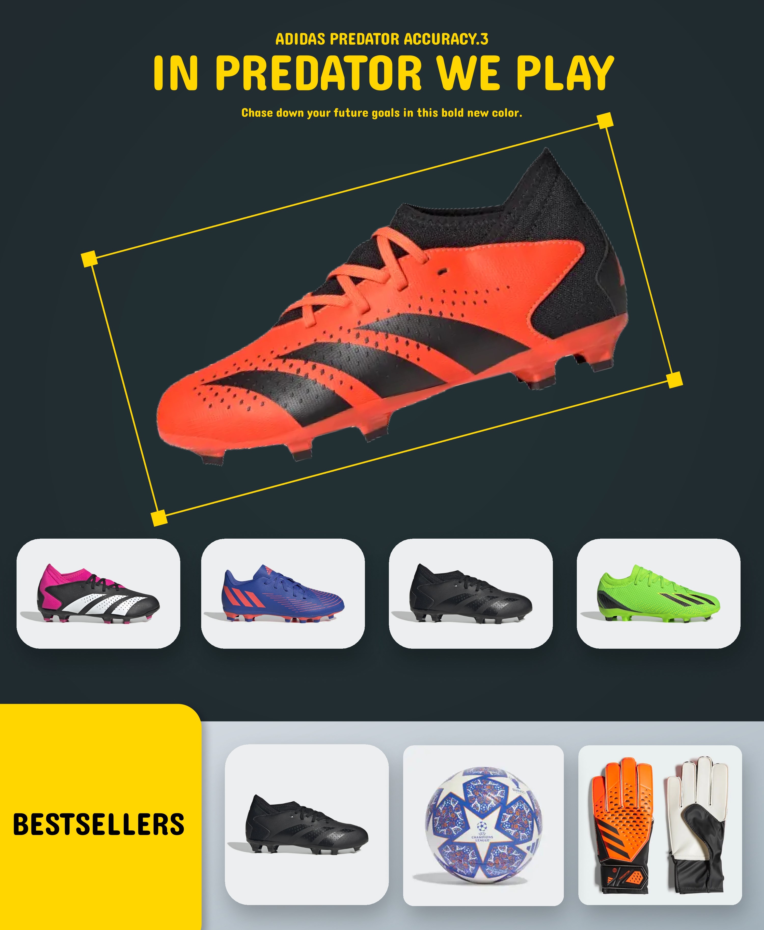
Futbol UI is an all-in-one football-related store that sells football jerseys, boots, training wears, and other accessories. The landing page showcases our wide range of products, their features, and benefits. It provides a seamless shopping experience that allows users to browse, search and purchase their favorite football gear easily. Live demo here.
- Inspiration 💡
- What it does ⚙️
- How we built it 🛠️
- Challenges we ran into 😓
- Accomplishments that we're proud of 🏅
- What we learned 🎓
- What's next for Futbol UI 🔜
- Screenshots 🖼️
- Contact 📩
As football enthusiasts, we wanted to create a platform that provides everything football-related in one place. The inspiration behind Futbol UI was to create a seamless shopping experience for football fans who want to buy authentic and high-quality football gear.
Futbol UI is an all-in-one football-related store that sells football jerseys, boots, training wears, and other accessories. The landing page showcases our wide range of products, their features, and benefits. It provides a seamless shopping experience that allows users to browse, search and purchase their favorite football gear easily.
- We used Figma and Photoshop to design the landing page.
- We started with wireframes and prototypes to establish the layout and functionality of the page. After several iterations, we finalized the design and developed the page using Figma and Photoshop.
One of the biggest challenges we faced was organizing the products in a way that is easy to navigate and search. We wanted to provide users with a seamless shopping experience that allows them to find the products they are looking for quickly and easily. After several iterations and user testing, we were able to create a layout that is intuitive and user-friendly.
We are proud of the visual appeal and functionality of the landing page. We were able to create a design that captures the essence of football while providing users with a seamless shopping experience. We also take pride in the high-quality products we offer and the positive feedback we have received from our customers.
During the project, we learned a lot about the importance of user experience and the role of visual elements in guiding visitors toward the desired action. We also learned about the challenges involved in creating a seamless shopping experience, such as organizing products and optimizing search functionality.
Our next steps involve expanding this Figma design into a code-based full-stack project and deploying it for the user.
Created by: @abhijithprakash and @amankshetri - feel free to contact us! 🙂


