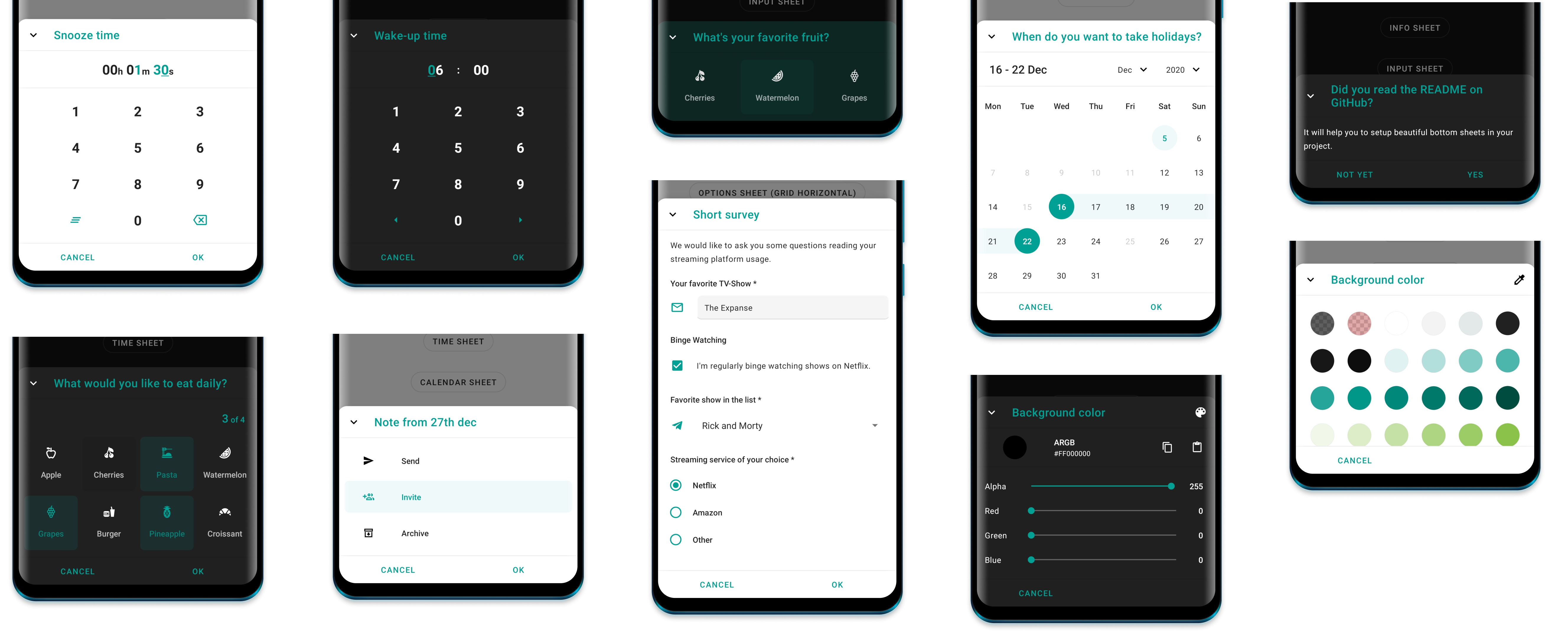
Get the sample apk to see the bottom sheets in real.
- Get started
- Appearance
- Info Bottom Sheet
- Options Bottom Sheet
- Clock Time Bottom Sheet
- Time Bottom Sheet
- Input Bottom Sheet
- Calendar Sheet
- Color Bottom Sheet
- Custom Bottom Sheet
- Other
In order to use any of the following Bottom Sheets, you have to implement the core module.
dependencies {
  ...
  implementation 'com.maxkeppeler.bottomsheets:core:<latest-version>'
}
The following functions can be called from any bottom sheet:
Use cancelableOutside() to disable dismissing the bottom sheet when outside ‚
Use state() to set the BottomSheetBehavior state.‚
Use peekHeight() to set the peek height for the bottom sheet.
Use cornerRadius() to set corner radius.
Use cornerFamily() to set corner family (cut or rounded).
Use borderWidth() to set the width of the border width.
Use borderColor() to set the color of the border.
Use hideToolbar() to hide the toolbar of the bottom sheet (close icon button, the title and the divider).
Use hideCloseButton() to hide the close icon button.
Use title() to set the title text.
Use onNegative() to set the negative button text and/ or the listener to be invoked when clicked.
Use onDismiss() to set a listener to be invoked when the bottom sheet is dismissed.
Use addBottomSheetCallback() to add a bottom sheet callback.
Use show() to show the bottom sheet.
Each of the bottom sheets have an extension function called build and show where the receiver is the used bottom sheet.
Use build to build a bottom sheet and display it later.
val sheet = InfoSheet().build(context) {
  // build bottom sheet
}

sheet.show() // Show bottom sheet when ready
Use show if you want to build and then immediately display it.
InfoSheet().show(context) {
  // build bottom sheet
} // Show bottom sheet
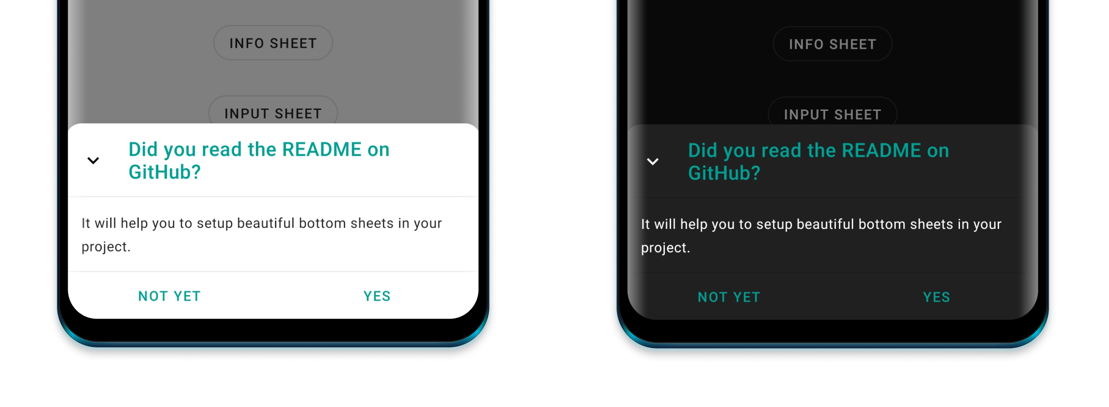
By default, the library switches to either day or night mode depending on the attr textColorPrimary. By default it uses the activity's colorPrimary and colorControlHighlight for the primary color and the highlights of the bottom sheets.
Recommended styles to overwrite:
<item name="bottomSheetPrimaryColor">@color/customPrimaryColor</item>
<item name="bottomSheetHighlightColor">@color/customHighlightColor</item>
Further things you can change or override:
<item name="bottomSheetBackgroundColor">@color/customBackgroundColor</item>
<item name="bottomSheetIconsColor">@color/customIconsColor</item>

Specific for OptionsSheet
<item name="bottomSheetOptionActiveImageColor">@color/customActiveOptionImageColor</item>
<item name="bottomSheetOptionActiveTextColor">@color/customActiveOptionTextColor</item>

Specific for title text
<item name="bottomSheetTitleColor">@color/customTitleTextColor</item>
<item name="bottomSheetTitleFont">@font/font</item>
<item name="bottomSheetTitleLineHeight">@dimen/dimen</item>
<item name="bottomSheetTitleLetterSpacing">value</item>

Specific for content text
<item name="bottomSheetContentColor">@color/customContentTextColor</item>
<item name="bottomSheetContentFont">@font/font</item>
<item name="bottomSheetContentLineHeight">@dimen/dimen</item>
<item name="bottomSheetContentLetterSpacing">value</item>

Specific for value Text (TimeSheet, ClockTimeSheet, CalendarSheet)
<item name="bottomSheetValueTextActiveColor">@color/customValueTextColor</item>
<item name="bottomSheetValueFont">@font/font</item>
<item name="bottomSheetValueLineHeight">@dimen/dimen</item>
<item name="bottomSheetValueLetterSpacing">value</item>

Specific for digit text
<item name="bottomSheetDigitColor">@color/customDigitTextColor</item>
<item name="bottomSheetDigitFont">@font/font</item>
<item name="bottomSheetDigitLineHeight">@dimen/dimen</item>
<item name="bottomSheetDigitLetterSpacing">value</item>

Specific for button text
<item name="bottomSheetButtonTextColor">@color/customButtonTextColor</item>
<item name="bottomSheetButtonTextFont">@font/font</item>
<item name="bottomSheetButtonTextLetterSpacing">value</item>
The Info Bottom Sheet lets you display information or warning.
dependencies {
  ...
  implementation 'com.maxkeppeler.bottomsheets:info:<latest-version>'
}For the default info sheet use it as following:
InfoSheet().show(context) {
  title("Do you want to install Awake?")
  content("Awake is a beautiful alarm app with morning challenges, advanced alarm management and more.")
  onNegative("No") {
    // Handle event
  }
  onPositive("Install") {
    // Handle event
  }
}
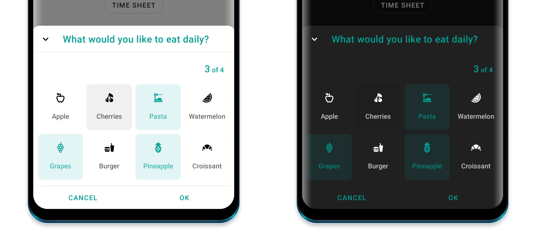
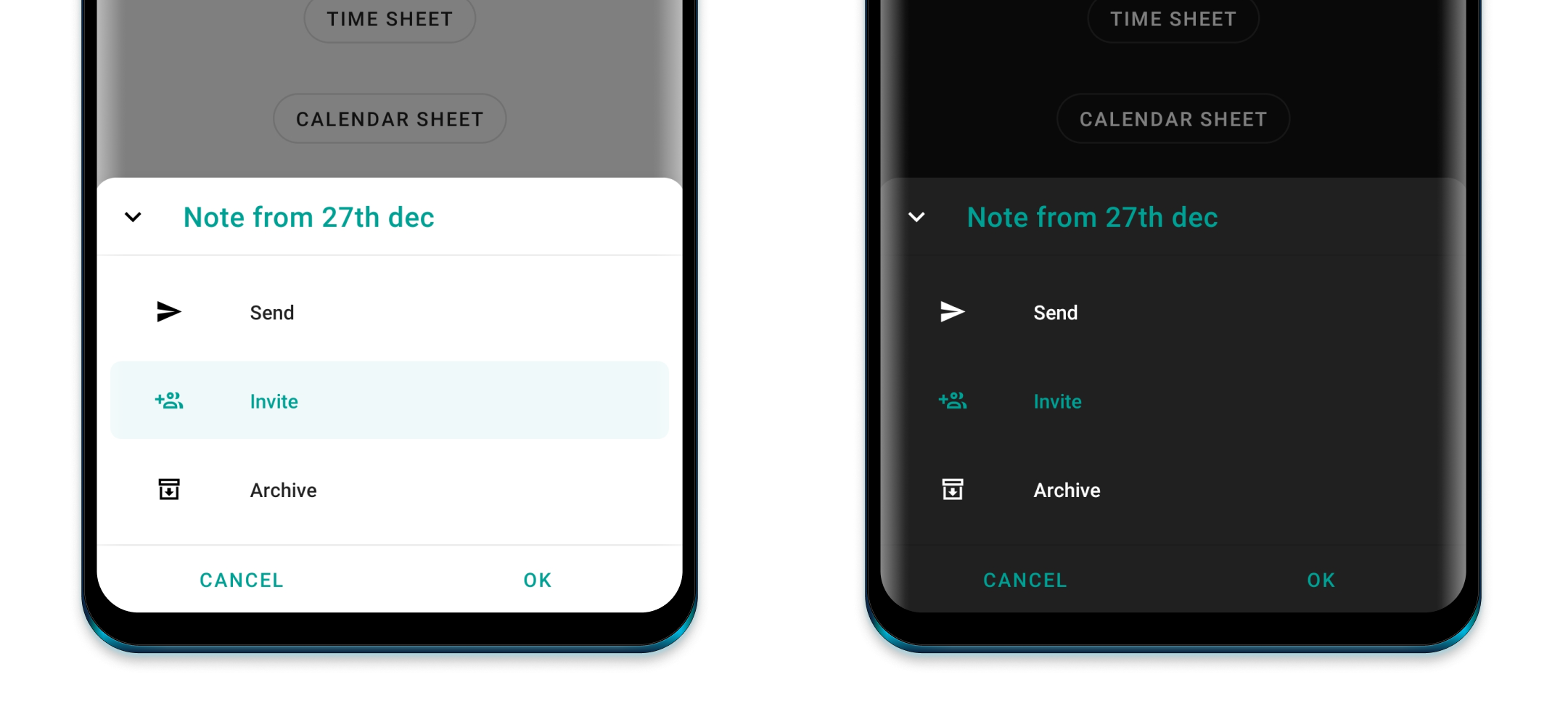
The Options Bottom Sheet lets you display a grid or list of options.
dependencies {
  ...
  implementation 'com.maxkeppeler.bottomsheets:options:<latest-version>'
}For the default options sheet use it as following:
OptionsSheet().show(context) {
  title("Text message")
  with(
    Option(R.drawable.ic_copy, "Copy"),
    Option(R.drawable.ic_translate, "Translate"),
    Option(R.drawable.ic_paste, "Paste")
  )
  onPositive { index: Int, option: Option ->
    // Handle selected option
  }
}
Use multipleChoices() to select multiple options.
Use showMultipleChoicesInfo() to display min and max amount of choices and current selection.
Use maxChoicesStrictLimit() prevents the user to select more choices than allowed.
Use minChoices() to set the minimum amount of choices.
Use maxChoices() to set the maximum amount of choices.
Set a listener with onPositiveMultiple() for multiple choices data.
Use showButtons() to show the buttons and require a positive button click.
Use displayMode() to either display it as a list, a vertical or horizontal growing scrollable grid.
Option Object
Use selected() to preselect an option.
Use disable() to disable an option.
Notice: Preselected options automatically increase the current selection while disabled options decrease the maximum amount of choices.
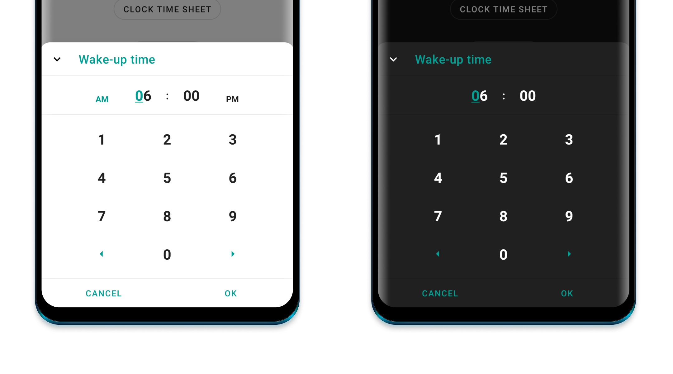
The Clock Time Bottom Sheet lets you quickly pick a time.
dependencies {
  ...
  implementation 'com.maxkeppeler.bottomsheets:time_clock:<latest-version>'
}For the default clock time sheet, in 24-hours format, use it as following:
ClockTimeSheet().show(context) {
  title("Wake-up time")
  onPositive { clockTimeInMillis: Long ->
    // Handle selected time
  }
}
Use format24Hours() to choose between the 24-hours or 12-hours format.
Use currentTime() to set the current time in milliseconds.
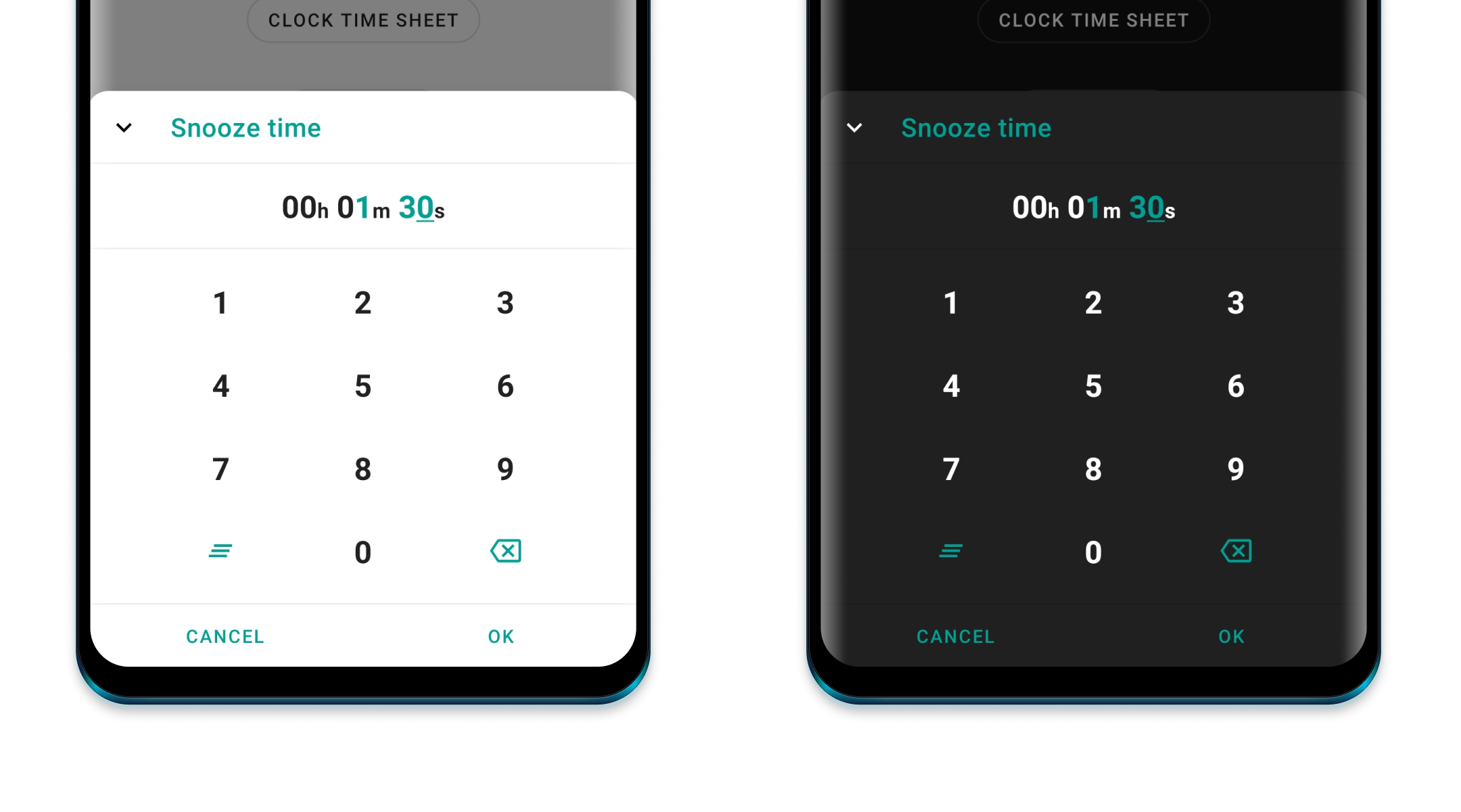
The Time Bottom Sheet lets you pick a duration time in a specific format.
dependencies {
  ...
  implementation 'com.maxkeppeler.bottomsheets:time:<latest-version>'
}For the default time sheet use it as following:
TimeSheet().show(context) {
  title("Snooze time")
  onPositive { durationTimeInMillis: Long ->
    // Handle selected time
  }
}
Use format() to select the time format. (e. g. HH:mm:ss, mm:ss, ...)
Use currentTime() to set the current time in seconds.
Use minTime() to set the minimum time.
Use maxTime() to set the maximum time.
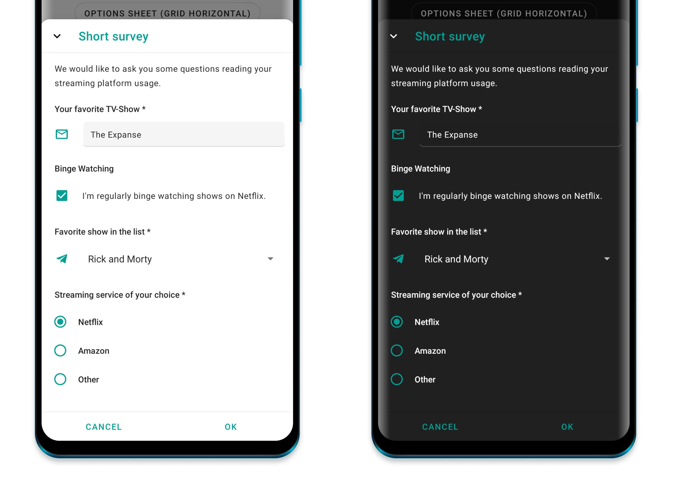
The Input Bottom Sheet lets you display a form consisting of various inputs.
dependencies {
  ...
  implementation 'com.maxkeppeler.bottomsheets:input:<latest-version>'
}For the default input sheet use it as following:
InputSheet()).show(context) {
    title("Short survey")
    content("We would like to ask you some questions reading your streaming platform usage.")
  with(InputEditText {
    required())
    label("Your favorite TV-Show")
    hint("The Mandalorian, ...")
    changeListener { value -> } // Input value changes
    resultListener { value -> } // Input value changed when form finished
  })
  with(InputCheckBox("binge_watching") { // Read value later by index or custom key from bundle
    label("Binge Watching")
    text("I'm regularly binge watching shows on Netflix.")
    // ... more options
  })
  with(InputRadioButtons() {
    required()
    label("Streaming service of your choice")
    options(mutableListOf("Netflix", "Amazon", "Other"))
  })
  // ... more input options
  onNegative { showToast("InputSheet cancelled", "No result") }
  onPositive { result ->
      showToastLong("InputSheet result", result.toString())
      val text = result.getString("0") // Read value of inputs by index
      val check = result.getBoolean("binge_watching") // Read value by passed key
  }
}
Supported Input options:
For now you can use InputEditText, InputCheckBox, InputRadioButtons, InputSpinner.
Use content() to add a content text (e. g. to explain the form).
Common configs are:
Use label() to set text of the input label.
Use drawable() to set drawable of the input.
Use required() to enforce that the user inputs value. By default, no input is required.
Use changeListener() to observe a change of the value.
Use resultListener() to receive the final value. (Or use the bundled data result listener.)
InputEditText
Use hint() to set text hint.
Use default() to set default text.
Use inputType() to set the android.text.InputType's.
Use inputFilter() to set the android.text.inputFilter.
InputCheckBox
Use text() to set the CheckBox text.
Use default() to set default value.
InputRadioButtons
Use text() to set the CheckBox text.
Use selected() to set selected index.
Use options() to add text options.
InputSpinner
Use text() to set the CheckBox text.
Use selected() to set selected index.
Use options() to add text options.
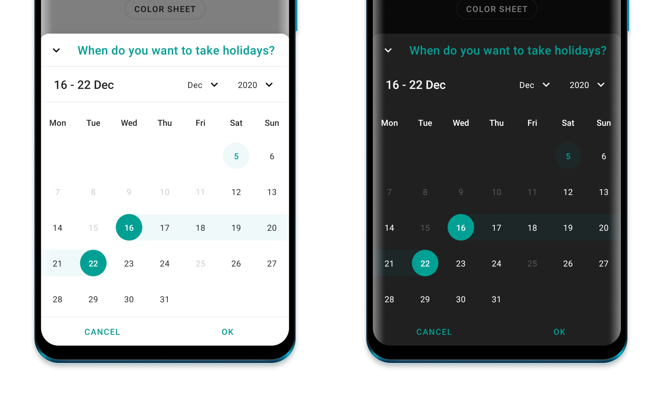
The Calendar Bottom Sheet lets you pick a date or date range. This type was build using the library CalendarView.
dependencies {
  ...
  implementation 'com.maxkeppeler.bottomsheets:calendar:<latest-version>'
}For the default time sheet use it as following:
CalendarSheet().show(this) { // Build and show
  title("What's your date of birth?") // Set the title of the bottom sheet
  onPositive { dateStart, dateEnd ->
    // Handle date or range
  }
Use selectionMode() to choose the selection mode (date or range).
Use calendarMode() to choose the calendar mode (week with various rows or month-view).
Use disableTimeline() to disable either past or future dates.
Use rangeYears() to set the range of years into past and future.
Use disable() to passCalendar object to disable various dates for selection.
Use showButtons() to show or hide the buttons view.
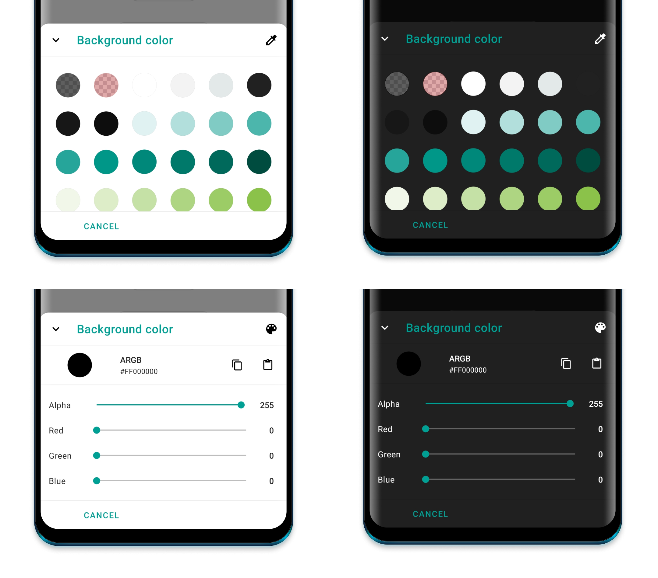
The Color Bottom Sheet lets you pick a color. Display the default material colors or specify which colors can be chosen from. You can allow to chose a custom color as well.
dependencies {
  ...
  implementation 'com.maxkeppeler.bottomsheets:color:<latest-version>'
}For the default color sheet use it as following:
ColorSheet().show(context) {
  title("Background color")
  onPositive { color ->
    // Use color
  }
}
Use defaultView() to select the default color view (Colors from templates or custom).
Use disableSwitchColorView() to disable switching betwen color views. Default view will only be shown.
Use defaultColor() to set default selected color.
Use colors() to pass all colors to be displayed in the color templates view.
Use disableAlpha() to disable alpha colors for custom colors.
With just the 'core' module you are able to create your own bottom sheet based on this library. You can use some components and styles within your own custom bottom sheet automatically. By default the buttons and toolbar view with logic is ready to be used by your own implementation.
dependencies {
  ...
  implementation 'com.maxkeppeler.bottomsheets:core:<latest-version>'
}You can find a custom bottom sheet implementation in the sample module.
For the default color sheet use it as following:
- Step: Create a class and extend from the class
BottomSheet.
class CustomSheet : BottomSheet() {
- Step: Implement the method:
onCreateLayoutViewand pass your custom layout.
override fun onCreateLayoutView(): View {
    return LayoutInflater.from(activity).inflate(R.layout.bottom_sheets_custom, null)
}
All of the base functionality can be used and on top of that you can extend the logic and behavior as you wish.
Check out some real apps which use this library.
Feel free to hit me up to include your app here.
- Sign for Spotify - Playlist and control widgets for Spotify on your home screen. (Uses:
Info,Options,Input,Color)
-
Leave a Star and tell other devs about it.
-
Watch for updates and improvements.
-
Open an issue if you see or got any error.
-
Leave your thanks in the guestbook or let me know if you use this library.
I created several bottom sheets for my apps Sign for Spotify and Awake in the recent months. I especially wanted to have a 'writable' clock time and duration time picker in form of a bottom sheet This is my first library - I'm happy about any feedback, tips etc. I hope you like it and can make use of it. :)
- Thanks to Sasikanth. I got some inspiration for the bottom sheet appearance through his Color Sheet library, as well as his note taking app Memoire.
- Thanks to Aidan Follestad and his material-dialogs library. I originally wanted to offer all bottom sheets through one library. I got inspired of his project to split the different bottom sheets into different modules/ libraries.
Copyright 2020 Maximilian Keppeler https://maxkeppeler.com

Licensed under the Apache License, Version 2.0 (the "License");
you may not use this file except in compliance with the License.
You may obtain a copy of the License at

   http://www.apache.org/licenses/LICENSE-2.0

Unless required by applicable law or agreed to in writing, software
distributed under the License is distributed on an "AS IS" BASIS,
WITHOUT WARRANTIES OR CONDITIONS OF ANY KIND, either express or implied.
See the License for the specific language governing permissions and
limitations under the License.
