Made with ❤️ by XMARTLABS.
Android PagerTabStrip for iOS!
👉 Looking for a SwiftUI version? Check out PagerTabStripView, it's fully written in pure SwiftUI. 👈
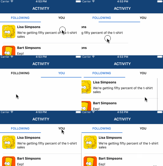
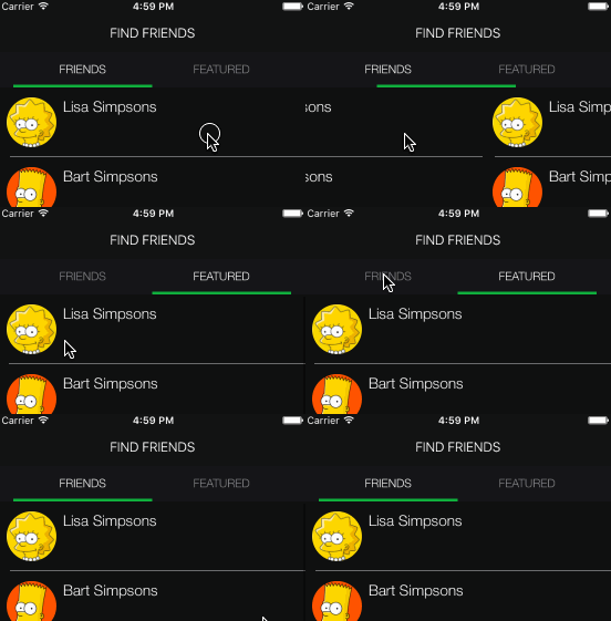
XLPagerTabStrip is a Container View Controller that allows us to switch easily among a collection of view controllers. Pan gesture can be used to move on to next or previous view controller. It shows a interactive indicator of the current, previous, next child view controllers.
 |
 |
 |
 |
|---|
- If you want to contribute please feel free to submit pull requests.
- If you have a feature request please open an issue.
- If you found a bug or need help please check older issues, FAQ and threads on StackOverflow (Tag 'XLPagerTabStrip') before submitting an issue.
Before contribute check the CONTRIBUTING file for more info.
If you use XLPagerTabStrip in your app we would love to hear about it! Drop us a line on twitter.
The library provides 4 different ways to show the view controllers.
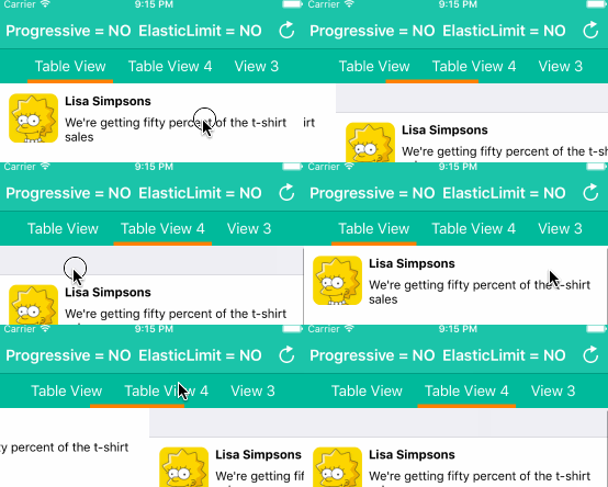
This is likely the most common pager type. It's used by many well-known apps such as instagram, youtube, skype, and many others.
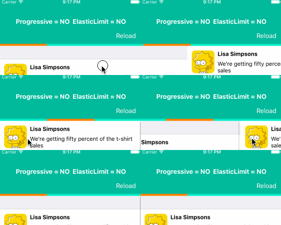
This mode doesn't show a title neither an image. It only shows a bar that indicates the current view controller.
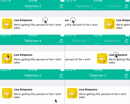
A long time ago, the twitter app made use of this type of pager in the app main screen.
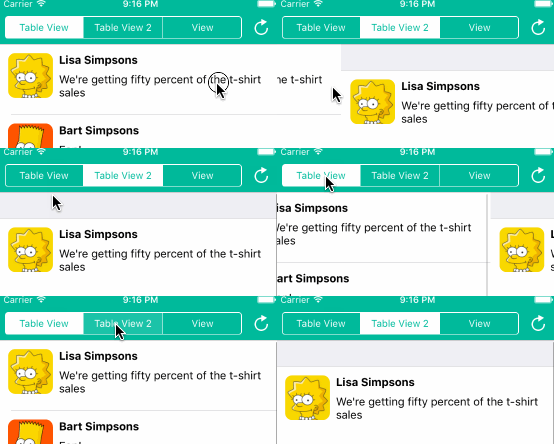
This mode uses a UISegmentedControl to indicate which view controller is being displayed.
Basically, we just need to provide the list of child view controllers to show, and these view controllers should provide the information (title or image) that will be shown in the associated indicator.
Let's see the steps to do this:
First, we must choose the type of pager we want to create. Depending on our choice, we will have to create a view controller that extends from one of the following controllers: TwitterPagerTabStripViewController, ButtonBarPagerTabStripViewController, SegmentedPagerTabStripViewController, BarPagerTabStripViewController.
All these built-in pager controllers extend from the base class
PagerTabStripViewController. You can also make your custom pager controller by extending directly fromPagerTabStripViewControllerin the event that no pager menu type fits your needs.
import XLPagerTabStrip

class MyPagerTabStripName: ButtonBarPagerTabStripViewController {
  ..
}We strongly recommend using IB to set up our page controller views.
Drag a UIViewController into the storyboard and set up its class with your pager controller (MyPagerTabStripName).
Drag a UIScrollView into your view controller view and connect PagerTabStripViewController containerView outlet with the scroll view.
Depending on which type of paging view controller you are working with you may have to connect more outlets.
For BarPagerTabStripViewController, we should connect barView outlet. barView type is UIView. ButtonBarPagerTabStripViewController requires us to connect buttonBarView outlet. buttonBarView type is ButtonBarView which extends from UICollectionView. SegmentedPagerTabStripViewController has a segmentedControl outlet; if the outlet is not connected the library try to set up the navigationItem titleView property using a UISegmentedControl. TwitterPagerTabStripViewController doesn't require us to connect any additional outlet.
The example project contains a example for each pager controller type and we can look into it to see how views were added and how outlets were connected.
You can provide the view controllers by overriding func viewControllers(for: pagerTabStripController: PagerTabStripViewController) -> [UIViewController] method.
override public func viewControllers(for pagerTabStripController: PagerTabStripViewController) -> [UIViewController] {
  return [MyEmbeddedViewController(), MySecondEmbeddedViewController()]
}
The method above is the only method declared in
PagerTabStripDataSourceprotocol. We don't need to explicitly conform to it since base pager class already does it.
Every UIViewController that will appear within the PagerTabStrip needs to provide either a title or an image.
In order to do so they should conform to IndicatorInfoProvider by implementing func indicatorInfo(for pagerTabStripController: PagerTabStripViewController) -> IndicatorInfo
which provides the information required to show the PagerTabStrip menu (indicator) associated with the view controller.
class MyEmbeddedViewController: UITableViewController, IndicatorInfoProvider {

  func indicatorInfo(for pagerTabStripController: PagerTabStripViewController) -> IndicatorInfo {
    return IndicatorInfo(title: "My Child title")
  }
}
For a detailed step-by-step guide about how to use the library, please check out this community blog post.
That's it! We're done! 🍻🍻
The pager indicator can be updated progressive as we swipe or at once in the middle of the transition between the view controllers.
By setting up pagerBehaviour property we can choose how the indicator should be updated.
public var pagerBehaviour: PagerTabStripBehaviourpublic enum PagerTabStripBehaviour {
case common(skipIntermediteViewControllers: Bool)
case progressive(skipIntermediteViewControllers: Bool, elasticIndicatorLimit: Bool)
}Default Values:
// Twitter Type
PagerTabStripBehaviour.common(skipIntermediateViewControllers: true)
// Segmented Type
PagerTabStripBehaviour.common(skipIntermediateViewControllers: true)
// Bar Type
PagerTabStripBehaviour.progressive(skipIntermediateViewControllers: true, elasticIndicatorLimit: true)
// ButtonBar Type
PagerTabStripBehaviour.progressive(skipIntermediateViewControllers: true, elasticIndicatorLimit: true)
As you might have noticed, common and progressive enumeration cases have skipIntermediateViewControllers and elasticIndicatorLimit associated values.
skipIntermediateViewControllers allows us to skip intermediate view controllers when a tab indicator is tapped.
elasticIndicatorLimit allows us to tension the indicator when we reach a limit, I mean when we try to move forward from last indicator or move back from first indicator.
Normally we don't need to implement these protocols because each pager type already conforms to it in order to properly update its indicator. However, there may be some scenarios when overriding a method may come in handy.
public protocol PagerTabStripDelegate: class {

    func updateIndicator(for viewController: PagerTabStripViewController, fromIndex: Int, toIndex: Int)
}

public protocol PagerTabStripIsProgressiveDelegate : PagerTabStripDelegate {

    func updateIndicator(for viewController: PagerTabStripViewController, fromIndex: Int, toIndex: Int, withProgressPercentage progressPercentage: CGFloat, indexWasChanged: Bool)
}
Again, the method invoked by the library depends on the
pagerBehaviourvalue.
settings.style.buttonBarBackgroundColor: UIColor?
// buttonBar minimumInteritemSpacing value, note that button bar extends from UICollectionView
settings.style.buttonBarMinimumInteritemSpacing: CGFloat?
// buttonBar minimumLineSpacing value
settings.style.buttonBarMinimumLineSpacing: CGFloat?
// buttonBar flow layout left content inset value
settings.style.buttonBarLeftContentInset: CGFloat?
// buttonBar flow layout right content inset value
settings.style.buttonBarRightContentInset: CGFloat?

// selected bar view is created programmatically so it's important to set up the following 2 properties properly
settings.style.selectedBarBackgroundColor = UIColor.black
settings.style.selectedBarHeight: CGFloat = 5

// each buttonBar item is a UICollectionView cell of type ButtonBarViewCell
settings.style.buttonBarItemBackgroundColor: UIColor?
settings.style.buttonBarItemFont = UIFont.systemFont(ofSize: 18)
// helps to determine the cell width, it represent the space before and after the title label
settings.style.buttonBarItemLeftRightMargin: CGFloat = 8
settings.style.buttonBarItemTitleColor: UIColor?
// in case the barView items do not fill the screen width this property stretch the cells to fill the screen
settings.style.buttonBarItemsShouldFillAvailiableWidth = true
// only used if button bar is created programmatically and not using storyboards or nib files as recommended.
public var buttonBarHeight: CGFloat?
Important: Settings should be called before viewDidLoad is called.
override func viewDidLoad() {
   self.settings.style.selectedBarHeight = 2
   self.settings.style.selectedBarBackgroundColor = UIColor.white

   super.viewDidLoad()
}We may need to update the indicator cell when the displayed view controller changes. The following function properties help to accomplish that. Depending on our pager pagerBehaviour value we will have to set up changeCurrentIndex or changeCurrentIndexProgressive.
public var changeCurrentIndex: ((oldCell: ButtonBarViewCell?, newCell: ButtonBarViewCell?, animated: Bool) -> Void)?
public var changeCurrentIndexProgressive: ((oldCell: ButtonBarViewCell?, newCell: ButtonBarViewCell?, progressPercentage: CGFloat, changeCurrentIndex: Bool, animated: Bool) -> Void)?
Let's see an example:
changeCurrentIndexProgressive = { (oldCell: ButtonBarViewCell?, newCell: ButtonBarViewCell?, progressPercentage: CGFloat, changeCurrentIndex: Bool, animated: Bool) -> Void in
    guard changeCurrentIndex == true else { return }

    oldCell?.label.textColor = UIColor(white: 1, alpha: 0.6)
    newCell?.label.textColor = UIColor.white

    if animated {
        UIView.animate(withDuration: 0.1, animations: { () -> Void in
            newCell?.transform = CGAffineTransform(scaleX: 1.0, y: 1.0)
            oldCell?.transform = CGAffineTransform(scaleX: 0.8, y: 0.8)
        })
    }
    else {
        newCell?.transform = CGAffineTransform(scaleX: 1.0, y: 1.0)
        oldCell?.transform = CGAffineTransform(scaleX: 0.8, y: 0.8)
    }
}settings.style.barBackgroundColor: UIColor?
settings.style.selectedBarBackgroundColor: UIColor?
// barHeight is only set up when the bar is created programmatically and not using storyboards or xib files as recommended.
settings.style.barHeight: CGFloat = 5settings.style.dotColor = UIColor(white: 1, alpha: 0.4)
settings.style.selectedDotColor = UIColor.white
settings.style.portraitTitleFont = UIFont.systemFont(ofSize: 18)
settings.style.landscapeTitleFont = UIFont.systemFont(ofSize: 15)
settings.style.titleColor = UIColor.whitesettings.style.segmentedControlColor: UIColor?- iOS 9.3+
- Xcode 10.2+
Follow these 3 steps to run Example project: Clone XLPagerTabStrip repository, open XLPagerTabStrip workspace and run the Example project.
CocoaPods is a dependency manager for Cocoa projects.
To install XLPagerTabStrip, simply add the following line to your Podfile:
pod 'XLPagerTabStrip', '~> 9.0'Carthage is a simple, decentralized dependency manager for Cocoa.
To install XLPagerTabStrip, simply add the following line to your Cartfile:
github "xmartlabs/XLPagerTabStrip" ~> 9.0
PagerTabStripViewController provides the following methods to programmatically change the visible child view controller:
func moveToViewController(at index: Int)
func moveToViewController(at index: Int, animated: Bool)
func moveTo(viewController: UIViewController)
func moveTo(viewController: UIViewController, animated: Bool)Check out our migration guide
This can be found in the CHANGELOG.md file.


