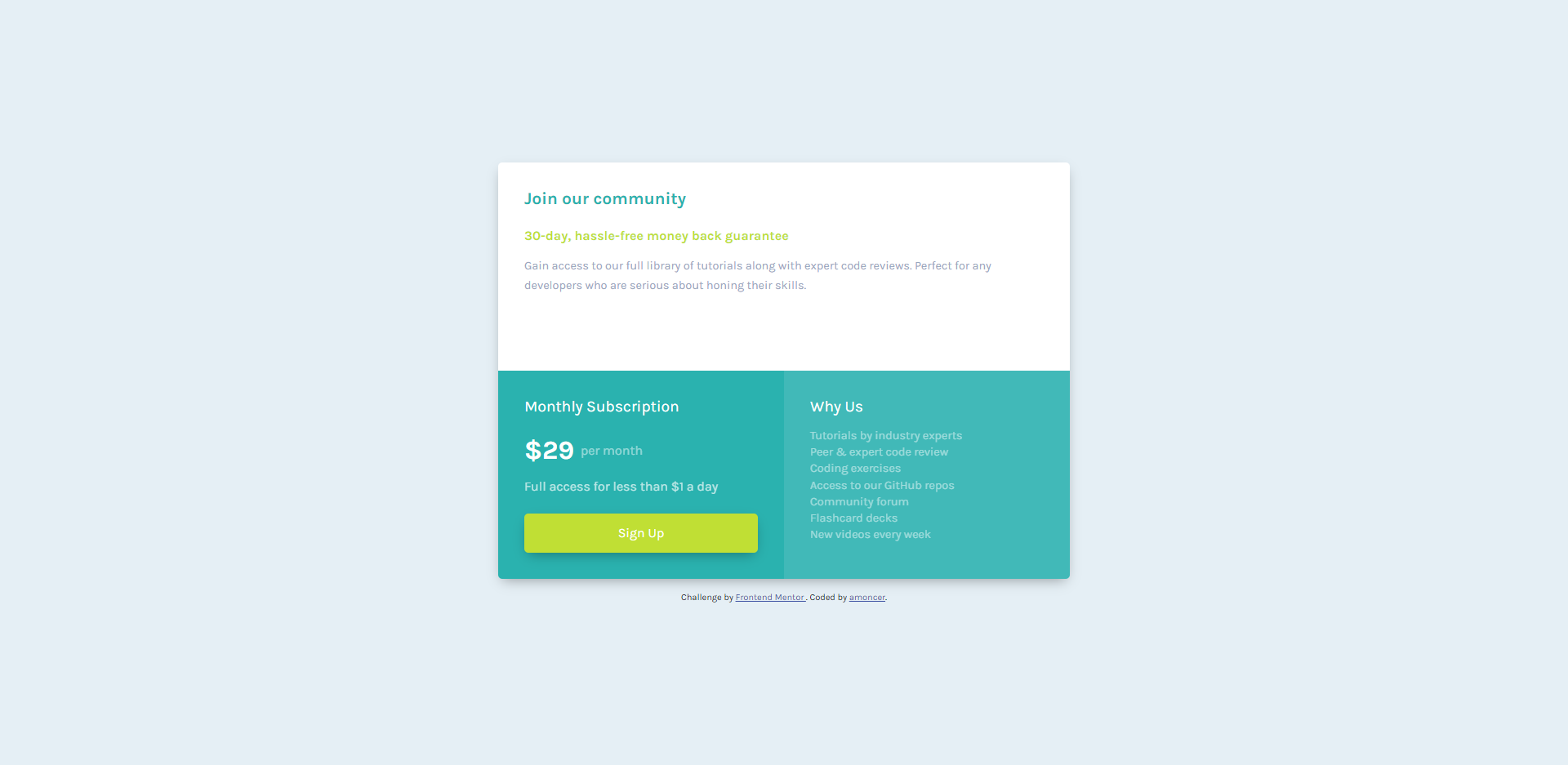
This is a solution to the Single price grid component challenge on Frontend Mentor. Frontend Mentor challenges help you improve your coding skills by building realistic projects.
Users should be able to:
- View the optimal layout for the component depending on their device's screen size
- See a hover state on desktop for the Sign Up call-to-action
- Solution URL: Add solution URL here
- Live Site URL: Add live site URL here
- Semantic HTML5 markup
- CSS
- Flexbox
- CSS Grid
- Mobile-first workflow
It's the first time i work with grid-template-areas, and it's pretty.
See code snippet below :
<div class="main">
  <section class="section-join"></section>
  <section class="section-subscription"></section>
  <section class="section-why"></section>
</div>.main {
display: grid;
grid-template-columns: 1fr 1fr;
grid-template-rows: 1fr 1fr;
grid-template-areas:
"join join"
"subscription why";
max-width: 700px;
}
.section-join {
grid-area: join;
}
.section-subscription {
grid-area: subscription;
}
.section-why {
grid-area: why;
}I'm still not comfortable with layouts and spacing (containers, margin, padding, display...), i need to focus on these topics to be more efficient.
- Frontend Mentor - @amoncer
