| title | author |
|---|---|
Building an image annotation Web Component |
Patrick Hall |
I have found many contexts in which it would be useful to add annotations to images. For example, I am interested in writing systems for various reasons, and I often need to add annotations to images of text. I am also interested in building Web Components, and I thought it would be fun to build a Web Component that allows users to add annotations to images. In this article I am keeping a record of the steps I took and research I had to do to get the component working.
The workflow I have in mind for users is as follows:
- The user selects an image to annotate.
- The user selects a tool to use for annotation.
- The user uses the tool to annotate the image.
- The user saves the annotations.
Probably the most difficult part of this project (in my estimation, after having made various prototypes) is managing issues to do with image scaling. Typically, annotating an image isn’t worth the effort with a low-resolution image of small dimensions. But with a large image, the user will need to zoom in and out to annotate different parts of the image. This means that selections for annotations will also have to scale. I have started looking into this spacing using <canvas>, but the problem with that is that selections are just pixels, and so they don’t scale with the image. I think a better solution is to use <svg>, so that the selections are <rect> elements. (Additionally, in the future it would be possible to support polygons. https://geojson.io is an inspiration for me here.)
The basic user interface I have in mind looks like this:
<iframe src="basic-interface.html" width="100%" height="300px"></iframe>Fugly, I know. The point right now is just to figure out what elements are necessary. To be honest I could probably dispense with the toolbar, but one must dream.
Because god.
Until we get to building out the component, I’ll keep working directly in the <body> tag as the top level.
Building things always makes you realize what’s obvious: we’re missing some kind of pane to see and edit annotations. But we don’t have any yet anyway, so we’ll come back to this. Let’s start with task one: loading an image.
The basic idea here is: when the user selects an image, add it to the <svg>.
We’re going to want the image to be in the <svg> as opposed to a background image or something, because we’re going to need to zoom things. That means using the <image> tag.
We’ll be using a couple images files in this project, they are included in the repo, so you can load them with the file picker from wherever you are running your localhost. (They are from the National Museum of Scotland). We’ll be using the one called mereri.jpg for this example.
So try loading mereri.jpg using the interface below:
<iframe src="load-image.html" width="100%" height="300px"></iframe>This doesn’t do much, it just alerts the file name when we load it. But at least we know loading is happening.
Now, we need to actually load the image into the <svg>. Our strategy will be to insert the file object into the DOM at the href of the <image> element. The .files property of the <input type=files> is a File object, which means that is a subtype of a Blob. And a blob, in case you are unfamiliar, is just some undifferentiated data stored by the browser and given an URL. So we don’t even need to use anything like URL.createObjectURL(), because the file already has a URL. In fact, if we pass a reference to our file object when we are creating the <image> tag’s HTML, the browser will put a blob URL in place and it will work.
export let loadImage = async changeEvent => {
  let image = changeEvent.target.files[0]
  let request = new Response(image)
  let blob = await request.blob()

  let imageHTML = `<image id=svg-image x="0" y="0" />`
  document.querySelector('svg').insertAdjacentHTML('beforeend', imageHTML)

  document.querySelector('#svg-image').setAttribute('href', URL.createObjectURL(blob))
}

document.querySelector('input[type=file]')
.addEventListener('change', changeEvent => loadImage(changeEvent))As you can see, the image doesn’t fit in the <svg>. But the image is loading correctly. As you can see below, the href attribute of the <image> tag is set to contain a blob URL (once you have loaded the image):
<image id="svg-image" x="0" y="0" href="blob:http://localhost:1111/cfe75b6a-887d-4d1a-81bb-c3a65ac28461"></image>Of course, your blob URL’s GUID will be different.
Plain old <img> tags have their own rules about scaling, and they’re pretty simple. They render the entire image, although you can adjust size and aspect ratio.
By default, if you just stick an image into a page, it’s going to be full-size.
<img src=mereri.jpg style=max-width:none;border:1px solid" class=show-image-size>As you can see, this image is 2000px wide and thus probably way too large for you to see. By default, I use a rule that says img { max-width: 100%}, so that images are never bigger than their parent container and thus always fit on the page. For the example above I turned off that default.
Where the size data comes from
I used a little code to generate the dimension sizes of any image in this page with a class of .show-image-size. It looks like this:
document.querySelectorAll('.show-image-size')
  .forEach(img => {
    img.addEventListener('load', () => {
      let p = document.createElement('p')
      let {width, height } = img.getBoundingClientRect()
      let {naturalWidth, naturalHeight} = img

      p.innerHTML = `<table>
      <tr><th>naturalWidth</th><td>${parseInt(naturalWidth)}px</td></tr>
      <tr><th>naturalHeight</th><td>${parseInt(naturalHeight)}px</td></tr>
      <tr><th>rendered width</th><td>${parseInt(width)}px</td></tr>
      <tr><th>rendered height</th><td>${parseInt(height)}px</td></tr>
      </table>`
      img.after(p)
    })
  })
The naturalWidth and naturalHeight properties of the image are the dimensions of the image file itself. The width and height properties of the image are the dimensions of the image as it is rendered on the page. See MDN for more information. As we’ll see below, the SVG <image> tag does not have a naturalWidth or naturalHeight property, so we’ll have to do some extra work to get that information.
With <img> tags, setting the width or height will cause it to be scaled.
In this case, the image file we are dealing with is 2000 wide and 1500 pixels tall. So if I set the width of the image to 500 pixels, the image will be scaled to 500 pixels wide and 375 pixels tall (the height is scaled automatically in proportion to the change in width):
<img src=mereri.jpg width=500 style="border:1px solid" class=show-image-size>Note that something similar happens if I set the height of the image to 500 pixels:
<img src=mereri.jpg height=500 style="border:1px solid" class=show-image-size>As you can see from the inline borders, the <img> tag adjusts its size so that the aspect ratio of the image is maintained: if we adjust the width, the height is automatically scaled in the same proportion, and vice-versa. If we set both height and width it is possible that the image will be distorted:
<img src=mereri.jpg height=200 width=800 style="border:1px solid" class=show-image-size>There’s one more thing worth noting before we move onto images in svg: panning. Panning
If you’re using a trackpad, you can pan around the image by using two fingers. If you’re using a touchscreen device, you can pan around the image by dragging with one finger. This is very much not how SVGs work, as we’ll see below.
<figure  style="max-width: none; border:4px double pink; height:150px; width: 300px; overflow:auto;" >
<img src=mereri.jpg  style="max-width: none; border:1px solid" class=show-image-size>
</figure>
So much for scaling <img> tags. In our web component, we’ve decided to use an <svg>, and so the our image will go into the SVG-land tag called <image>, not <img>. The name isn’t the only thing that changes: the whole system of scaling changes as well.
The <image> tag in SVG is quite different from the <img> tag in HTML. Most obviously, the <img> tag is self-closing, but <image> must be </image> closed.
<image> also accepts different attributes than the <img> tag. For one, the href attribute on <image> replaces the src attribute of an <img> tag, although it does the same thing — it specifies the URL of the image file we want to show.
Why `src` in `![]() ` but `href` in `
` but `href` in `![]() `?
`?
I was curious. Here’s what ChatGPT said.
The difference between the
hrefattribute for<image>and thesrcattribute for<img>comes down to the historical definitions and usage of these elements.
<img>Element: The<img>element is used to embed images in HTML documents. Thesrcattribute (short for "source") defines the source URL of the embedded image. This has been the standard way to link to images in HTML for many years.
<image>Element: The<image>tag is often associated with SVG (Scalable Vector Graphics). In SVG, thehrefattribute is used to link to an image source, aligning with the way links are defined in other parts of the SVG specification.The divergence in attribute names may seem confusing, but it's the result of different standards and specifications that have evolved over time. While HTML has its origins in defining static documents, SVG is an XML-based vector image format that has its own specific ways of handling links and references.
In modern browsers, you might find that the
<image>element in SVG will also accept thexlink:hrefattribute, though this has been deprecated in favor of simply usinghref.
But the way that the file is shown varies drastically. Below, I have the same image inserted into an <img> tag above, but this time it’s inside an <image> tag which is in turn inside an <svg> tag.
<svg class="show-svg-size" style="border:3px double rebeccapurple" >
<image style="border:1px solid"  id="svg-image" x="0" y="0" href="mereri.jpg"></image>
</svg>
<svg class="show-svg-size" style="border:3px double rebeccapurple" >
<image style="border:1px solid" id="svg-image" x="0" y="0" href="mereri.jpg"></image>
</svg>
Okay, weird. Some differences from the preceding <img> tag:
- You can’t pan this image. If you try to, you’ll scroll the whole page. It’s as if the browser didn’t notice that you were interacting with the image.
- This
<svg>has the same dimensions as the<img>tag above, and the image appears to be scaled in exactly the same way (i.e. itsnaturalWidthandnaturalHeightare the being used to determine the size of the image). - But note that I didn’t specify anywhere that the
<svg>should have the same dimensions as the<img>tag: those are the default dimensions of the<svg>tag. Rather, I specified that the<img>should be like the<svg>.
Otherwise, the two approaches are giving us the same result: they are cropping the original image in the same way, and they are not scaling the image in any way.
An <svg> tag is really more like a window than a container. It has a size, but it doesn’t have a size in the same way that a <div> has a size. <div>s get their sizes from their contents, or they can be explicitly set via CSS. The size of an <svg> can also be set via CSS, or by explicit width and height attributes on the element itself. If use neither of those options, the <svg> will have a default size of 300px by 150px, which is what we’re seeing here. (The 3px purple border explains the 6 extra pixels on both axes).
Note that there is no naturalWidth or naturalHeight involved.
This is where svg scaling gets kind of complex.
Hey, remember how we were making an image annotation interface?
I think one of the reasons discussions of
SVGscaling get confusing is that they are often described in isolation. I’m hoping that this explanation will be more useful precisely because we’re talking about a specific content — the grid-based basic UI we described above.
Let’s put this SVG back into the interface we were working on above:
Now our <svg> tag finds itself inside the grid layout we started working on (it’s found in layout.css). But here I’ve updated the layout to 1) tell the <main> tag in our our UI that it should be a grid container, and 2) tell the <svg> tag to fill up the grid cell in which it finds itself. Crucially, note that we are not using any specific dimensions for anything. Here is the relevant CSS:
main {
  display: grid;
}

main svg {
  height: 100%;
  width: 100%;
  background-color: lightgray;
}
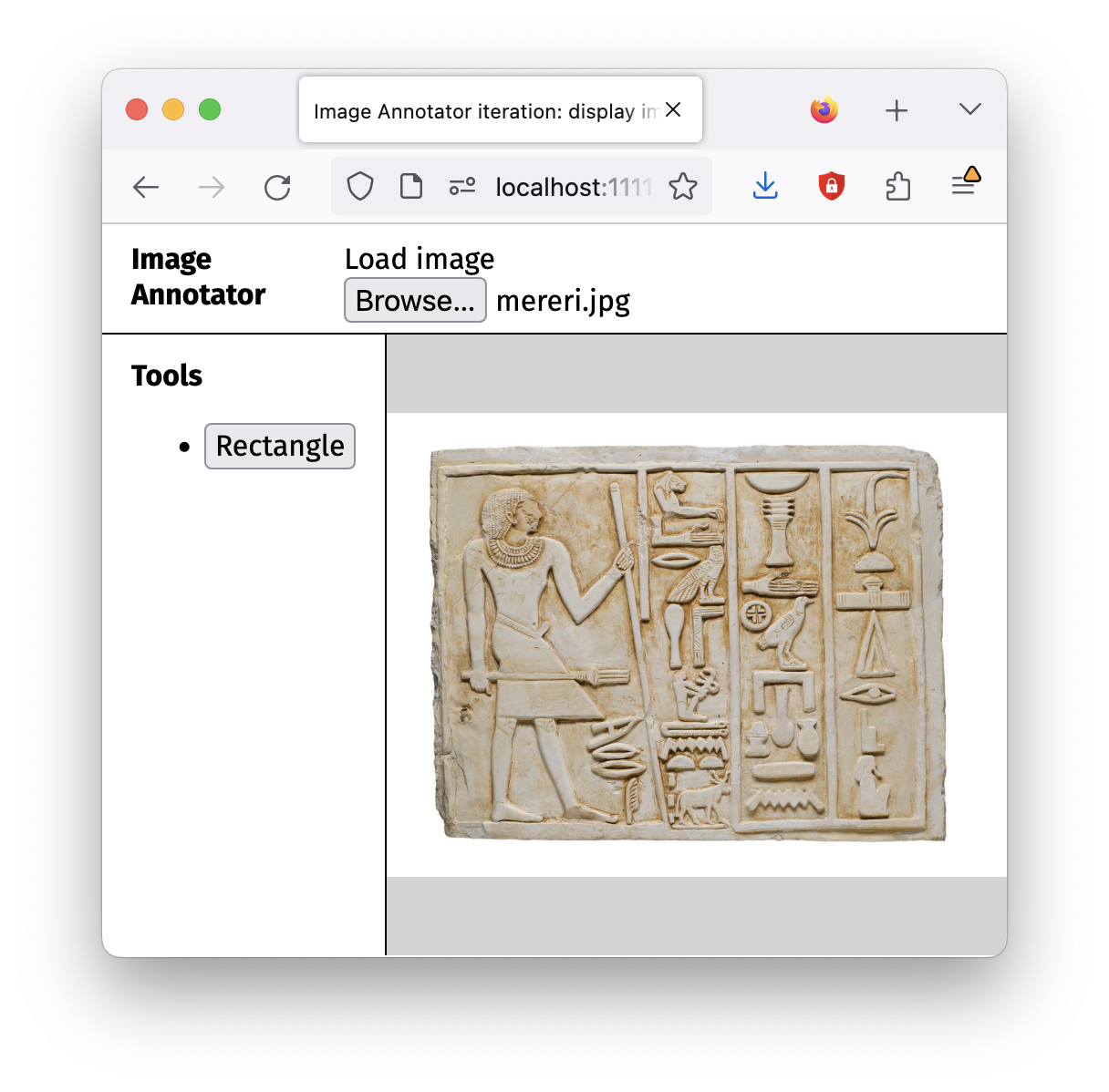
If you open the the current step (display-image.html) in its own tab, you’ll see much more of the <image> tag, but in all likelihood it will still be cropped.
main {
  display: grid;
}

main svg {
  height: 100%;
  width: 100%;
  background-color: lightgray;
}
I’m going to be honest with you, I can’t believe that this seems to work as well as it does. I was gearing up to expect to have to use
viewBoxandnaturalWidthandnaturalHeightand a lot of matrix math and stuff. We’ll see if this approach remains viable as we move into getting mouse coordinates.
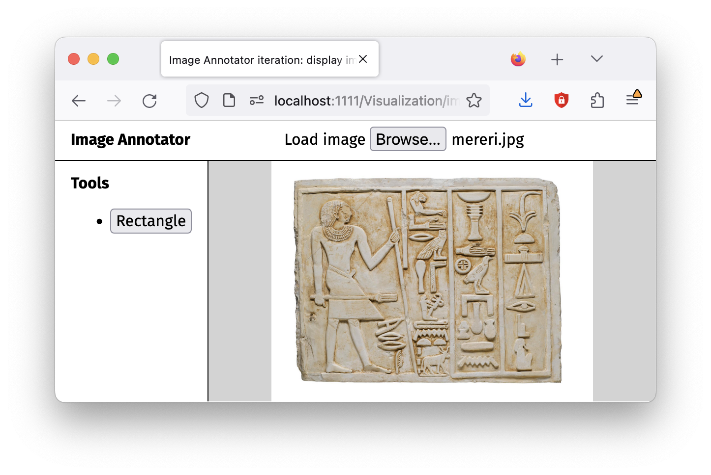
Note what is happening here: if you resize your browser window, you’ll see that image is scaled to keep it within the available area, but it is not cropped. This pattern is referred to as letterboxing, when a widescreen-formatted film is displayed on a standard television screen with its original aspect ratio. “Mattes” are added above and below to make the whole image fit.
The same thing can happen if we make the browser window narrower, except that the mattes will be on the sides:
So, our image is scaling acceptably. (Yes, we’re going to want to handle panning and zooming. We’ll get to that later.) Now we need to deal with mouse coordinates.
In a click event listener, we get an object that describes the click event in the callback function as the second argument of .addEventListener. This object is called a MouseEvent. It has a property called clientX that gives the x-coordinate of the click event, and a property called clientY that gives the y-coordinate of the click event.
clientX and clientY are relative to something called the viewport, which is essentially the browser window. So if you click in the upper left corner of the browser window, you’ll get clientX and clientY values close to 0.
In the demo below, we have an empty page where you can try this. Note that the origin is in the upper left corner: if you click up there you’ll get clientX and clientY values close to 0. (There is actually an information <div> placed in the top right corner, but it has a CSS property called pointer-events set to none, which means it is ignored when you happen to click inside it. The full CSS is here.)
Note that the listener here is listening to the <body> tag, which is the full viewport. (We removed the default 8px margin from the <body> and <html> elements to keep things simple.) It looks like this:
<script>
  document.body.addEventListener('click', clickEvent => {
    document.querySelector('td.x').textContent = `${clickEvent.clientX}px`
    document.querySelector('td.y').textContent = `${clickEvent.clientY}px`
  })
</script>
Also, if your head is spinning, remember that the demo above is inside of an <iframe> tag! So there really is a whole document inside that demo box — try opening it in a new tab for a more “pure” experience of the viewport vis-à-vis your browser window.
But sometimes, we want to know where we clicked relative to the boundaries of a particular element, rather than relative to the whole viewport (the <body> tag). For those cases there is another pair of event properties to look at: offsetY and offsetX. These properties are relative to the element that is listening for the event. So if we listen for a click event on the <body> tag, the offsetX and offsetY values will be relative to the <body> tag. If we listen for a click event on a <div> tag, the offsetX and offsetY values will be relative to the boundaries of that <div> tag. Try it out below:
As you can see, the <body> column only updates when you click outside of the yellow box. Otherwise, the <div> column updates because the <div> intercepts the click event first.
And take note: the offsetX and clientX values are different in the <div> column, because offsetX has its own coordinate system with 0,0 in its top left corner, but they are the same in the <body> column.
So when we make a selection on our <image>, the offsetX and offsetY will be more important than the clientX and clientY values, since we want to know where in the image we are clicking, not where in the document we are clicking. So, let’s test out our previous layout with the <svg> and see what happens:
So, I’ve added the click location debugging code into this application too. If you click in lower right corner of the Mereri image, while the offsetX values vary for <body>, <svg>, and <image>, we do not see values that suggest the full width of the 2000px by 1500px image. So although the image has been scaled to fit as per the previous section, the offsetX and offsetY values are not scaled. We will have to figure out how to do that ourselves.


