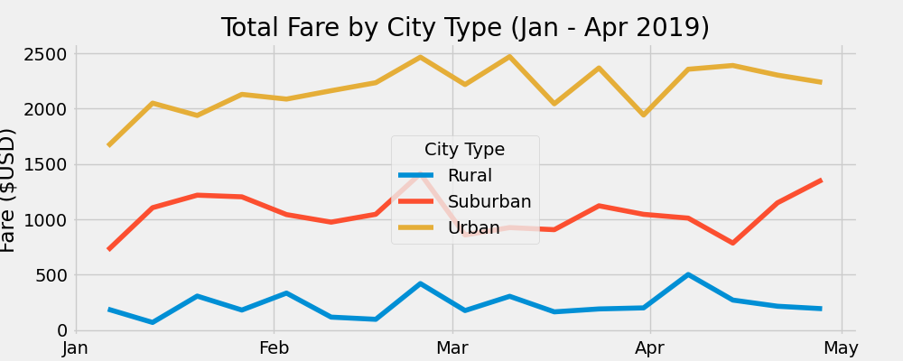
The purpose of this analysis was to take 2 CSV files, with city data and ride data, merge them, and extract information about ride frequencies by week in different types of areas ('Urban', 'Suburban', and 'Rural'). The data shown was collected from January through April of 2019.
The summary DataFrame is presented below.

From the table, its clear that urban rides comprise the vast majority of rides (68%), followed by suburban (26%) and then rural (6%). The proportion of drivers in urban areas is even higher (81%). Since rural rides are likely longer, the fare per ride is higher than in suburban or urban areas. This, along with less drivers, explains the high fare per driver in rural areas compared to urban and suburban ones.
The weekly plot of rides by city type is shown below.

By and large, the different city types experienced similar timing in peaks and troughs of ride-sharing frequencies. The largest collective week was the last week of February. An interesting note is the steady increase of suburban riders towards the end of the data collection, against the level trend of urban and rural riders.
Based on this analysis, I have three recommendations:
- Ride the wave of recent suburban interest by advertising in those areas and targeting a suburban demographic.
- Rural rides may simply be too expensive right now. Only 6% of rides are rural, despite there being a much larger proportion of Americans (~18%) who live in rural areas.
- Short urban rides are still the moneymaker by volume, although this wavered in March. Ensure that this rider type is not forgotten in upcoming marketing.