This is a solution to the Huddle landing page with single introductory section challenge on Frontend Mentor. Frontend Mentor challenges help you improve your coding skills by building realistic projects.
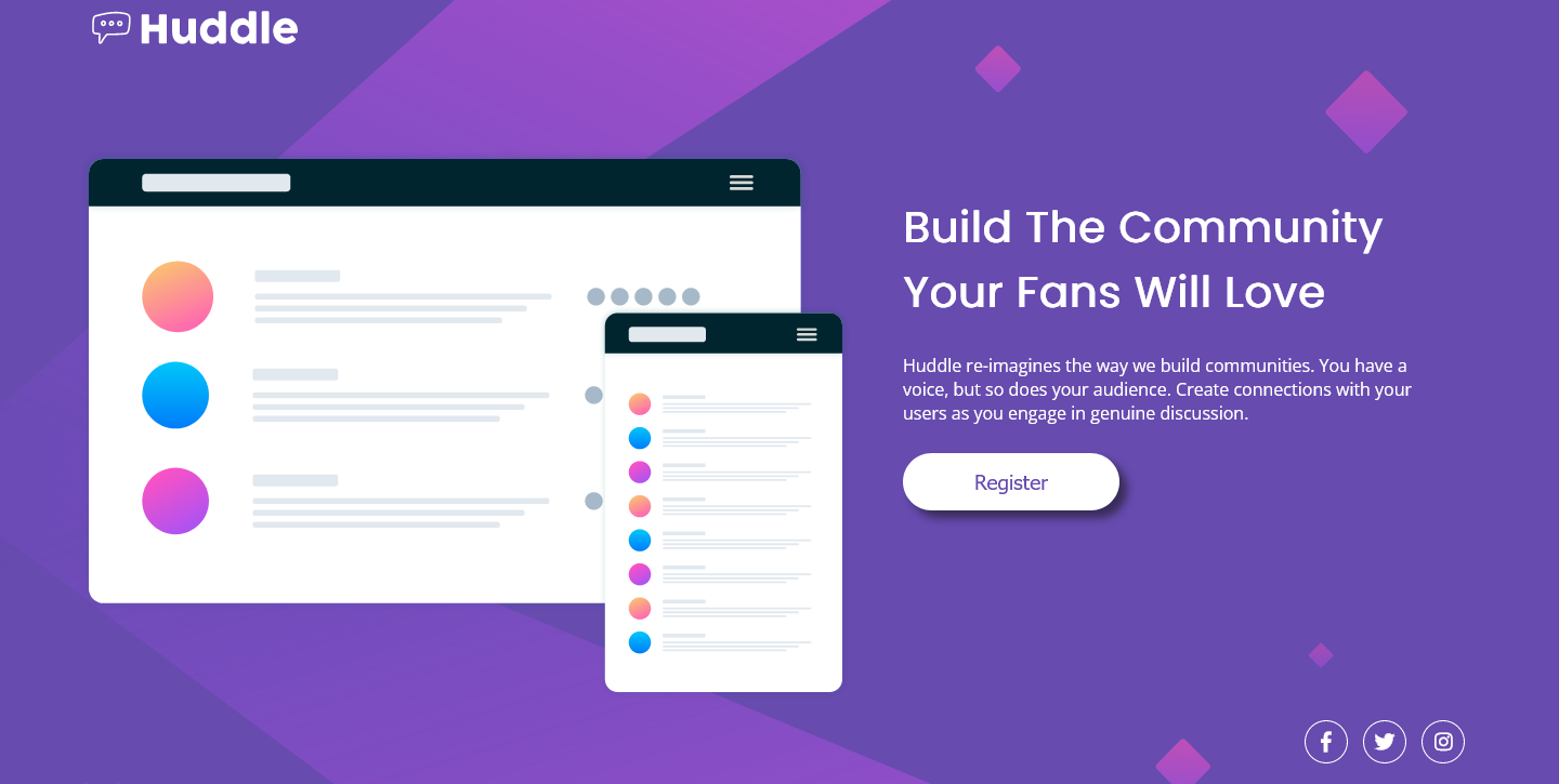
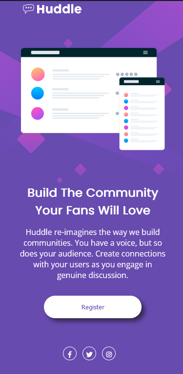
- Desktop version (1440px) and Mobile version (375px)


- My poor little fingers
- Core html & css rules to build a pixel perfect website that does not deviate from the picture
That position absolute is not optimal to use for the same page that needs optimization on two different resolution canvases.
To solve this problem I had to go from
.social-imgs {
  position: absolute;
  right: 35px;
  bottom: 15px;
}
to
.social-imgs {
  margin-top: 610px;
  margin-left: 1200px;
}
which fixed the issue for the social media icons not being static while every other element on the page was (on the desktop version)
But this completely messed up the mobile version putting the icons miles away from their original coordinates due to the margins being too long for the 375px version
The mobile social media icons (social-imgs) were still using the "position"'s property values
@media (max-width:375px) {
.social-imgs{
  top: 720px;
  left: 120px;
  }
}
I thought that maybe all I had to do was specify in the mobile version that I want the "social-imgs" (social media icons) to be position relative
That did not work, so I tried my best to find the closest coordinates using margin values to recreate my previous position
@media (max-width:375px) {
.social-imgs{
    margin-top: 665px;
    margin-left: 125px;
  }
}
If anybody has suggestions on how I could of solved this better please message me or if you can tell me why putting position absolute did not work for the mobile version please let me know.
Also, in the body I used an svg file as the background image, which is something I've never done before. After learning about svgs I think they are the best in terms of file size, resolution quality and responsivness.
I want to learn more about website responsivness. This challenge asked specifically for a 1440px width but as I resized the web page it looked really bad since everything was static. I had to use pixels to achieve this amount of precision for the website to look exactly as the picture when in 1440px or 375px width
Also, percentages are my best known way at the moment to make websites responsive to different screens as it takes an amount that is calculated depending on the individual user's resolution.
- w3schools - This helped me understand how to move a background image in the body. Very simple.
- w3schools - This helped me understand how to resize a body's background image.
- Github - anasolomon
- Frontend Mentor - @anasolomon