Visualize the amount of time spent on an activity.
Requires R, the tidyverse, and argparse.
# run the script:
Rscript timegraph.R my.csv

# alternatively:
./timegraph.R my.csv
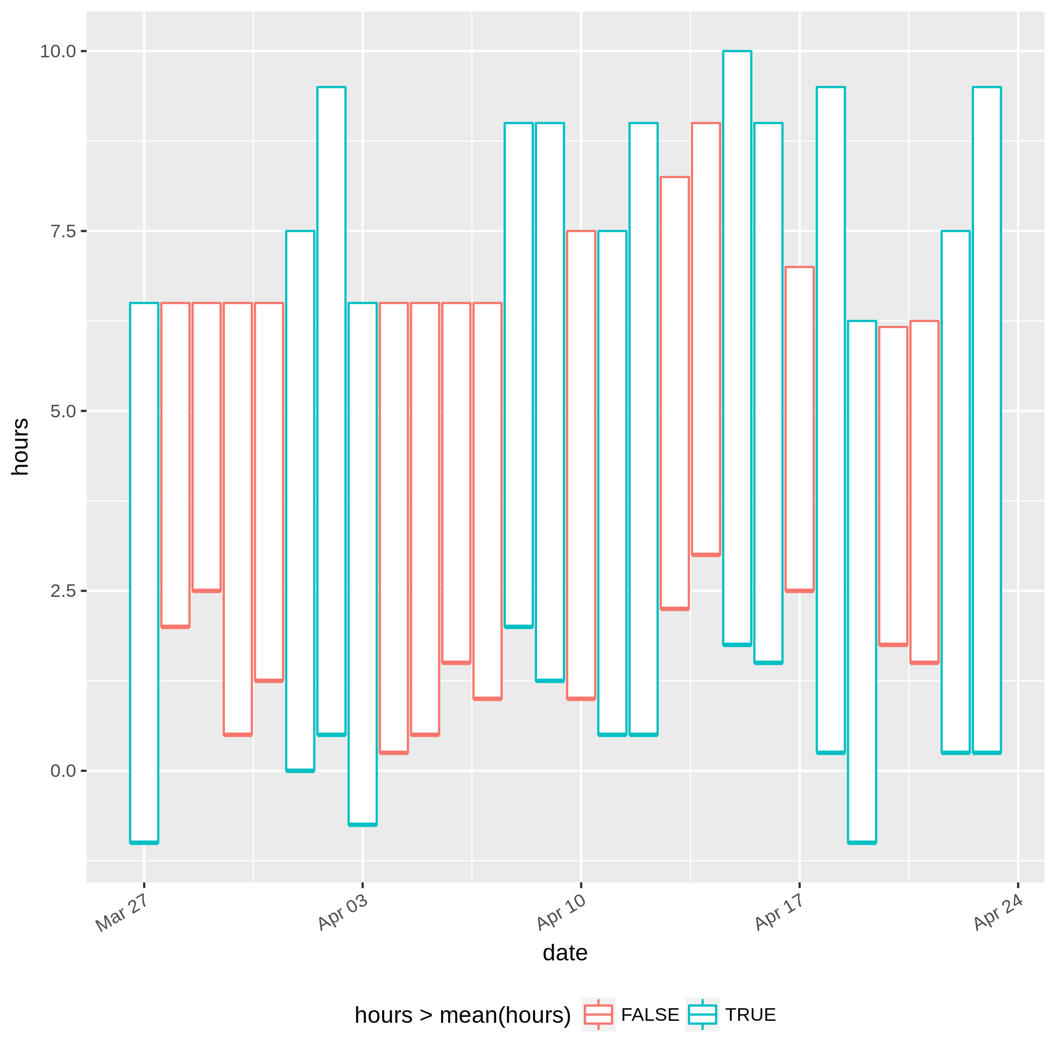
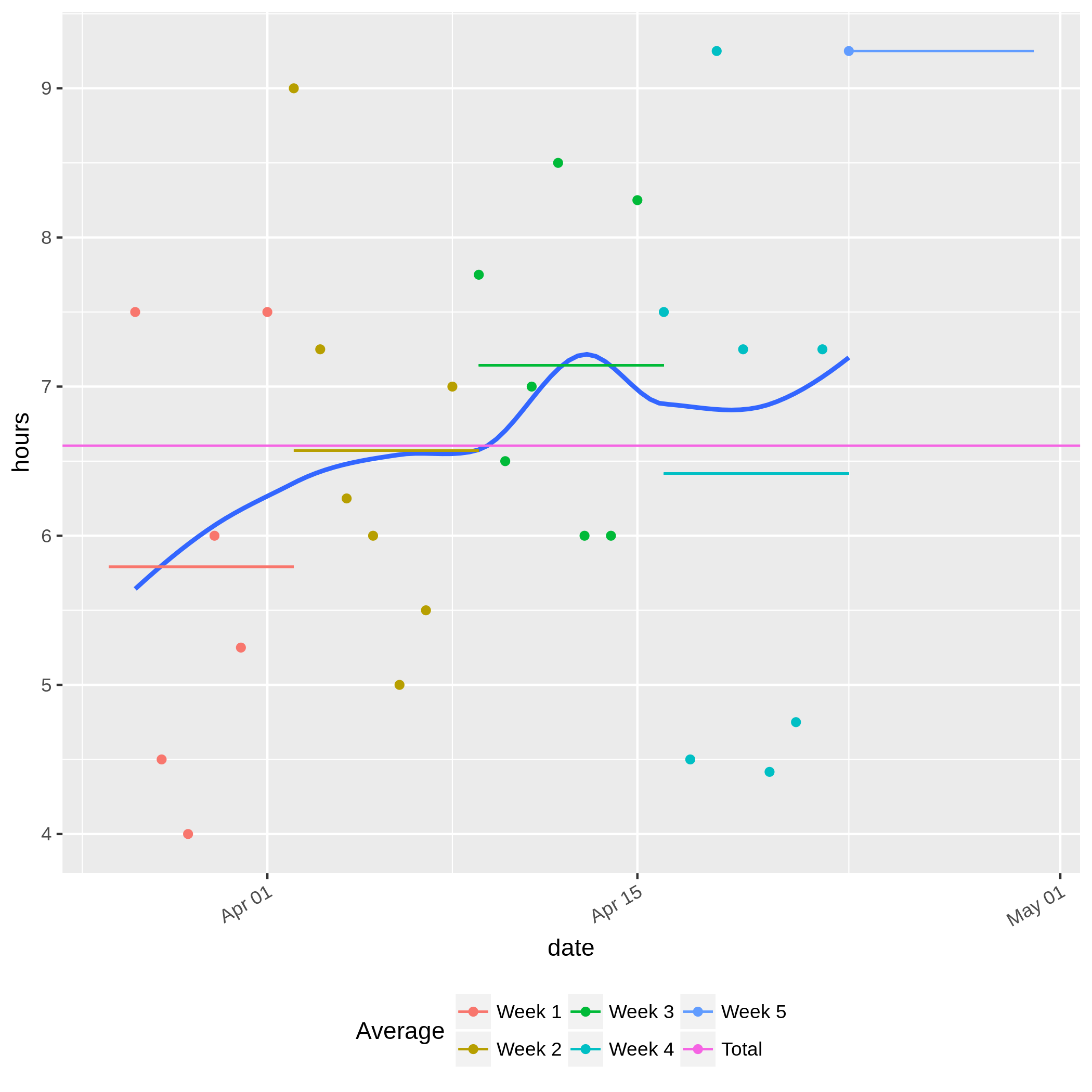
This produces two files in the current directory, bars.png and averages.png,
based on the data in the CSV file.
Creates a floating box plot based on the data. Each bar starts and ends at the respective times denoted in the CSV. The bar is red when it is shorter than the average number of hours, and cyan when it is longer.
Plots each point in the CSV, calculating duration as end - start.
Draws a smooth trend line through the points, and adds horizontal line segments
representing the average for each week.
A horizontal line representing the average over all weeks is also drawn.
example.csv includes data representing the amount of time spent sleeping on a
given day, relative to midnight.
For instance, on March 27, the user went to sleep at 23:00 and woke up at 06:30
the following day.
The plots for this set of data are shown below (click to enlarge):

