All you need to build a website is a computer, and two pieces of software: a web browser (Chrome, Safari, Firefox, Internet Explorer), and a text editor.
As programmers, our main jobs really is to write and manipulate lots of text across lots of files. Thus, you'll be spending a lot of time in your text editor, and productivity gains in using it will have a very large impact in your efficiency.
It's not just about raw speed though, getting comfortable using our text editor will allow us to enter and stay in 'flow', where our code output keeps up with our thoughts.
The preferred text editor at General Assembly is Atom.
You can learn more about Atom here.
HTML done right makes creating a website a breeze. HTML done wrong means you do lots and lots of deleting, writing a little bit, and deleting again.
Let's say you want to make a webpage of your favorite jokes. We're going to do this using fake HTML. (Don't bother writing it down!)
What does a cloud wear on its butt?
Thunderpants.

What do you call a cow with no legs?
Ground beef.
You want the jokes' set-ups to attract attention, so let's make them orange:
<orange>What does a cloud wear on its butt?</orange>
Thunderpants.

<orange>What do you call a cow with no legs?</orange>
Ground beef.
This is what HTML looks like. You take some text, and at each end of it you put tags. The tag at the end -- the closing tag -- looks like the tag at the start -- the open tag -- but with a slash in it.
Two tags make one element.
Elements have to nest. That is, every element has to be completely inside another element (like those Russian dolls).
So if I wanted to make the jokes' set-ups orange and underlined, I might do this:
<orange><underline>What does a cloud wear on its butt?</underline></orange>However, this would be wrong:
<orange><underline>What does a cloud wear on its butt?</orange></underline>Now the underline element ends sort-of inside the orange element and also sort-of outside it.
So now our whole webpage looks like this:
<orange><underline>What does a cloud wear on its butt?</underline></orange>
Thunderpants.

<orange><underline>What do you call a cow with no legs?</underline></orange>
Ground beef.
This looks pretty good! Looking at it, you can tell what's going on.
Let's say instead of 2 jokes, you have 100 jokes. Then you decide that instead of orange and underlined, you want the set-ups to be green and underlined. What do I have to do?
Wouldn't it be nice if we could just make a rule that says, "OK, I want every set-up to be orange and underlined." Then, if we want to change all the set-ups, we can just change that rule! One thing to change, instead of 100.
<div class="setup">What does a cloud wear on its butt?</div>
Thunderpants.

<div class="setup">What do you call a cow with no legs?</div>
Ground beef..setup{
color: green;
text-decoration:underline;
}Here, we're using actual HTML. div stands for division, as in, "a chunk of a webpage."
The tags look a little different. I've given the div elements an attribute.
An attribute of an element is a small modification to it. In this case, we're giving the divs a "class", which is like a "type". (Note that attributes are only in the start tag, not the close tag.)
In my CSS, the . before setup is a selector. .setup means "select every element with a class of setup, and then do something to it".
The "somethings" we're "doing" here is changing the color to green, and decorating the text with an underline.
This is how all CSS looks: you have a selector, followed by the properties you want to change and the values you want to give them.
There are many selectors. For example, if I wanted to just select all div elements, I would write div without the .. If I forget the . before setup, it would mean "select all setup elements", and setup isn't a kind of element.
Now, if I want to change the color of all my setups, I just need to change one line of code!
<div class="green">What does a cloud wear on its butt?</div>
Thunderpants.

<div class="green">What do you call a cow with no legs?</div>
Ground beef..green{
color: green;
}If I want to change the color of the setups, I can still just change one line of code. But now I have something like this:
.green{
  color: red;
}
That is, the things with the class of green are now red. That's really confusing for web designers looking at your code -- including you!
This is the most important rule of web design: you should never put anything indicative of style in your HTML. That is, you should never give elements classes of centered or big or pink. Instead, you should give them classes like header or paragraph or punchline.
This is called semantic naming: naming things according to their function, rather than how you want them to look. This is because form follows function: the way you want elements to look is always based on the purpose of the element on the page.
You always want headers to stand out and be obvious. You always want paragraphs to use Times New Roman. You always want links to be blue, unless they're in your navigation bar, in which case you want them to be grey.
HTML is usually written first in one file, and then its CSS is written in another. If you write HTML perfectly, you'll never need to touch it once you start writing CSS.
For example, here's semantically-named, good HTML:
<div class="page">
  <div class="header">Nayana's Favorite Jokes</div>

  <div class="joke">
    <div class="setup">What does a cloud wear on its butt?</div>
    <div class="punchline">Thunderpants.</div>
  </div>

  <div class="joke">
    <div class="setup">What do you call a cow with no legs?</div>
    <div class="punchline">Ground beef.</div>
  </div>
</div>
This brings up another way of making your code good and easy-to-read:
The way the code above has been indented, it's really easy to see which elements are inside which other elements. Indentation is a visual cue.
This is really important. This is the easiest, simplest way to make your code look good to everyone else. Indent. It seems silly, but it can make all the difference between someone hiring you and someone tossing your resume in the trash. If they can't read your code, they can't tell whether you're any good at what you do, and won't hire you.
This is why HTML comes built-in with many elements beyond just div that have implied classes: they tell you the purpose of whatever's inside them without you needing to write class everywhere.
For instance, the humble <p> tag. p stands for "paragraph". This might be a good substitute in place of <div class="punchline">. It still makes semantic sense, and it's a lot easier to write.
There are over 130 HTML elements that come standard on every web browser. Don't worry -- you'll use about 20 of them for 90% of things, the same way you use the same 100 words for 90% of conversations.
A special character is a character other than a through z, 0 through 9, and the most common punctuation marks, like comma, period, and hyphen.
One example is the trademark "tm" symbol. To include it on a webpage, you'd write ™.
This is because different computers have different ways of translating 0s and 1s into text. On Macs, the "tm" symbol might be a certain sequence of 0s and 1s. On PCs, it might be another. Writing ™ tells a web browser, "Just show a trademark symbol with whatever sequence of 0s and 1s you want."
Have you ever seen a Microsoft Word document where the quotation marks or apostrophes were all replaced with a few characters of gibberish?
This is an example of an encoding error: different computers recording quotation marks or apostrophes as different sequences of 0s and 1s.
Reglar straight quotes, ", are a standard character. But curved quotes -- which Word uses -- are a special character (hence why I can't include them in these notes). To use them on a webpage, you'd write “ or ”.
Special characters all have the same form: an ampersand, followed by an abbreviation, followed by a semicolon.
Interestingly, ampersand is also a special character. This is because web browsers always think ampersands indicate a special character, so if you just want to display an ampersand, you have to tell it that you just want to show an ampersand, not actually use it to create another special character. It's written as &.
Same for the angle brackets used in HTML. A web browser thinks anything inside angle brackets is an HTML tag. To have the browser show angle brackets instead of reading them as HTML, you'd write < (less than) and > (greater than).
One thing you'll see on many pages is a...
A comment is a piece of code that is ignored by the browser. It's still in the code, it just doesn't do anything.
<!-- Comments look like this. -->For a great example, go to http://www.theoatmeal.com, and look at the source code. In Chrome, you can do this by pressing Command + Option + U, or going to View > Developer > View Source.
- They're often used to leave notes to other developers (including jokes), and yourself
- You can "comment out" pieces of code. This lets you test different pieces of code without needing to delete and copy and paste things.
An element's name is usually an abbreviation.
-
<a>: One of my least favorite tags, because an "anchor" is what we always think of as a "link" -- and there's a<link>that does something completely unrelated. Remember: an anchor is a link. To make an anchor actually go somewhere when you click on it, you give it an attribute calledhref(which stands for hypertext reference, which isn't important). For example:<a href="http://google.com">Google</a> -
<img />: Like<a>, an image also needs an attribute in order to work. This attribute issrc, as in "source":
<img src="http://images.com/image.jpg" alt="This is an image" />
The alt attribute is what text is shown when the image can't be seen by the user: if the image doesn't load, or if the user is blind. This is required by law as a result of the Americans With Disabilities act, even though most "seeing" people will never know it's there.
<img /> is an example of a self-closing tag. There are only a couple of these. They're elements that don't have any text content, so there's not any point in having an open and a close tag.
<h1>: Thehstands for "headline", which is a bit of text that introduces other text. There's<h1>through<h6>, which the numbers indicating the level of "importance". For example:
<!DOCTYPE html>
<head>
  <title>Info About the Constitution</title>
  <link rel="stylesheet" type="text/css" href="style.css">
</head>
<body>
<h1>The US Constitution</h1>
  <h2>Article I</h2>
    <h3>Section A</h3>
    <h3>Section B</h3>
  <h2>Article II</h2>
    <h3>Section A</h3>
    <h3>Section B</h3>
      <h4>Subsection 1</h4>
        <h5>Clause i</h5>
          <h6>Subclause a</h6>
</body>
Generally, a page will have only one <h1> because that's the most important headline, meaning it should introduce the rest of the page.
Don't skip from <h1> to <h6>. Go in order.
<q>and<blockquote>: In web design, a block is a piece of content that occupies its own main "chunk" of the page. The other block elements include<p>,<div>, and<h1>through<h6>. A long or important quote should probably have its own block of the page.
Shorter and less-important quotes will probably go inside a block. Elements that go inside blocks are called inline. Other inline elements include <em>, <strong>, and <a>.
-
<em>and<strong>: The difference is that things that are "emphasized" aren't necessarily loud (or "strong"), and things that are strong are not necessarily emphasized. -
<ul>and<ol>:
My favorite things:
- Whiskers on kittens
- Brown paper packages
- Schnitzel with noodles
My favorite things:
1. Whiskers on kittens
2. Brown paper packages
3. Schnitzel with noodles
The second list implies that "whiskers on kittens" are more my favorite thing than packages and noodles, whereas the first list implies they have equal weight. This is the difference between an ordered and an unordered list.
Lists can only contain list items. That is, this is good:
<h1>My favorite things</h1>
<ul>
  <li>Whiskers on kittens</li>
  <li>Brown paper packages</li>
  <li>Schnitzel with noodles</li>
</ul>
This is bad:
<ul>
  <h1>My favorite things</h1>
  <li>Whiskers on kittens</li>
  <li>Brown paper packages</li>
  <li>Schnitzel with noodles</li>
</ul><dl>: A definition list is like a dictionary representation of things:
<dl>
  <dt>Nayana</dt>
    <dd>A cool girl</dd>
    <dd>A web development instructor</dd>
  <dt>Sam</dt>
    <dd>A cool dude</dd>
    <dd>A guy with really nice hair</dd>
    <dd>A data science instructor</dd>
</dl>Why do we have this weird collection of elements? The people responsible for HTML tried to create a set of built-in elements that would capture most of the semantic situations in which you'd find yourself.
Putting it another way, they tried to provide all the elements you might want when writing a book.
Definition lists might seem really specific, but they might be good to use for a list of items on a webstore:
<dl>
  <dt>Alpaca Socks</dt>
    <dd class="product_image"><img src="socks.jpg" /></dd>
    <dd class="description">These socks are so warm and fuzzy!</dd>
    <dd class="pay"><a href="http://paypal.com/socks">Click here</a> to buy them.</dd>
</dl>It might mean they're adding comments, crossing things out, writing suggestions... They're not changing the words you wrote; they're adding a layer of meaning on top of them. This is the purpose of HTML: to take words, and add a layer of meaning on top of them.
Writing HTML is more like writing a script: taking a bunch of dialogue and splitting it up into lines, with actor suggestions, like "This is delivered off-stage", "This is happy", and so on.
HTML's purpose is to tell you the function of words, also known as words' semantic value.
When writing HTML, think only of the semantics. If you find yourself thinking, "This should be centered", "This should be red", "I'll put a sweet background image here"... Ignore those thoughts! Just think about what the words mean.
This is why HTML is usually written first in one file, and then its CSS is written in another.
Remember: If you write HTML perfectly, you'll never need to touch it once you start writing CSS.
Let's mosey on over to my favorite website, Twitter.com/GA_DC. It's pretty great. It's pretty fancy. But what would it be without CSS? Take 1 minute to talk with the people around you about how this wonder of the modern web would look different without CSS, and how that would impact your interactive with the site.
CSS is powerful. There is such a wide breadth of things to learn about CSS and honestly, you it could probably take years just to learn its capabilities, nuances and subtleties. So, the goal of this class isn't to do a rundown of every possible CSS selector, but to have you walk away with a solid foundation in how to approach the task of styling your sites. As you use it consistently you realize that, while sometimes frustrating, CSS provides a powerful toolkit for making your UI more usable, marketable, and generally awesome!
At the crux of it all, the primary concept of CSS is to select an HTML element and then do something to it. ie. I want to take the body element, and I want to apply a background color to it.
Let's throw some dummy content into HTML inside our index.html:
<!DOCTYPE html>
<html lang="en">
<head>
  <title>CSS!</title>
</head>
<body>
  <h1>Hello world!</h1>
  <p>Flannel tote bag Shoreditch hashtag. Austin scenester letterpress, gastropub Intelligentsia cardigan bespoke polaroid tofu single-origin coffee listicle stumptown swag distillery. Cred actually beard, master cleanse sartorial four dollar toast typewriter lo-fi tilde Etsy try-hard. Swag plaid mlkshk, twee typewriter ennui blog butcher lumbersexual taxidermy Bushwick 90's sartorial fingerstache. Wes Anderson Thundercats fashion axe ethical, put a bird on it bitters leggings umami American Apparel Helvetica. Paleo PBR Vice kale chips High Life fap. McSweeney's Schlitz vinyl, put a bird on it taxidermy Carles cronut Marfa Etsy kale chips Bushwick selfies.</p>
  <!-- /*http://hipsum.co -->
</body>
</html>
So one way we can style elements in HTML is in the tag itself. These are called inline-styles:
<p style="background:blue;"></p>Take a couple minutes and chat with your partner about why this particular way of styling an element might not be the greatest approach? See if you can think of some specific scenarios when using inline styles would be a disadvantage...
Don't use inline styles if you can avoid it. They are very specific! (More on this in a minute)
The next approach to implementing a style is to put the styling in the <head>:
<head>
  <title>CSS!</title>
  <style>
    p {
      background: blue
    }
  </style>
</head>
You've seen this before, but I want to highlight some syntax here. From p until the ending curly brace is a CSS rule. The p in this code is what's called the selector. The background in the code is the property. Finally blue is the value.
This is a bit better. I feel less gross. But feel kinda weird about this one, too. Why might that be? (ST-WG)
What if you have both styles in the head and inline styles? Which style will be applied? Why is this?
What's the best way? External stylesheets! Let's create a new file called style.css:
In our index.html let's go ahead and link to that stylesheet in the <head>:
<head>
  <title>CSS!</title>
  <link rel='stylesheet' href='style.css'>
</head>
In style.css:
p{
  background:blue;
}
Ahh, much better. You might be asking yourself, "Self? Isn't this a lot more work?" And you might be right initially. But we're talking about 1 <p> right now. What if we're talking about 100 <p>'s and now those elements were spread across multiple web pages. Now all of a sudden this last method is less work.
The other big advantage of the stylesheet approach is that it preserves separation of concerns. It is possible to style web pages using HTML alone. We did this in the early 2000s using mostly images and table borders. CSS allows us to separate the styles of our website/app from the content and behavior:
- HTML
- Content
- CSS
- Styles
- JS
- Behavior
As you can see, there's more than one place to target elements. There's also multiple WAYS you can target elements. Let's throw some additional content in index.html:
<body>
  <h1>Hello world!</h1>
  <p>This is some fake dummy content. It doesn't matter what it is! Whatever you want! Smelly fish create beautiful works of art in order to achieve world peace.</p>
  <p class="red">This paragraph tag element has a class of "red"</p>
  <p class="red" id="green">This paragraph tag element has an id of "green"</p>
  <div class="red">This div tag element has a class of "red"</div>
</body>
All I did here was add two <p> elements and added a class of "red" to both and an id of "green" to the last. Additionally I added a <div> element with a class of red.
The first thing I want to do is make it so all elements with the class of "red" has a background of red. In our style.css:
.red {
  background: red;
}
Awesome, but I think I want just the <p> elements with that class name to have a background of red. So in style.css:
p.red{
  background: red;
}
Finally to select an element with an id you use #. I'm going to change the background color of the p element with class "green" in our style.css:
#green{
  background: green;
}If I change the css selector from p.red back to .red you'll notice that the paragraph element with the id of green is still green. This is because of CSS Specificity. While CSS cascades from top to bottom. The CSS that is applied depends on Specificity as well. Take the following example:
#green {
  background: green;
}
.red {
  background: blue;
}

.red {
  background: red;
}
In this example the elements that have the class red, will ultimately have a background of red even though blue was set first because it takes the last declared property. However, even though the #green selector was written first, it has a higher specificity and therefore overides the following background properties.
The following list of selector types is by increasing specificity:
- Universal selectors (e.g., '*')
- Type selectors (e.g., h1)
- Class selectors (e.g., .example)
- Attributes selectors (e.g., [type="radio"])
- Pseudo-classes (e.g., :hover)
- ID selectors (e.g., #example)
- Inline style (e.g., style="font-weight:bold")
You can read more about CSS specificity here You can access a CSS specificty calculator here
One of the tricky things about CSS at first is the Box Model. But it's actually really simple. Let's break it down.
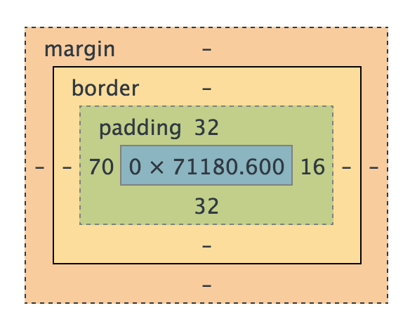
Any HTML element can be considered a box, and so the box model applies to all HTML elements. If you select an element prescribe it a height and width, the content itself will be that height and width.
What the size doesn't include:
- padding
- border
- margin
Let's go into our existing index.html and style.css and add some stuff to illustrate what I mean. In index.html:
<p>This is a paragraph</p>
<p class="padding">This is a paragraph</p>
In style.css:
p {
  background: red;
  height: 100px;
  width: 20%;
}
Lets check this out in our chrome browser with the developer tools. As you can see, everything is identical. Which makes sense. Let's go ahead and add some padding to the html element with class "padding". In styles.css:
p {
  background: red;
  height: 100px;
  width: 20%;
}

p.padding {
  padding:10px;
}
Well that's certainly interesting. Even though the dimensions are the same. The element with padding is larger.
Let go ahead and add margin: 10px; and border: 10px solid black; to the padding class as well. Let's inspect that element in the browser and you can see Chrome's clear depiction of content, padding, border and margin.
All these different sizings can be confusing. This can especially be frustrating when you think something's 20 % when in actuality it isn't. Enter box-sizing.
At the top of our style.css:
* {
  box-sizing: border-box;
}
Now when we refresh, all of our 20% widths are the same regardless of padding. It also includes border! However, it does not include the margin.
Man, there's a lot of them. We've seen many just in this lesson thus far. There are far more than I can cover. Additionally, there's just no way to know them all. Unless you're a CSS savant. Fortunately, there are some great references. Here's just a few!
- CSS Documentation
- CSS Tricks - SO GOOD
- Codrops CSS Reference
- 30 CSS Selectors You Must Memorize
- 10 CSS3 Properties You Need to be Familiar With
- A to Z CSS Screencasts
- How to Make Your Site Look Half-Decent in Half an Hour
Check out this GIF. Developers used to feel that way all the time defining page layout using CSS. Why is that?
HTML was created as a document-oriented language. CSS emerged as a way to make an HTML file appear more document-like. Literally, like something you would make in Microsoft Word.
So layout wasn't much of a concern in the beginning. But as the web has evolved, so have the design needs of developers. Unfortunately, it takes a while for CSS -- and by that we mean the CSS Working Group -- to catch up with those needs.
It's difficult to establish new CSS standards. The CSS Working Group has a hard time agreeing on anything, especially cross-browser standards.
Fortunately, Flexbox, a layout mode introduced with CSS3, has slowly but surely become a standard over the past few years. It's designed to ensure that elements on a page behave predictively on varying screen sizes and devices.
Let's start out by talking about a problem that anybody who has written CSS has had to deal with:
I have a div. I would like to center it vertically and horizontally on my page.
Example on Codepen
<html>
  <body>
    <div> Div 1 </div>
  </body>
</html>
body {
min-height: 100vh;
margin: 0 auto;
}
div {
width: 100px;
height: 100px;
background: #990012;
color: #FFFFFF;
border-radius: 10px;
font: 14pt Comic Sans MS;
text-align: center;
line-height: 100px;
}These might work...
Padding: The simplest approach would be to set equal padding on the top and bottom of the container (body) element. We would need to know the exact height of the element and container in order to get this exactly right. This can also get tedious when there is more than one element in a container.
Margin: Similarly, we could add some margin to the element we are trying to center. The same issues remain.
Absolute Positioning: You could use properties like
topandleftto position an element in the center. This, however, removes it from the document flow.
These could work in other scenarios...
line-height: When vertically centering a single line of text, you can set the line-height to that of the whole container.
vertical-align: Used to align words within a line of text (e.g., superscript, subscript).
The tough part is that how to vertically center a element depends on its context. Depending on your situation, one or more of the above techniques could work. Here's an enlightening post on the matter.
body {
  min-height: 100vh;
  margin: 0 auto;
  display: flex;
  justify-content: center;
  align-items: center;
}
View solution here
When you declare display: flex on a container, it becomes a flex container.
First, you use flex-direction to indicate whether you want the items in the container -- the flex items -- to "read" left-to-right (row), right-to-left (row-reverse), top-to-bottom (column), or bottom-to-top (column-reverse).
When you specify a flex-direction, you can think of it as placing an axis in that direction across your flex container. So if you use flex-direction: row or row-reverse, this main axis will be the same as the X-axis (horizontal) on a graph. If you use flex-direction: column or column-reverse, the main axis will be the Y-axis.
Then, you determine how you want to align or justify the items along this main axis using the justify-content property. It'll do nice things for you like let you put even spacing between all the items (space-between and space-around).
Finally, you control how you align the items along the axis that goes across the main axis -- the cross axis, if you will -- with the align-items property. If you have flex-direction:row, the main axis is the X-axis, and the cross-axis is the Y-axis.
Lastly, you can also do nice things like control how you want things to line up across the cross-axis by using align-content, such as space-between and space-around.
| Property | What's It Do? | Examples |
|---|---|---|
| display | flex |
|
| flex-direction | Sets the directional flow of flex items | row, column |
| justify-content | Align along flex-direction (main axis) | center, space-between |
| align-items | Align along not-flex-direction (cross axis) | flex-start, center |
That's a lot of CSS properties! Don't worry, you're not expected to memorize all of them. Us instructors need to look them up all the time! Here's a great resource.
I want my footer to lie along the bottom of my page. Once I've accomplished that, I want to evenly distribute the content boxes horizontally inside of the <main> element.
<html>
  <header>
    FlexBox
  </header>
  <main>
    <section>Content 1</section>
    <section>Content 2</section>
    <section>Content 3</section>
  </main>
  <footer>
    Nayana Davis Productions
  </footer>
</html>
body {
min-height: 100vh;
margin: 0 auto;
font: 12pt Comic Sans MS;
}
header, footer {
width: 100%;
height: 30px;
background: #000000;
color: #FFFFFF;
text-align: center;
line-height: 30px;
}
main {
background: #D3D3D3;
}
section {
width: 100px;
background: #990012;
color: #FFFFFF;
border-radius: 10px;
margin: 5px;
text-align: center;
line-height: 100px;
}Making the footer lie against the bottom of the screen is pretty easy: just use absolute or fixed positioning. However, using absolute or fixed positioning means everything else on the page ignores my footer. The text of <main> could easily run under the footer. We want the text to "push" the footer to the end of the page.
body {
  min-height: 100vh;
  margin: 0 auto;
  font: 12pt Comic Sans MS;
  display: flex;
  flex-direction: column;
  justify-content: space-between;
}
What's the main axis of the ``on here? What about the cross axis?
Main: y-axis. Cross: x-axis.
Now let's horizontally distribute the <section> elements containing the page's content inside of the <main>. What element should we style?
main {
  background: #D3D3D3;
  display: flex;
  justify-content: space-around;
}CSS Animations are a great way to add a layer of polish to your design. Good design inspires trust, so adding little touches to your work is a great way to impress users (and potential employers!).
CSS uses the same basic concepts found in hand-drawn animation - Keyframes:

In the above image, the the left and right-most drawings are Keyframes - they define the starting or ending point of a smooth transition. The drawings between the left and right-most image are Inbetweens - they don't have to be drawn on a storyboard, because the animator can assume what they will look like without a visual reference.
In web-based animations, Keyframes work the same way - the represent the beginning or ending state of the element being animated. However, our Inbetweens will be generated by code, instead of being filled in by hand later.
Transitions let us tell the browser how to change a property over time.
Let's add some starter code:
<!DOCTYPE html>
<html>
<head>
	<title>CSS Animations</title>
	<link href="https://fonts.googleapis.com/css?family=Shadows+Into+Light|Shrikhand" rel="stylesheet">
	<link rel="stylesheet" type="text/css" href="style.css">
</head>
<body>

	<div id="greeting">Hello Friend.</div>

</body>
</html>*{
box-sizing: border-box;
}
#greeting {
width: 400px;
height: 400px;
background: #332532;
border: 8px solid #F77A52;
color: #F77A52;
font-family: 'Shrikhand', cursive;
font-size: 70px;
padding: 40px;
text-align: left;
}
#greeting:hover {
width: 600px;
height: 600px;
background: #CAFCD8;
border: 20px solid #04BFBF;
color: #04BFBF;
font-family: 'Shadows Into Light', cursive;
font-size: 130px;
line-height: 1;
padding: 200px 60px 60px 60px;
text-align: right;
}Let's add a new property to the #greeting CSS:
transition: all 2s ease;- Transition is the name of the CSS property. It tells the element to try to animate certain values if it can.
- All means, 'try to animate ALL property values'. This could also be replaced with specific properties, like width or color.
- 2s is the amount of time you'd like the animation to take - in this case, 2 seconds.
- Ease is the "Speed Curve" of animation - basically, a tweak to the math of how long the animation takes to produce more realistic animation effect. Ease, for instance, starts slow, speeds up around the middle, then slows down at the end - giving the impression of "weight" in the animation. This part of the value is optional - if left out, it defaults to "ease".
Now let's reload and check out our animation - way smoother! Feel free to play with the transition values until you find a speed and transition you like.
You'll notice that some properties animated their transition, while others didn't - for instance, our background color transitioned beautifully through the color spectrum, but our font-family simply toggled into the new font. That's because font-family can't be animated - its way to complex for a browser to figure out on its own. However, while there are some values like font-family that can't be animated, you'll find that most cosmetic properties can be.
But why stop there? We can go further!
Animations are similar to transitions, in that they let us have properties change over time, but they give us more control over how those changes happen. For example, we have more control over how the animation repeats, change between multiple values at once, etc.
To keyframe animate a CSS element, we need two components - the animation structure itself, and then a call to the animation with specific instructions. Let's write a keyframe animation that will make our greeting bounce:
	@keyframes bounce {
		0% {
			position: relative;
			top: 0px;
		}
		50% {
			position: relative;
			top: -120px;
		}
		100% {
			position: initial;
			top: 0px;
		}
	}
Here, we're able to see our keyframe structure even more clearly - they're broken up by percentages, 100% being the complete duration of the animation (we'll set the specific timing in our animation call). We can add as many keyframes as we want, and as few as two (0 and 100%). At each point, we can specify a new set of css properties.
While we could go nuts and add all sorts of property changes in here, I would encourage you to think of Keyframe Animations the same way you would JS prototypal functions - they work best when they are clear, simple, and extensible. Our 'bounce' animation serves a single function - to bounce an element. By keeping it style-neutral, we allow ourselves to use the animation on lots of different elements.
Now that we have a basic animation set up, let's call it on our #greetings element:
	#greeting:hover {
		animation-name: bounce;
		animation-duration: .5s; /* or: Xms */
		animation-iteration-count: 10;
		animation-direction: normal; /* or: alternate, reverse */
		animation-timing-function: ease-out; /* or: ease, ease-in, ease-in-out, linear, cubic-bezier(x1, y1, x2, y2) */
		animation-fill-mode: forwards; /* or: backwards, both, none */
		animation-delay: 0s; /* or: Xms */
	}
The above call runs the animation as soon as the class animated is added to our element (if we wanted a delay, we could adjust animation-delay). We start by calling the animation by its name - bounce. We tell it how long to take in animation-duration. In fact, there's so many animation options, I would encourage you to look them up and use whatever properties make the most sense for you:
http://www.w3schools.com/cssref/css3_pr_animation-direction.asp
Transforms allow you to rotate, skew, and pivot your HTML elements in 3D space! While you'll still be rendering your result on a 2D canvas - your computer screen - you can still move your object around like it were a physical object. This is both exciting and terrifying, as the CSS tranform property has almost 2 dozen unique value types.
My suggestion? Keep it simple at first, then see how deep the rabbit hole goes. Let's start with a basic roate:
	#greeting:hover {
		-webkit-transform: rotateY(180deg);
		-moz-transform: rotateY(180deg);
		transform: rotateY(180deg);
	}
Now add the rotate class to our click function and give it a go! You'll see our greeting flip around, showing you its reverse side. This is still live text, and a live HTML element - so you can imagine the possibilities hidden in the tranform property.
Sidenote: notice the
-webkit-and-moz-prefixes on the above CSS? Those are called vendor prefixes. Some of the animations we're doing are so cutting edge, that they haven't been formally adopted by all browsers. In cases like this, you'll have to call the same value multiple times with vendor-specific prefixes to make sure that Chrome(webkit), Firefox(moz), IE(ms), and Opera(O) all display the animation correctly. Always leave a non-prefixed call in as well - as these properties are formally adopted, the need for the vendor prefix will dissapear, as will its support. Not sure if you need a prefix? Go to Can I Use and search for the CSS property you want to use - you'll receieve a detailed breakdown of what browsers support it.