Visualize race results as a slopegraph with finishing times for each race in a series as the variable. The distribution of finishers at each race can be compared and each individual's performance can be traced through the series.
Reads race results in CSV format from standard input. Prints SVG XML to standard output.
Expected CSV fields are: RACE (arbitrary sequentially-sortable identifiers), NAME (assumed unique; may appear multiple times, no more than once per RACE), and TIME (H:MM:SS format).
Options are set by directly editing the config hash or by giving the path to an equivalent YAML file as the first command line argument. Check out config/results.yaml for an annotated example.
./runslope.py [config.yaml] <results.csv >slopegraph.svg
The focus is on positioning result labels and link lines. Not intended to support every option needed to produce arbitrary publication-ready graphics. Import the output into a page layout program and select element groups to adjust styles or add annotations.
Here is an example using the first six finishers from each race in a four-race series. Data file top6.csv looks like this:
"RACE","NAME","TIME"
"1","Samuel Williams","33:29"
"1","Jack Hillenbrand","34:31"
"1","Dan Schaffer","35:12"
"1","Stephen Marcin","35:22"
"1","Steve Esposito","35:30"
"1","Jordan Varano","35:33"
"2","Jack Hillenbrand","35:02"
"2","Nick Montesano","35:38"
"2","Steve Esposito","36:25"
"2","Michael Murphy","39:30"
"2","Aaron Perry","39:39"
"2","Steven Cammisa","39:50"
"3","Jack Hillenbrand","36:22"
"3","Dan Young","36:44"
"3","Steve Esposito","37:06"
"3","Jordan Varano","37:07"
"3","Christopher Cowden","40:04"
"3","Aaron Perry","40:08"
"4","Jack Hillenbrand","33:38"
"4","Steve Esposito","35:22"
"4","Tom Eickelbrg","35:30"
"4","Stephen Marcin","36:08"
"4","Michael Murphy","39:11"
"4","Aaron Perry","39:16"
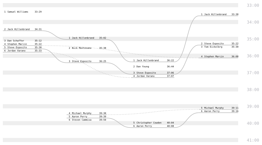
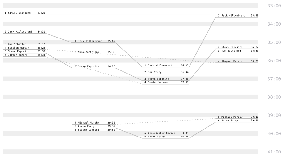
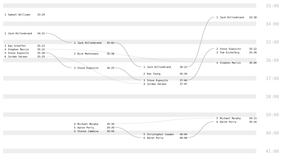
The results for each race in the series are shown in columns from left to right. Finishing time is visually represented by the vertical distribution of result labels; the same scale is used for all races, facilitating comparison of individual and overall results. Solid lines connect an individual's results from consecutive races; dotted lines span skipped races to connect returning runners with their earlier results.
cutoff: null
strict: false
weaklink: true
curve: 0.5
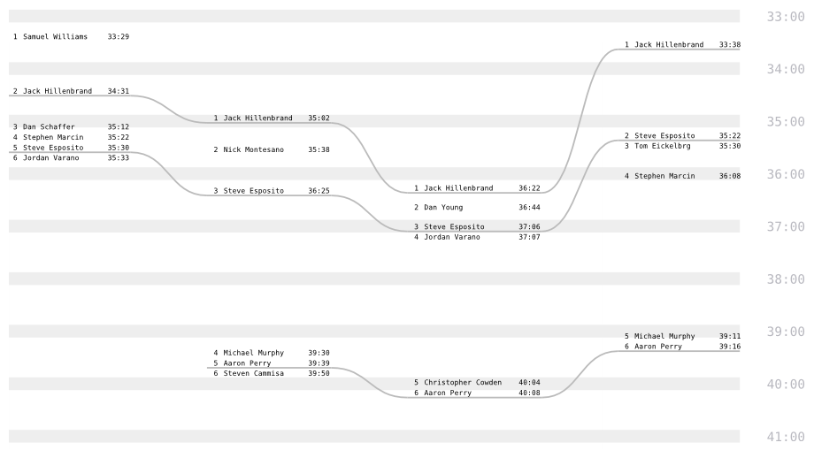
To focus attention on consecutive finishes, hide dotted lines between disjunct results:
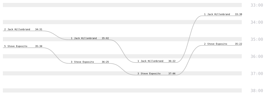
weaklink: falseSetting the strict property to true carries this emphasis on attendance even further. Individuals who were not present for all races are not shown. Actual finishing ranks are still displayed in the result labels:
strict: trueIf a cutoff time is specified, slower results are omitted from the output:
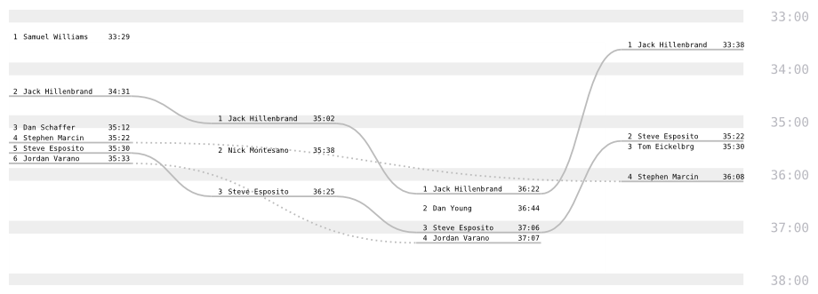
cutoff: '38:00'
strict: false
weaklink: true
Set the curve property to 0 for straight lines. Compare slopes to compare changes.
curve: 0Set the underline offset to 0 to omit underlines; only connector lines will be shown.
underline: 0Legibility is maintained by shifting close result labels down until they don't overlap. As a result, dense packs of finishers will inevitably be plotted inaccurately. This can be mitigated by adjusting the overall vscale (higher values spread out the results more) or, to some extent, by reducing the overlap margin.
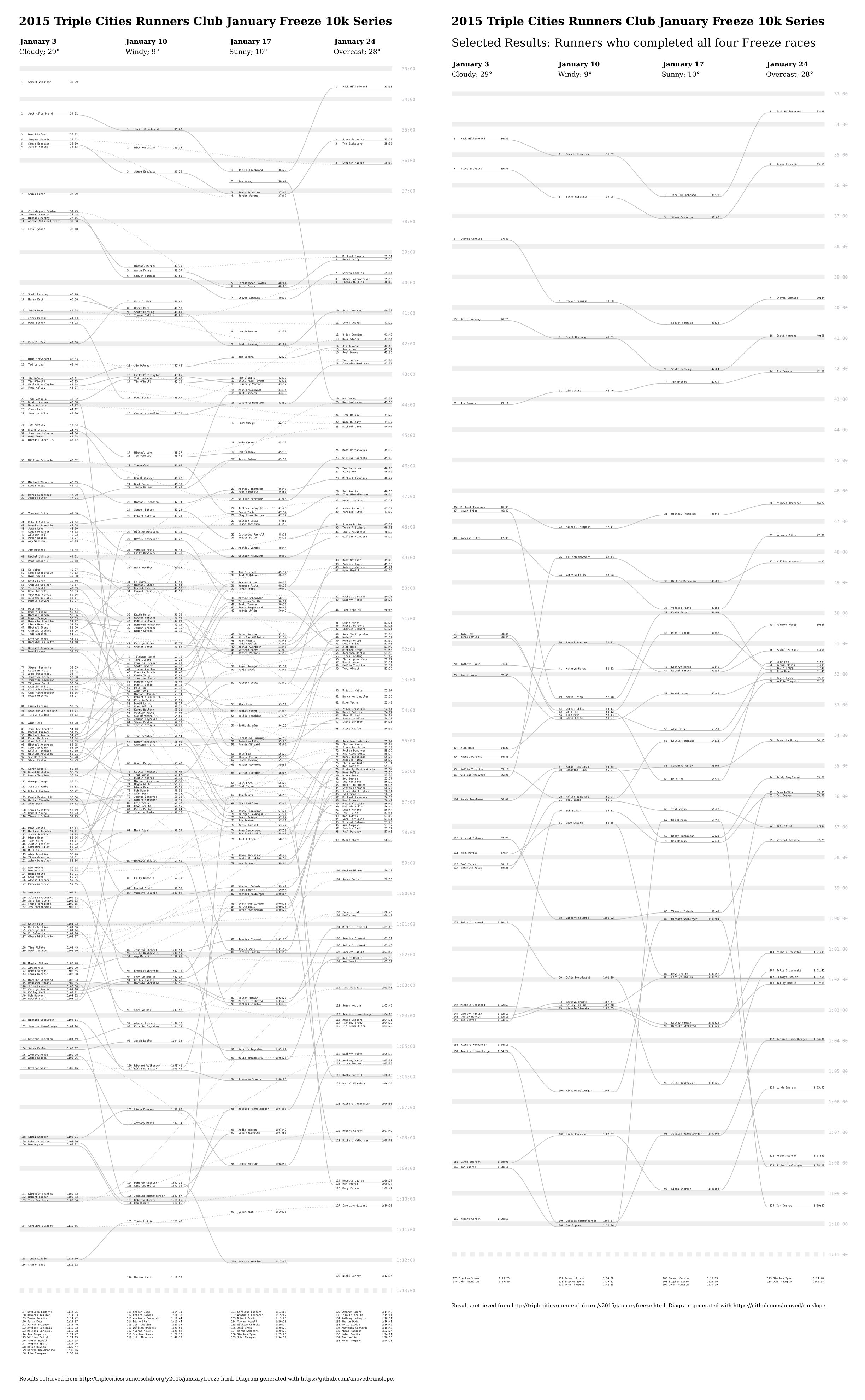
Developed mainly to visualize the results of my running club's 2015 "January Freeze" 10k series. Check out the complete and selected results posters.
Requires PySVG (for output) and PyYAML (for reading optional config file; easily excised).
sudo apt install python-pip
pip install pysvg
pip install pyyaml
Modeled after Ben Concutere's sg.
This project is released under an open source MIT license.
