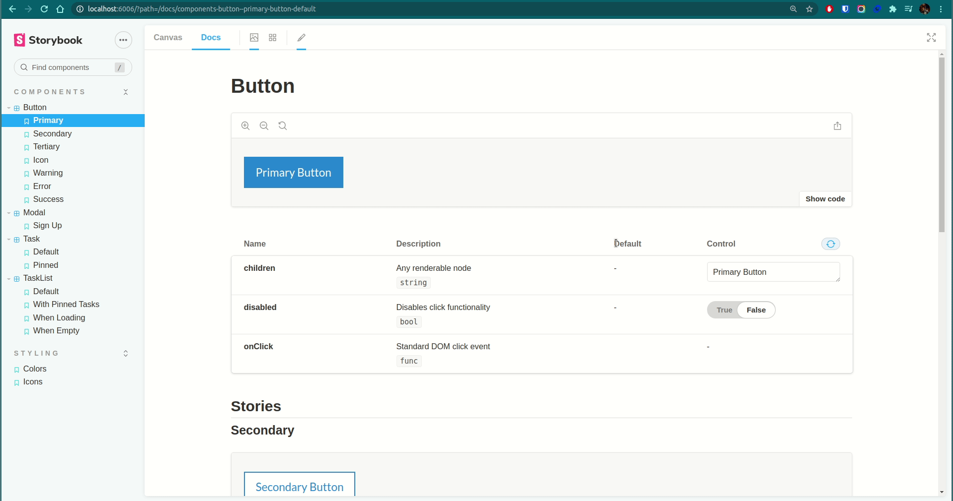
This repository showcases using Storybook as a development tool for building React components and for housing a styleguide. There is also a bare bones todo application that utilizes the components. Examples contained within showcase:
- Using and configuring storybook and it's plugins.
- Writing CSS via the CSS-in-JS tool
styled-components. - Setting global styles across the application and the storybook instance.
- Building themes passed around via context.
- Creating stories to showcase a component and it's permutations.
- Building styleguide pages for iconography and colors.
This project assumes you already have Node and Yarn installed. The steps are as follows:
- Install node dependencies:
yarn install- Run the application:
yarn start- Run storybook:
yarn storybook