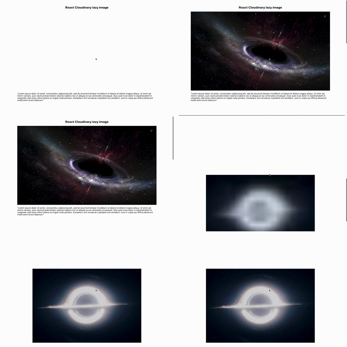
Optimised images with Cloudinary.
'react-cloudinary-lazy-image' is React component which cover "blur-up" effect, lazy-loading and formatting. The component is based on Gatsby image by Kyle Mathew, however instead of GraphQL and Gatsby it uses Cloudinary API. Have a speed and optimized gatsby-images without gatsby.
- Downsize larger images to the size needed by your design - even on desktop there is no need to get as big image as possible.
- Remove metadata from delivered images - by default images contain a lot of information useful for cameras and graphics applications, but not for web users.
- Format images to newer formats like JPEG-XR and WebP - common formats like PNG, JPG or GIF are not optimised to be send wireless.
- Lower image quality - many images have extra-high resolution, however it’s possible to lower quality without a significant visual impact.
- Downsize images on smaller device - display images for mobile users faster as there is probably slower internet connection.
- Lazy load images - allow images to download only when user scroll to it allows to speed up initial page load.
- Hold position of element - page doesn’t jump while images load.
- “Blur-up” technique - show very low resolution image before the original loads.
Points 1-4 are handled by Cloudinary.
npm install react-cloudinary-lazy-image --save
Fixed example:
import React from 'react'
import Img from 'react-cloudinary-lazy-image'

export default ({publicId}) => (
    <div>
        <h1>Lazy-image with Cloudinary</h1>
        <Img
            cloudName={'cloud'}
            imageName={publicId}
            fixed={{
                width: 300,
                height: 300
            }}
            urlParams={'g_face,c_lfill'}
        />
    </div>
)
Fluid example:
import React from 'react'
import Img from 'react-cloudinary-lazy-image'

export default ({publicId}) => (
    <div>
        <h1>Lazy-image with Cloudinary</h1>
        <Img
            cloudName={'cloud'}
            imageName={publicId}
            fluid={{
                maxWidth: 300,
                height: 300
            }}
            style={{
                width: '40vw',
                height: '20vh'
            }}
        />
    </div>
)Same as in gatsby-image there are two types of responsive images. Fixed and fluid.
- Images with fixed height and width. Cover double pixel density for retina display.
- Images in fluid container. Takes smallest possible picture to fill container. Configurable step allow you to have control over breakpoints.
You can set image transformation according to Cloudinary documentation,
by setting urlParams. You can also find all formats that can be passed to imgFormat prop or get more info about quality prop.
| Name | Type | Description |
|---|---|---|
fixed |
object |
Object with 'width' and 'height' properties |
fluid |
object |
Object with 'maxWidth' required property. Optionally step, default=150 and 'height'. If height not set, uses 'c_scale' otherwise 'c_lfill' |
fadeIn |
bool |
Defaults to fading in the image on load |
cloudName |
string |
Cloudinary cloud name, default=process.env.CLOUD_NAME or process.env.REACT_APP_CLOUD_NAME |
imageName |
string |
Cloudinary publicId |
urlParams |
string |
Cloudinary image transformations params. Overrides default 'c_lfill' or 'c_scale' |
title |
string |
Passed to the img element |
alt |
string |
Passed to the img element |
style |
object |
Spread into the default styles of the wrapper element |
imgStyle |
object |
Spread into the default styles of the actual img element |
placeholderStyle |
object |
Spread into the default styles of the placeholder img element |
backgroundColor |
string / bool |
Set a colored background placeholder instead of "blur-up". If true, uses default "lightgray" color. You can also pass in any valid color string. |
onLoad |
func |
A callback that is called when the full-size image has loaded. |
onError |
func |
A callback that is called when the image fails to load. |
imgFormat |
string / bool |
Allow Cloudinary to format image. By default is set to 'f_auto'. Can be switch off by passing 'false' or be formatted to specific format (ex. 'webp') |
quality |
string / bool |
Allow Cloudinary to change quality of image. By default is set to 'q_auto'. Can be switch off by passing 'false' or to specific value (ex. 'best') |
