relplot is a Python package for plotting reliability diagrams and measuring calibration error,
in a theoretically-principled way.
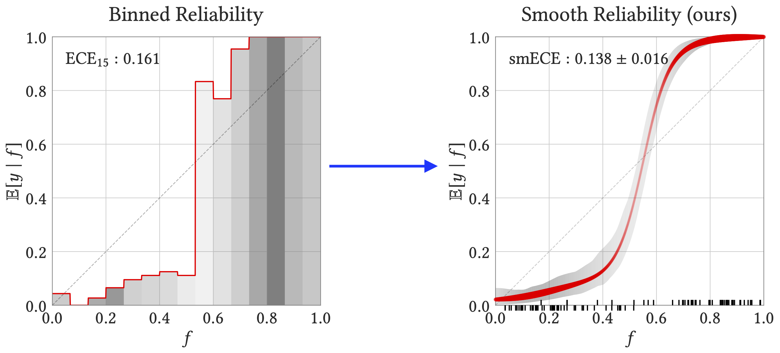
The package generates reliability diagrams as shown on the right:

How to Read the Diagram
-
The input data is a set of observations: pairs of predicted probability and true outcomes
$(f_i, y_i) \in [0, 1] \times {0, 1}$ . For example,$f_i$ may be the forecasted "chance of rain" on day$i$ , and$y_i$ the indicator of whether it rained or not on day$i$ . -
The x-axis shows the predicted probabilities, and the y-axis shows an estimate of the true probability, conditioned on the predicted probability. Formally, this is a regression of outcomes
$y$ on predictions$f$ . -
The tick marks show the raw data: namely, the predicted probabilities for up to 100 datapoints, plotted above or below the x-axis according to whether the true outcome was 1 or 0. The thickness of the red regression curve represents the smoothed density of these tick marks, while the height of the curve represents the smoothed fraction whose true outcome is 1.
-
The SmoothECE (smECE) is a measure of mis-calibration: it is essentially the average absolute difference between the red regression curve and the diagonal, averaged over x-coordinates that are distributed as the tick marks are (i.e. integrated over the density of predictions). See the paper for full details of the estimator and its properties.
-
The smECE is reported with
$\pm$ denoting 95% confidence intervals, estimated via bootstrapping. The gray band similarly shows 95% bootstrapped confidence bands around the regression line.
Formally, the reliability diagram is obtained by kernel smoothing with a careful choice of parameters. The choice of smoothing bandwidth (akin to "bin width") is cruicial, but is done automatically by the code in a theorhetically-justified way.
This package is based on the theoretical results in the paper Smooth ECE: Principled Reliability Diagrams via Kernel Smoothing (ICLR 2024).
Install with Pip:
> pip install relplotOr, clone the repo and install with:
> cd relplot
> pip install .Basic usage:
import relplot as rp

# ...
# f: array of probabilities [f_i]
# y: array of binary labels [y_i]

calib_error = rp.smECE(f, y)   # compute calibration error (scalar)
fig, ax = rp.rel_diagram(f, y) # plot
See a quick demo in notebooks/demo.ipynb.
For more control, one can compute the calibration data with relplot.prepare_rel_diagram, and then plot it later with relplot.plot_rel_diagram.
For example:
...
diagram = rp.prepare_rel_diagram(f, y) # compute calibration data (dictionary)
print('calibration error:', diagram['ce'])
plt.plot(diagram['mesh'], diagram['mu']) # plot the calibration curve manually
fig, ax = rp.plot_rel_diagram(diagram) # plot the diagram in a new figure
The smoothed regression function itself is returned as diagram['mu'],
which specifies values on the grid of x-coordinates in diagram['mesh'].
This can be used for manual re-calibration.
Methods expect inputs in the form
of a 1D array of predicted probabilities (f) and a 1D array of binary labels (y),
where
In the multi-class setting, confidence calibration can be measured by expressing it as the binary calibration of the distribution on (confidence, accuracy) pairs. A convenience function for this common use case is provided:
# f: [N, C] array of logits over C classes
# y: [N, 1] array of predicted classes
conf, acc = relplot.multiclass_logits_to_confidences(f, y) # reduce to binary setting
relplot.rel_diagram(f=conf, y=acc) # plot confidence calibration diagram
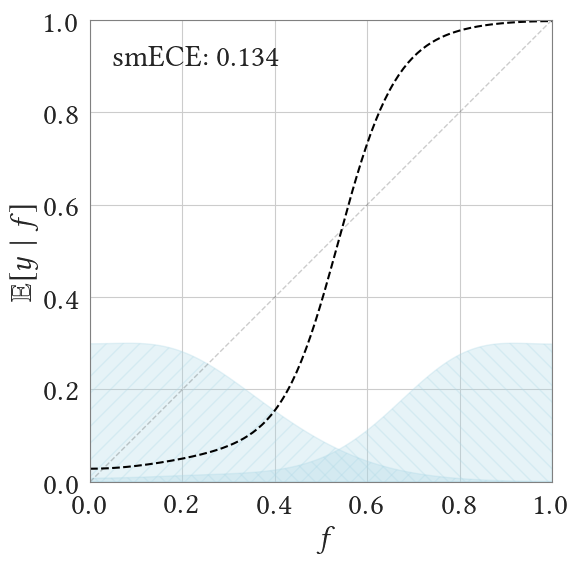
relplot.smECE(f=conf, y=acc) # compute smECE of confidence calibrationThe plot made by relplot.rel_diagram can be customized in various ways, as shown below.
See this notebook for examples of more options: notebooks/figure1.ipynb
- For small datasets, you may want to disable bootstrapping (which subsamples the data). Pass the parameter
plot_confidence_band=False. - To override the automatic choice of kernel bandwidth for the diagram, set the parameter
kde_bandwidth.
- The header image (Figure 1 of the paper) is generated in notebooks/figure1.ipynb
- The experiments in the paper are reproduced in notebooks/paper_experiments.ipynb
-
relplot.metricscontains implementations of various alternate calibration measures, including binnedECE and laplace kernel calibration. This is in addition to the recommended calibration measure of smoothECE (relplot.smECE). -
relplot.rel_diagram_binnedplots the "binned" reliability diagram. Not recommended for usage; included for comparison. -
relplot.config.use_tex_fontscan be set to True if you have$\LaTeX$ installed.
If you use relplot in your work, please consider citing:
@inproceedings{blasiok2024smooth,
      title={Smooth {ECE}: Principled Reliability Diagrams via Kernel Smoothing},
      author={B{\l}asiok, Jaros{\l}aw and Nakkiran, Preetum},
      booktitle={The Twelfth International Conference on Learning Representations},
      year={2024},
      url={https://openreview.net/forum?id=XwiA1nDahv}
}We thank Jason Eisner for helpful suggestions on the package and documentation.
