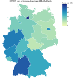
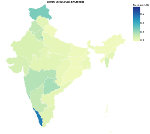
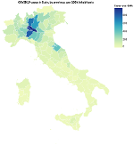
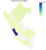
I wanted to better understand COVID-19, so I cloned Johns Hopkins' daily-updated dataset, fired up a Clojure REPL, and started massaging the data into a visualization using the Vega grammar.
This repository is a REPL notebook to demonstrate and extend that exploration.
A cleaned-up subset of the code I used to produce the visualizations
in the article is in the covid19-in-the-repl namespace. If you're
new to Clojure or just want to understand the article, I recommend
starting there:
- Clone the Johns Hopkins dataset repo to resources/ within this repo
- Open
applied_science.covid19-clj-viz.covid19_in_the_repl - Start a Clojure REPL (based on deps.edn, not Leiningen)
- Evaluate forms one at a time, with a browser window open next to your editor so you can see the visualizatons as you go
Other namespaces are for exploring and visualizing COVID-19 data in other, similar ways:
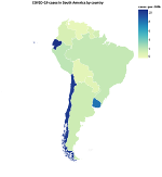
italian-situationreplicates Alan Marazzi's article The Italian COVID-19 situation without Panthera, as a demonstration of using orthodox Clojureitaliavisualizes COVID-19 cases in Italy [contributed by David Schmudde]indiavisualizes COVID-19 cases in India [contributed by Noor Afshan Fathima]south-americavisualizes COVID-19 cases in South America by countries and in Peru by regions [contributed by Yuliana Apaza and Paula Asto]exploreis a grab-bag of general visual explorations – line & bar charts, choroplethschinaanddeutschlandare for transforming country-specific data in support of visualizationssource/*namespaces are for parsing of source data (e.g. Johns Hopkins, the World Bank) into usable structures
Some namespaces depend on cloning other repos into resources. For
instance, we put data from Italy's Civil Protection
Department into
resources/Italia-COVID-19 to support visualizations in the italia
and italian-situation namespaces.
MIT License
Copyright (c) 2020 David Liepmann, Jack Rusher
