scholarnetwork is an R package that provides functions to extracts publication information from Google Scholar, create network of collaborators based on co-authored projects, and visualize these networks using a force-directed layout algorithm.
An initial release of this package is available in this repository (eventually maybe also on CRAN), and can be installed directly using Hadley Wickham's devtools package:
if(!require("devtools")) install.packages("devtools")
library("devtools")
install_github("pablobarbera/scholarnetwork")
For now, the package consists of two functions, extractNetwork and plotNetwork, which correspond to the data collection and data visualization steps.
extractNetwork wraps the get_publications function from the scholar package, which extracts the list of publications on a Google Scholar profile, cleans it, and then parses the results into a format that is more suitable for network analysis:
-
a data frame of weighted edges, where each edge is a collaboration in a publication, and the weight is one divided by number of co-authors; and
-
a data frame with node-level information, which includes the group resulting from running a walktrap community detection algorithm.
d <- extractNetwork(id="jGLKJUoAAAAJ", n=500)
str(d)
List of 2
$ nodes:'data.frame': 40 obs. of 3 variables:
..$ label : chr [1:40] "A Boydstun" "A Valeriani" "A Venetz" "C Roca Cuberes" ...
..$ degree: num [1:40] 0.75 1.69 0.75 0.667 1.69 ...
..$ group : num [1:40] 11 7 10 8 7 1 3 4 5 13 ...
$ edges:'data.frame': 106 obs. of 3 variables:
..$ node1 : chr [1:106] "P Barberá" "C Vaccari" "K Ackermann" "P Barberá" ...
..$ node2 : chr [1:106] "A Boydstun" "A Valeriani" "A Venetz" "A Venetz" ...
..$ weight: num [1:106] 0.25 0.31 0.25 0.25 0.25 ...
plotNetwork takes the lists of nodes and edges returned by extractNetwork and visualizes it using networkD3. The output of this function is an html file with the network visualization. Note that this function will also work with any other set of edge and node lists.
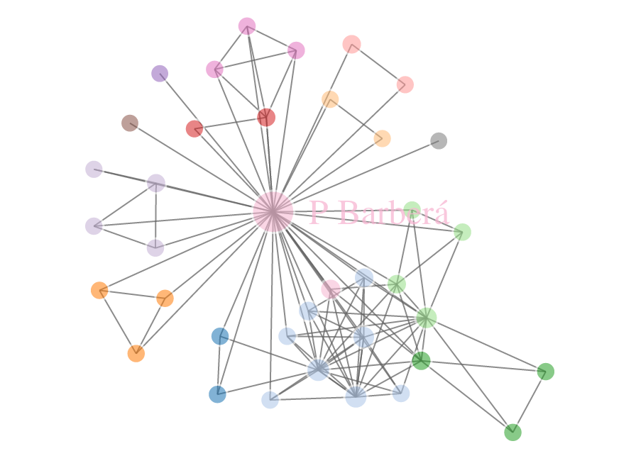
plotNetwork(d$nodes, d$edges, file="network.html")The output of this function is an interactive visualization of the network. The figure below shows a screenshot of this visualization. Click here for the D3 visualization.
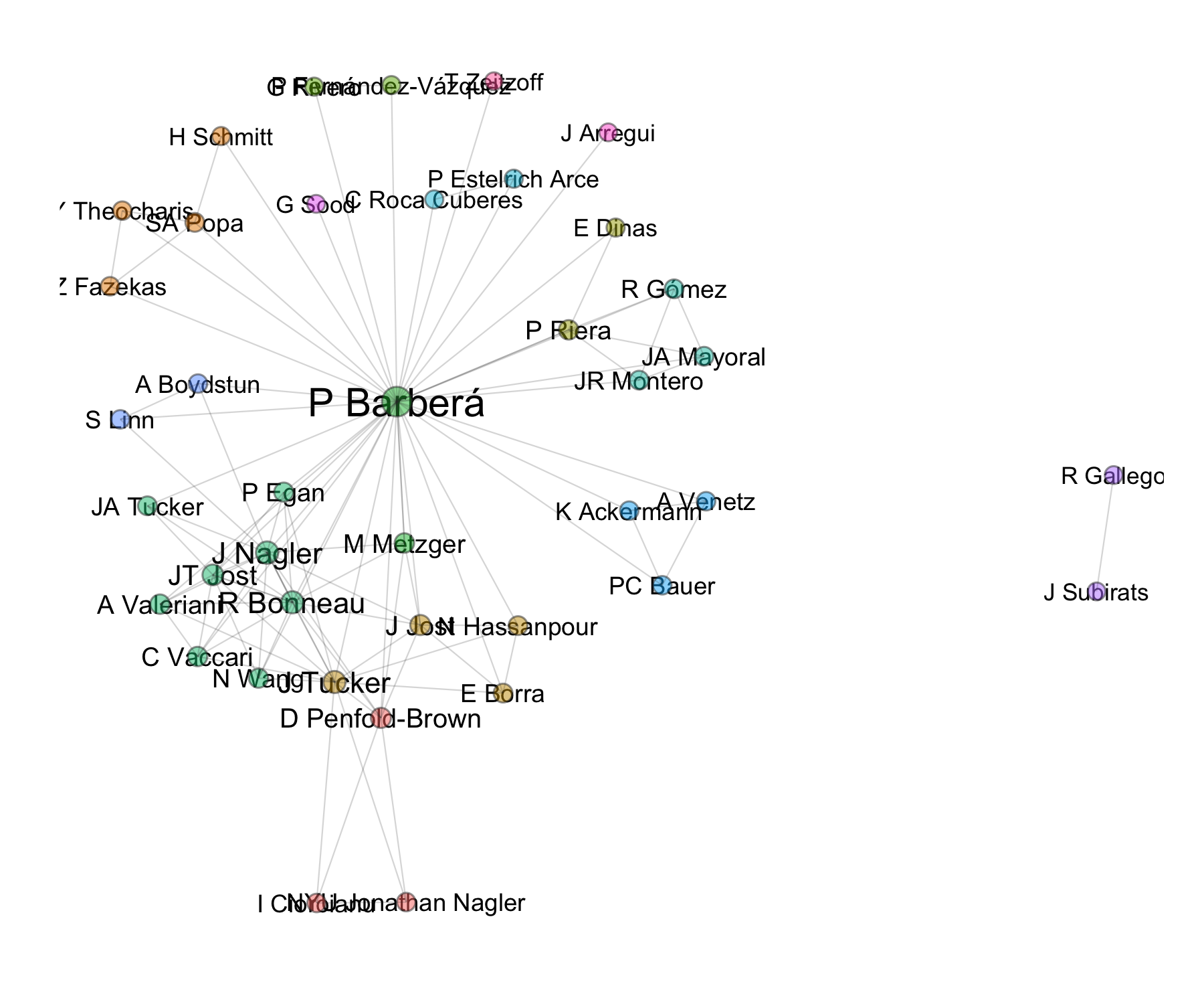
The output of the extractNetwork function can also be used to generate a static version of this visualization with e.g. ggplot2:
library(ggplot2)
library(igraph)
# cleaning network data
network <- graph_from_data_frame(d$edges, directed=FALSE)
set.seed(123)
l <- layout.fruchterman.reingold(network, niter=1500) # layout
fc <- walktrap.community(network) # community detection

# node locations
nodes <- data.frame(l); names(nodes) <- c("x", "y")
nodes$cluster <- factor(fc$membership)
nodes$label <- fc$names
nodes$degree <- degree(network)

# edge locations
edgelist <- get.edgelist(network, names=FALSE)
edges <- data.frame(nodes[edgelist[,1],c("x", "y")], nodes[edgelist[,2],c("x", "y")])
names(edges) <- c("x1", "y1", "x2", "y2")

# and now visualizing it...
p <- ggplot(nodes, aes(x=x, y=y, color=cluster, label=label, size=degree))
pq <- p + geom_text(color="black", aes(label=label, size=degree),
                    show_guide=FALSE) +
  # nodes
  geom_point(color="grey20", aes(fill=cluster),
             shape=21, show_guide=FALSE, alpha=1/2) +
  # edges
  geom_segment(
    aes(x=x1, y=y1, xend=x2, yend=y2, label=NA),
    data=edges, size=0.25, color="grey20", alpha=1/5) +
  ## note that here I add a border to the points
  scale_fill_discrete(labels=labels) +
  scale_size_continuous(range = c(5, 8)) +
  theme(
    panel.background = element_rect(fill = "white"),
    plot.background = element_rect(fill="white"),
    axis.line = element_blank(), axis.text = element_blank(),
    axis.ticks = element_blank(),
    axis.title = element_blank(), panel.border = element_blank(),
    panel.grid.major = element_blank(),
    panel.grid.minor = element_blank(),
    legend.background = element_rect(colour = F, fill = "black"),
    legend.key = element_rect(fill = "black", colour = F),
    legend.title = element_text(color="white"),
    legend.text = element_text(color="white")
  ) +
  ## changing size of points in legend
  guides(fill = guide_legend(override.aes = list(size=5)))

pq
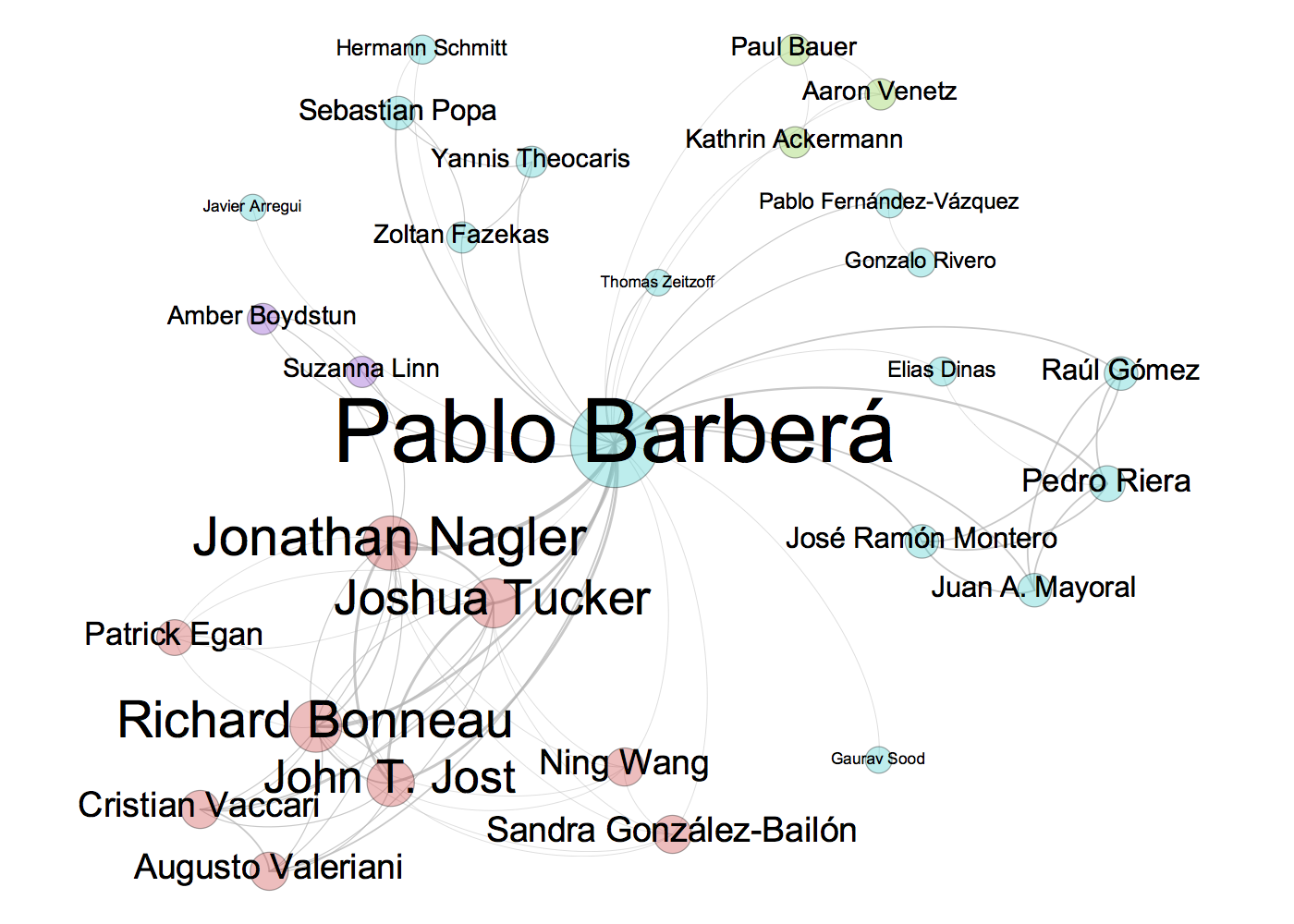
However, it is difficult to make sure labels do not overlap. A probably better option is to export the network data to a format that Gephi can read, and then edit it manually in Gephi, as shown below.
df <- data.frame(Source = d$edges$node1, Target = d$edges$node2)
write.csv(df, file="edgelist-gephi.csv", row.names=FALSE)

