react-typeahead
A typeahead/autocomplete component for React
react-typeahead is a javascript library that provides a react-based typeahead, or autocomplete text entry, as well as a "typeahead tokenizer", a typeahead that allows you to select multiple results.
Usage
For a typeahead input:
var Typeahead = require('react-typeahead').Typeahead;
React.renderComponent(Typeahead({
  options: ['John', 'Paul', 'George', 'Ringo'],
  maxVisible: 2
});
For a tokenizer typeahead input:
var Tokenizer = require('react-typeahead').Tokenizer;
React.renderComponent(Typeahead({
  options: ['John', 'Paul', 'George', 'Ringo'],
  onTokenAdd: function(token) {
    console.log('token added: ', token);
  }
});
Examples
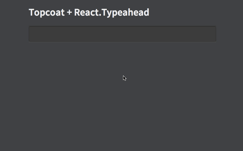
- Basic Typeahead with Topcoat
- Typeahead Tokenizer with Topcoat
- Typeahead Tokenizer with simple styling
API
Typeahead(props)
Type: React Component
Basic typeahead input and results list.
props.options
Type: Array
Default: []
An array supplied to the fuzzy search.
props.maxVisible
Type: Number
Limit the number of options rendered in the results list.
props.customClasses
Type: Object
Allowed Keys: input, results, listItem, listAnchor
An object containing custom class names for child elements. Useful for integrating with 3rd party UI kits.
props.placeholder
Type: String
Placeholder text for the typeahead input.
props.onKeyDown
Type: Function
Event handler for the keyDown event on the typeahead input.
props.onOptionSelected
Type: Function
Event handler triggered whenever a user picks an option
Tokenizer(props)
Type: React Component
Typeahead component that allows for multiple options to be selected.
props.options
Type: Array
Default: []
An array supplied to the fuzzy search.
props.maxVisible
Type: Number
Limit the number of options rendered in the results list.
props.customClasses
Type: Object
Allowed Keys: input, results, listItem, listAnchor, typeahead
An object containing custom class names for child elements. Useful for integrating with 3rd party UI kits.
props.placeholder
Type: String
Placeholder text for the typeahead input.
props.defaultSelected
Type: Array
A set of values of tokens to be loaded on first render.
props.onTokenRemove
Type: Function
Event handler triggered whenever a token is removed.
props.onTokenAdd
Type: Function
Event handler triggered whenever a token is removed.