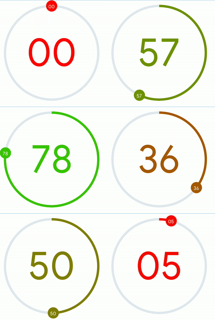
-
Install the library and react-native-svg
npm i --save rn-arc-slider react-native-svg
-
Link native code for SVG
npx react-native link react-native-svg
import ArcSlider from "rn-arc-slider";<ArcSlider
value={value}
onChange={setValue}
trackColor={"red"}
showThumbText
showText
/>

|
Slider with Thumb |

|
Progress Bar |

|
Arc Slider without center text |
| Prop Name | Type | Default | Description |
|---|---|---|---|
trackRadius |
number | 100 |
Radius of Circular Slider |
thumbRadius |
number | 12 |
Size of Thumb |
trackWidth |
number | 5 |
Size of Track |
value |
number | 0 |
Value between minValue to maxValue |
minValue |
number | 0 |
Minimum value |
maxValue |
number | 100 |
Maximum value |
onChange |
((angle: number) => any) | none |
onChange Handler |
trackColor |
string | #2089dc |
Color for Track |
trackTintColor |
string | #e1e8ee |
Color for Track Tint |
thumbColor |
string | #2089dc |
Color for Thumb |
thumbTextColor |
string | white |
Color for Text on Thumb |
thumbTextSize |
number | 10 |
Font size for Text on Thumb |
showThumbText |
boolean | false |
Show text on center of thumb |
noThumb |
boolean | false |
Show Thumb on Track |
showText |
boolean | false |
Show text on center of circle |
textColor |
string | #2089dc |
Text color for center of circle |
textSize |
number | 80 |
Text Size for center of circle |
maxAngle |
number | 359.9 |
Maximum arc angle in degrees i.e. its range is 0 to 359 |
minAngle |
number | 0 |
Minimum arc angle in degrees i.e. its range is 0 to 359 |
All PRs are welcome
This project is under license from MIT. For more details, see the LICENSE file.
Made with ❤️ by Arpit Bhalla


