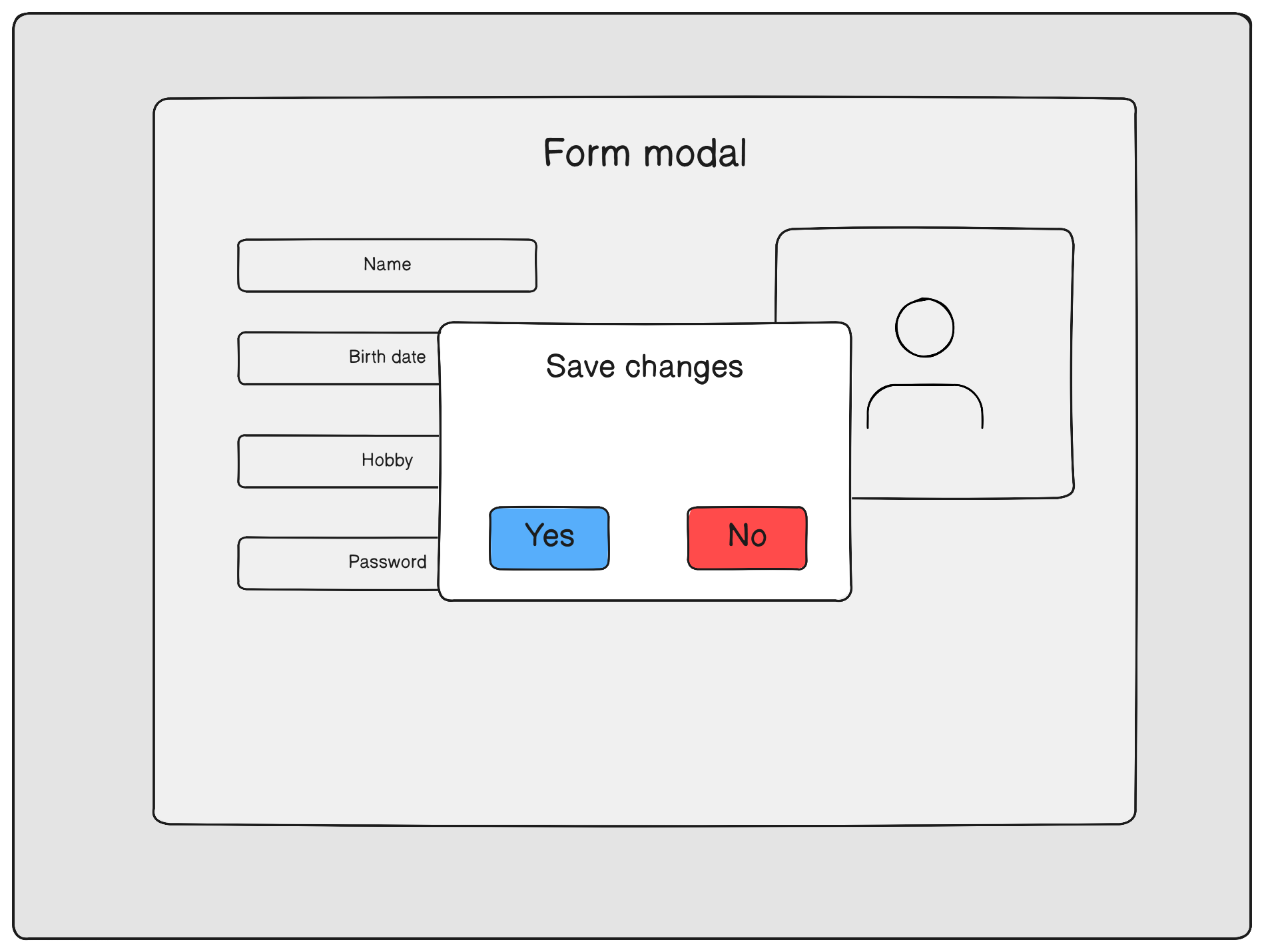
⚠ This library is responsible for the logic of managing modal windows and does not provide graphical elements for creating modal windows. The author of the library decided to trust your taste and creativity ✨
- Installation
- Setting Up
- useModal Usage
- Animating Your Modal
- Configuring Different Scenarios for Modals
- Philosophy of the Library
Using NPM
npm i react-modal-controlUsing Yarn
yarn add react-modal-controlUsing PNPM
pnpm add react-modal-controlCreate a modal window component
// Greeting.jsx

export const Greeting = () => {
  return (
    <div>
      <h2>Greeting</h2>
    </div>
  );
};
Create a file that will contain all modal windows within an object
// modals.js

import { Greeting } from './Greeting.jsx';

const MODAL_WINDOWS = {
  greeting: Greeting,
};

export default MODAL_WINDOWS;
Wrap your app into ModalWindowsProvider and provide required options to provider
import { ModalWindowsProvider } from 'react-modal-control';
import MODAL_WINDOWS from './modals';

function App() {
  return (
    <ModalWindowsProvider
      type="queue"
      appearenceMode="after-close"
      modals={MODAL_WINDOWS}
    >
      {/* rest */}
    </ModalWindowsProvider>
  );
}
After that define a place and wrap of modals uisng ModalRenderer
import { ModalWindowsProvider, ModalRenderer } from 'react-modal-control';
import MODAL_WINDOWS from './modals';

function App() {
  return (
    <ModalWindowsProvider
      type="queue"
      appearenceMode="after-close"
      modals={MODAL_WINDOWS}
    >
      {/* rest */}

      <ModalRenderer>
        {(modal) => <div className="modal-window-wrapper">{modal}</div>}
      </ModalRenderer>
    </ModalWindowsProvider>
  );
}
The final step is to initialize useModal hook and we are ready to go
// hooks/useModal.js

import { init } from 'react-modal-control';
import { MODAL_WINDOWS } from './modals';

const { useModal } = init(MODAL_WINDOWS);

export default useModal;
The main reason why the useModal hook needs to be created by calling the init function is to achieve additional
type safety for the first argument, which is the key of the modal window,
and options, including props, for the corresponding modal.
This allows achieving autocompletion, even when using JavaScript.
You can open modal window from any place of your app by using useModal hook
import useModal from './hooks/useModal';

function Menu() {
  const { open } = useModal();

  function handleClick() {
    // here you need to pass a key from MODAL_WINDOWS object
    open('greeting');
  }

  return (
    <div>
      <button onClick={handleClick}>Open greeting</button>
    </div>
  );
}
If modal window requires props you can provide it in options
// Greeting.jsx

function Greeting({ name }) {
  return (
    <div>
      <h2>Hello, {name}</h2>
    </div>
  );
}

// Menu.jsx

function Menu() {
  const { open } = useModal();
  const [name, setName] = useState('');

  return (
    <div>
      <input
        type="text"
        placeholder="Enter your name"
        onInput={(event) => setName(event.target.value)}
        value={name}
      />
      <button onClick={() => open('greeting', { props: { name } })}>
        Greet me
      </button>
    </div>
  );
}
Also you can close recent opened modal window
const { close } = useModal();

close();
If you want to close specified modal provide an id
const { open, close } = useModal();

useEffect(() => {
  // open on component render
  const id = open('greeting');

  //close on rerender
  return () => close(id);
}, []);
To control modal window from inside of it you can use useInternalModal
// Greeting.jsx
import { useInternalModal } from 'react-modal-control';

export const Greeting = () => {
  const { isActive, isClosing, closeSelf } = useInternalModal();
  return (
    <div>
      <button onClick={closeSelf}>Close</button>
      <h2>Greeting</h2>
    </div>
  );
};If you want to animate modal before it will be closed you can use useModalCapture hook.
Modal window will be in closing stage until release call or component unmount.
import { useModalCapture } from 'react-modal-control';

function ModalWithAnimation() {
  const [animate, setAnimate] = useState(false);

  const release = useModalCapture(() => setAnimate(true));

  return <FadeOutAnimation animate={animate} onAnimationEnd={release} />;
}In the event that multiple components are responsible for animations, you can set a delay for each of them. The modal window will be closed after 2 seconds because it requires all components to release the modal window before closing it.
import { useModalCapture, useInternalModal } from 'react-modal-control';

function Delay({ isClosing, timeout }) {
  const release = useModalCapture();

  useEffect(() => {
    if (isClosing) {
      const timeoutId = setTimeout(() => {
        release();
      }, timeout);

      return () => clearTimeout(timeoutId);
    }
  }, [isClosing]);

  return <p>Timout is: {timeout} ms</p>;
}

function Modal() {
  const { isClosing } = useInternalModal();

  return (
    <div>
      <Delay timeout={1000} isClosing={isClosing} />
      <Delay timeout={2000} isClosing={isClosing} />
    </div>
  );
}
⚠ However, it is not recommended to create a delay for each animation. The best approach is to add a single delay to the element of the modal window, after which all the window's contents become invisible, eliminating the need for additional delays.
It is possible to allow the simultaneous opening of multiple modal windows or configure the windows to open one after another.
This behavior is achieved by passing options to the ModalWindowsProvider.
<ModalWindowsProvider type="multiple" modals={MODAL_WINDOWS}>
  {/* rest */}
</ModalWindowsProvider>
In this case, all open windows are rendered. The most common way to display them is cascading, one behind the other.
In the queue type, when multiple modal windows are triggered to open, they will be queued one after another, with each new modal window appearing only after the previous one has been closed. This approach ensures that users have a focused and sequential experience with the modal windows, without overlapping or obstructing views.
<ModalWindowsProvider
  type="queue"
  appearenceMode="after-close"
  modals={MODAL_WINDOWS}
>
  {/* rest */}
</ModalWindowsProvider>
appearenceMode may be configured as after-close or during-close
When using the after-close management mode, the next modal window in the queue will only open after the currently open window has been completely closed.
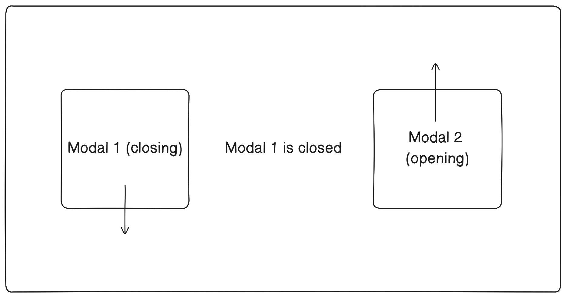
The during-close mode allows the next modal window to be displayed while the previous one starts closing. This enables the creation of animations involving overlapping modal windows.
<ModalWindowsProvider
  type="queue"
  appearenceMode="during-close"
  modals={MODAL_WINDOWS}
>
  {/* rest */}
</ModalWindowsProvider>Consider that a modal window in your application is something not tied to a specific component and can exist independently of it. For example, it's very convenient to use built-in methods of the browser API like prompt or confirm and get the result.
//inside a function

const userInput = prompt('Enter your name');

if (userInput === null) {
  alert('Your name is required to continue');
  return;
}

// continue
The main conveniences are:
- The ability to invoke them from anywhere in the code.
- No need to think about the logic of opening dialog windows.
You can also use this library in the same way. Your first step will be to create the modal window itself, unlike built-in confirm and prompt, your dialog window requires implementation.
After this, you can similarly open it in any component of your application using:
const { open } = useModal();

open('my-prompt', {
  props: {
    onValue: (value) => {
      // display it in your component
    },
    onCancel: () => {
      // show an error message
      // you can also do this by using your custom error modal window
    },
  },
});


