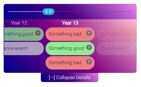
See this project at artoonie.github.io/timeline-range-slider
The project page has dynamic sliders you can interact with.
The default configuration gives you a slider with a collapsible timeline:
Features:
- A mobile-friendly range slider,
- With a collapsible events timeline to list events which occurred at each index in the slider,
- With tooltips for deeper explanations of the summaries
Benefits:
- Vanilla Javascript & CSS
- No external libraries: no jQuery, bootstrap, Sass, etc
- Simple javascript configuration with sane defaults
- Simple, easy-to-override CSS
- Permissive license
Pick what works for your setup:
npm i @artoonie/timeline-range-slider- Download assets from github package
- Just download the files in the
timeline-range-sliderdirectory. Go on. I won't judge you.
If you're not using node.js, functions begin with trs_ namespace to avoid conflicts:
Include the files in your HTML and create a wrapper div:
<link rel="stylesheet" href="slider.css">
<script type="text/javascript" src="slider.js"></script>
<div id="slide"></div>
Create a slider by calling:
const config = {wrapperDivId: 'slide', numTicks: 10}
trs_createSliderAndTimeline(config);
additional config options are described below.
You can a slider value manually by calling:
trs_setSliderValue('slide', 5);You can animate a slider to have it move front-to-back with
trs_animate('slide');Hide the timeline with:
trs_toggleTimelineVisibility('slide');HTML:
const slider = require('./timeline-range-slider/slider.js');
require('./timeline-range-slider/slider.css');

<div id="slide"></div>
Javascript:
slider.createSliderAndTimeline(config);
slider.setSliderValue('slide', 5);
slider.animate('slide');
slider.toggleTimelineVisibility('slide');The config dictionary has the following options:
| key/default | description |
|---|---|
wrapperDivId* required |
The div id in which to place the slider |
numTicks* required |
The number of elements in the slider |
width default: 600 |
The maximum width of the slider. If the page is narrower than this, the slider will responsively scale. |
hideTimelineInitially default: true |
Whether or not the timeline is initially expanded or collapsed |
tickLabelPrefix default: 'Round ' |
What does each tick represent? Placed in the header row of the timeline. |
hideActiveTickText default: false |
Should we hide tickText on the active tick? By default, we hide the text and show a slider via CSS. Only change this if you override the CSS for the active tick. |
tickText default: '•' |
The text that marks a tick in the slider. Can be a single string or a list. If it's a list, must be the size of numTicks. |
color default: 'orangered' |
The color of past tick marks. Can be a single string or a list. If it's a list, must be of size numTicks. |
sliderValueChanged default: null |
Callback to be notified when the slider changes. |
animateOnLoad default: false |
Should the slider animate all steps on load? |
timeBetweenStepsMs default: 1s/numTicks |
How fast should the animation run? |
timelinePeeking default: true |
Should the timeline "peek open" during animation, and close after the animation completes? |
timelineData default: random data |
The timeline data. See below for how to structure this. |
leftArrowText default: < |
What text to place in the left arrow button? |
rightArrowText default: < |
What text to place in the right arrow button? |
The timelineData contains the events that occurred at each "tick" in the timeline.
It is a list of lists. Each of the numTicks elements contains a list of events.
A single event is structured as follows:
const oneTimelineItem = {
  summaryText: "Short summary",

  /* optional */
  className: "custom-class-for-summary-label",

  /* optional */
  moreInfoText: "Description to show when hovering"
}
Each "tick" can have multiple events (or zero events).
A complete timelineData structure might look like:
const timelineData = [
    [
        {summaryText: "Event 1, tick 1"},
        {summaryText: "Event 2, tick 1"}
    ],
    [
        {summaryText: "Event 1, tick 2",
         className: "some-class"}
    ],
    [ /* No events in tick 3 */
    ],
    [
        {summaryText: "Event 1, tick 4"},
        {summaryText: "Event 2, tick 4"},
        {summaryText: "Event 3, tick 4",
         moreInfoText: "a long description"}
    ]
]


