Activaitons Histogram
The Twin Peaks Chart
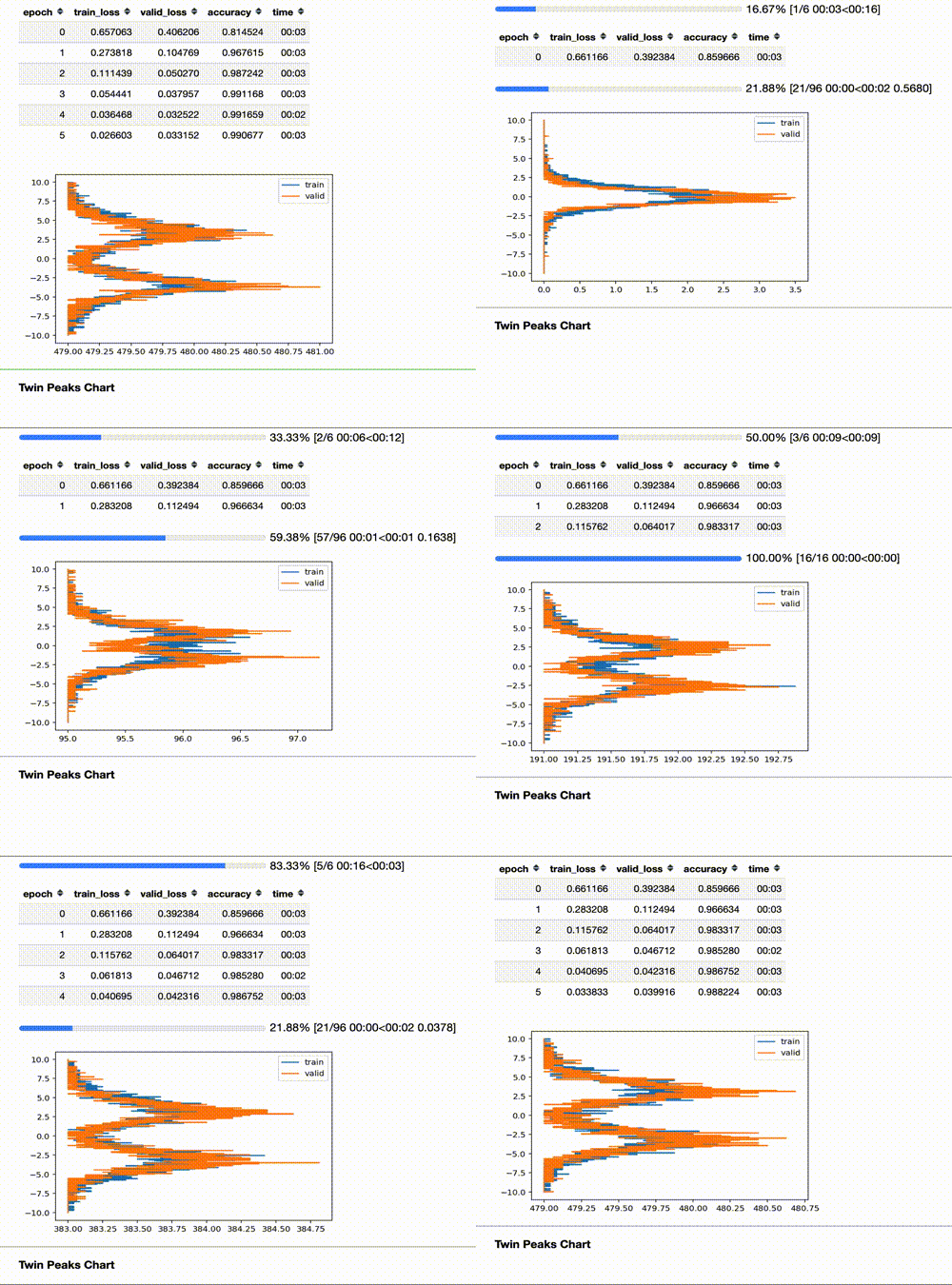
*The Twin Peaks chart is a tool we can use to evaluate the health of our model in real time.
The Twin Peaks chart is a tool we can use to evaluate the health of our model in real time.
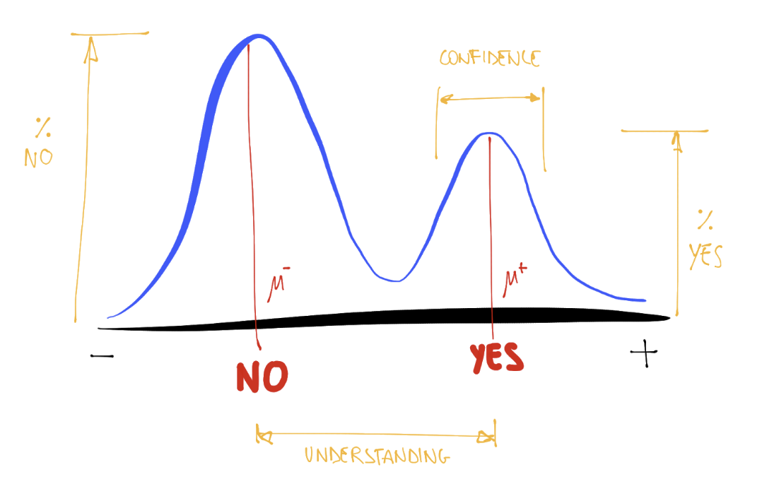
It compares, for the last layer, the average of the activations histogram of the last quarter of batches with the activations histogram of the validation set for the same epoch.
The Colorful Dimension
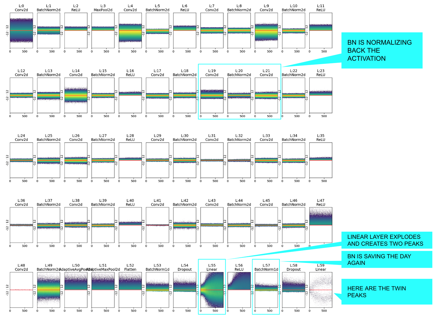
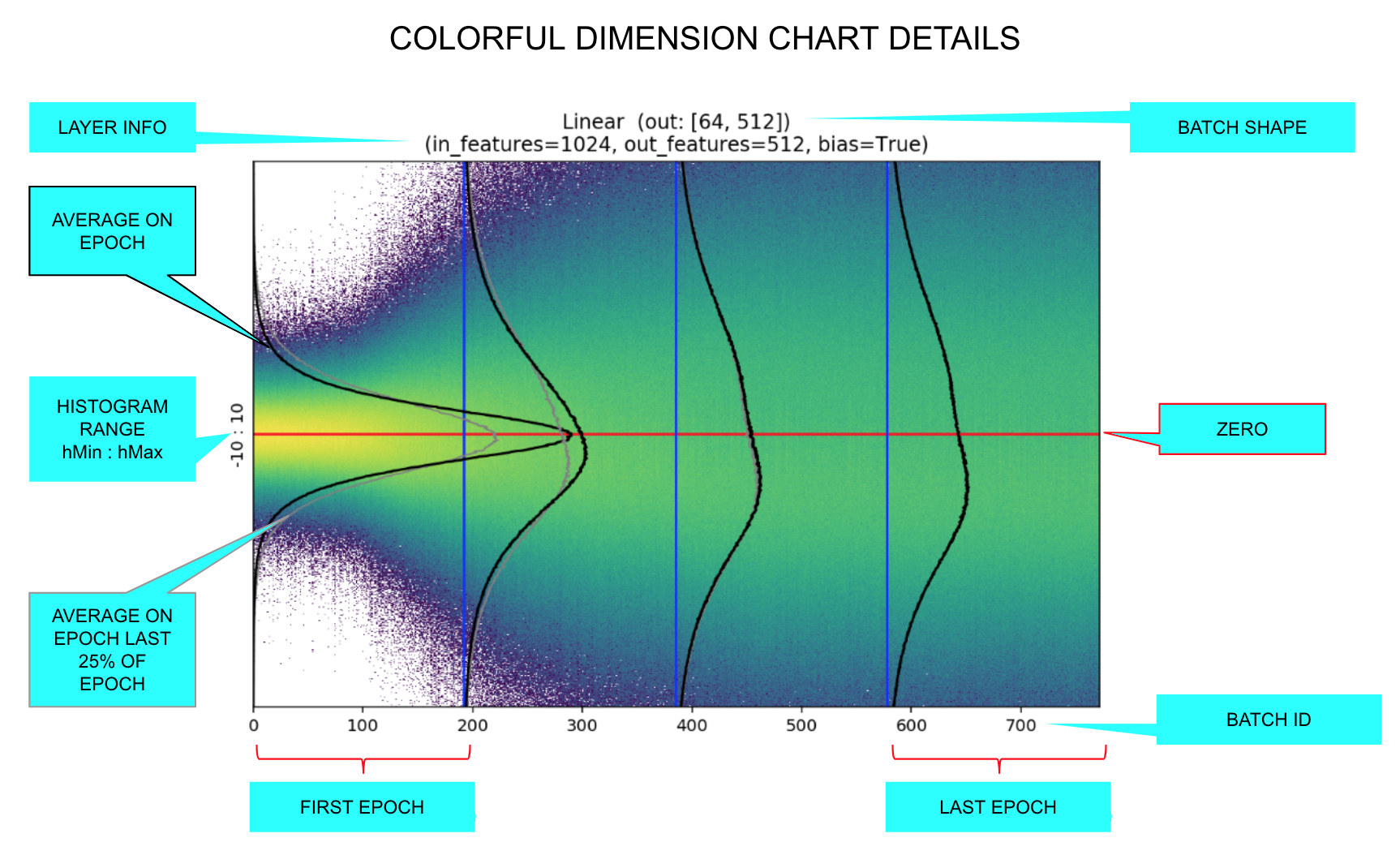
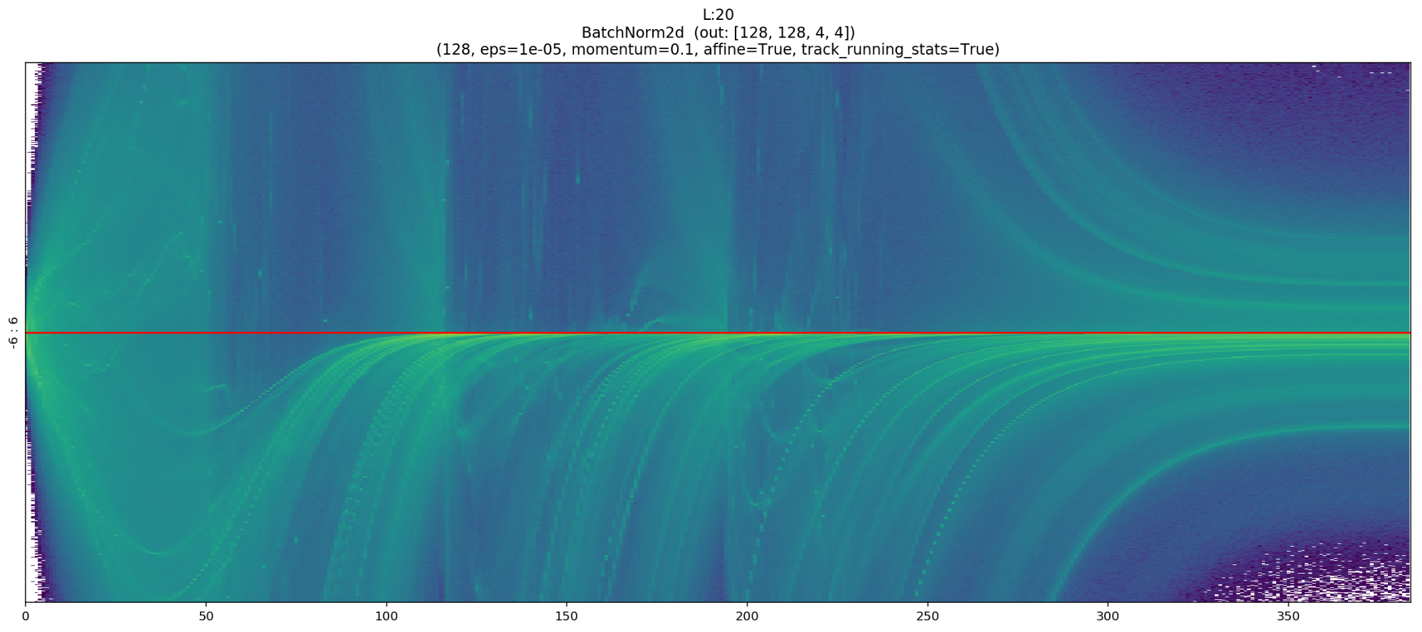
The colorful dimension charts are made by plotting the activations histogram epoch by epoch, coloring the pixel according to log of intensity.
Sample usage
data = ImageDataBunch.from_folder(untar_data(URLs.MNIST_SAMPLE),bs=1024)
# (1) Create custom ActivationsHistogram according to your needings
actsh = partial(ActivationsHistogram,modulesId=None,hMin=-10,hMax=10,nBins=200)
# Add it to the callback_fns
learn = cnn_learner(data, models.resnet18, callback_fns=actsh, metrics=[accuracy])
# Fit: and see the Twin Peaks chart in action
learn.fit_one_cycle(4)
# (2) Customize and Plot the colorful chart!
learn.activations_histogram.plotActsHist(cols=20,figsize=(30,15),showEpochs=False)On the repository
- sample_usage.ipynb : Documentation and samples for all methods.
- TwinPeaksChartPost.ipynb : Contains all the charts and experiment of this very post.
- sample_mnist_binary_classifier.ipynb : Complete sample on mnist.
- sample_cifar_multi_class.ipynb : Complete multi class example.
- sample_head_pose_regression.ipynb : Complete regression example.
- sample_planet_multi_category.ipynb : Complete multi category example.
