Analysis of corona virus infections and deaths based on data from https://github.com/CSSEGISandData/COVID-19 .
I am not an epidemiologist, virologist, or any other expert in the field. I work in data science and engineering. I'm not a Tory, nor am I Labour. In recent times, I'm politically vacant. There is no political motivation behind this analysis. Nor do I have anything to gain or promote.
In terms of infection numbers, I've taken the number of confirmed cases. This is not ideal as the confirmed cases are far far lower than the expected actual infections. I discuss this more later.
There could be errors in the underlying data, in the analysis, or in the interpretation. If you do find any, I'd appreciate it if you let me know in a constructive manner - either here on github, or on twitter (@ashic).
I have immense respect for the CMO, CSO, and the outstanding researchers working on the UK's approach to dealing with this pandemic. From my limited understanding, the work is exemplary, and the approach is credible.
I will outline my approach and findings. I will then discuss various aspects of the situation, and in the end, have a section where I'll provide regular updates. The charts will be updated regularly (ideally, once a day, when the underlying data is refreshed).
Different countries had their break outs at different times. This makes it incredibly difficult to compare them, as each scenario is different. Italy and the UK had their first confirmed cases on the same day - January 31, 2020. Since then, Italy has had far higher infection rates than the UK. However, it could be argued that the UK didn't really experience a breakout on January 31. I'm analysing confirmed infection rates and deaths separately. For confirmed infections, I'm taking the first day where the confirmed infections role by 5% day on day for the subsequent five days as the breakout date. This represents a sustained increase, but doesn't lose data from before a certain number of confirmed infections. For deaths, I'm taking the day of the first death to be the day from which we analyse the corresponding country's data. Death numbers are still quite low for most countries, and as such, this is - in my opinion - acceptable. I may change the criteria in the future.
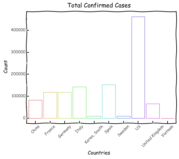
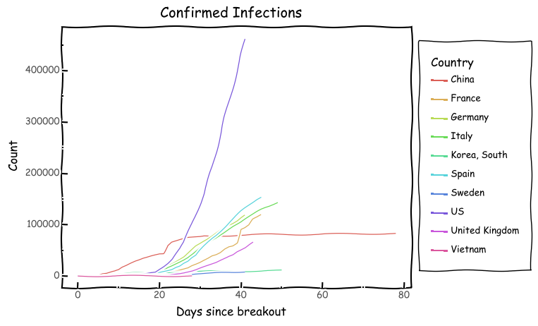
We'll start off with simple counts for confirmed infections and deaths.
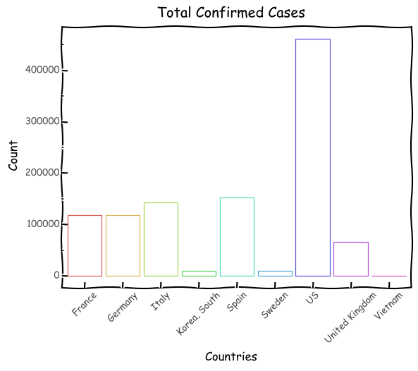
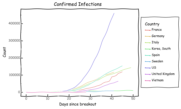
China skews it somewhat, so let's look at it without China.
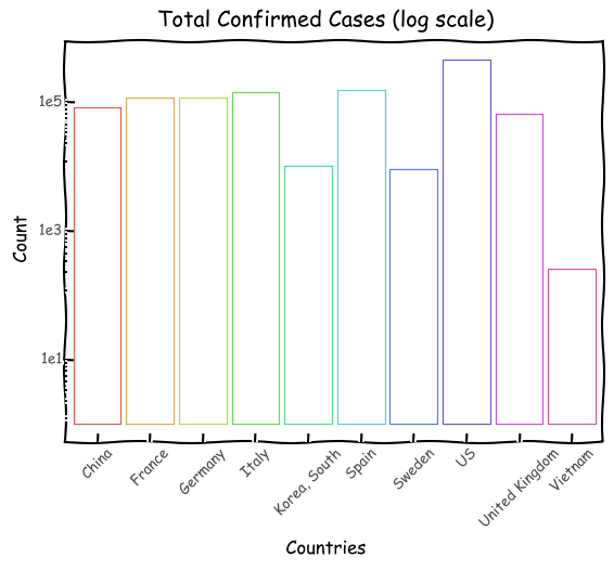
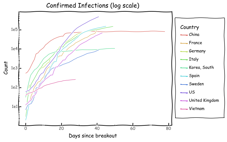
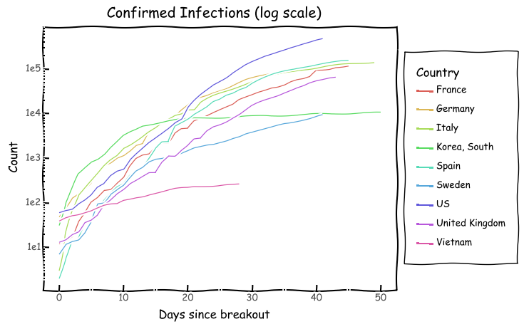
Since some countries have exponentially larger counts, let's look at the data on a logarithmic scale. This helps us compare numbers across countries in terms of orders of maginiture.
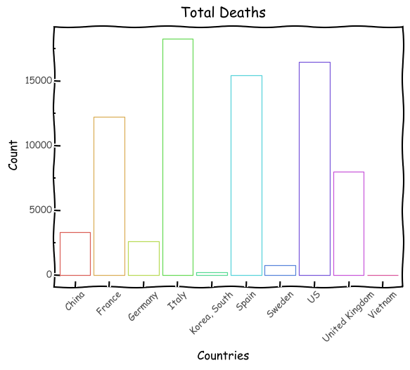
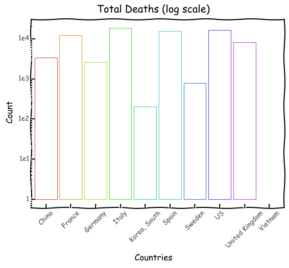
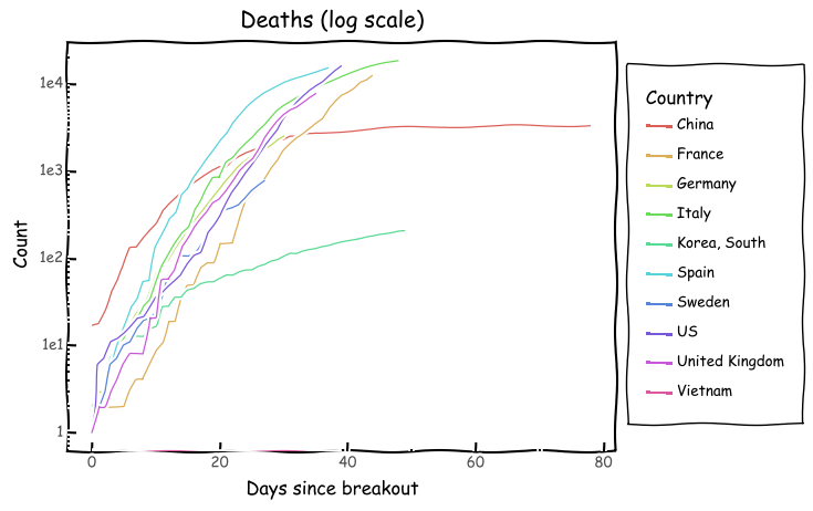
Italy has now surpassed China in terms of deaths. Since the two are an order of maginitude higher compared to the rest, we'll look at the log scale.
This chart is difficult to read. It also suffers from the problem that our data source starts on January 22, 2020. On that date, China already had 548 confirmed cases. Even with this chart, we see that cases in Italy and Spain are rising rapidly. Italy crossed 500 cases 7 days into her breakout. As such, shifting China's curve 7 days to the right would give a more accurate depiction. Even with that, we see that Italy started off better, but now is following a very similar exponential path. Taking China out of the picture gives us a clearer view of the others.
Speaking of exponentials, a good approach to visualise comparison in exponential growth is on a logarithmic scale. For the unitiated, this means were comparing orders of magnitude, rather than absolute numbers. Something that grows exponentially on a normal scale may be linear of a logarithmic scale.
On this scale, we can see that China's numbers have hit inflection (i.e. the exponential part of the logistic may be over). However, Italy and Spain's steep progression is noteworthy. The UK's numbers are considerably lower than the others, but the angle of ascent cannot be ignored. Vietnam with it's outstanding preparation since SARS stands out.
And to round of the confirmed cases, we have a log chart without China.
I think the second chart above is quite important. It clearly shows that even though we broke out at similar times, the UK is right at the start of her exponential curve. Looking at the log chart, we can see a similar steepness to Italy. We're growing exponentially, but at a rate less than Italy. That does not mean we won't hit numbers like Italy. In all likelihood, we will have to deal with those heights eventually. We're not doing "better" to the point where we won't see that level of increase. Judging by how quickly this thing can spread, it's a matter of when.
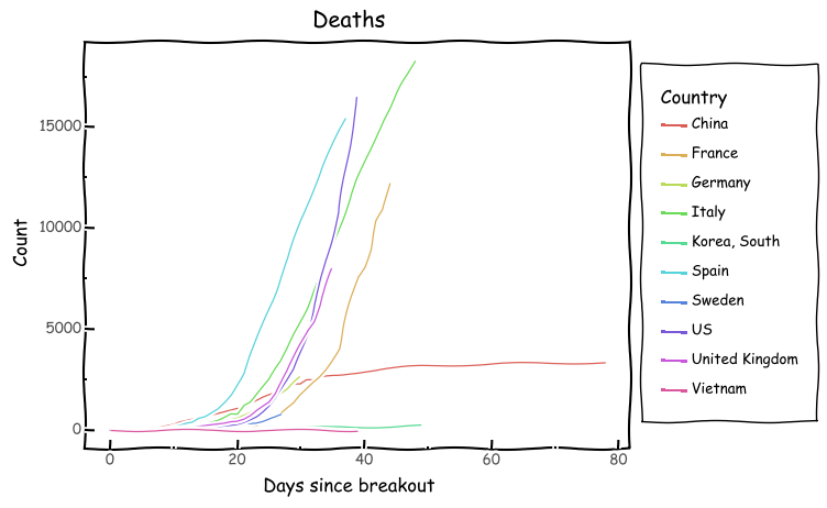
Looking at the total number of deaths since the first death in each country, we get the following.
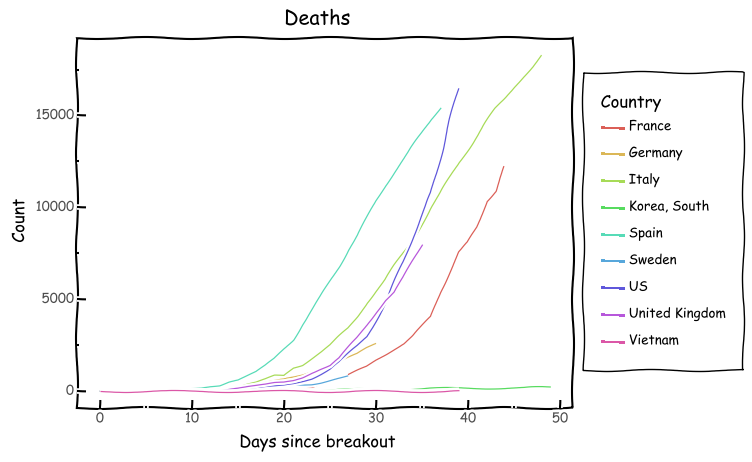
Again, China dominates the numbers, but the sharp incline of Italy and Spain is quite scary. Removing China gives us a better view.
This shows how much further Italy is to the rest, but also the fact that Spain in its early breakout is fairing worse than Italy did at the same time.
On a log scale, we have this.
And without China:
As we can see, in terms of deaths, the numbers are still quite low for most countries. Sadly, this will likely increase over the coming days.
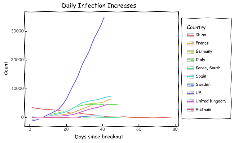
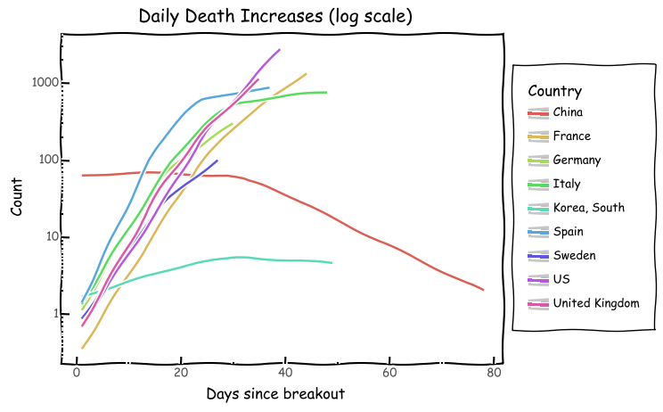
Another thing worth looking at is the day on day increase rates of infections and deaths. Since the number can increase or decrease on any particular day, we use smoothing to get a better picture of the curve. The increase rates are outlined here:
