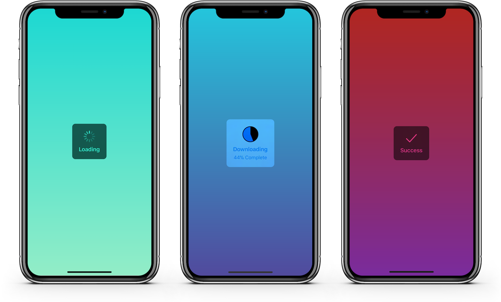
An elegant and simple progress HUD for iOS and tvOS.
The ultimate progress HUD for iOS and tvOS is here: JGProgressHUD!
- Plug and play: Simple integration, easy to use, few lines of code required.
- Easily customizable (custom animations, indicator views and more).
- Uses
UIVisualEffectViewandUIMotionEffectfor a native look. - Uses AutoLayout to provide a fully dynamic layout.
- Detects and repositions when keyboard appears/disappears.
- Well documented and maintained.
- Voice Over/
UIAccessibilitysupport. - Backward compatibility to iOS 8.
- Can be used with Swift and Objective C.
- And most importantly, it looks good!
Download the source code and open the Examples project to try JGProgressHUD and see all of its features in action!
Objective C:
JGProgressHUD *HUD = [JGProgressHUD progressHUDWithStyle:JGProgressHUDStyleDark];
HUD.textLabel.text = @"Loading";
[HUD showInView:self.view];
[HUD dismissAfterDelay:3.0];
Swift:
let hud = JGProgressHUD(style: .dark)
hud.textLabel.text = "Loading"
hud.show(in: self.view)
hud.dismiss(afterDelay: 3.0)
This displays a dark HUD with an activity indicator and the title "Loading". The HUD is presented with a fade animation and is dismissed after 3 seconds with a fade animation.
JGProgressHUD *HUD = [JGProgressHUD progressHUDWithStyle:JGProgressHUDStyleDark];
HUD.textLabel.text = @"Error";
HUD.indicatorView = [[JGProgressHUDErrorIndicatorView alloc] init]; //JGProgressHUDSuccessIndicatorView is also available
[HUD showInView:self.view];
[HUD dismissAfterDelay:3.0];JGProgressHUD *HUD = [JGProgressHUD progressHUDWithStyle:JGProgressHUDStyleDark];
HUD.indicatorView = [[JGProgressHUDPieIndicatorView alloc] init]; //Or JGProgressHUDRingIndicatorView
HUD.progress = 0.5f;
[HUD showInView:self.view];
[HUD dismissAfterDelay:3.0];For more examples, including in Swift, see Examples.
Important: You should always show JGProgressHUD in a UIViewController view.
JGProgressHUD can be displayed in 3 styles:
- Extra Light
- Light
- Dark
By default a HUD will display an indeterminate progress indicator. The indicator view can be completely hidden by setting the indicatorView property to nil. These indicator views are available by default:
- Indeterminate progress indicator
- Pie progress indicator
- Ring progress indicator
- Success indicator
- Error indicator
- Image indicator
Custom indicator views can be created by subclassing JGProgressHUDIndicatorView.
By default a HUD will use a fade animation. Several parameters can be altered such as animation duration or animation curve. A HUD can be displayed without animation and different animations can be used. These animations are available by default:
- Fade
- Zoom and Fade
Custom animations can be created by subclassing JGProgressHUDAnimation.
To dim the content behind the HUD set your dim color as backgroundColor of your JGProgressHUD instance.
Add JGProgressHUD as a dependency in your Package.swift file:
.package(url: "https://github.com/JonasGessner/JGProgressHUD", .upToNextMajor(from: "2.0.0"))In your Cartfile add:
github "JonasGessner/JGProgressHUD"
In your Podfile add:
pod 'JGProgressHUD'
- Drag the
JGProgressHUD.xcodeprojfile into your Xcode project. - Add
JGProgressHUD.frameworkto "Embedded Binaries" in the "General" tab of your target.
After installing import the module where you want to use it:
@import JGProgressHUD;Swift:
import JGProgressHUDSee the Examples project for an example implementation of JGProgressHUD as framework.
- Base SDK of iOS/tvOS 11.0 or higher.
- Deployment target of iOS 8.0, tvOS 9.0 or higher.
JGProgressHUD can also be used by projects written in Swift. See Installation for details.
Detailed documentation can be found on here.
Each class and method is well documented, making it easy to quickly get a good overview. To start, see JGProgressHUD.h.
MIT License.
© 2014-2019, Jonas Gessner.
Created and maintained by Jonas Gessner, © 2014-2019.


