Jetpack Compose provides Android app developers with a modern and intuitive way to create user interfaces. Sometimes, standard layouts may not fully meet your needs. In such cases, creating custom layout designs might be necessary. In this article, you'll learn how to create custom layouts using Jetpack Compose.
Custom layouts are special layout designs you can create when standard layout components don't meet your requirements. While standard layouts like Row, Column, and Box are sufficient in many scenarios, there are cases where more flexibility and control are needed. For example, custom layouts are useful for specific design patterns or complex layout requirements.
When creating a custom layout, you use MeasurePolicy and Layout functions to define how child components should be measured and positioned on the screen. MeasurePolicy defines how each child component is measured, while the Layout function determines how these components are placed on the screen.
val measurePolicy = MeasurePolicy { measurables, constraints ->
    // Measure child elements
    val placeables = measurables.map { measurable ->
        measurable.measure(constraints)
    }
    // Determine layout
    layout(constraints.maxWidth, constraints.maxHeight) {
        var yPosition = 0
        placeables.forEach { placeable ->
            placeable.placeRelative(x = 0, y = yPosition)
            yPosition += placeable.height
        }
    }
}Let's create a custom layout step by step using an example. For instance, we can create a custom layout that arranges elements in a grid format. This way, we can ensure child elements are placed sequentially and in a specific layout.
First, let's create a measurePolicy and then use it in the Layout function.
@Composable
private fun CustomGridLayout(
    modifier: Modifier = Modifier,
    columns: Int,
    content: @Composable () -> Unit,
) {
    val measurePolicy = MeasurePolicy { measurables, constraints ->
        val columnWidth = constraints.maxWidth / columns
        val placeables = measurables.map { measurable ->
            measurable.measure(constraints.copy(maxWidth = columnWidth))
        }
        val height = placeables.maxOfOrNull { it.height } ?: 0

        layout(width = constraints.maxWidth, height = height * (measurables.size / columns + 1)) {
            var xPosition = 0
            var yPosition = 0
            placeables.forEachIndexed { index, placeable ->
                placeable.placeRelative(x = xPosition, y = yPosition)
                xPosition += columnWidth
                if ((index + 1) % columns == 0) {
                    xPosition = 0
                    yPosition += height
                }
            }
        }
    }

    Layout(
        content = content,
        modifier = modifier,
        measurePolicy = measurePolicy,
    )
}
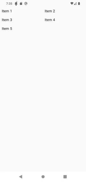
After creating the custom layout, let's see how we can use it and its output:
@Composable
fun MyScreen() {
    CustomGridLayout(modifier = Modifier.statusBarsPadding(), columns = 2) {
        Text("Item 1", Modifier.padding(8.dp))
        Text("Item 2", Modifier.padding(8.dp))
        Text("Item 3", Modifier.padding(8.dp))
        Text("Item 4", Modifier.padding(8.dp))
        Text("Item 5", Modifier.padding(8.dp))
    }
}
In this article, we learned how to create custom layout designs with Jetpack Compose. Custom layouts are useful when standard layouts are insufficient, allowing us to add more flexibility and customization to our applications. Using these techniques, we can shape our user interfaces exactly as needed. When we have more complex layout requirements, we can create our own custom layouts using MeasurePolicy and Layout functions.
