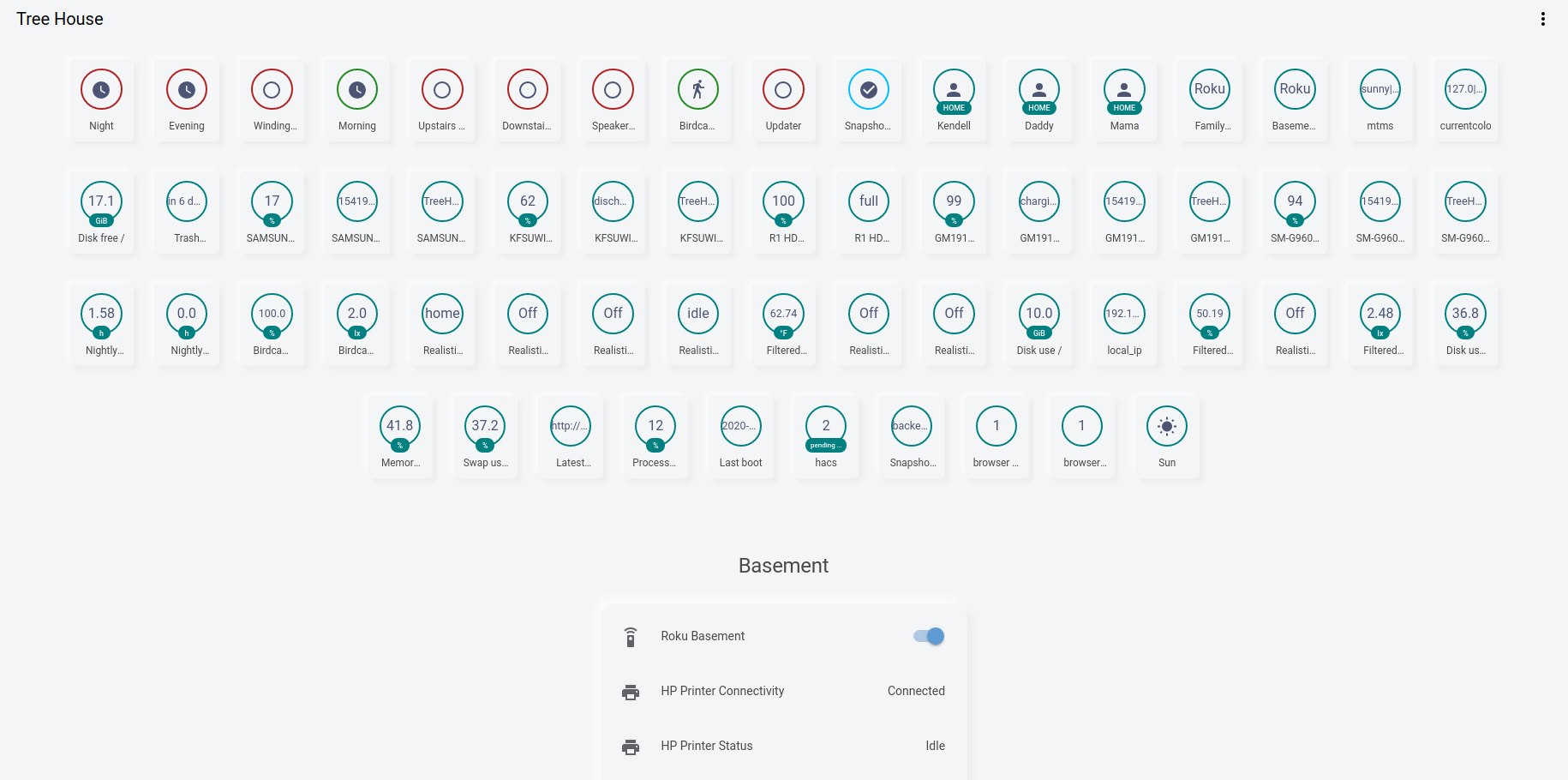
Home Assistant light theme, built on from @JuanMTech, using style boilerplates from @thomasloven and @N-L1.
This theme depends on card-mod for the soft-ui styling.
Looking for the dark theme instead?
This theme is pretty powerful. It can:
- Apply soft-ui to an auto-generated dashboard, and keep it auto-generated.
- Help you to only use the necessary style in your handmade dashboard, and keep it simple.
- Work in most places over HA, not just Lovelace.
- Apply a compact header to Lovelace, without installing an addon.
- You can use your own colors by just copy/pasting the card-mod part.
- This will clamp your columns to 1 column wide. More info.
- These things are supported.
- This theme was based off of the Google Light Theme.
- These other notes may be outdated, and most of the time you can just use
!important. You should probably just look at the source.
Expand anyway
This theme can modify how you style cards. Here's some points:
- To add soft-ui to cameras, there's extra margin and border radius added to the images and label.
- All non-markdown cards will be given background. Make it transparent instead to undo.
- All non-markdown, non-custom-button-card, non-entities, non-custom-mod-card cards will be given 30px margin and a standard box shadow.
- The whole entity card will have no shadow, 30px margin vertically, and 20px margin horizontally.
- Every entity in the entities card will have 8px padding up/down,
display: block,95%width, and margin0 auto 0 5px. - All media control cards will have text color of
5F6267and background color that matches. - The actual entities in the entities card will have standard box shadow, border radius, and
12pxmargin and10pxpadding. - The header of the entities card will have no box shadow, and the name will use
100%of the card width and be centered. - The badge area will take up
90%width max, centered horizontally, and with 8px vertical margin. - All cards will be constrained vertically, with just 1 column and max width of
500px. (Technically there's multiple columns, but we stack them vertically. Also panel mode won't be affected.) - The badge will have
5pxborder radius,11px 8pxpadding,11px 12pxmargin,inline-blockdisplay, and a standard thin box shadow. - Badge color will be changed (I don't fully understand how it works)
- Descriptions will be clamped to one line, and font size will be
1em. - More info dialogs will cause the background to be blurred by
2.5px, and make it slightly whited out. The dialog will have standard border radius, and a background ofrgba(255, 255, 255, 0.8), and the header will have the same background as the rest.

