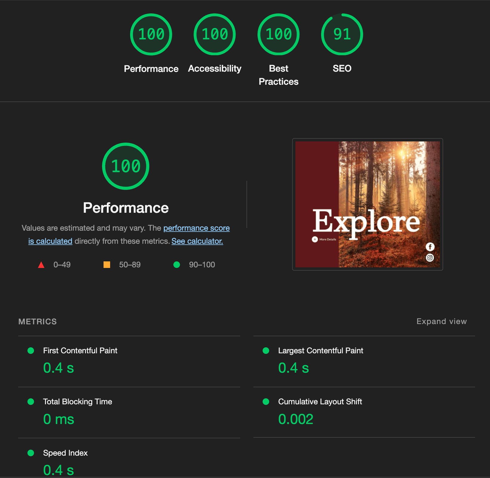
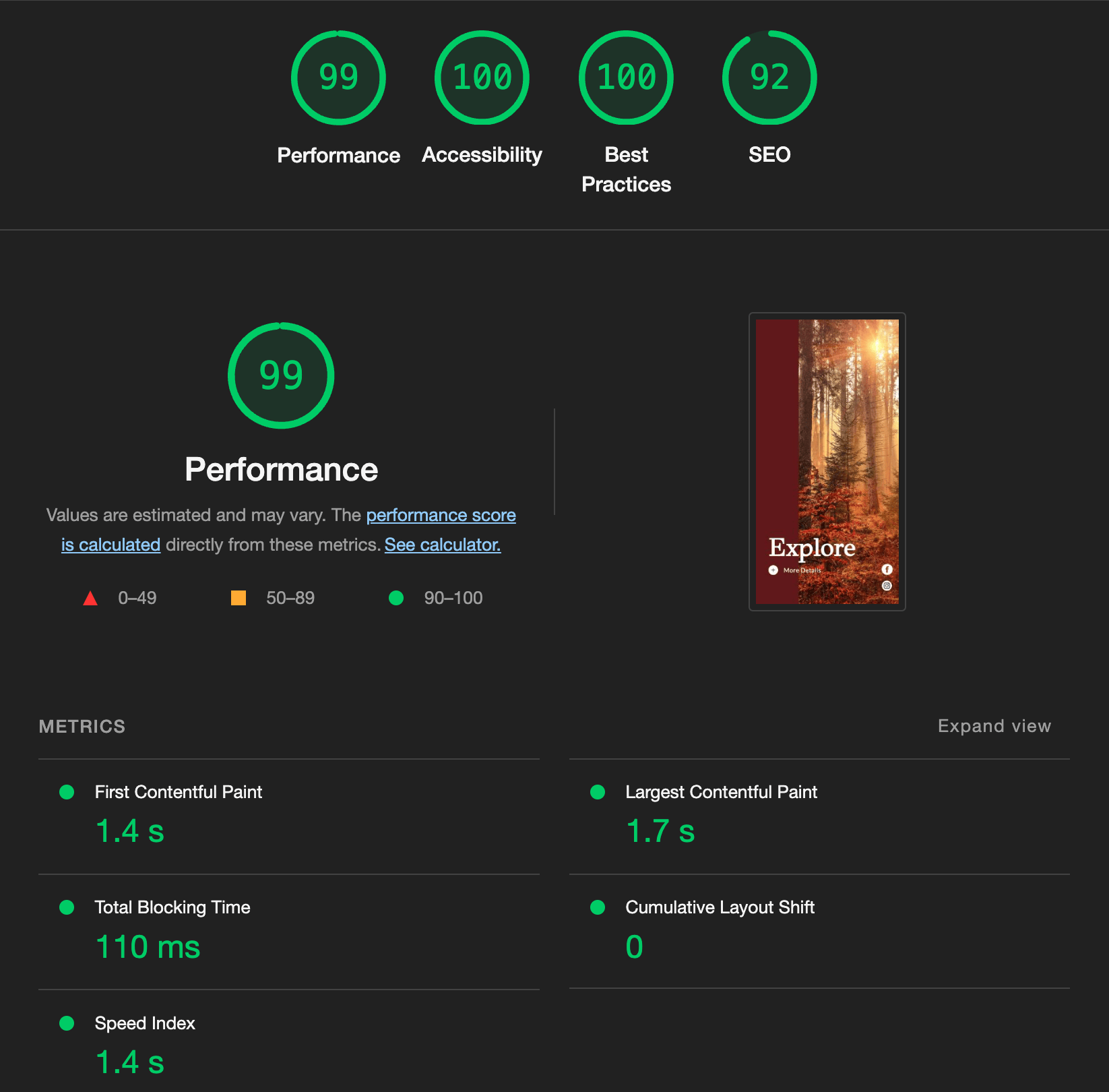
This test project is showcasing my developer skills to build a website based on a provided design. I mostly adhered to making it pixel perfect although because I was only provided a single screen size I improvised in some specifics so that the end result is more responsive for all screen sizes and adheres to a global design system like offered in Tailwind.
- CD setup for
mainbranch, deployed on vercel - https://david-explore-page.vercel.app/
- Responsive across mobile and desktop and tablet screensizes
- Accessibility focused code with aria-labels, etc
- Resusable Vue components for future flexibilty
- Locally installed fonts for maximum performance (via fontsource)
- Integrate a more robust animation library like GSAP or VueUse's Motion library
- Vuejs 3 with Vite
- Tailwind CSS
npm installnpm run devnpm run buildLint with ESLint
npm run lint
