Parallax is a tool for visualizing embeddings.
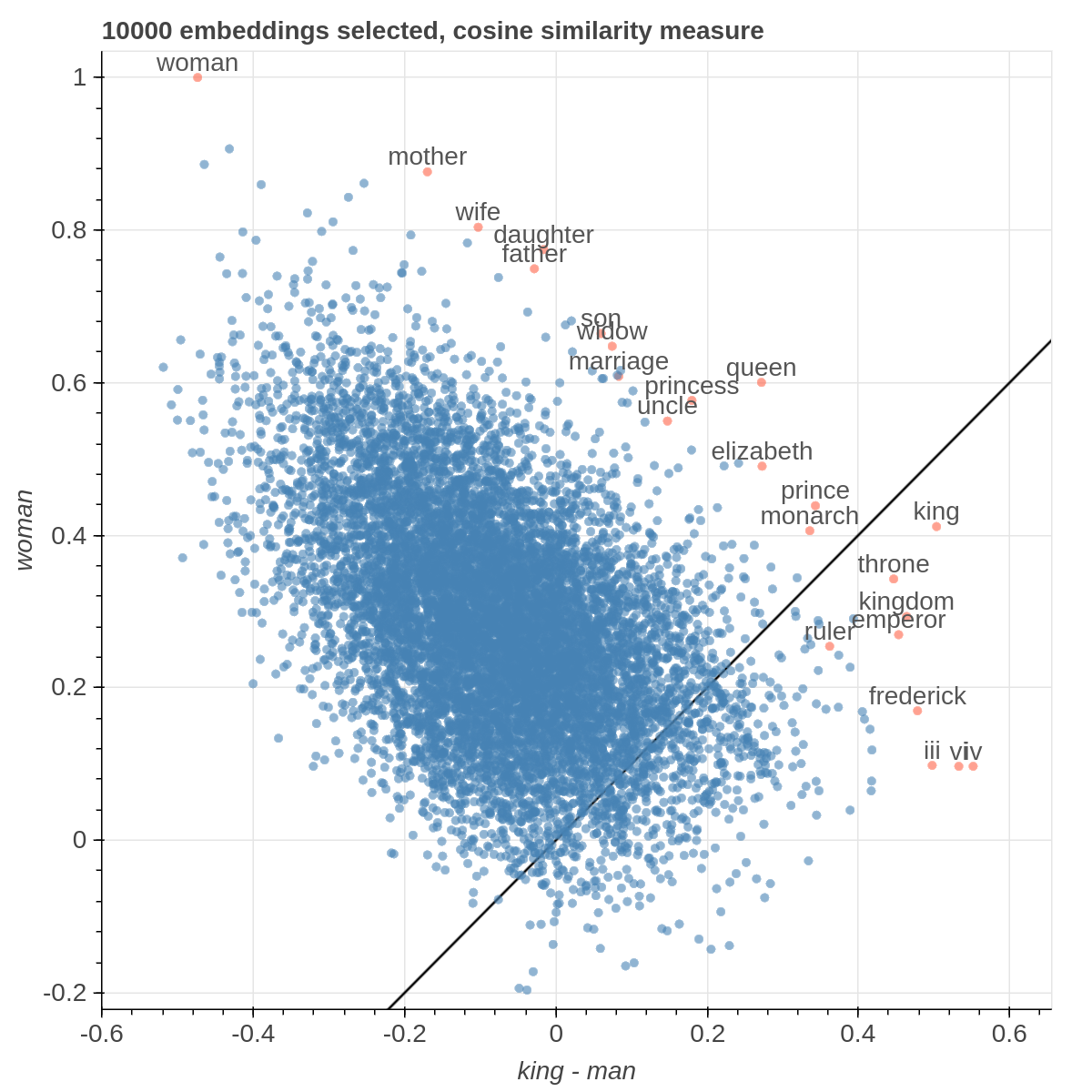
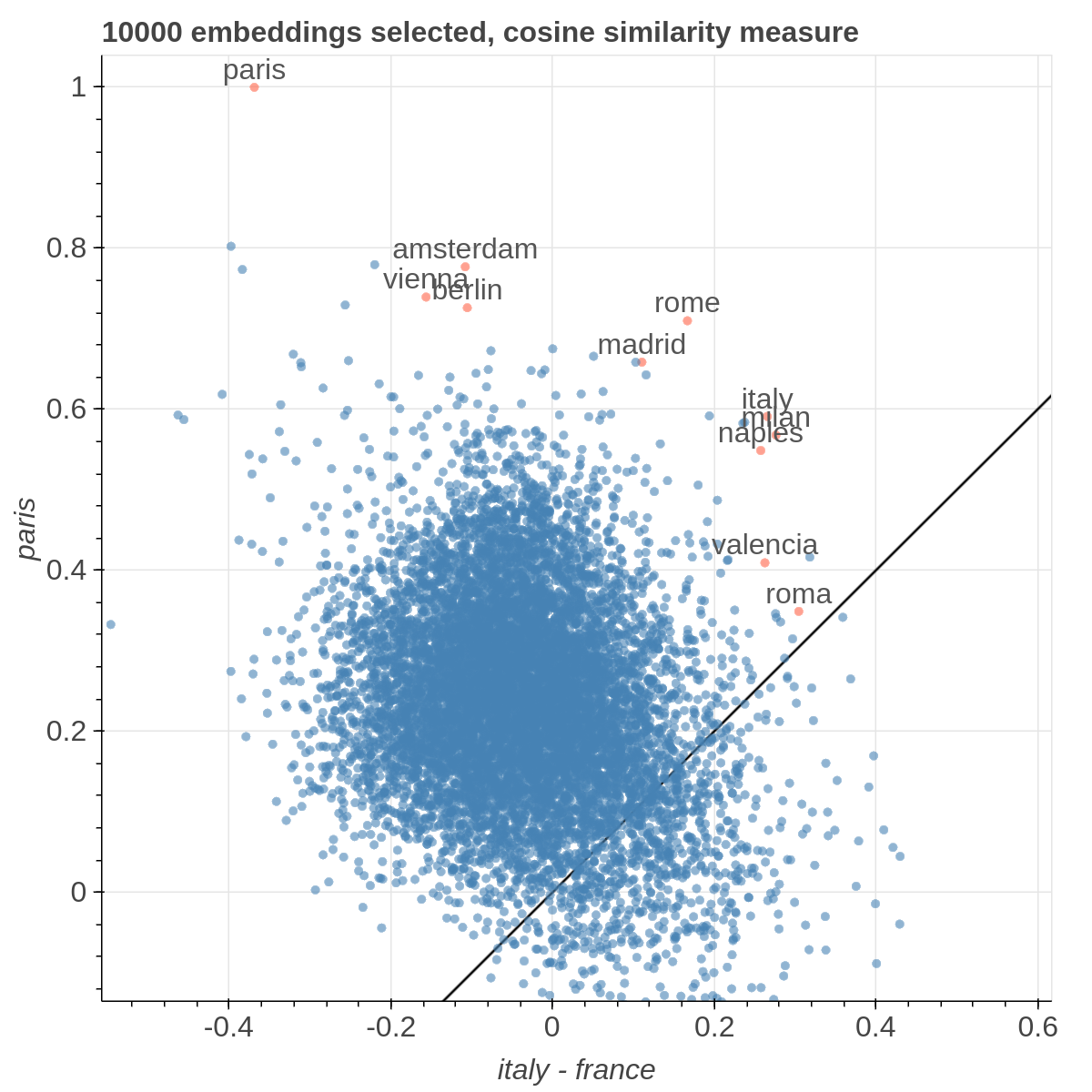
It allows you to visualize the embedding space selecting explicitly the axis through algebraic formulas on the embeddings (like king-man+woman) and highlight specific items in the embedding space.
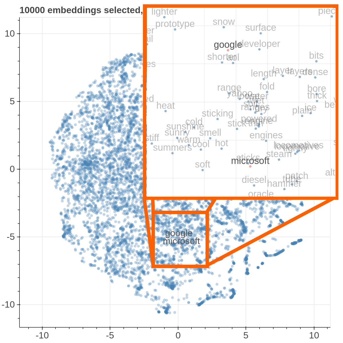
It also supports implicit axes via PCA and t-SNE.
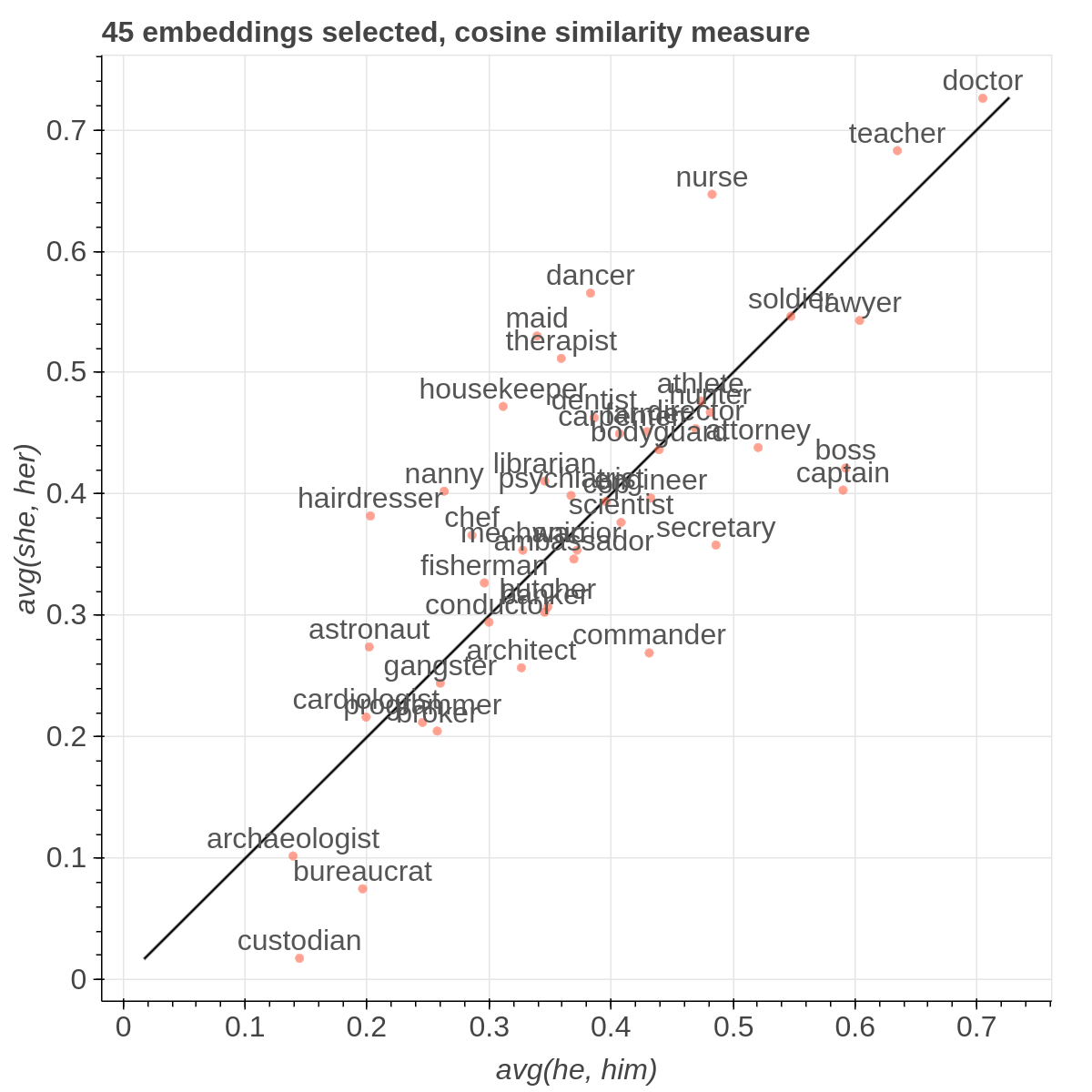
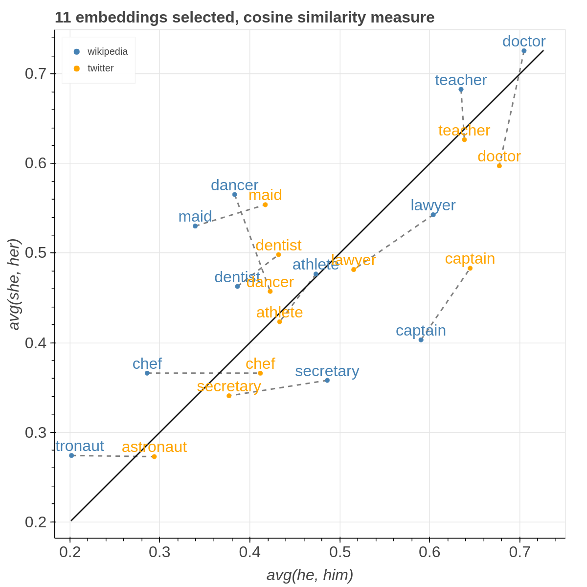
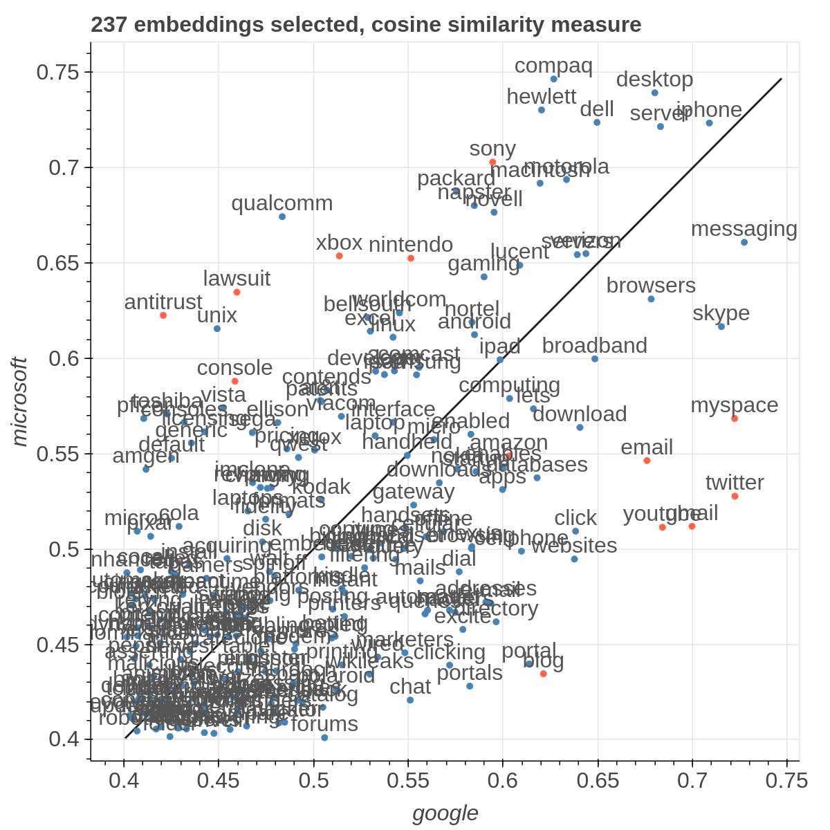
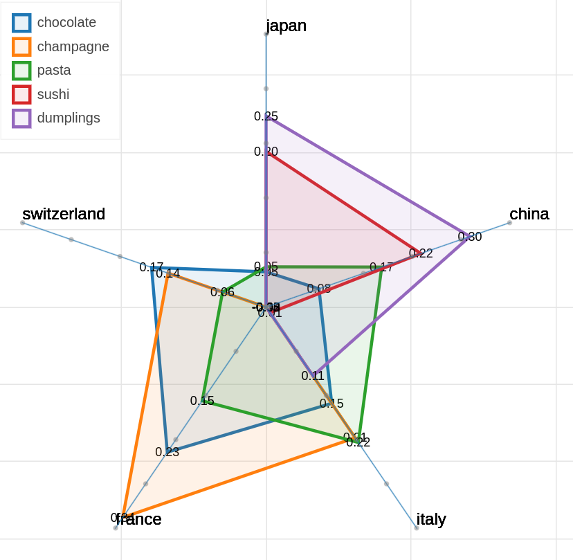
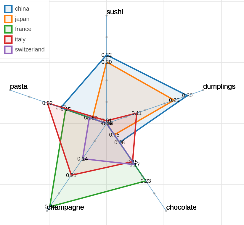
There are three main views: the cartesian view that enables comparison on two user defined dimensions of variability (defined through formulae on embeddings), the comparison view that is similar to the cartesian but plots points from two datasets at the same time, and the polar view, where the user can define multiple dimensions of variability and show how a certain number of items compare on those dimensions.
This repository contains the code used to obtain the visualization in: Piero Molino, Yang Wang, Jiwei Zhang. Parallax: Visualizing and Understanding the Semantics of Embedding Spaces via Algebraic Formulae. ACL 2019.
And extended version of the paper that describes thoroughly the motivation and capabilities of Parallax is available on arXiv
If you use the tool for you research, please use the following BibTex for citing Parallax:
@inproceedings{
  author = {Piero Molino, Yang Wang, Jiwei Zhang},
  booktitle = {ACL},
  title = {Parallax: Visualizing and Understanding the Semantics of Embedding Spaces via Algebraic Formulae},
  year = {2019},
}
The provided tool is a research prototype, do not expect the degree of polish of a final commercial product.
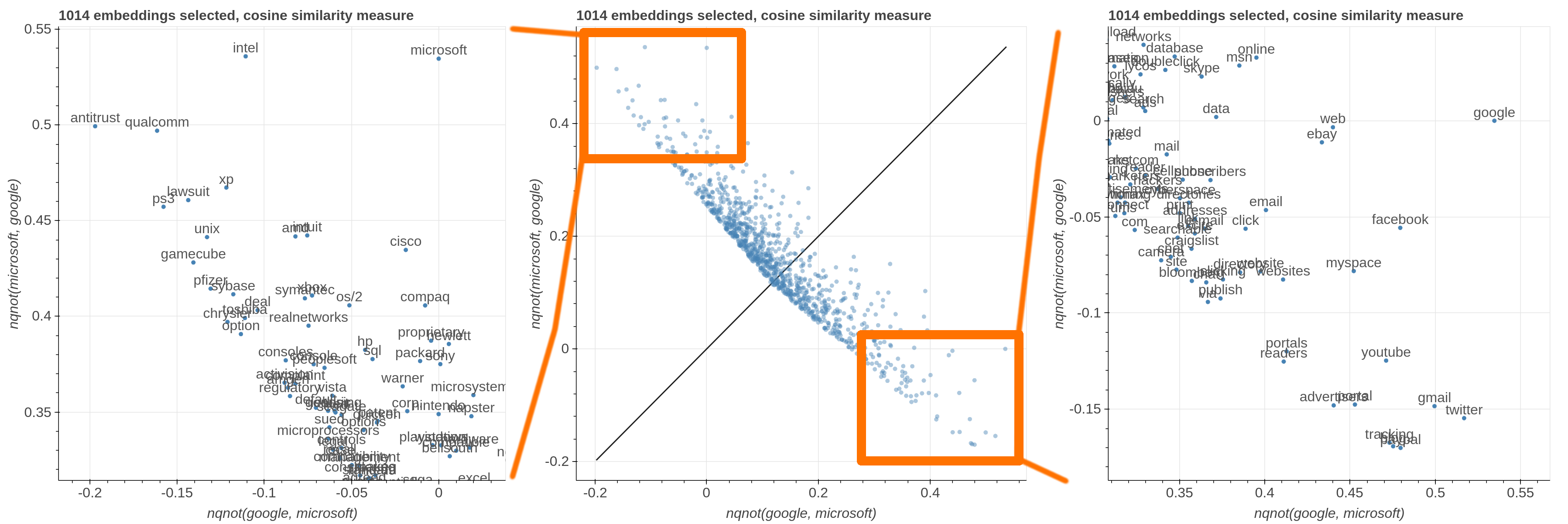
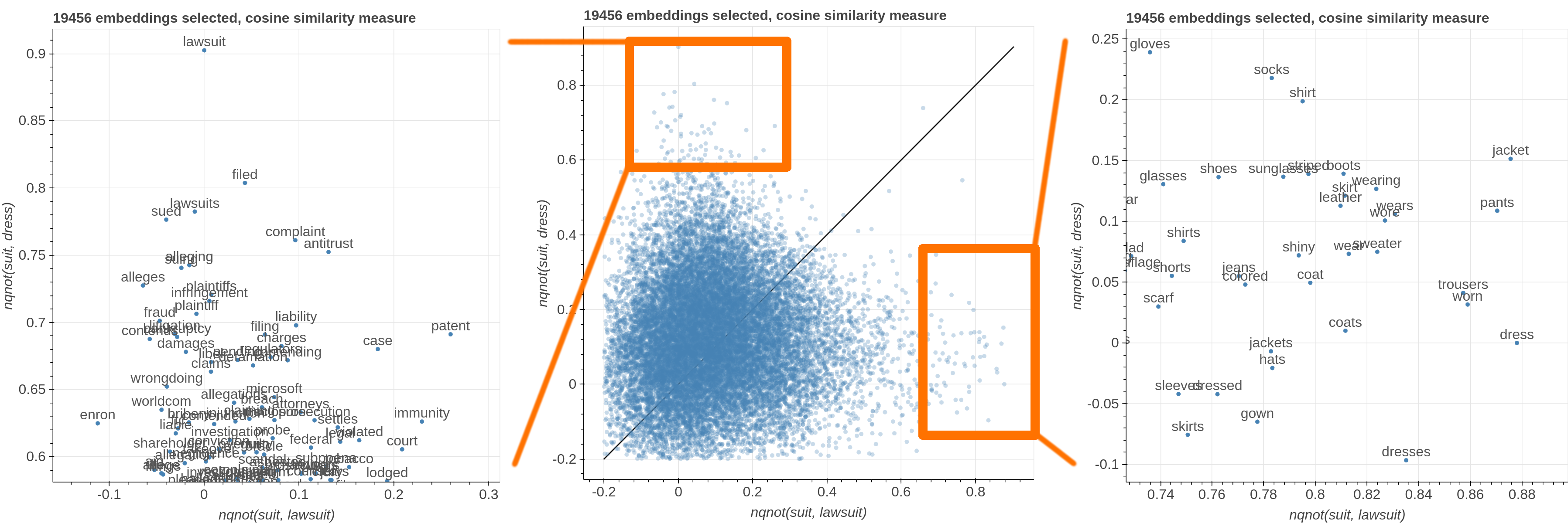
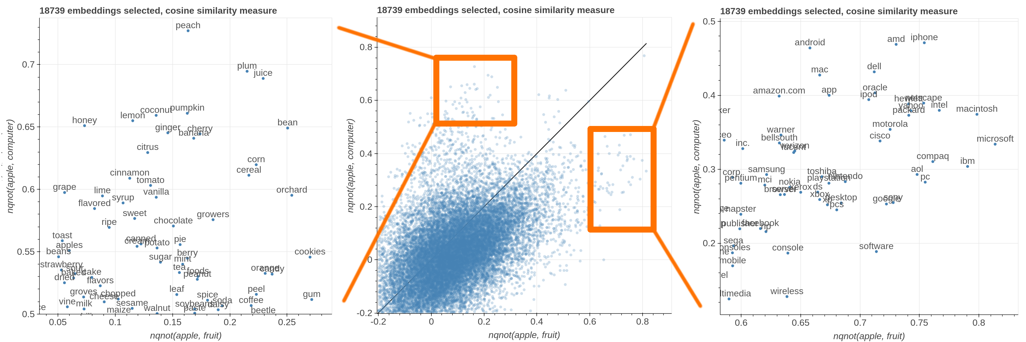
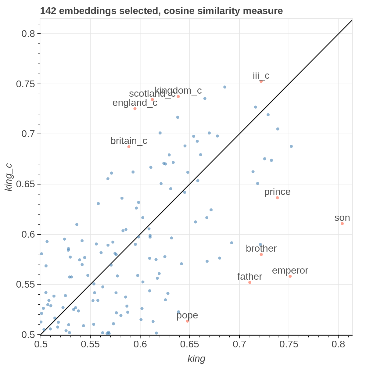
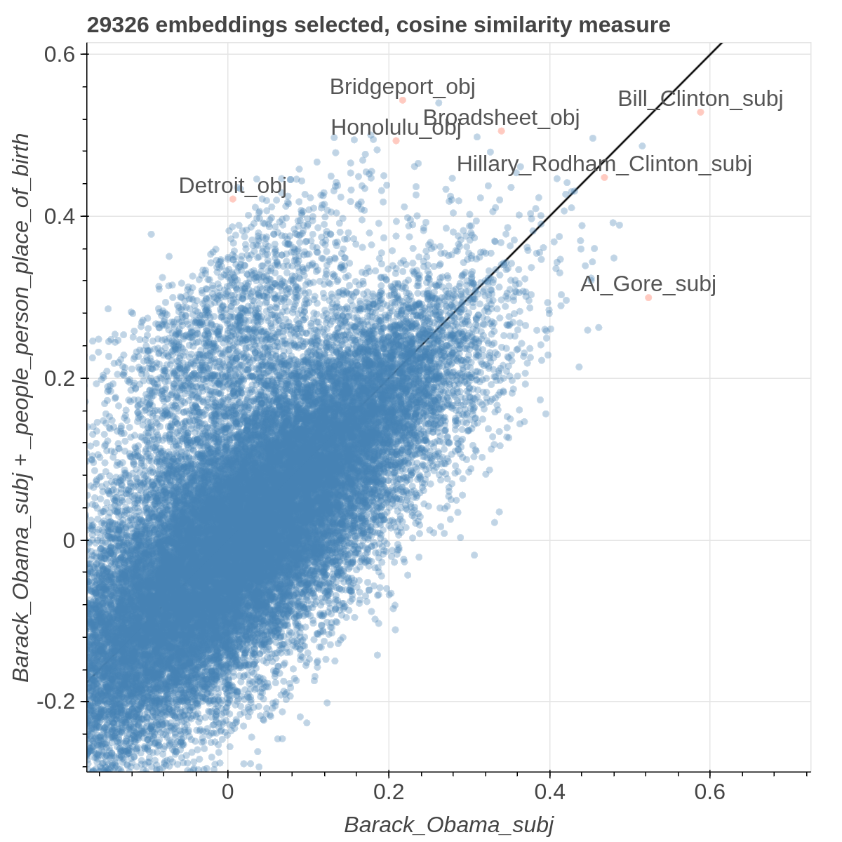
Here are some samples visualizations you can obtain with the tool. If you are interested in the details and motivation for those visualizations, please read the extended paper.
virtualenv -p python3 venv
. venv/bin/activate
pip install -r requirements.txt
In order to replicate the visualizations in our paper, you can download the files in:
https://drive.google.com/open?id=19EYhNu1Q-tRMKrGd05VF9nRVVbKEM-u3
and place the four files in data folder.
The Google Drive folder contains the Gigaword+Wikipedia and Twitter embeddings trained with GloVe, plus some metadata we obtained by the automatic script in modules/generate_metadata.py.
To obtain the cartesian view run:
bokeh serve --show cartesian.py
To obtain the comparison view run:
bokeh serve --show comparison.py
To obtain the polar view run:
bokeh serve --show polar.py
You can add additional arguments like this:
bokeh serve --show cartesian.py --args -k 20000 -l -d '...'
-dor--datasetsloads custom embeddings. It accepts a JSON string containing a list of dictionaries. Each dictionary should contain a name field, an embedding_file field and a metadata_file field. For example:[{"name": "wikipedia", "embedding_file": "...", "metadata_file": "..."}, {"name": "twitter", "embedding_file": "...", "metadata_file": "..."}].nameis just a mnemonic identifier that is assigned to the dataset so that you can select it from the interface,embedding_fileis the path to the file containing the embeddings,metadata_fileis the path that contains additional information to filter out the visualization. As it is a JSON string passed as a parameter, do not forget to escape the double quotes:
bokeh serve --show cartesian.py --args "[{\"name\": \"wikipedia\", \"embedding_file\": \"...\", \"metadata_file\": \"...\"}, {\"name\": \"twitter\", \"embedding_file\": \"...\", \"metadata_file\": \"...\"}]""
-kor--first_kloads only the firstkembeddings from the embeddings files. This assumes that the embedding in those files are sorted by unigram frequency in the dataset used for learning the embeddings (that is true for the pretrained GloVe embeddings for instance) so you are loading the k most frequent ones.-lor--lablesgives you the option to show the level of the embedding in the scatterplot rather than relying on the mousehover. Because of the way bokeh renders those labels, this makes the scatterplot much slower, so I suggest to use it with no more than 10000 embeddings. The comparison view requires at least two datasets to load.
If you want to use your own data, the format of the embedding file should be like the GloVe one:
label1 value1_1 value1_2 ... value1_n
label2 value2_1 value2_2 ... value2_n
...
while the metadata file is a json file that looks like the following:
{
  "types": {
    "length": "numerical",
    "pos tag": "set",
    "stopword": "boolean"
  },
  "values": {
    "overtones": {"length": 9, "pos tag": ["Noun"], "stopword": false},
    "grizzly": {"length": 7, "pos tag": ["Adjective Sat", "Noun"], "stopword": false},
    ...
  }
}
You can define your own type names, the supported data types are boolean, numerical, categorical and set.
Each key in the values dictionary is one label in the embeddings file and the associated dict has one key for each type name in the types dictionary and the actual value for that specific label.
More in general, this is the format of the metadata file:
{
  "types": {
    "type_name_1": ["numerical" | "binary" | categorical" | "set"],
    "type_name_2": ["numerical" | "binary" | categorical" | "set"],
    ...
  },
  "values": {
    "label_1": {"type_name_1": value, "type_name_2": value, ...},
    "label_2": {"type_name_1": value, "type_name_2": value, ...},
    ...
  }
}
The side panel of the cartesian view contains several controls.
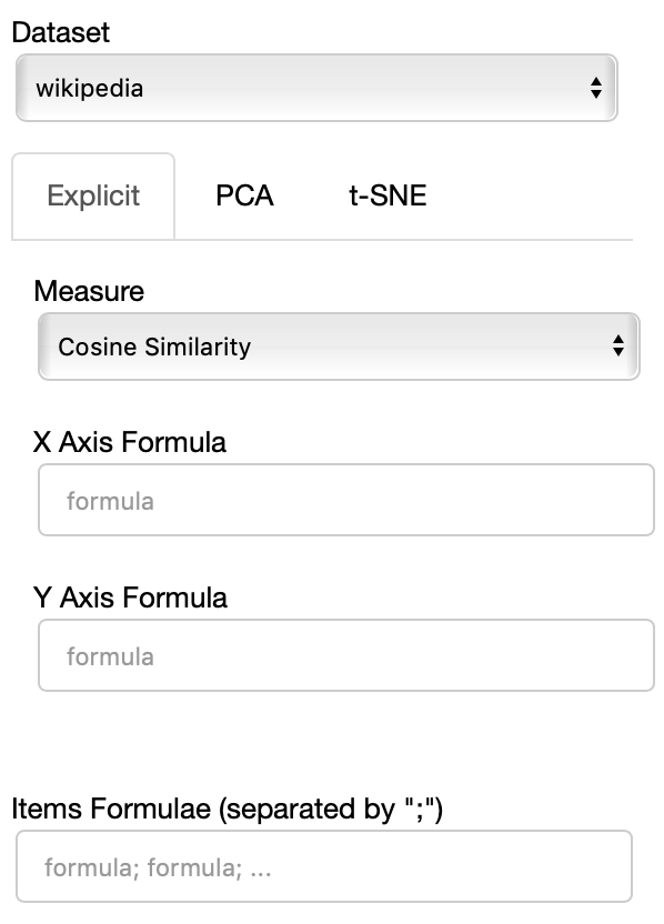
The Dataset dropdown menu allows you to select which set of embeddings use use among the ones loaded.
The names that will appear in the dropdown menu are the names specified in the JSON provided through the --datasets flag.
If the Explicit projection method is selected, the user can specify formulae as axes of projection (Axis 1 and Axis 2 fields.
Those formulae have embeddings labels as atoms and can contain any mathematical operator interpretable by python. Additional operators provided are
avg(word[, word, ...])for computing the average of a list of embeddingsnqnot(words, word_to_negate)which implements the quantum negation operator described in Dominic Widdows, Orthogonal Negation in Vector Spaces for Modelling Word-Meanings and Document Retrieval, ACL 2003
The Measure field defines the measure to use to compare all the embedding to the axes formulae.
Moreover, the user can select a subset of items to highlight with a red dot instead of a blue one. They will also have their dedicated visualization controls to make them more evident. Those items are provided in the Items field, separated by a semicolon. The items can be formulae as described above, which includes also single words.
If the PCA projection method is selected, the user can select how the filters (explained later) are applied, if before or after the projection.
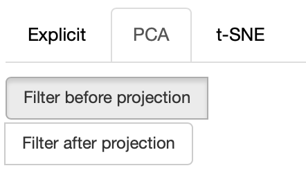
If before is selected, the embeddings are first filtered, then the PCA is computed, while the inverse happens. note that the variance on the filtered subset of data may be substantially different than the variance on the full set of data, so the two visualizations may end up being substantially different. Also note that computing the PCA after filtering can be substantially faster, depending on the amount of items left after filtering.
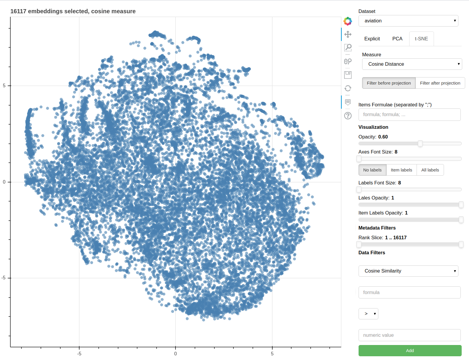
If the t-SNE projection method is selected, the user can select how the filters (explained later) are applied, if before or after the projection and the measure the t-SNE algorithm is going to use. Consider that t-SNE is slow to compute and it may take minutes before the interface is updated, check the output on the console to make sure t-SNE is calculating.
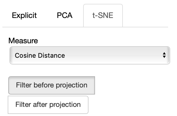
The same considerations regarding filtering before or after for PCA apply to the t-SNE case too.
Additional parameters of the t-SNE algorithm are available for you to tweak:
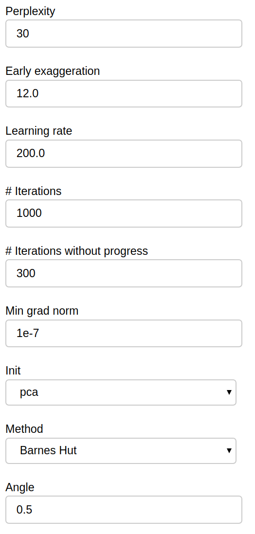
Those parameters map exactly to the scikit-learn implementation, refer to it for further details.
THe Visualization section of the panel lets you configure how the datapoints are visualized in the plot.
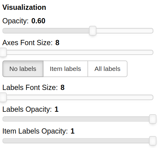
You can set the opacity of the points and the size of the axes labels.
If the --labels parameter is used, additional controls are available.
You can also decide which labels to visualize, if the ones for all the items, if only for the items specified in the Items field or for none of them.
The opacity of each datapoint and the size and opacity of the labels of the items listed in the Items field are also modifiable.
The Metadata filters sections allow you to select a subset of the points to visualize according to their properties.
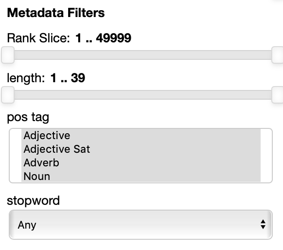
The rank slice control is always present. It allows for selecting the points depending on the ordering they have in the original embedding file. This assumes that the ordering matters: in many cases, like for instance in the case of the pretrained GloVe embeddings, the ordering reflects the frequency, so you can select, for instance to filter out the 100 most frequent words and the visualize only the 5000 most frequent words and to filter out the top 100 by moving the handles.
The other filters depend entirely on the metadata file specified in the --datasets parameter.
In this example each point has 3 attributes: length (in characters), pos tag (the part of speech) and stopword are shown.
Numerical properties like length have a two handle range control so that you can select the interval you want to keep, for instance you may want to visualize only points with associated labels longer than 4 characters.
Categorial and set properties like pos tag (in this case shown as set, a the same word, in absence of the context it appears in can have multiple parts of speech associated with it, like the word 'cut' for instance) have a list of values you want to select, for instance you can select to visualize only verbs and adjectives.
Binary properties like stopword have a dropdown menu for you to select if you want to visualize only the points with a true value, false value or any of the two values.
THe Data filters filters section allows you to select which points to visualize based on their embeddings, specifically their similarity or distance with respect to a formula.
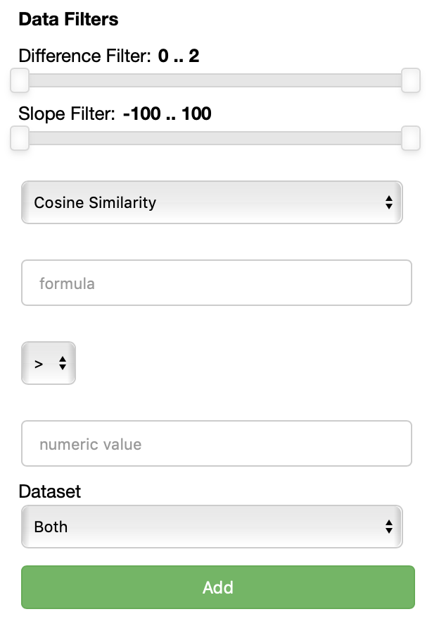
Each data filter reads as a rule like 'visualize only the datapoints that have a {similarity/distance} {greater/equal/lower} than {value} with respect to {formula}'. Each field is populated with the values you specify. One could for instance decide to visualize only the points that are closer than 0.5 to the word 'king'.
Using the Add button, one can add an additional data filter. If more than one data filter is specified, they are applied in AND meaning a datapoint has to satisfy the conditions of all the fitlers to be visualized.
THe control panel of the comparison view is really similar to the one of the cartesian view, with the following differences.
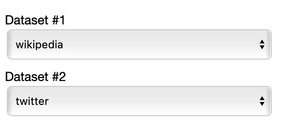
This time you have to select two datasets among the ones specified in the JSON to compare.
Also two additional filters are now available for you in order to visualize only the lines with a slope within a certain range and the lines that describe pairs of points that are more distant than a specified amount among each other in the two datasets.
The polar view control panel is different from the previous two.
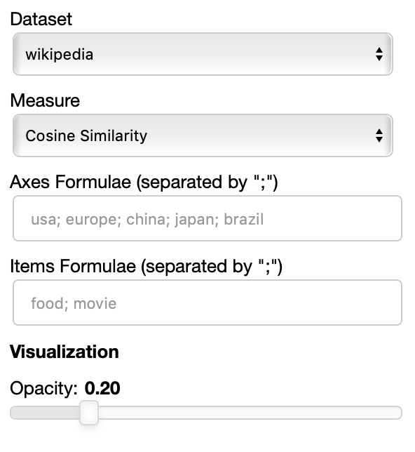
As you can specify as many axes as you want and as many items as you want, the two Axes and Items fields both accept a variable number of formulae divided by semicolon. Note that this visualization may became hard to interpret if too many items are visualized at the same time on too many axes, so choose them wisely.
The only visualization parameter to modify in this case is the opacity of the polygons that describe each item.
This code is supposed to be a prototype, we do not suggest deploying this code directly in the wild, but we suggest to use it on a personal machine as a tool.
In particular formulae are evaluated as pieces of python code through the eval() function.
This may allow the execution of arbitrary python code, potentially malicious one, so we suggest not to expose a running Parallax server to external users.
Because of the use of eval() there are also some limitations regarding the labels allowed for the embeddings (the same rules that apply for python3 variable naming):
- Variables names must start with a letter or an underscore, such as:
- _underscore
- underscore_
- The remainder of your variable name may consist of letters, numbers and underscores.
- password1
- n00b
- un_der_scores
- Names are case sensitive.
- case_sensitive, CASE_SENSITIVE, and Case_Sensitive are each a different variable.
- Variable names must not be one of python protected keywords
- and, as, assert, break, class, continue, def, del, elif, else, except, exec, finally, for, from, global, if, import, in, is, lambda, not, or, pass, print, raise, return, try, while, with, yield
- Variable names can contain unicode characters as long as they are letters (http://docs.python.org/3.3/reference/lexical_analysis.html#identifiers) Lables that don't respect those rules will simply not be resolved in the formulae. There could be solutions to this, we are already working on one.
- display errors in the UI rather than in the console prints (there's no simple way in bokeh to do it)
- add clustering of points
- solve the issue that embedding labels have to conform to python variable naming conventions
- t-SNE is slow to compute, should require a loading UI.
- the scatterplot is in webgl and it's pretty fast even with hundreds of thousands of datapoints. With the labels enabled it uses html canvas that is really slow, so you may want to reduce the number of embeddings to less than 10000 for a responsive UI.
- In the polar view, changing axes and items can result in wrong legends
- The polar view rendering strategy is clearly sub-optimal
We are already working on a v2 of parallax that will not be using Bokeh but deck.gl for much improved performance with webgl rendering of labels, much faster implementation of t-SNE and more streamlined process for loading data. Stay tuned and reach out if you want to contribute!