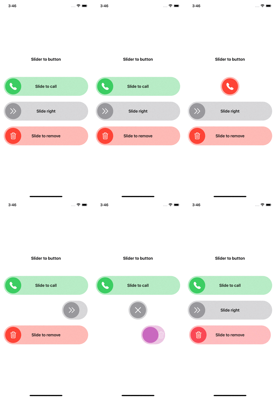
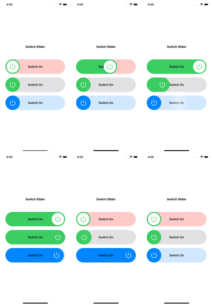
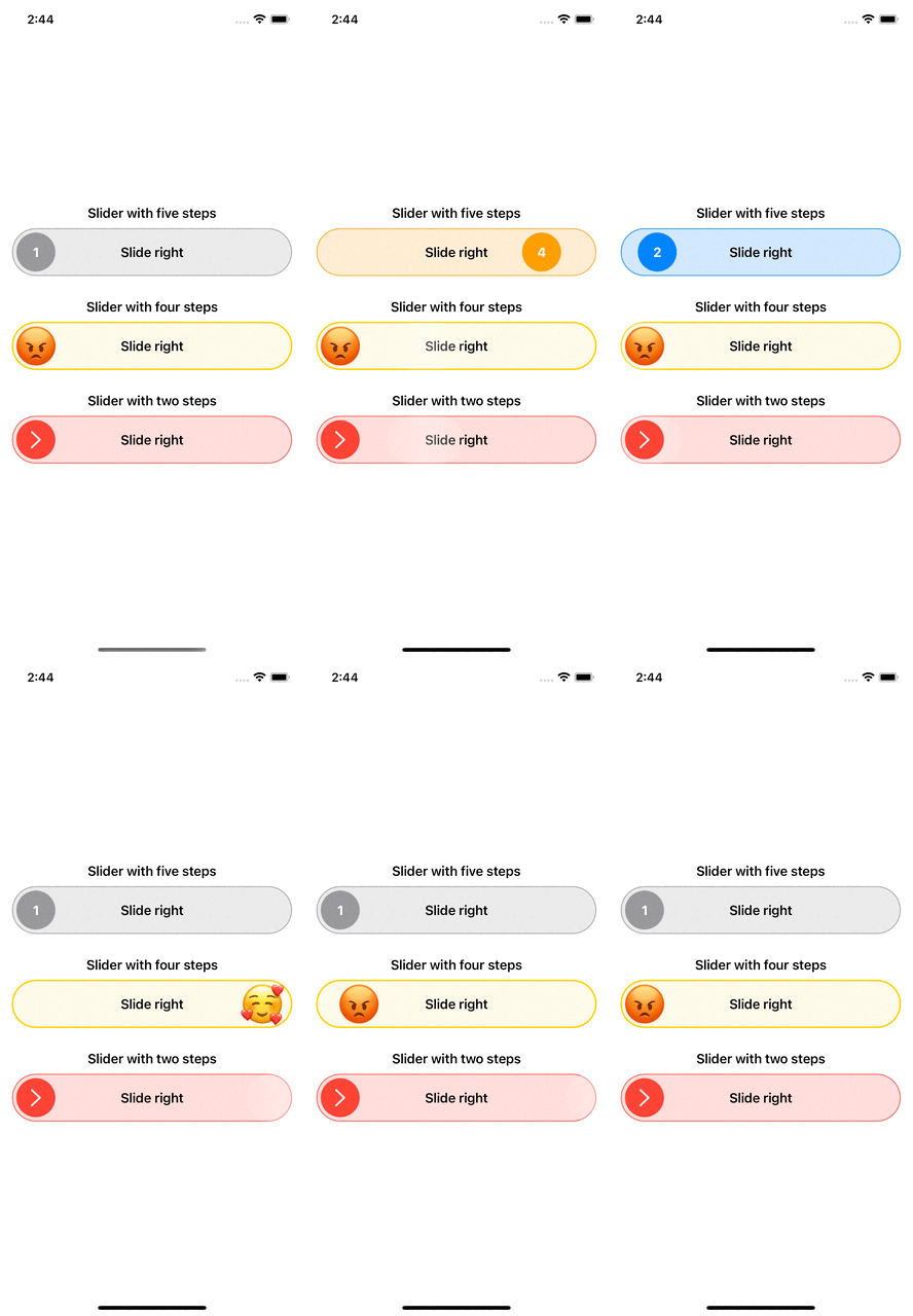
Avaialable componements:
SliderToButton- Slider that will become a button after you finish slidingSwitchSlider- Slider that behave like switch toggle, only you need to slideStepsSlider- Slider that has many steps to stop by depends on your needsRatingSlider- Slider that was made for rating only, it requires five images that represent the rating stars
FancySliders is a SwiftUI package.
- macOS 10.15 or Greater
- iOS 15 or Greater
Add this to your project using Swift Package Manager. In Xcode that is simply: File > Swift Packages > Add Package Dependency
https://github.com/ayoubElhoucine/FancySliders-iOS.git import FancySliders @State private var thumbColor = Color.green
SliderToButton(
width: UIScreen.main.bounds.width - 32,
height: 80,
title: "Slide to call",
titleColor: .black,
bgColor: thumbColor.opacity(0.4),
initialMode: .slider // (.slider/.button) in case you need it to a button as first just set initialMode to .Button
) {
// thumnail view factory: you can customize the thumb view depends on your need
Circle()
.fill(thumbColor)
.padding(6)
.overlay {
Image(systemName: "phone.fill")
.resizable()
.foregroundColor(.white)
.scaledToFit()
.frame(width: 30)
}
} didFinishSliding: {
// call back for finish sliding
withAnimation {
thumbColor = .red
}
} didClick: {
// callback for button state click
withAnimation {
thumbColor = .green
}
} SwitchSlider(
width: UIScreen.main.bounds.width - 60,
height: 80,
title: "Switch On",
titleColor: .black,
colorOn: .green,
colorOff: .red.opacity(0.3)
) {
// thumnail view factory: you can customize the thumb view depends on your need
Circle()
.fill(.white)
.padding(6)
.overlay {
Image(systemName: "power")
.resizable()
.foregroundColor(.green)
.scaledToFit()
.frame(width: 30)
}
} didComplete: { value in
// value will be true or false
} StepSlider(
width: UIScreen.main.bounds.width - 32,
height: 60,
stepCount: 2 // number of steps
) {
// thumnail view factory: you can customize the thumb view depends on your need
Circle()
.fill(.red)
.padding(5)
.overlay {
Image(systemName: "chevron.right")
.resizable()
.scaledToFit()
.foregroundColor(.white)
.frame(height: 22)
}
} content: {
// content view factory: you can customize the content view depends on your need
Capsule().fill(Color.red.opacity(0.2))
.overlay {
Capsule().stroke(.red, lineWidth: 1)
Text("Slide right").fontWeight(.semibold)
}
} onSliding: { value in
// trigered when user is on sliding, the value will be int from 0 to (stepCount - 1)
} didComplete: { value in
// trigered when user finish sliding, the value will be int from 0 to (stepCount - 1)
}you need to add the images to assets package and use them in images, you need five images that will represent your rating from one to five star
            RatingSlider (
                width: UIScreen.main.bounds.width - 32,
                height: 58,
                images: RatingImages(firstImage: "emoji-1", secondImage: "emoji-2", thirdImage: "emoji-3", fourthImage: "emoji-4", fifthImage: "emoji-5")
            ) {
                // content view factory: you can customize the content view depends on your need
                ZStack {
                    Capsule().fill(.yellow.opacity(0.2))
                        .overlay {
                            Capsule().stroke(.yellow, lineWidth: 2)
                        }
                    Text("Rate your experience!")
                        .foregroundColor(.black)
                }
            } didRate: { value in
                // trigered when user finish rating, the value will be int from 0 to 4
}Feel free to contribute via fork/pull request to main branch. If you want new feature or report a bug then start a new issue.
Elhoucine Ayoub


