Starter kit for modern web applications!
This project (a GitHub template) is an opinionated setup for modern web applications. It's a combination of essential (and minimal) libraries/components/utils/etc., which developers usually need during the process of making modern React applications.
Almost all projects need to have a router, a UI framework, store integration, theming, error handling, base file/folder structure, a builder, some developer tools (eslint, prettier, etc), and many more. In this starter kit, we tried to put together the best options available from the above-mentioned fields. Out of the box, it provides a modern production-ready setup created by developers for developers 💚
- ✅ Vite
- ✅ React
v18🔥
- ✅ TypeScript
- ✅ Router
React Router v6
- ✅ UI-framework
MUI v5
- ✅ Store
Recoil
- ✅ Notifications
- ✅ Theme
- ✅ Base file/folder structure
- ✅ PWA
- ✅ Performance
- ✅ Hotkeys
- ✅ Error Handling
- ✅ Pages
- ✅ Dev tools
- ✅ eslint
- ✅ prettier
- ✅ husky
- ✅ lint-staged
- ✅ https localhost
Vite is a blazingly fast build tool based on native ES modules, rollup, and esbuild. React-PWA v1 was based on CRA. We still love CRA and really think it's a great tool, but Vite provides a much better developer experience and it's unconditionally faster (maybe, we will also create a CRA version of React-PWA v2 in near future).
The latest version (v18) is used here. All dependencies support React v18 and the v2 is refactored according to the latest changes and requirements of React v18.
"Not using TypeScript is like driving without a seatbelt" - Matt Howard.
For those who are not familiar with TypeScript - don't worry, you will love it, as we all did. TypeScript is a superset of JavaScript; it should be very easy to work with if you know JavaScript.
React Router v6 is used here. You can find routing in the src/routes folder.
MUI v5 is used here. MUI is a fully-loaded component library, super customizable, and easy to use.
As a store management tool Recoil is used. Check the src/store folder for more information.
Out of the box you have a notification system. To show a simple notification you can use useNotification hook:
import { useNotifications } from '@/store/notifications';

function MyCoolComponent() {
  const [notifications, actions] = useNotification();

  function showNotification() {
    actions.push({ message: 'Բարև, կարմի՛ր արև' });
  }

  return (
    ...
  );
}The theme system is based on MUI Theme. To get the current theme mode or to change it you can use useTheme hook:
...
import { useTheme } from '@/store/theme';

function MyCoolComponent() {
  const [theme, actions] = useTheme();

  // check the current theme mode
  console.log(theme);

  // if you want to change the theme, call an appropriate action
  function toggleTheme() {
    actions.toggle();
  }

  ...
}
You have access to theme object via sx prop and styled-components:
import Box from '@mui/material/Box';
import Button from '@mui/material/Button';
import { styled } from '@mui/system';

// styled-components
const MyCoolButton = styled(Button)(({ theme }) => ({
  marginRight: theme.spacing(1),
  color: theme.palette.text.disabled,
}));

// sx prop
function MyCoolComponent() {
  return <Box sx={{ borderRadius: theme.shape.borderRadius }}>...</Box>;
}
Also, you can redefine the theme in the theme configuration file. Check the src/theme/themes.ts file for more information.
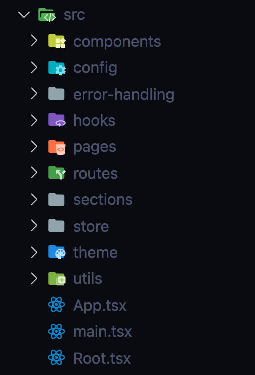
Here how the base file/folder structure looks like:
TBD: more information about the file/folder structure will be added soon.
Out of the box, it's a Progressive Web Application. It can be installed on mobile and desktop devices 🙂, it can work offline, and many more. Check more about PWAs here
Your users will also be informed about the new version of your app:
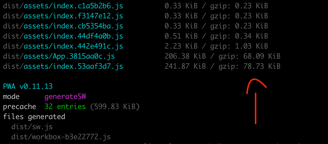
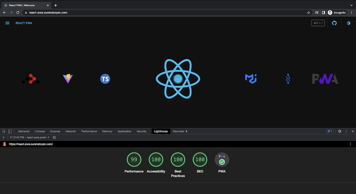
After all these integrations the biggest bundle size is ~79KB. It means even the first load will be pretty fast (in my case it's 1.1s), further loads (already cached by service worker and workbox) will take ~0.25s.
NOTE: The performance is not 100 because it's running on demo server.
A basic implementation of hotkeys is demonstrated here. Check the src/sections/HotKeys for more information.
Currently, you can use the following hotkeys:
Alt+s - to toggle the theme mode
Alt+t - to toggle the sidebar
Alt+/ - to open the hotkeys dialog
Nobody likes white screens and crashes without any notes. In src/error-handling you can find the error handling implementation. Here you can find withErrorHandler high order component. You can wrap any component by this HOC and it will catch all errors and show a default or your custom fallback. Currently, the main APP component is wrapped by withErrorHandler HOC.
From a layout point of view the application consists of 3 main parts:
- Header
- Sidebar
- Pages
The last one is a router-based switcher. All routes are defined in src/routes. By default, pages are being loaded asynchronously via asyncComponentLoader. You can use it to asynchronously load any React component you want. It uses React.Suspense and React.lazy with some magic 🧙♂️
-
The latest version of
eslintwith the latest recommended collection ofeslintrules is available out of the box. It contains:- eslint:recommended
- react/recommended
- @typescript-eslint/recommended
Check the .eslintrc.json file for more information.
-
Stop fighting about styling in code reviews; save your time and energy - configure it once and let the machine format/correct your code.
Check the .prettierrc.json file for more information.
There is an additional configuration for your import statements. They will be automatically ordered and grouped by the given rules (check the
.prettierrc.js) - one more topic for debates in code reviews :) -
You can use it to lint your commit messages, run tests, lint code, etc.
Currently, only
pre-commithook is set up. Every time you try to do a commit it will runprettierandeslintto be sure that everything is according to the rules. -
lint-stagedhelps to runeslintandprettieronly on staged files - it makes the linting process super fast and sensible. -
It's a simple way to run your application on localhost with https.
Just run:
npm run https-preview # or yarn https-previewafter:
npm run build # or yarn buildand check
https://localhostin your browser.NOTE: first time it will ask you about installing localhost certificate. For more info check this
You can use this template by just pressing Use this template.
Or you can fork/clone it.
Install dependencies:
npm install # or yarnIn order to run it in development, run:
npm run dev # or yarn devIn order to do a production build, run:
npm run build # yarn buildThere are two more scripts:
preview and https-preview
previewcommand will boot up local static web server that serves the files fromdistfolder. It's an easy way to check if the production build looks OK in your local environment.https-previewis the same, but with HTTPS. It's handy for testing your PWA capabilities in your local environment.
