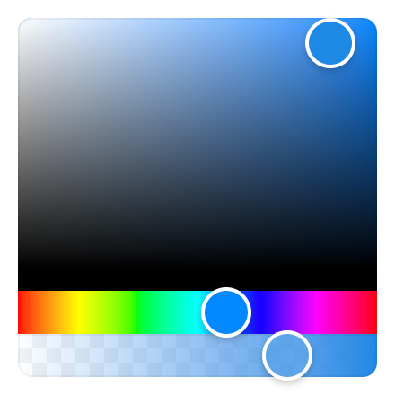
- Small: Just 2,3 KB (minified and gzipped). Size Limit controls the size.
- Fast: Built with standards based Custom Elements.
- Bulletproof: Written in strict TypeScript and covered by 60+ tests.
- Simple: The interface is straight forward and easy to use.
- Mobile-friendly: Works well on mobile devices and touch screens.
- Framework-agnostic: Can be used with any framework.
- No dependencies
npm install vanilla-colorful --save
Or use one of the following content delivery networks:
<script type="module" src="https://unpkg.com/vanilla-colorful?module"></script><script type="module" src="https://cdn.skypack.dev/vanilla-colorful"></script><hex-color-picker color="#1e88e5"></hex-color-picker>
<script type="module">
import 'vanilla-colorful';
const picker = document.querySelector('hex-color-picker');
picker.addEventListener('color-changed', (event) => {
const newColor = event.detail.value;
});
</script>The default vanilla-colorful's input/output format is a HEX string (like #ffffff). In case if
you need another color model, we provide 12 additional color picker bundles.
How to use another color model
| File to import | HTML element | Value example |
|---|---|---|
"hex-color-picker.js" |
<hex-color-picker> |
"#ffffff" |
"hsl-color-picker.js" |
<hsl-color-picker> |
{ h: 0, s: 0, l: 100 } |
"hsl-string-color-picker.js" |
<hsl-string-color-picker> |
"hsl(0, 0%, 100%)" |
"hsla-color-picker.js" |
<hsla-color-picker> |
{ h: 0, s: 0, l: 100, a: 1 } |
"hsla-string-color-picker.js" |
<hsla-string-color-picker> |
"hsla(0, 0%, 100%, 1)" |
"hsv-color-picker.js" |
<hsv-color-picker> |
{ h: 0, s: 0, v: 100 } |
"hsv-string-color-picker.js" |
<hsv-string-color-picker> |
"hsv(0, 0%, 100%)" |
"hsva-color-picker.js" |
<hsva-color-picker> |
{ h: 0, s: 0, v: 100, a: 1 } |
"hsva-string-color-picker.js" |
<hsva-string-color-picker> |
"hsva(0, 0%, 100%, 1)" |
"rgb-color-picker.js" |
<rgb-color-picker> |
{ r: 255, g: 255, b: 255 } |
"rgba-color-picker.js" |
<rgba-color-picker> |
{ r: 255, g: 255, b: 255, a: 1 } |
"rgb-string-color-picker.js" |
<rgb-string-color-picker> |
"rgb(255, 255, 255)" |
"rgba-string-color-picker.js" |
<rgba-string-color-picker> |
"rgba(255, 255, 255, 1)" |
<rgba-color-picker></rgba-color-picker>
<script type="module">
  import 'vanilla-colorful/rgba-color-picker.js';

  const picker = document.querySelector('rgba-color-picker');
  picker.color = { r: 50, g: 100, b: 150, a: 1 };
</script>vanilla-colorful exposes CSS Shadow Parts allowing to override the default styles:
hex-color-picker {
  height: 250px;
}

hex-color-picker::part(saturation) {
  bottom: 30px;
  border-radius: 3px 3px 0 0;
}

hex-color-picker::part(hue) {
  height: 30px;
  border-radius: 0 0 3px 3px;
}

hex-color-picker::part(saturation-pointer) {
  border-radius: 5px;
}

hex-color-picker::part(hue-pointer) {
  border-radius: 2px;
  width: 15px;
  height: inherit;
}vanilla-colorful provides an additional <hex-input> element that can be used to type a color:
<hex-input color="#1e88e5"></hex-input>
<script type="module">
  import 'vanilla-colorful/hex-input.js';

  const input = document.querySelector('hex-input');
  input.addEventListener('color-changed', (event) => {
    const newColor = event.detail.value;
  });
</script>
<hex-input> does not use Shadow DOM and renders an input element without any custom styles. You
can also provide a custom input element as a child if you want to configure it.
vanilla-colorful provides a set of base classes that can be imported without registering custom elements. This is useful if you want to create your own color picker with a different tag name.
import { RgbBase } from 'vanilla-colorful/lib/entrypoints/rgb.js';

customElements.define('custom-color-picker', class extends RgbBase {});vanilla-colorful supports TypeScript and ships with types in the library itself; no need for any other install.
How you can get the most from our TypeScript support
While not only typing its own class methods and variables, it can also help you type yours. Depending on
the element you are using, you can also import the type that is associated with the element.
For example, if you are using our <hsl-color-picker> element, you can also import the HslColor type.
import type { HslColor } from 'vanilla-colorful/hsl-color-picker';

const myHslValue: HslColor = { h: 0, s: 0, l: 0 };
All the included custom elements are compatible with lit-analyzer and lit-plugin extension for Visual Studio Code, so you can benefit from type checking in lit-html templates.
vanilla-colorful uses Custom Elements and Shadow DOM, and does not support IE11 or legacy Edge.
vanilla-colorful has all the benefits of react-colorful with one important difference.
While react-colorful claims to have zero dependencies, it still expects you to use React or Preact.
This means that Angular, Vue, Svelte or vanilla JS users would have an extra dependency in their apps.
Now when all the evergreen browsers support standards based Custom Elements, it's perfect time to build such tiny and lightweight UI controls as web components rather than framework components.

